

BLOG
The Evolution of the 3D Industry Panel: Who will survive?
Did you enjoy this blog post? If so, then why not:
Leave Comment | Subscribe To This Blog | Email Me
Breathing Space
Position your subject so there is sufficient "breathing room" between the front of your subject and the rendering border. Otherwise, things can appear cramped or crowded-even off-balance. It's unnerving for the viewer to see a subject just about to leave the frame.
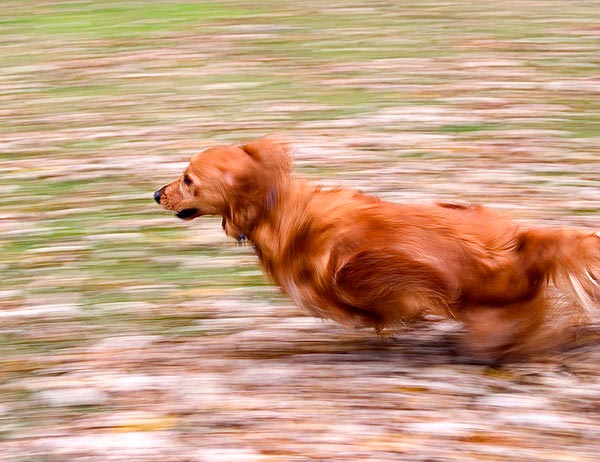
Motion Blur
Did you enjoy this blog post? If so, then why not:
Leave Comment | Subscribe To This Blog | Email Me
Keep An Open Mind
A major part of any staging process involved trail and error, shifting objects around while paying close attention to how the objects interact. Consider how colors overlap, how objects cast shadow on one another and how certain effects are more pleasing than others.
Here Are 7 Tips For Better Composition.
- Have a basic layout in mind, vertical or horizontal.
- Have reference photos
- Removing objects can be as helpful as adding new ones
- Experiment
- Cast shadows are a wonderful way to explain form. A shadow gives solidity to the object casting the shadow, and the shape of the shadow can help explain other forms as well.
- As you refine a composition, pay attention diagonal lines and angles created by objects; try to make diagonals more interesting through a slight adjustment. Also avoid creating tangents (places where objects abut or overlap one another) that are visually confusing.
- Be open to removing something if it isn't working, even towards the end of th process. Fine tuning the negative spacing, as well as the way the various shapes overlap.

Keep An Open Mind
Did you enjoy this blog post? If so, then why not:
Leave Comment | Subscribe To This Blog | Email Me
Good composition
“Good composition is like a suspension bridge - each line adds strength and takes none away.”
Did you enjoy this blog post? If so, then why not:
Leave Comment | Subscribe To This Blog | Email Me
ARCHITECTURAL 3D AWARDS 2013
The CGarchitect Architectural 3D Awards are the largest awards event for the architectural visualization industry. Now in its 10th year, the awards attract entries from top studios, freelancers and students from around the world.

The CGarchitect.com Architectural 3D Awards were started in 2004 to recognize outstanding achievement in the field of architectural visualization. In such a competitive field it becomes more and more difficult make yourself seen. With the wide visibility of CGarchitect, what better way to use this exposure than to help the artists that make up our community. 2013 marks our 10th annual awards, which will once again take place in La Coruna, Spain during the Mundos Digitales conference. Past awards have taken place in Los Angeles, San Diego and Boston. Over the past nine years many extremely talented individuals and companies have gone on to form new alliances and partnerships and advanced their careers.
Did you enjoy this blog post? If so, then why not:
Leave Comment | Subscribe To This Blog | Email Me
Thumbnail Sketches
Sketching is a good way to build your composition with simple shapes, lines, and tone. Nobody has to see your sketches, and they don't need to be refined; just start sketching. Start with simple shapes, and build upon that. Your sketches can fall into three groups.
Croquis
A Croquis is a thumbnail sketches that establish the image's main concept and sets the composition by indicating the most important shapes and values.
Esquisse
An Esquisse is a refined version of the Croquis: a more resolved thumbnail with a refined value structure and something closer to the final composition.
Étude
Is a drawing of an individual natural element, such as a tree, a patch of undergrowth, or a rock outcropping.
Thumbnail Sketches
Did you enjoy this blog post? If so, then why not:
Leave Comment | Subscribe To This Blog | Email Me
Creating a Strong Composition
The composition should be simple, and it should be about one thing, or concept. A deft artist can make even the most mundane subject interesting.
- When in doubt, keep it simple. Less is more.
- Take time to plan out your composition.
- interesting renderings have a harmonious balance of opposites, such as cool and warm, dark and light, thick and thin textures, detail and ambiguity, and hard and soft edges.
- The unequal treatment of these elements is pleasing to our senses.
Seek an interesting flow of eye movement - avoid a static composition.
Great compositions don’t just happen by accident. They take planning, patience, and a knowledge of all the visual elements at your disposal.

Did you enjoy this blog post? If so, then why not:
Leave Comment | Subscribe To This Blog | Email Me
Locking Transforms For Blueprint Modeling
Previously, I showed you how I model in 3DS MAX Design by creating a high resolution bitmap, using a DirectX Shader. Well, once you get your blueprints in place, you need to lock them down, so you don't accidentally mess things up.

I want to slide the plane back and forth, but only on one direction, and never up or down. It's very easy to accidentally nudge something slightly, so locking things down is very important.
Did you enjoy this blog post? If so, then why not:
Leave Comment | Subscribe To This Blog | Email Me
Creating Depth In An Elevation
This drawing by the celebrated renderer Schell Lewis shows that a subtle use of shades and shadows can offset use of perspective in achieving a sense of depth. The relief and projection depend largely on the form and value of the shade and shadow tones. Note also the way Lewis handles the smaller detail in the shadow of the cornice.

Schell Lewis
I love the idea of studying the masters, like the renderer Schell Lewis, and using technology to capture the same feeling that they were able to capture using the pencil. Nowhere does it say we, architectural illustrators, have to show perspectives, just because we can. This entrance is a small part of a bigger picture, but Lewis was able to capture the architecture with a small vignette.
Did you enjoy this blog post? If so, then why not:
Leave Comment | Subscribe To This Blog | Email Me
BUTTERFLY - THE SHORT FILM
THE CONCEPT OF BUTTERFLY HOUSE
When I was just a kid, I´ve been painting some butterfly in a nice way, the method consist in draw just in one side of the paper then close the both sides to have a mirrored image. The most common image was a butterfly.

Did you enjoy this blog post? If so, then why not:
Leave Comment | Subscribe To This Blog | Email Me

Custom Home
Here, is a custom home that I am working on, and i thought that I would share with you.
3D Rendering of a Custom Home
Did you enjoy this blog post? If so, then why not:
Leave Comment | Subscribe To This Blog | Email Me
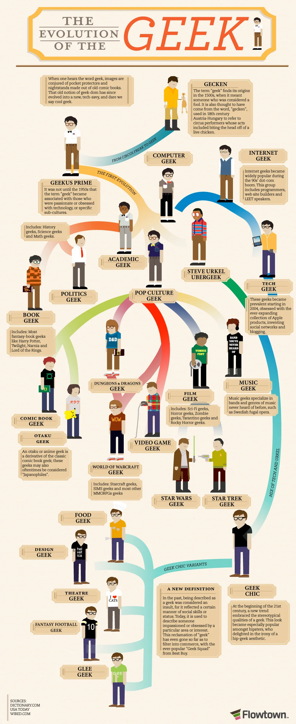
Who’s the Geek?
What is a Geek? History defines a geek as a person who is nothing but foolish; so foolish that the identity created is socially differentiable. The word “Geek” originated from “Gecken” used in Austria-Hungary in the 18th century. “Gecken” was used to refer to circus performers displaying bizarre acts like biting the head off a live chicken (EEEK!!!)
Time is the biggest healer of wounds, and perhaps also labels. Geeks too have evolved over time. The modern era defines a Geek as a person obsessed with technology or sub cultures (thanks to the thinkers of the 1950s). Geeks can no longer be contained under one flag. Like civilizations and cultures, Geeks have flourished over time and now you can fins various types of Geeks. Let’s see if you can associate any of the people around you to the following Geek categories:
The Academic Geeks
Don’t you just hate that book worm sitting in the front row of your classroom? Who does the guy think he is? Always paying attention to the teacher, memorizing all the lessons and to add insult to injury, scoring a much higher G.P.A than you! Steer clear of this Geek or he might imprint you, savvy?
The Computer Geeks
These guys probably deserve glasses more than your 90 year old granny. Glued to their monitors, they have nothing better to do but roam in cyber space rather than the real world. Now these types of Geeks further evolved into internet Geeks.
The Computer Geeks
These guys probably deserve glasses more than your 90 year old granny. Glued to their monitors, they have nothing better to do but roam in cyber space rather than the real world. Now these types of Geeks further evolved into internet Geeks.
The Internet Geeks
These poor souls will probably never know the names of their neighbors, but will be-friend a person sitting half the world away. Oh the horror! Get a life man! Don’t spend the whole of your life surfing just on the internet. Try the real sport for a change.
The Tech Geeks
Moving on; these Geeks made the scene in 2004, with a fetish for anything and everything that Apple has to offer. Nope, not the one that got Adam and Eve kicked out of heaven, the one invented by the late Mr. Steve Jobs. Job well done?
The Star Wars Geeks
Here we go! Who on God’s green earth would be obsessed with Star Wars? Apparently, a lot of people. Just mention Sky Walker, Princess Leah or The Darth Vader and watch em bounce.
There are still many categories of geeks to be explained, but if I spend another minute trying to do it, I fear I might be counted as one too. So take a look at the following infographics and enter the world of Geeks.

Did you enjoy this blog post? If so, then why not:
Leave Comment | Subscribe To This Blog | Email Me
10 Things That Artists Hate To Hear
![artists-hate-to-hear[13].jpg](https://images.squarespace-cdn.com/content/v1/50357984e4b09af678ed11bf/1363376937789-6NB5WQK6E2X96ME22RUK/artists-hate-to-hear%5B13%5D.jpg)
Did you enjoy this blog post? If so, then why not:
Leave Comment | Subscribe To This Blog | Email Me

Not an ArchViz
I love architecture, and I am not well diversified in the work I chose to take on. For the past 20+ years, I have been illustrating architecture, both by hand and computer, but I thoroughly enjoyed my latest project, which was not architecture. Nuff said, meet The Big Boy! The Big Boy is a portable tornado shelter that I was asked to illustrate for a client out of Texas.
Did you enjoy this blog post? If so, then why not:
Leave Comment | Subscribe To This Blog | Email Me
The Artist's Den
The Artist's Den from amRUNjeva on Vimeo.
Did you enjoy this blog post? If so, then why not:
Leave Comment | Subscribe To This Blog | Email Me
Texture in Computer Graphics
The feel of an object's surface - its physical texture - depends on the degree to which it is broken up by its composition or treatment. The more broken, the rougher the texture. This not only determines how we feel it, but also how we see it. Rough surfaces intercept light rays, producing an often irregular pattern of lights and darker; glossy surfaces reflect the light more evenly, giving a less broken appearance. As we see these patterns of different values, our memory of touching surfaces with similar characteristics then triggers a tactile response or sensory reaction. Thus, we can predict an object's feel without ever touching its surface.

CG Grass
Did you enjoy this blog post? If so, then why not:
Leave Comment | Subscribe To This Blog | Email Me
Side Lighting in CG
Side lighting emphasizes an object's mass and helps develop the contours of its form; however, a light placed directly in front of the object (or multiple lights evenly spaced on either side) will seem to flatten the object by centering the highlight, restricting the shadow area, and limiting the range of value that defines the object. Not to be overlooked, of course, is the strength of the light source itself. Extreme drama often requires the greatest contrast possible.
Although lights and shadows exist in nature as the by-products of strict physical laws, CG artists often adjust them to enhance the three-dimensional effect of a rendering and/or provide greater compositional interest.

Side Lighting
Did you enjoy this blog post? If so, then why not:
Leave Comment | Subscribe To This Blog | Email Me
DirectX Shader for Blueprint Modeling in 3DS MAX
DirectX shaders are slow in 3ds Max, especially when they are applied on a lot of objects, so use them sparingly. If you want to model from a print, but don't need the high quality background, you can use this blueprint modeling technique
Now, here is how you lock your planes from getting moved.
Did you enjoy this blog post? If so, then why not:
Leave Comment | Subscribe To This Blog | Email Me
Blueprint Modeling
Typically, my projects start with PDF's. Today, I am modeling a roof to a custom home, so I thought I would take the opportunity to record my screen. The process is straightforward but isn't thoroughly documented any place. I hope you enjoy, and if you have any questions, please comment. Is your blueprint image not clear enough? There is another way to model from a blueprint, and it using a Directx shader.

Now, here is how you lock your planes from getting moved.
Did you enjoy this blog post? If so, then why not:
Leave Comment | Subscribe To This Blog | Email Me
Aerial Perspective
Far-off objects don't just appear smaller as they recede, they also become less distinct, with little visible detail, paler colors, and reduced contrast of tone. This is known as atmospheric, or color perspective, and is the primary means of creating the illusion of space in a rendering. Tiny specks of dust in the atmosphere cause colors and tones to become paler in the distance, where objects have exceedingly little distinguishable detail. The colors also become "cooler", with more blues, grays, and blue-greens.
As far as I know, and for the most part, there isn't a render engine that can produce this natural phenomenon. So, take some artistic liberties in post production, to bring your exterior renderings to a whole new level, by using levels and curves, to achieve the color perspective effect.

Color Perspective
Did you enjoy this blog post? If so, then why not:
Leave Comment | Subscribe To This Blog | Email Me