

BLOG
Artist's Tip - Post Production
The most enjoyable part of any rendering is adding the finer details of light and color, but don't overdo things or the rendering could become busy and overworked. It is not always easy to know when a rendering is finished, so if you are not sure, put down the mouse for awhile and then come back to it with fresh eyes.

Post Production
Did you enjoy this blog post? If so, then why not:
Leave Comment | Subscribe To This Blog | Email Me
Every Student In Every School Should Learn To Code
Code.org is a non-profit foundation dedicated to growing computer programming education. Our goals include:
- Spreading the word that there is a worldwide shortage of computer programmers, and that it's much easier to learn to program than you think.
- Building an authoritative database of all programming schools, whether they are online courses, brick+mortar schools or summer camps.
Our vision is that every student in every school has the opportunity to learn how to code. We believe computer science and computer programming should be part of the core curriculum in education, alongside other science, technology, engineering, and mathematics (STEM) courses, such as biology, physics, chemistry and algebra.

Did you enjoy this blog post? If so, then why not:
Leave Comment | Subscribe To This Blog | Email Me
Artist's Tip - Compare Shapes and Directions
It is important to compare shapes and directions when you draw. Usually people see objects in isolation; for example, landscape is seen as first one tree, then another, and then a background. As an artist, you need to learn how to see and compare all these features simultaneously, and use background features as a check for shapes.

Did you enjoy this blog post? If so, then why not:
Leave Comment | Subscribe To This Blog | Email Me

3D Scanned Humans
For adding some human warmth to your images & animations...
I looked high, and low, for good 3D people. I landed on Human Alloy, and I was pleased with them.
Lobby Rendering Using 3D People Scans
Did you enjoy this blog post? If so, then why not:
Leave Comment | Subscribe To This Blog | Email Me
Go Beyond Literally Copying the World
Conception and creativity have always been part of the artists impression, it is usually a matter of degree as to how much an artist use their imagination and how much they use their perceptual vision in the selection and development of their rendering.
Artist, therefore, go beyond verbatim copying and transform into their personal style. Capable artist, whatever the level of creativity they employ, are able to convince us that the fantasy is a possible reality. Any successful work of art, regardless of the medium, leads the thoughtful observer into the persuasive world of the imagination.

Did you enjoy this blog post? If so, then why not:
Leave Comment | Subscribe To This Blog | Email Me
3Doodler: The World's First 3D Printing Pen
It's a pen that can draw in the air! 3Doodler is the 3D printing pen you can hold in your hand. Lift your imagination off the page!
Did you enjoy this blog post? If so, then why not:
Leave Comment | Subscribe To This Blog | Email Me
Render, Render, and Render Some More
Render, render, render. Don't be afraid to experiment. Play. Once you've learned to do something, don't keep doing it the same way over and over - get out of your comfort zone. Use what you can from others and believe in yourself. Don't render for grandma, don't render for the market - render to please yourself and you'll be OK.

Did you enjoy this blog post? If so, then why not:
Leave Comment | Subscribe To This Blog | Email Me
10 Rules for Being a Professional Artist
You may have been one of the lucky readers who got their hands on a hot magazine that Artists Network published several years ago: Acrylic Artist.

If you didn't happen to get a copy (digital issues of Acrylic Artist are still available in NorthLightShop.com), then you may have missed the work of Mark Gould. I was browsing through an issue recently, and his acrylic landscapes once again caught my eye, such as his painting My Neighbor's House 816 (above; acrylic on panel, 24x36). In this feature article, Mark shares his philosophy for professional creatives that I thought was worth passing along here:
Mark Gould's 10 Rules for Being a Professional Artist
1. Creative efforts take priority over other activities whenever possible.
2. Simplify all aspects of life in order to think and act creatively.
3. Ensure the creative process is always challenging and enjoyable; always balance a risk of failure with the potential for success in order to keep efforts honest and engaging.
4. Be the eternal student, always willing to learn.
5. Welcome other opinions-good, bad or indifferent-but never relinquish final judgment to another.
6. Seek out people who are positive in their approach to the creative process and welcome their constructive critique. Avoid negative people and their attitudes, even when personal sacrifice is required.
7. Think before committing time, money or other resources to any future aspect of the creative endeavor. Be certain that both feeling and logic regarding the decision are sound.
8. Release to the public only those works that are fully "competent and satisfactory," those that are properly executed with a high degree of creativity.
9. Never become problematic for any gallery or collector. Be sincere and forthright in all gallery dealings. Require absolute honesty in return.
10. Be truthful and self-aware in regard to your creative efforts. Only then can artistic vision be trusted and improved.
Great reminders! If you're ready to take this advice to heart, especially the points that are on the creative side, Acrylic Solutions: Exploring Mixed Media Layer by Layer by is a great resource. In it, Chris Cozen and Julie Prichard share more than 30 painting lessons to keep you actively moving toward your own art goals
Did you enjoy this blog post? If so, then why not:
Leave Comment | Subscribe To This Blog | Email Me
The Sketch Is Where It All Begins
The idea for a rendering may be derived from anything, really - a flash of sunlight, the tilt of a head, a glass on the table, but the sketch is where it all begins, the point where inspiration meets artist. Gloriously free of the need to get it right, the sketch is where possibilities are explored, compositions are found and visions come to life. Sketches represent the art in its raw form.
Sketching is messy, unfinished and noncommittal. It allows you to have fun and think about things more unconventionally - without the expectation that it has to lead to anything at all. Sketches are a byproduct and castoffs of a thought in the process.
Year ago I would jump right into a rendering as soon as I got an idea. This would occasionally result in a decent rendering, but not as often as I'd have liked. When I started planning first and working things out in advance, my success rate tremendously went up. Sketching is unquestionably worth the time. Sketching has taught me that it's all about balance - between planning everything out and following that plan, but also allowing for hidden surprises and spontaneous happenings.

Did you enjoy this blog post? If so, then why not:
Leave Comment | Subscribe To This Blog | Email Me
Acrobat 9 Pro: Creating Multimedia Projects with Brian Wood
Acrobat 9 Pro has the ability to integrate JavaScript, multimedia, and Flash within interactive PDFs. In
Acrobat 9 Pro: Creating Multimedia Projects, Brian Wood teaches web developers, graphic designers, and anyone else how to use Adobe Acrobat 9 Pro. He shows how to create visually exciting PDF presentations, documents, and interface elements for distribution on the web, on CD/DVD, and via email. Brian explains the difference between embedded and linked media elements and shares several JavaScript examples that relate to all aspects of multimedia. Exercise files accompany the course.
Topics include:
- Working with the new Flash CS4 video integration Embedding and linking to all types of multimedia Creating links, buttons, and other navigation systems Integrating layers and buttons for web page-like effects Adding sounds to complement embedded video action Using buttons and bookmarks to interact with layers
Did you enjoy this blog post? If so, then why not:
Leave Comment | Subscribe To This Blog | Email Me
The number one benefit of information technology
“The number one benefit of information technology is that it empowers people to do what they want to do. It lets people be creative. It lets people be productive. It lets people learn things they didn’t think they could learn before, and so, in a sense, it is all about potential.”
Did you enjoy this blog post? If so, then why not:
Leave Comment | Subscribe To This Blog | Email Me
What is freelancing?
In this course, author and seasoned freelancer Tom Geller shows you how to prepare for a transition to freelancing. Begin by taking a look at your career goals, the systems that will support you, and proper ways to plan for success. Find out how to marshal your resources, refine your portfolio for presentation to clients, and estimate your costs to avoid any surprises on the financial front. Plus, discover how to create invoices, manage your books and taxes, expand your client base with marketing, and grow your business.
Topics include:
- What is freelancing?
- Defining your career goals
- Funding your startup
- Getting licenses, permits, and insurance
- Setting prices
- Finding work through agencies
- Getting referrals
- Working with time and project management tools
- Increasing your rates
The whole course can be found here
Did you enjoy this blog post? If so, then why not:
Leave Comment | Subscribe To This Blog | Email Me
Movement
Architectural Illustrators can use the shape, along with the other element form, to generate visual forces that direct our eyes as we view the rendering.
Many shapes, such as the triangle, have a general body movement that points in one specific direction. Obviously, not all shapes are equally important in contributing to movement, for some provide more of a directional force than others. Compare, for example, the 'forceful" rectangle to the "stable" but less directional square.
As a general rule, the longer the shape, the greater the directional force.

The "forceful" triangle
Did you enjoy this blog post? If so, then why not:
Leave Comment | Subscribe To This Blog | Email Me

Our Emotional Sensitivity To Shape
Our emotional sensitivity to shape is demonstrated by the familiar Rorschach (inkblot) test, which was designed to aid psychologists in evaluating emotional stability.
By using the knowledge that some shapes are inevitably associated with certain objects and situations, the architectural illustrator can set the stage for a pictorial drama.
Whether viewing inkblots or artwork, our response to shape is often primitive and subconscious. Some shapes convey fairly common meanings. Square, for instance, frequently utter perfection, stability, solidity, symmetry, self-reliance, and monotony. Similarly, circle may suggest confidence, independence, and/or confinement; oval may suggest fruitfulness and creation; stars could suggest reaching out.
So, you can use shapes to express a emotion or mood, in your architectural renderings. Afterall, isn't that what we are trying to do?

Did you enjoy this blog post? If so, then why not:
Leave Comment | Subscribe To This Blog | Email Me
Dean Rhys Morgan

Did you enjoy this blog post? If so, then why not:
Leave Comment | Subscribe To This Blog | Email Me
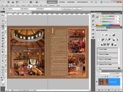
Resizing An Image in Photoshop
let me give you a little advice.
If you're going to scale up an image, and if you are going to give it a higher resolution, do it this way, Go to Image > Image Size, set that resolution to an even multiple of the original.

So here I have started with 72. So I am going to set it to 288, four times the 72, and I am going to choose a special method, Nearest Neighbor. Notice that it says preserve hard edges.


Remember Nearest Neighbor when you have screenshots because that's the way to go. When I click OK, look, it's nice and sharp, it has a nicer resolution.
What I do sometimes if I want to make sure that my editor isn't going to freak out, I'll go back to Image Size-- sometimes people freak out when they just see the 288-- I uncheck Resample Image, I change that Resolution to 300.

What that means is that it's not making new pixels, it's just making the existing pixels a little bit smaller. When I click OK, nice and sharp, and I haven't lost anything. That's your overall goal, you don't want to lose any information; you want to maintain detail.
Did you enjoy this blog post? If so, then why not:
Leave Comment | Subscribe To This Blog | Email Me

A Look at the Meaning in Colors
Today’s infographic comes to us from The Logo Company and gives us a look into the choice of colors worn by the logos that we see every day. Do you want your company to give off a sense of excitement or boldness? Red might be the color for you then. How about if you want your customers to feel like your company is trustworthy and dependable? You might want a nice, light shade of blue in that case.

Did you enjoy this blog post? If so, then why not:
Leave Comment | Subscribe To This Blog | Email Me
CGRAMP Image of the Week “Rustic Cabin” | Bobby Parker

CGR Image of the week!
Did you enjoy this blog post? If so, then why not:
Leave Comment | Subscribe To This Blog | Email Me

Color Managed Workflow
If you've ever had printed out a page on your desktop Inkjet printer and held it up to the monitor, chances are you've been a little disappointed at how far off the printed output is from your monitor. Well, it's a common heartbreak, and that's because your monitor and ink on paper are two very different realities. And if you compare your screen and your Inkjet print to the final printed piece, you may very well be looking at three rather different versions of your job.It's really maddening. So what you do you hang your hat on? Well, the solution to this problem is to have a fully color managed workflow. But that can be expensive, kind of confusing, and a bit complicated to implement. If you want to fully pursue the color managed workflow, you have to invest in expensive equipment to profile your monitor and all your printers. But if you don't want to go that far, you can still improve your monitor substantially by using the colorimeter, Now, you can expect to pay from $200 and up for a colorimeter. The way it works is the colorimeter and its software combine to send color signals to the monitor.The colorimeter reads the values and then compares them to an internal ideal value. And then it sets up a Reference File that's called a Profile, that's used to control the output of your monitor. Now, if you're part of a work group that produces a lot of work for print, it actually might be worth hiring a color management consultant to come in, profile all of your equipment for you. They'll use their own sophisticated equipment to set up your monitors and printers without you having to make the investment in that equipment. Now, they'll probably recommend that calibrations and profiles be updated periodically, especially if you add new equipment. Now, in color-critical environments, for example in printing plants fresh profiles are often generated just after new ink is installed in a printer, if that printer is being used for generating proofs.
You should also consider the lighting conditions in your work area. If you have ever gone to a printing company to view proofs, you've probably stood in a viewing booth that's specially constructed for optimal viewing conditions. It may even be a stand-alone room. It's usually painted a neutral gray, and special lights are installed. You may have heard them referred to as D50 or 5000 K lights, and that refers to their color temperature, the K if you care, stands for Kelvin, and that's the temperature measurement system. So why is 5000 K chosen? Well, it's supposed to mimic the temperature of sunlight at high noon. The higher the color temperature, the bluer the light source, and as you go below 5000 K, lights get warmer. For example, the household incandescent bulbs around 2800K. Now, those official viewing sources can be really expensive, but I am going to let you in on a little secret. You can come very close by using fluorescent bulbs from the hardware or home improvement store. Just make sure it says 5000 K or D50 on the bulb. Now, I realize that it's true that your final printed piece is going to be viewed under a wide variety of lighting conditions, from kitchen fluorescents to candlelight, to incandescent living room lamps. So why pick a particular color temperature for viewing? Well, it's for consistency. There has to be some constant to ensure color accuracy, especially when you're judging color corrections from one proof to the next or you are looking at a press proof. You might even avoided wearing clothing that could reflect on the monitor or on a proof that you're viewing with the customer. Now, maybe that's why we all wear black and gray, it's not because we're stylish, we're just being color correct.
If you want to delve deeper into color management, I'd recommend Chris Murphy's course for lynda.com that's called Color Management Essential Training, and Chris is also one of the authors of Real-World Color Management, which is sort of an instant classic on the subject. Don't be intimidated by the heft of the book. It's very readable, very understandable, and it's actually funny in spots--which is pretty amazing given that that's a technical and arcane topic. Now, while calibrating, profiling, and special lighting might seem like an awful lot of extra work, all those things together can go a long way toward giving you more realistic expectations of your final printed result.

Color Wheel
Did you enjoy this blog post? If so, then why not:
Leave Comment | Subscribe To This Blog | Email Me