

BLOG
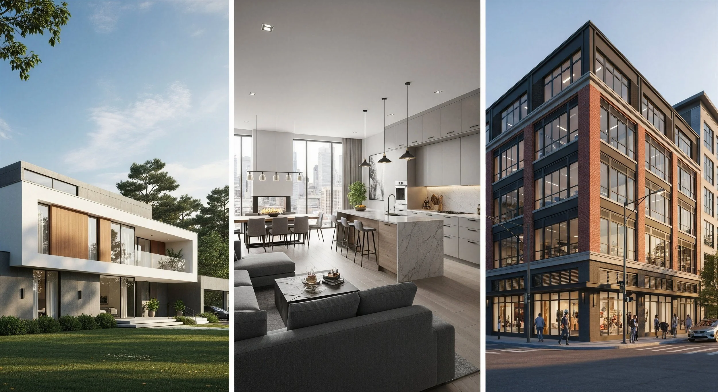
Will AI Replace Residential Renderers?
If you have been following design and visualization trends in 2026, you have probably seen some version of the same question: will AI put renderers out of business?
The short answer is no. But it is absolutely changing the business.
AI image tools are getting faster, cheaper, and easier to use. That means architects, interior designers, developers, and homeowners can now generate quick concept visuals in minutes instead of waiting days for a first pass. For simple presentations, that is a real shift.
At the same time, AI still struggles with the things that matter most in professional architectural visualization: scale, buildability, material accuracy, lighting consistency, camera logic, and design intent.
So the better question is not whether AI will replace renderers. It is this: which parts of rendering are becoming automated, and which parts still need a trained eye?
Here is where things stand.
1. AI is replacing some early-stage visualization tasks
This is the part many people are reacting to, and it is real.
AI can already help generate:
quick mood images
concept directions
rough interior or exterior ideas
alternate material looks
fast presentation visuals for client discussions
For many designers, that is enough to improve communication early in a project. If a client wants to see a space with darker floors, a different stone palette, or a wallpaper idea, AI can help create a rough visual immediately.
That means some low-stakes rendering work is already being compressed.
2. AI is not replacing precise architectural rendering
This is where the hype usually breaks down.
Professional renderings are not just pretty images. They are communication tools. They help clients, consultants, and teams understand what is being designed before it gets built. That requires accuracy.
AI still has trouble with:
proportions and scale
window and door alignment
realistic furniture sizing
material consistency across views
detailed floor plan interpretation
repeatable revisions
matching exact architectural drawings
That is a problem if the rendering needs to support design decisions, approvals, marketing, or construction alignment.
In other words, AI can suggest. Human renderers still have to resolve.
3. The biggest change is speed, not total replacement
What AI is really doing is changing expectations around speed.
Clients are getting used to seeing visuals faster. Designers are getting more comfortable using generated imagery as part of concept presentations. Studios are experimenting with AI to speed up ideation, admin tasks, post-production, and certain production steps.
That does not eliminate rendering firms. It changes what clients expect them to deliver.
The old model was often: wait, pay, review, revise.
The new model is becoming: explore quickly, narrow direction sooner, then produce final visuals with more precision.
That means renderers who adapt can actually become more valuable, not less.
4. Entry-level rendering work is under the most pressure
If there is one part of the market that is most exposed, it is lower-complexity, lower-budget rendering work.
Why?
Because that is where clients are most willing to trade precision for speed and cost savings.
If someone only needs a quick visual to sell an idea internally or help a homeowner imagine a room, AI may be good enough. That kind of work used to require outsourcing or a lower-cost rendering partner. Now, some of it can be handled in-house with prompting and basic editing.
That does not mean the entire market disappears. It means the lower end of the market gets more competitive.
5. High-end rendering still depends on human judgment
At the high end, the value of rendering is not just image generation. It is interpretation.
A strong renderer understands:
what the architect is trying to communicate
how to frame the most important design moments
how materials should actually read in light
how to make an image feel believable, not just attractive
how to carry design intent across multiple views and revisions
That level of nuance still matters, especially in luxury residential, hospitality, mixed-use, and design-led development work.
AI can help with efficiency. It still does not replace judgment.
6. The renderers who win will use AI, not ignore it
This is probably the most important takeaway.
AI is not just a threat to rendering studios. It is also a tool for rendering studios.
The firms that stay competitive will likely use AI to:
accelerate concept development
test more directions early
speed up internal workflows
reduce repetitive production steps
improve turnaround without sacrificing quality
The firms that struggle will be the ones trying to defend every old process just because it is familiar.
In 2026, the market is rewarding teams that can combine speed with expertise.
7. Clients still need help knowing what looks right
One thing that often gets overlooked in the AI conversation is this: generating an image is not the same as evaluating an image.
A client, homeowner, or even a busy design team may not always catch what is off. But professionals do.
That is still a major reason people hire renderers.
The value is not only in making the image. It is in knowing when the image is wrong, misleading, or visually inconsistent with the project.
That critical eye is still hard to automate.
So, will AI replace architectural renderers?
No. But it will reshape architectural rendering.
AI is already taking over some of the quick, rough, early-stage visualization work that used to require more time and cost. It is helping designers move faster and explore more ideas upfront.
But when a project needs precision, consistency, realism, and design intelligence, human renderers still matter.
The likely outcome is not replacement. It is segmentation.
Some clients will use AI for fast concept visuals.
Some will still need professional rendering partners for polished, accurate imagery.
And the strongest studios will be the ones that know how to do both: move quickly when speed matters, and deliver precision when the work demands it.
What this means for residential projects
In residential design, that balance is becoming especially important.
Homeowners and builders want fast visuals. They also want confidence before making expensive decisions. That creates a growing need for rendering partners who can work efficiently while still producing clear, believable imagery grounded in the actual design.
That is where the human role remains strong.
AI may help accelerate the process, but it still takes experience to turn a concept into a rendering that feels trustworthy, useful, and buildable.
Need residential renderings with speed and clarity?
Bobby Parker helps architects, designers, and residential developers create photorealistic imagery that communicates the design clearly without overcomplicating the process.
If you need residential renderings that balance efficiency, realism, and fast turnaround, let’s talk.

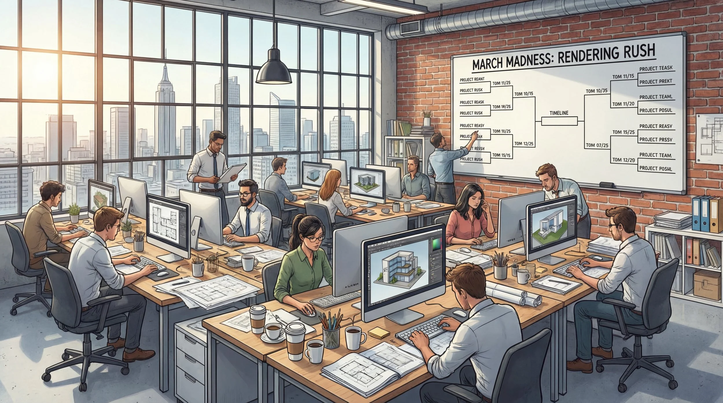
March Madness! Is March Still Peak Season for Residential Renderings?
March is busy because the stakes are high. When construction, budget, and marketing all converge, visual exterior renderings become the tool that prevents expensive surprises and keeps momentum.
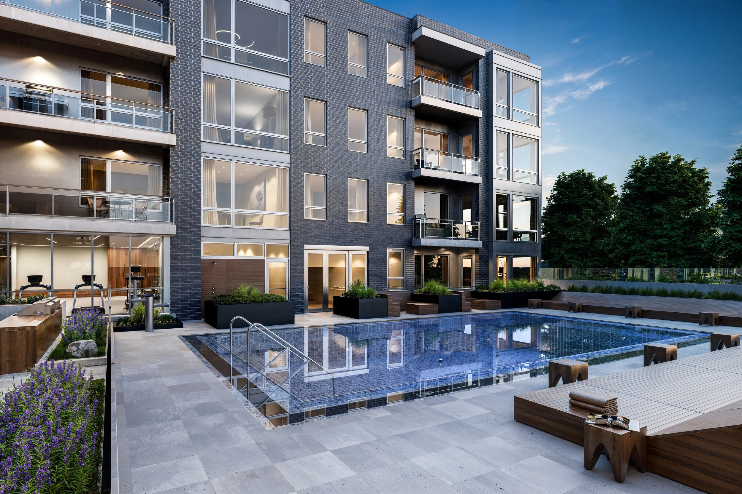
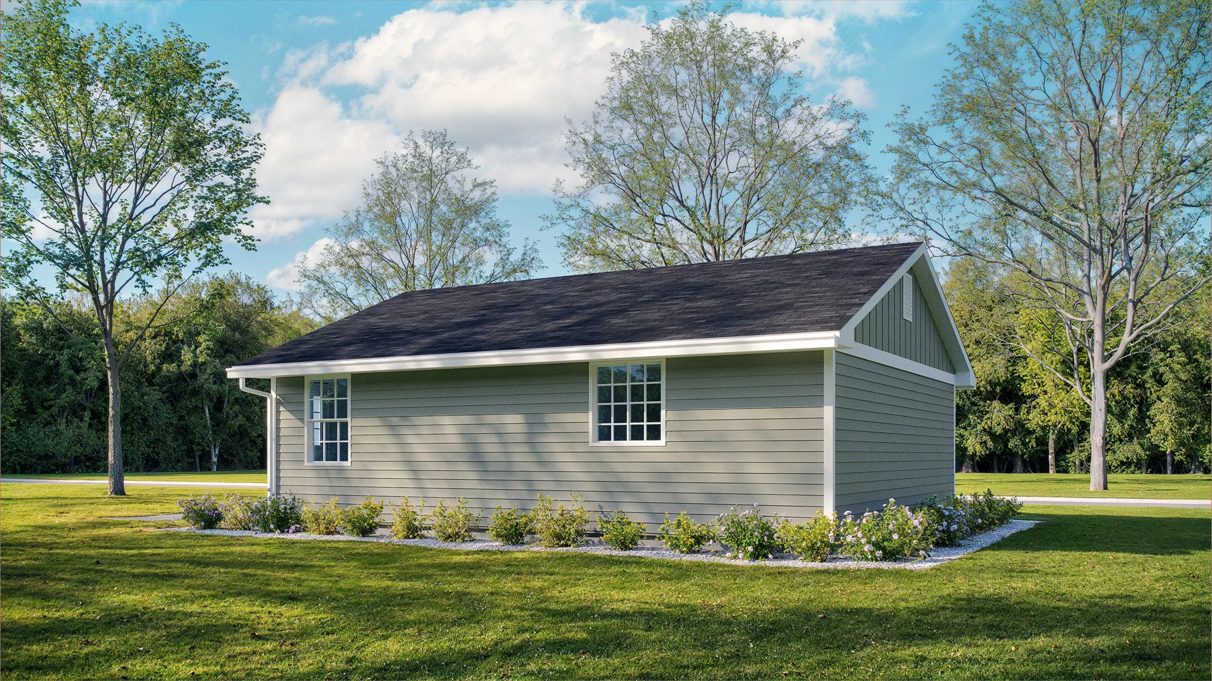
Exterior 3d Rendering of a Single Family Home.
If you have ever tried to book an architectural illustrator in March, you have probably heard some version of: “My schedule is full.” In architectural visualization, March is peak season. It is not random. It is a predictable collision of residential building timelines, budget deadlines, and spring marketing launches.
Before we get into the “why March,” it helps to look at what residential teams are prioritizing right now, because those design trends also influence how many views, angles, and options clients request.
What’s Trending in Residential Builds in 2026
We are seeing a few clear themes shaping what clients want to communicate through imagery:
Warm modern materials
Limestone, travertine, textured plaster, and light woods are showing up across modern villas, transitional homes, and hill-country inspired builds. These materials read best when the lighting is calibrated to show texture, not just color.
Darker window systems with softer palettes
Bronze and black frames are pairing with warmer masonry, wood soffits, and calmer exterior colors. The renderings have to balance contrast without making the home feel harsh.
Indoor-outdoor living as a core “selling point”
Large openings, covered terraces, courtyards, and outdoor kitchens are often the hero moments. That usually means more views are needed to tell the story: entry, rear elevation, terrace life, and a twilight option.
Energy-smart detailing that clients want to feel good about
Heat pumps, improved building envelopes, solar readiness, and all-electric planning are showing up more often. Even when the tech is not visually obvious, clients want the home to feel modern, efficient, and future-proof.
Flexible space and “life-ready” layouts
Home offices, bonus rooms, ADUs, and multi-use spaces matter more than ever. Residential renderings increasingly need to communicate how the home lives, not just what it looks like.
Resilience and climate-aware design
Better drainage, durable cladding, deeper overhangs, and shading strategies are becoming part of the design conversation. When these details are modeled clearly, they help reduce uncertainty and change orders later.
Now, here is why March becomes the bottleneck.
1. The Spring Construction Surge
As weather improves, projects move from planning to action. For many residential builds and renovations, April and May are target start months. That makes March the moment teams need final visuals to:
align on exterior selections before procurement
support permits and approval conversations
secure final funding or homeowner sign-off
finalize pre-build marketing materials
If images are not ready by late March, schedules get tight fast.
2. Fiscal Deadlines and “Use It or Lose It” Budgets
A lot of organizations operate on a fiscal year that ends March 31. When teams have remaining budget, they often rush to commission renderings before the window closes. This can include municipalities, nonprofits, and corporate groups funding housing initiatives or planning work. It is one of the less obvious drivers of March demand.
3. The Real Estate Pre-Sale Window
Spring is prime time for residential sales activity. Builders and developers want listings, brochures, and pre-sale pages ready before buyers start touring in late spring and summer. High-quality renderings bridge the gap between drawings and confident decisions, especially when the home is not built yet.
4. Awards, Features, and Portfolio Timing
March also lands near a cluster of publication cycles, showcases, and submission deadlines. Architects and designers want their work presented cleanly and consistently, which drives a spike in requests for “competition-grade” imagery.
March is busy because the stakes are high. When construction, budget, and marketing all converge, visual exterior renderings become the tool that prevents expensive surprises and keeps momentum.
If you are aiming for an April or May start, the best time to begin the rendering conversation is early February.
A New Chapter for Bobby Parker Renderings
Large Residential Rendering

Modern Interior Rendering

Large Home Exterior Rendering
After more than fourteen years of working with architects, designers, and home builders across the country, Bobby Parker Renderings is entering a new phase.
I recently accepted a full-time senior position with a design and development firm. As part of that transition, my rendering business will continue operating with production and client services now supported by Studio inHaus, a Chicago-based visualization studio specializing in architectural, product, and automotive visualization.
For existing clients, the goal of this transition is simple: continuity and stability.
The Bobby Parker Renderings brand will continue to serve residential architects, designers, and developers who need clear, photorealistic imagery to communicate their designs. Clients can expect the same focus on accuracy, efficiency, and straightforward project workflows that the brand has always been known for.
Over the years, Bobby Parker Renderings developed strong relationships with architects and residential designers who rely on high-quality exterior renderings to present homes, developments, and design concepts to clients, planning boards, and investors.
Before starting my new full-time role, I want to ensure those relationships and ongoing projects would continue to be supported. I chose to work with Tom Livings at Studio inHaus, whom I have personally known for close to 10 years, as a leader in the Architectural Visualization industry. Studio inHaus brings a larger production team, expanded technical infrastructure, and additional capacity to handle projects reliably while maintaining the standards clients expect. This structure allows the business to continue serving the residential sector while providing the operational depth needed for long-term stability.
What This Means for Clients
If you’ve worked with Bobby Parker Renderings before, very little will change in how projects move forward.
Clients will still be able to:
Request photorealistic exterior renderings for residential projects
Receive clear quoting and defined review stages
Work with a team familiar with the typical workflow of residential architects and home designers
Behind the scenes, Studio inHaus will manage production scheduling, rendering pipelines, and client support to ensure consistent turnaround times and reliable project delivery.
Continued Focus on Residential Architectural Visualization
Bobby Parker Renderings has always focused primarily on the residential sector — from single-family homes to small developments and custom architecture.
That focus will continue.
The team will remain dedicated to producing high-quality architectural renderings for residential projects, including:
Custom single-family homes
Residential developments
Spec homes and builder marketing visuals
Architectural concept presentations
Photorealistic exterior visualizations for planning and approvals
By combining Bobby Parker Renderings long-standing client relationships with Studio inHaus’ production infrastructure, the goal is to provide dependable rendering services that architects and designers can rely on.
Looking Forward
Building Bobby Parker Renderings over the past fourteen years has been a meaningful experience, and maintaining continuity for the clients who supported that journey was an important priority during this transition.
The business will continue to operate under the Bobby Parker name, supported by the Studio inHaus team, with the same commitment to clarity, professionalism, and quality architectural visualization.
For new project inquiries or questions about the transition, please reach out through the usual contact channels.
We look forward to continuing to support your residential design projects.
Contact: hello@studioinhaus.com
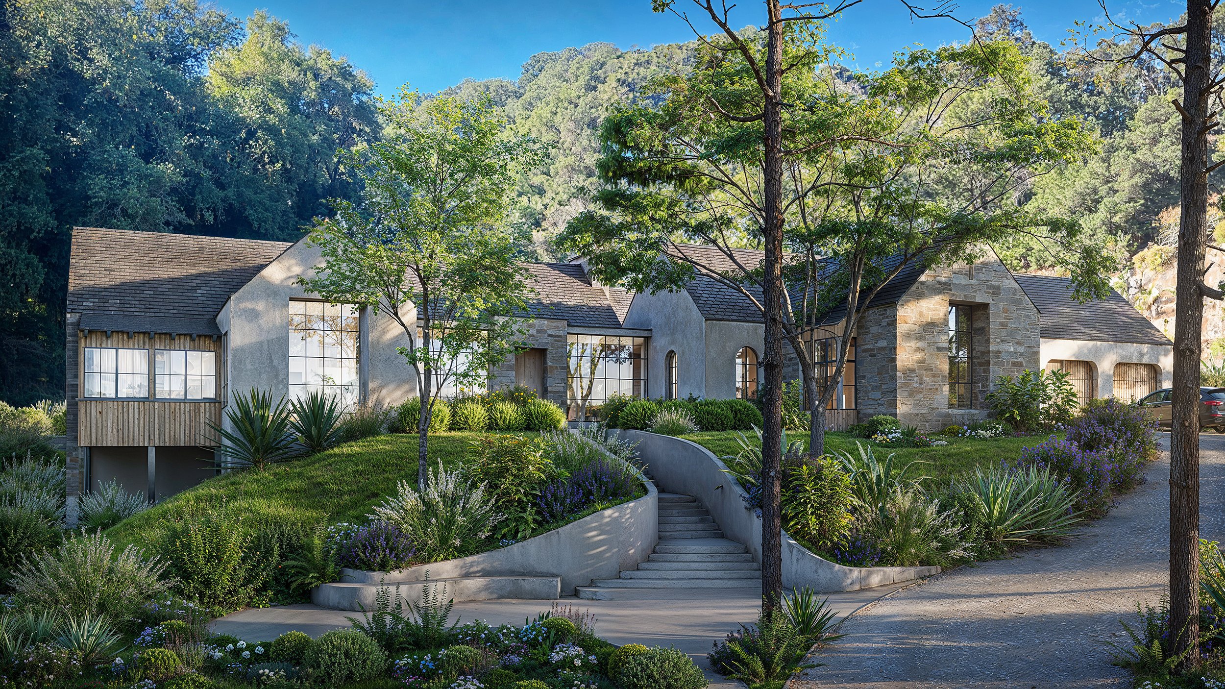
Modern Limestone Hill Country Villa: 3-Bedroom Architectural Rendering
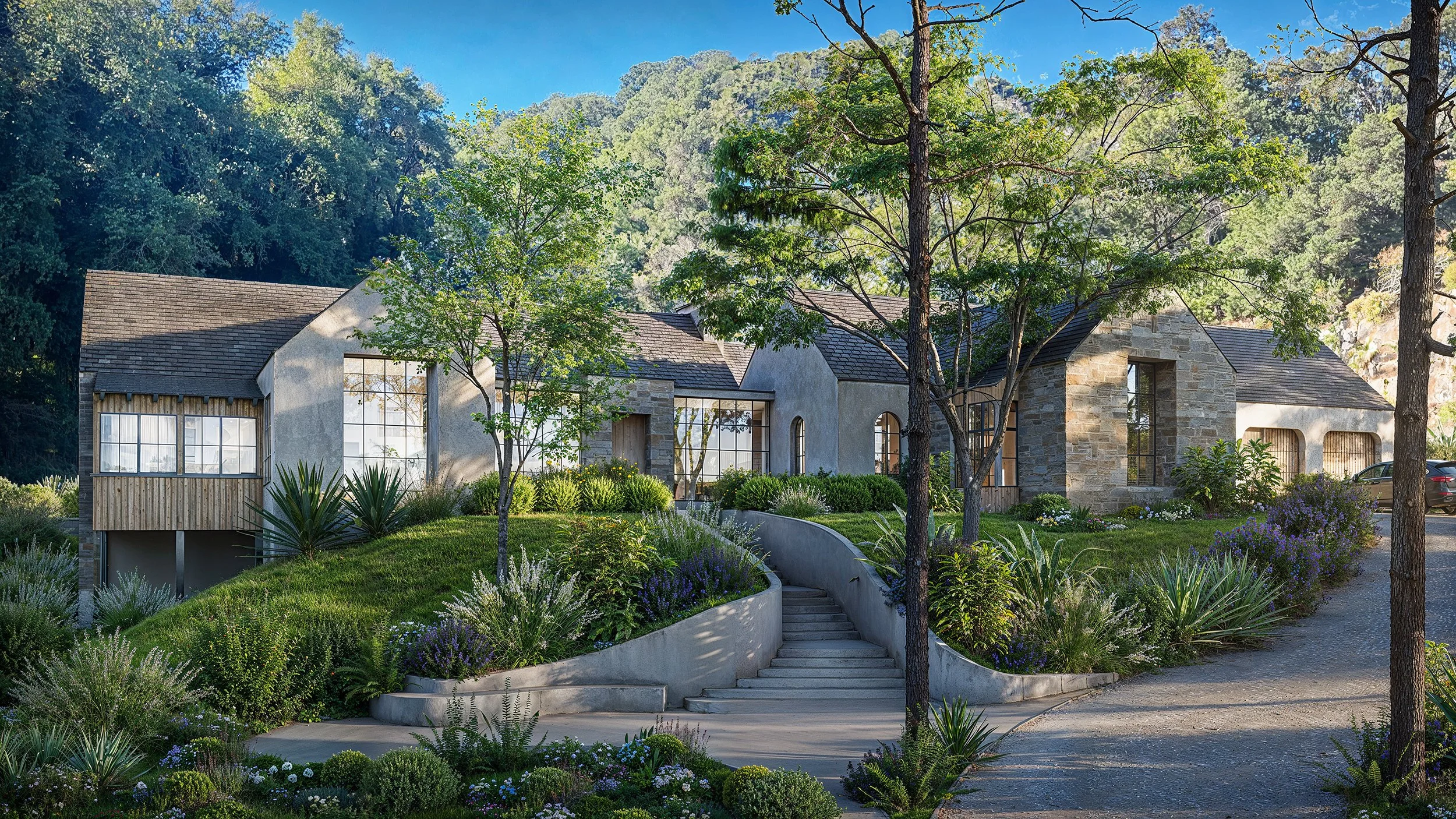
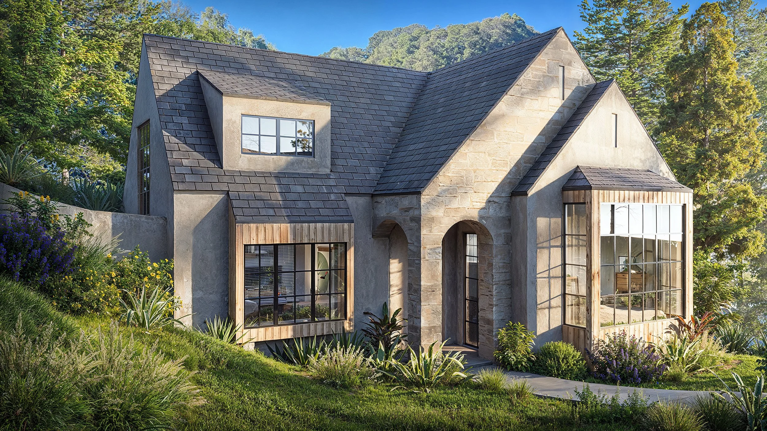
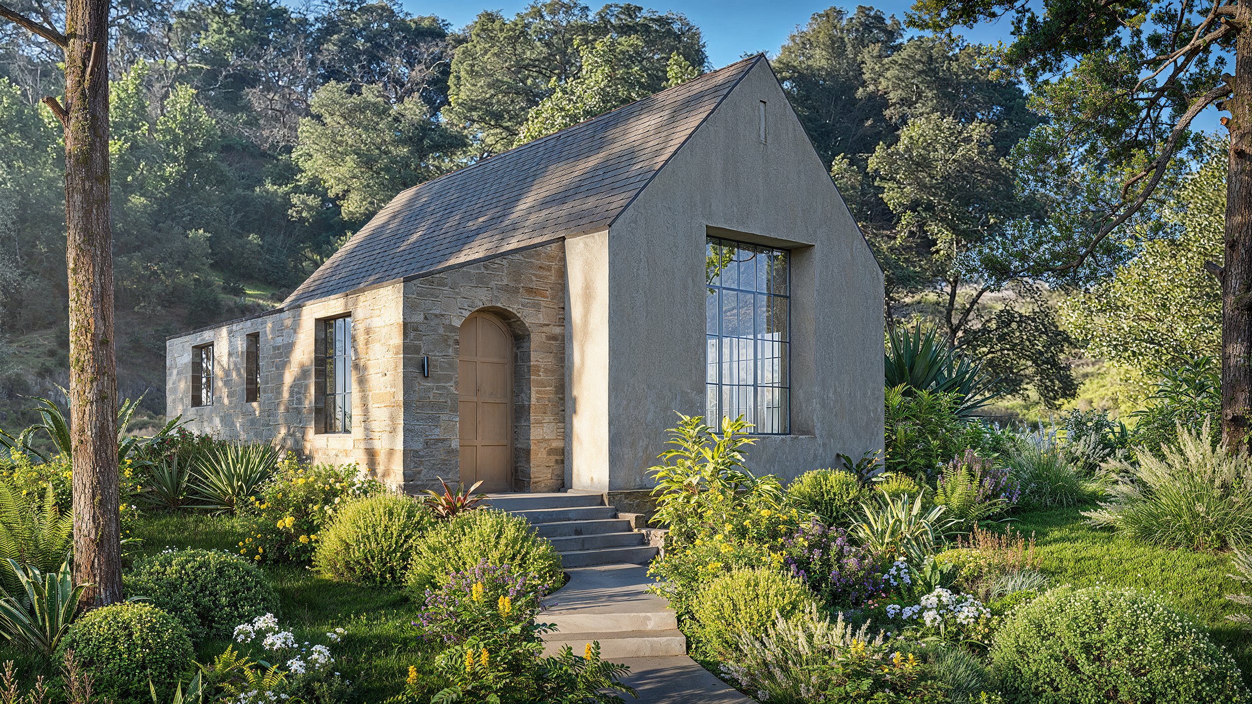
As the architectural illustrator behind these renderings, my goal is to breathe life into the cold, technical data of blueprints and elevations. While a 2D floor plan is a vital construction document, it often remains a "flat" abstraction to a client, requiring a leap of faith to imagine how light, texture, and space will actually feel. These high-fidelity visualizations bridge that imaginative gap, transforming lines into a tangible experience.
Capturing Atmospheric Truth
A 2D drawing can label a wall as "stone," but this rendering shows the tactile reality of how that stone catches the soft, raking morning sun. It explains the "atmospheric truth" of the design—how the massive, earth-toned masonry of the right wing grounds the house, while the expansive glazing in the center creates a seamless, transparent bridge to the forest behind it. This allows the architect to explain the emotional intent of the home: a sanctuary that is simultaneously private and open to its natural surroundings.
Clarifying Complex Spatial Relationships
These renderings help the client navigate the property's complex topography. In 2D, the relationship between the rising stone staircase, the terraced landscaping, and the varying roof heights can be difficult to decode. Here, the client immediately understands the "journey" of the arrival—how the path winds through curated greenery to reach the recessed entry. This visual clarity eliminates the "unknown factors" that often lead to mid-construction changes, as the client can see exactly how the building's scale relates to a human being standing on the driveway.
A Shared Visual Language
Ultimately, these images serve as a universal language. They allow the architect and client to align on every detail—from the specific grain of the vertical wood siding to the way the trees' shadows will dance across the facade. By seeing the finished project "long before the first brick is laid," the client moves from uncertainty to confidence and emotional investment, ensuring the final build matches their dream perfectly.
Would you like to see how these renderings can be adapted to show the interior spatial flow or how the home looks under different lighting conditions?
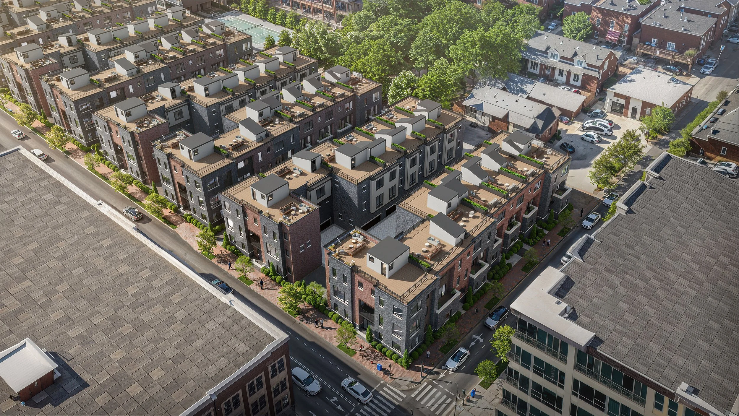
High-angle architectural rendering

High-angle architectural rendering
This high-angle architectural rendering showcases a modern, multi-unit residential development that blends seamlessly into a vibrant urban fabric. The image serves as a powerful proof of concept, illustrating how a sophisticated visualization can bridge the gap between a blueprint and a reality that potential buyers and city officials can truly "feel."
The Power of Context and Detail
What makes this rendering particularly effective is its meticulous attention to context. Unlike isolated 3D models, this project is nestled within a fully realized neighborhood. We see existing brick buildings, mature trees, and realistic street life—pedestrians on the sidewalk, cars parked along the curb, and rooftop gardens in bloom. This "lived-in" quality is essential for winning community and planning approval, as it demonstrates how the new density respects the existing architectural scale while revitalizing the block.
Visualizing Lifestyle Before Groundbreaking
To sell units before construction starts, a rendering must sell a lifestyle, not just square footage. Here, the focus on rooftop terraces is a masterstroke. By populating these private outdoor spaces with greenery and lounge furniture, the visualization invites potential residents to imagine themselves hosting a summer dinner or enjoying a morning coffee with a view of the city. This aspirational quality transforms a technical drawing into a desirable home, enabling developers to secure pre-sales by providing a tangible "look and feel" that aligns with the premium price point.
Precision in Materiality
The rendering excels in showcasing the interplay of modern materials. The juxtaposition of dark masonry with warm brick accents and clean, white geometric pop-ups creates a dynamic facade. High-fidelity textures—from the gravel on the rooftops to the subtle reflections in the glass—give the structure a sense of permanence and quality. This level of detail builds trust with investors and buyers, proving that the final product will be a high-end addition to the Denver skyline.
Ultimately, this image is more than a picture; it is a strategic communication tool. It communicates density without overcrowding, modernism without coldness, and a future neighborhood that feels immediately accessible today.
Would you like to explore how to integrate these visuals into a digital marketing campaign or a presentation for a city planning board?

Why Architects and Rendering Artists Should Charge More for Difficult Clients?

In the architectural renderings industry, not all clients are created equal. Some come prepared with clear briefs, decisive feedback, and a genuine respect for your time. Others? They send vague briefs, request endless revisions, and shift goalposts mid-project. If you're not accounting for this in your pricing, you're leaving money — and your sanity — on the table.
The Hidden Cost of a Difficult Client
Time is the most valuable resource in any creative business. A straightforward project might take 20 hours from brief to final delivery. That same project, in the hands of a difficult client, can balloon to 40+ hours through no fault of your own. Unclear feedback, last-minute scope changes, and excessive revision rounds all eat into your profitability. When you charge a flat rate regardless of client behavior, you're essentially subsidizing their indecision.
Recognizing the Red Flags Early
Experience teaches you to spot difficult clients before signing a contract. Watch for warning signs during initial consultations: vague or constantly shifting project goals, pushback on your standard rates, unrealistic deadlines, or an inability to make decisions. These early signals are almost always a preview of what's to come. Trust your instincts — if something feels off, it probably is.
Building a Difficulty Premium Into Your Pricing
The solution isn't to turn away challenging clients — it's to price them appropriately. Consider building a **complexity and client management fee** into your quotes for projects that show red flags. This can range from 20% to 50% above your standard rate, depending on the level of anticipated friction. Frame

Trusting the Process: How God’s Hand Guides My Path
In 2014, I received the unexpected news that my job was gone. Having never experienced unemployment before, I was overwhelmed and in shock. How do I tell my wife? How do I pay my bills? I packed up my stuff and was escorted out of the building like I'd done something wrong. Twelve years of my life dedicated to the man, and this is how I am treated! Anyway, I walked out to my car, started it up, and drove away. Before I could get out of the parking lot, my phone rang, and it was a firm overseas, the UK, and they asked if I would be interested in taking on a large project for them. I will repeat it. I had work before I left the parking lot after being laid off from a job I held for more than a decade.
In case you don't know, I didn't initiate that call. No marketing, nobody knew I lost my job; it was literally a miracle. The job went well; it lasted about a month, I got paid, and my bills were paid. Also, on the day the project ended, someone on a web forum was too busy to finish his projects, so he asked if I would take one on for him. Yes, please! The next 12 years were a blur with project after project. I didn't go a day without work for 12 years, and I also didn't take a vacation because of it. I tried, but it was always with my computer so that I could keep up with my schedule.
I am a praying man, and I try to trust God for my every need. Having said that, there is always a fear that things can stop as fast as they started, but the projects kept coming... until January of 2026. Not one project came in for January, which would be my work for February—enough work in January to wrap up my December projects, but nothing for February. Panic, no, because maybe God wants to give me a little rest. After all, January and February are my slowest months, but never this slow.
Walking out of the gym, I pray that God opens doors that only He can open and guides my feet. I encourage you to seek His guidance in your daily life, trusting that He will lead you through your challenges as He did for me. No worries, I gave it to God.
Days later, after my prayer, at the end of January, there are no projects on the board, and I get a DM from a forum I haven't been to in years. The person was complimenting me on a project I posted many years ago. As I was leaving the site, I got curious about the job market and picked the Jobs tab. I saw one job here in the states (everything else was overseas) with 1000's of views, but the discription looked like it was written personally for me. I reached out to them, not to apply, but to inquire because I was curious. After a couple of weeks, I was offered a position that I could not turn down. I accepted, and I will be relocating in a couple of weeks.
Feeling this supernatural turn of events, I am filled with gratitude and faith, hoping to inspire others to trust God's divine intervention in their lives.
The March Madness of Architectural Illustration: Why It's the Busiest Time of Year
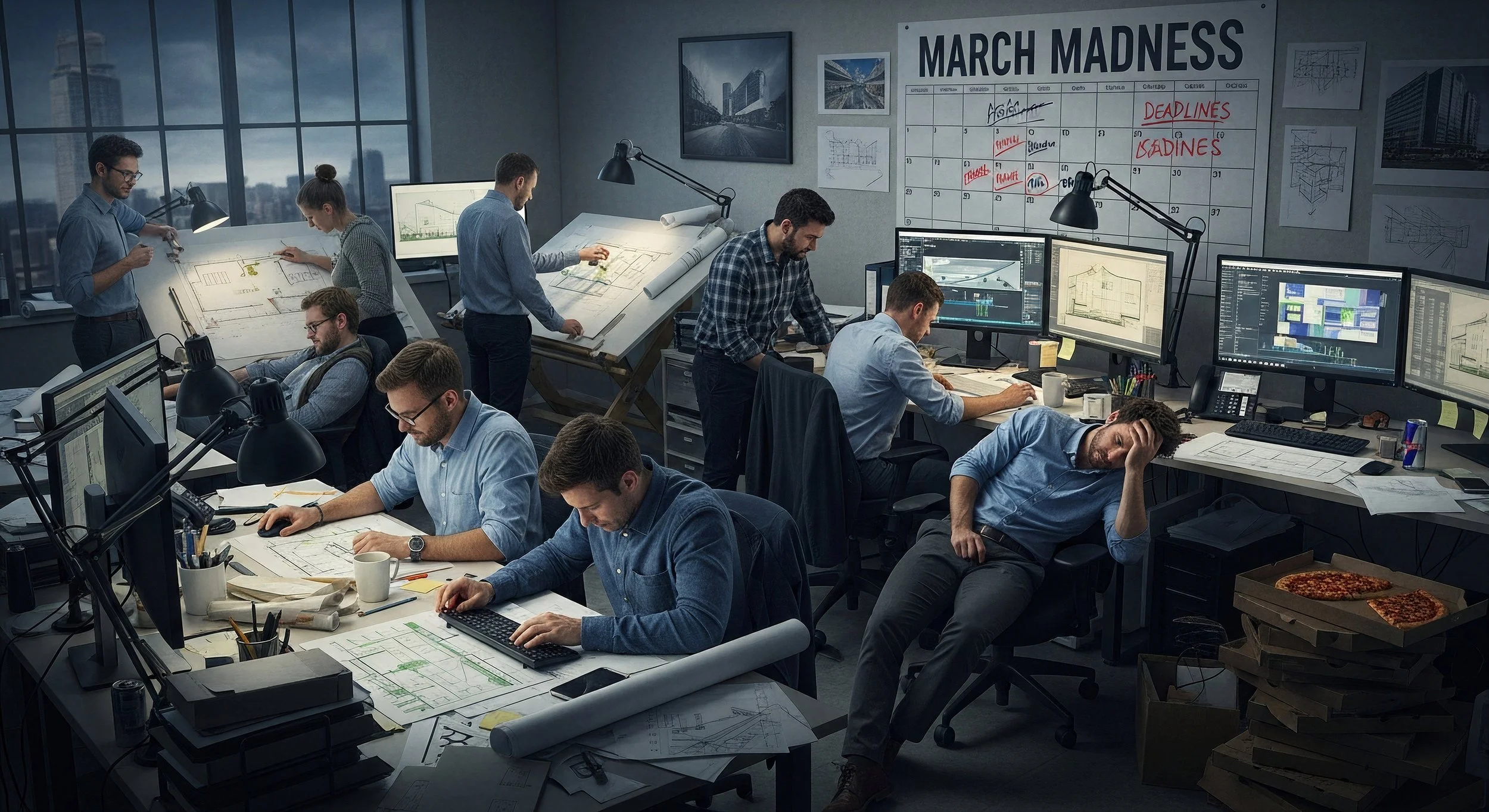
If you've ever tried to book an architectural illustrator in March, you've likely heard a familiar refrain: "My schedule is full." In the world of architectural visualization, March is the industry's "peak season," often rivaling the intensity of tax season for accountants. But why exactly does this 31-day stretch become such a bottleneck for the profession?
It isn't just a coincidence; it is a perfect storm of construction cycles, fiscal deadlines, and major marketing pushes. Recognizing these trends can help industry professionals anticipate demand and prepare accordingly, making your work more effective and timely.
1. The Spring Construction Surge
As the ground thaws, the hammers start swinging. In many regions, construction activity surges in the spring as the weather improves. For a project to break ground in April or May, developers must have finalized their high-quality renderings by March. These visuals are critical for securing final building permits, attracting final investors, and launching pre-sale marketing campaigns that keep a project financially viable.
2. Fiscal Year Deadlines
While many of us think of the new year in January, many government entities, non-profits, and international corporations operate on a fiscal year ending March 31st. This creates a 'use it or lose it'scenario for budgets, prompting organizations to rush to commission 3D renderings before the fiscal year ends, highlighting the need for early planning.
March is a premier month for global design exhibitions and architecture awards. Events like the Architectural Digest Design Show and various ASAI competition deadlines drive a massive spike in demand. Being prepared for these opportunities can help you stand out and meet the industry's peak needs.
March is a premier month for global design exhibitions and architecture awards. Events like the Architectural Digest Design Show and various ASAI competition deadlines drive a massive spike in demand. Architects want their best work showcased in high-gloss renderings for these stages, leading to a flood of "rush" requests for competition-grade imagery.
3. The Real Estate "Pre-Sale" Window
Spring is the peak season for real estate. To capture the interest of buyers looking for new homes or commercial spaces in the summer, developers need their marketing materials ready in March. High-quality 3D renderings are the primary tool for pre-selling units that haven't been built yet, making the illustrator's work the bridge between a blueprint and a sale.
For architectural illustrators, March is a marathon. It's the time of year when the art of visualization meets the high-stakes reality of the global construction and real estate market. To stay ahead, consider planning your projects early- don't wait until March to call.

Big Things Are Coming: A Major Announcement This March

Celebrate!
Change is in the air — and not just small, incremental updates. I am talking about something bold. Something transformative. Something that has been in the works behind the scenes for months. And in March, I am finally ready to share it.
If you’ve been following along, you may have sensed that I have been building toward something bigger. Quiet improvements. Strategic shifts. New energy. Those weren’t random moves — they were stepping stones. Now, everything is aligning for a major leap forward.
This upcoming announcement represents growth, vision, and a renewed commitment to raising the standard. It’s about expanding what’s possible and delivering more value, more innovation, and more opportunity than ever before. I have listened carefully to feedback, studied the landscape, and invested deeply in making sure what’s coming next isn’t just exciting — it’s meaningful.
March will mark the beginning of a new chapter.
While I can’t reveal all the details just yet, here’s what I can say: this is designed to elevate the experience across the board. Whether you’ve been with me from the beginning or you’re just discovering what I do, this next phase is built with you in mind—bigger capabilities, expanded offerings, a sharper focus-get ready for something exciting and new.
Growth should be intentional. It should create momentum. It should open doors that didn’t exist before. That’s exactly what this announcement will do. It reflects where I am headed — not just where I have been.
In the coming weeks, I will be sharing subtle hints and behind-the-scenes glimpses. Engage with these updates, ask questions, and share your thoughts-your involvement will make this journey even more exciting.
Mark your calendar for March. Something significant is on the horizon — and it’s going to change the game.
This is more than an update. It’s a milestone that marks a major step forward in our journey together.
Stay tuned.

Competitive world of architectural visualization
In the competitive world of architectural visualization, having top-tier skills isn't enough; you need a strategic approach to finding clients. Whether you are a seasoned 3D artist or a freelancer just starting, landing consistent architectural rendering clients requires combining high-quality work with proactive marketing.
Here is a roadmap to finding and securing clients in 2026.
1. Build a Portfolio That Sells
Your portfolio shouldn't just be a collection of pretty pictures; it needs to be a sales tool.
Curate, Don't Dump: Include only your top 6–10 images.
Tell a Story: Include "before and after" shots, or show the process from sketch to final render.
Show Functionality: Explain how your renders helped an architect win a competition or secure a client.
Diversify: Ensure you have both interior and exterior scenes, day and night, to show versatility.
2. Leverage Instagram and LinkedIn for Outreach
Social media platforms are invaluable for finding architectural firms.
Instagram: Use it for visual storytelling. Post Reels showing the process (lighting tweaks, material choices) to demonstrate expertise. Follow and tag architects, interior designers, and real estate developers.
LinkedIn: Use LinkedIn to find and connect with decision-makers at medium-sized firms. Share your work, join specialized groups, and engage with content posted by prospective clients.
3. Proactive Cold Outreach (Value First)
Do not just send a "Need renders?" email. That rarely works. Instead, lead with value.
Personalize Your Message: Research the firm, compliment a recent project, and explain how a high-quality rendering could enhance their next presentation.
Offer a Trial: Propose a small, paid test project or a free consultation to show you understand their specific design aesthetic.
4. Specialize and Target
Trying to sell to everyone means you sell to no one. Focus on a niche.
Niche Down: Target high-end residential designers, boutique commercial architects, or landscape designers.
Local Networking: Visit local architecture firms, attend building trade shows, and join local design associations. Face-to-face networking builds trust faster than digital outreach.
5. Utilize Freelance Platforms Strategically
Platforms like Behance, CGArchitect, and specialized niches on Upwork are good, but avoid the "race to the bottom" on price.
Filter Clients: Only bid on projects that fit your style and budget requirements.
Use Specialized Sites: Look at CAD-specific sites like Cad Crowd or CGHero, which are more tailored to AEC (Architecture, Engineering, Construction) projects.
Conclusion
Getting rendering clients in 2026 is about building trust and showing value. By consistently posting your work, reaching out personally, and focusing on a niche, you will move from chasing clients to having them come to you.
Computer - sets you apart in the architectural rendering industry
Yes, a fast computer is a critical factor that sets you apart in the architectural rendering industry, primarily by providing a competitive advantage in efficiency, productivity, and the ability to handle complex projects. While artistic skill is paramount, the capability to quickly iterate designs, render high-resolution images, and meet tight deadlines is essential in a professional, client-driven market.
Here is how a fast computer sets you apart in this industry:
Faster Turnaround Times: In a competitive industry where "time is money," a high-performance computer reduces rendering times from hours to minutes. This allows you to take on more projects, meet tight deadlines, and deliver quick revisions to clients.
Handling Complex Scenes: High-end hardware (CPUs with high core counts, robust GPUs, and ample RAM) allows you to work on large-scale, detailed projects with complex geometries, lighting setups, and high-resolution textures without system lag or crashes.
Enabling Real-Time Workflows: Modern rendering tools (like Lumion, Enscape, Twinmotion) require fast GPUs to offer real-time visualization, allowing for instant feedback on design changes, which is a major differentiator in client presentations.
Professional Reliability: A powerful machine prevents inefficiencies like delayed actions or frozen software, which are unacceptable in a professional setting. It ensures stability during long rendering sessions, reducing the risk of crashes that can destroy progress.
Key Hardware Components for Competitive Advantage
GPU (Graphics Processing Unit): Considered the most critical component for modern, fast rendering engines (NVIDIA RTX series is frequently used).
CPU (Processor): Multi-core processors (Intel i7/i9 or AMD Ryzen 7/9) are essential for handling complex, CPU-dependent rendering tasks.
RAM: 32GB or more is recommended to keep multiple applications running smoothly without slowdowns.
While a fast computer is a necessary investment to separate yourself from the crowd, it must be paired with artistic skill in lighting, composition, and texturing to produce truly high-quality, professional, and memorable renderings.

Architectural illustrators should generally sign their renderings
Architectural illustrators should generally sign their renderings to help them feel valued and recognized for their work, establish authorship, protect intellectual property, and build professional branding. The signature should be discreet, avoiding any overshadowing of the artwork. While not legally required like an architect's seal, a signature acts as a copyright mark to prevent unauthorized usage. It distinguishes the artist's work, aids in marketing, and maintains a professional, artistic standard.
Key considerations for signing renderings include:
Visibility: Place the signature in a corner or a location that does not distract from the architectural design, often subtly integrated into the image, such as on a sidewalk or in a shadow. This helps illustrators feel confident that their signature can be discreet yet effective, respecting the artwork's integrity. Purpose: Signing highlights the specific artistic contribution, which is distinct from the legal, technical, and liability responsibilities of an architect's stamp.
Professional Branding: For freelance illustrators, signing their work is a key way to ensure they are credited for their contributions when their work is shared or published, boosting their confidence and supporting their branding efforts and portfolio development.While some clients may request no signature for a clean, "finished" photo-real look, signing is generally accepted industry practice for artistic work.

Discounts or lower rates for Architectural Renderings
Yes, architectural illustrators and rendering studios generally offer discounts or lower rates if the client provides a complete, usable 3D model. Supplying an accurate, well-structured 3D model (e.g., in SketchUp, Revit, or Rhino) reduces the labor-intensive modeling phase, allowing the artist to focus directly on texturing, lighting, and composition.
Here is a breakdown of how providing a model affects pricing:
Significant Time Savings: Because the artist does not need to build the geometry from scratch, production time decreases, typically lowering the overall rendering fee.
Reduced "Modeling" Costs: A large portion of a renderer's fee is spent on the initial 3D modeling effort. By providing the model, you eliminate or reduce this line item, which can lead to lower, more customized project-based pricing.
Quality of Model Matters: The discount is often contingent on the model being "clean" and ready for rendering. If the file requires significant cleanup, conversion, or detailing, the savings may be reduced or eliminated.
Focus on Texturing/Lighting: The fee will transition from a "build and render" price to a "lighting, texturing, and rendering" price.
Key Considerations:
Upfront Communication: Always mention that you are providing a 3D model when requesting a quote to ensure the savings are reflected in the initial proposal.
File Format: Ensure the file is in a format compatible with the illustrator's workflow (e.g., OBJ, FBX, SketchUp, Rhino).
While some, particularly lower-cost providers, might not reduce their prices significantly, reputable professionals will generally adjust their fees to reflect the lower labor investment.

Why Posting Unlabeled AI Content Is Hurting Your Credibility

AI Generated!
AI tools are everywhere now, and that’s not inherently a bad thing. Used transparently, they can be helpful, efficient, and even impressive. But there’s a growing problem in the building, design, and visualization industries: people posting AI-generated content without saying it’s AI—and passing it off as real work. That’s where the damage starts.
Builders, if you didn’t build it, don’t post it. Designers, if you didn’t design it, don’t claim it. Architectural illustrators and 3D artists, if you didn’t model, light, texture, and render the project yourself, don’t present it as your craft—unless you are explicitly selling AI imagery and clearly labeling it as such.
Why? Because trust is the currency of professional services.
Clients hire you based on what they believe you can actually deliver. When they discover that a stunning structure was never built, or that a “portfolio” space was generated by an AI prompt rather than professional skill, confidence collapses. Even if the work looks good, the realization that you were misleading is far more damaging than any technical shortcoming.
And clients will find out. AI artifacts are becoming easier to spot. Reverse image searches exist. Conversations reveal gaps. When expectations meet reality, the truth surfaces quickly—and awkwardly.
There’s also a bigger issue: people are tired of AI hype. What once felt exciting now feels noisy, repetitive, and impersonal. Feeds are flooded with impossible spaces, perfect lighting, and designs that ignore physics, budgets, and construction logic. Real expertise stands out more than ever because it’s grounded in reality.
Posting unlabeled AI content doesn’t make you look innovative. It makes you look interchangeable. Worse, it suggests you’re willing to blur the truth to attract attention. That’s not the message you want to send to serious clients making serious financial decisions.
Transparency isn’t anti-AI. It’s pro-integrity.
If you use AI, say so. If you sell AI renderings, label them clearly. If your value is your real-world experience, craftsmanship, and problem-solving ability, protect it by showing authentic work. Your reputation is built over years and can be eroded in a few misleading posts.
In an industry built on trust, honesty isn’t optional—it’s the foundation.
Artwork on this post was created using AI
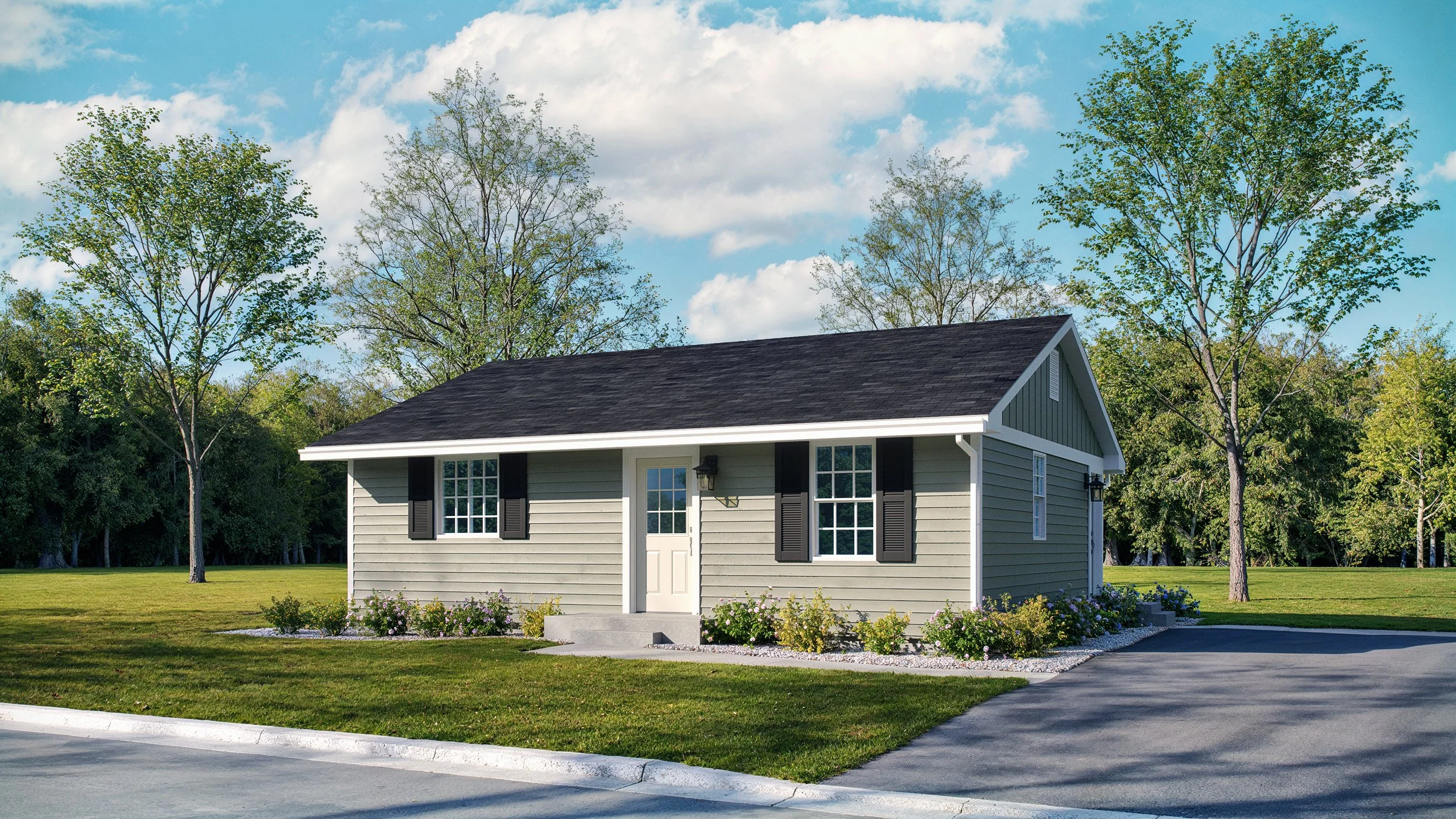
Building Your Dream on a Single Level: The Appeal of the Classic Ranch - House plan Rendering

The enduring charm of the ranch-style home is a cornerstone of American residential architecture, offering a blend of simplicity, comfort, and functionality that appeals to homeowners across generations. At Menards® Building Supplies, we understand the timeless appeal of this design and offer a variety of high-quality, stock house plans that make building your dream, single-level home an achievable reality. The rendering you see here is a perfect example of such a plan, showcasing the efficient, accessible living space that defines the style.
Accessibility and Ease of Living for Every Stage of Life
One of the most significant benefits of a ranch home is its single-story layout, which is ideal for anyone planning to "age in place" or those with limited mobility. The absence of stairs not only creates a safer, more accessible living environment for young families and retirees alike, but also simplifies everyday tasks like moving furniture or carrying in groceries. This thoughtful design promotes a seamless flow throughout the home, ensuring that every square foot is usable and comfortable.
Efficient Design Meets Indoor-Outdoor Connection
Ranch plans are renowned for their open-concept layouts that maximize space and natural light, making the interior feel much larger than its actual square footage suggests. Large windows and direct access to outdoor spaces via patios or porches seamlessly blend indoor and outdoor living, perfect for entertaining guests or simply enjoying a quiet morning coffee.
Beyond comfort, these homes are built with efficiency in mind. The straightforward structure typically results in lower heating and cooling costs and simpler maintenance requirements compared to multi-story homes. From gutter cleaning to painting, exterior upkeep becomes less of a chore, freeing up your valuable time for more enjoyable pursuits.
Build with Confidence Using Menards® Building Supplies
When you choose a stock plan from a designer available through Menards®, you gain access to an accurate material list and the extensive inventory of building materials needed to bring this vision to life. From lumber and roofing to siding and interior finishes, we are a preferred source for builders and DIY enthusiasts due to our comprehensive selection and competitive pricing.
Whether you are a seasoned builder or tackling your first home project, the classic, adaptable design of a ranch home offers endless possibilities for customization and expansion. It is a smart investment with great resale value, offering a beautiful, low-maintenance lifestyle for years to come. Explore the possibilities and start building your future today with a reliable, timeless ranch home plan.
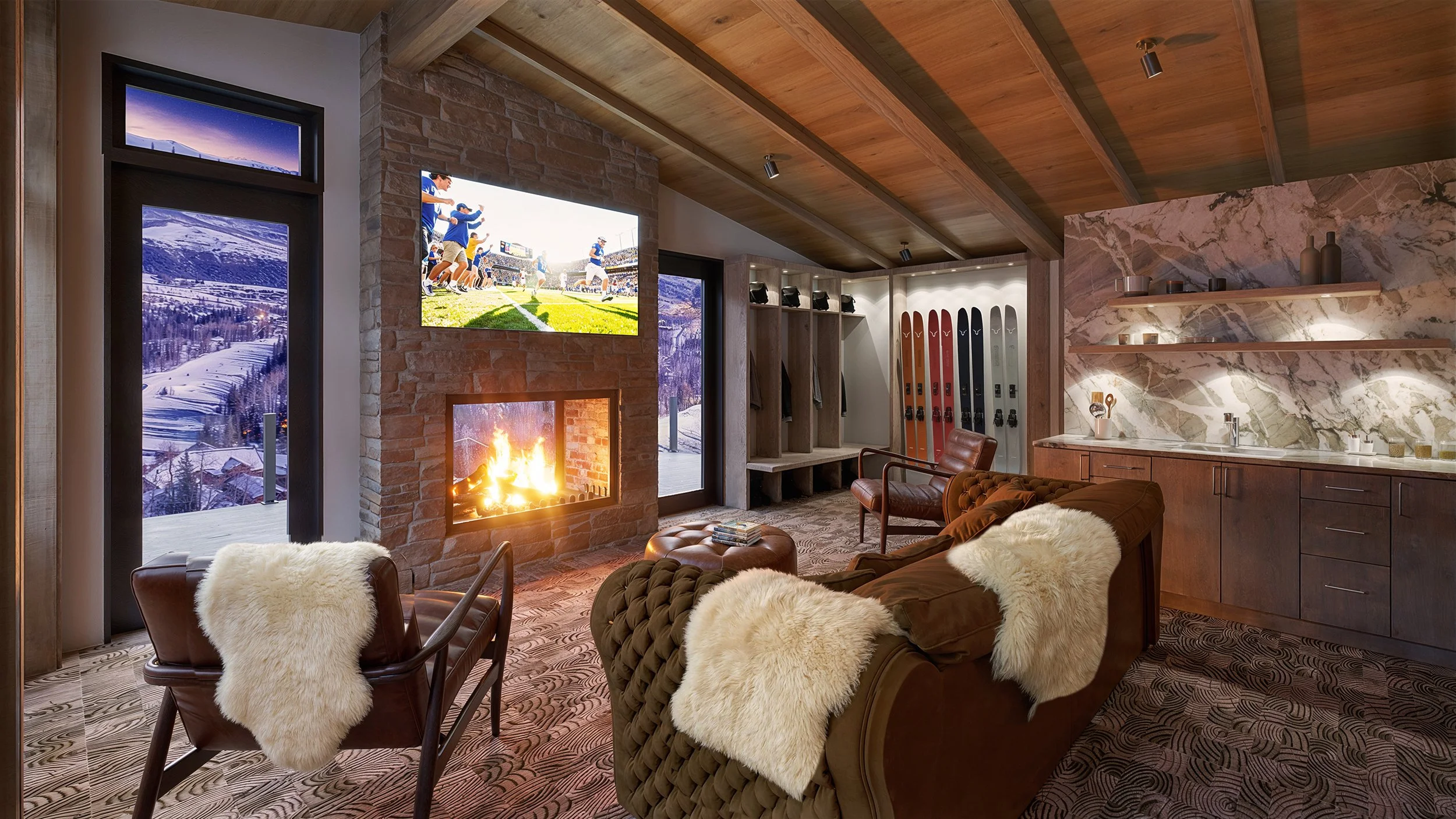
Experience Luxury Before It's Built: Stunning Architectural Rendering of a Modern Mountain Home
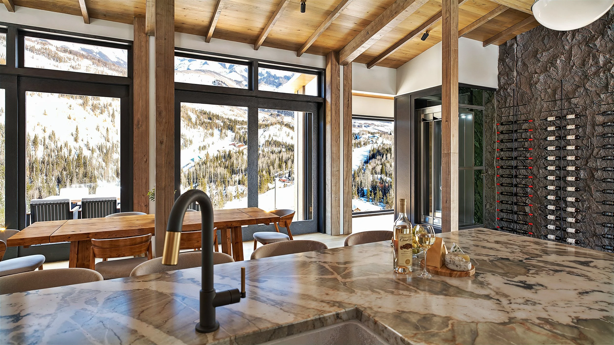
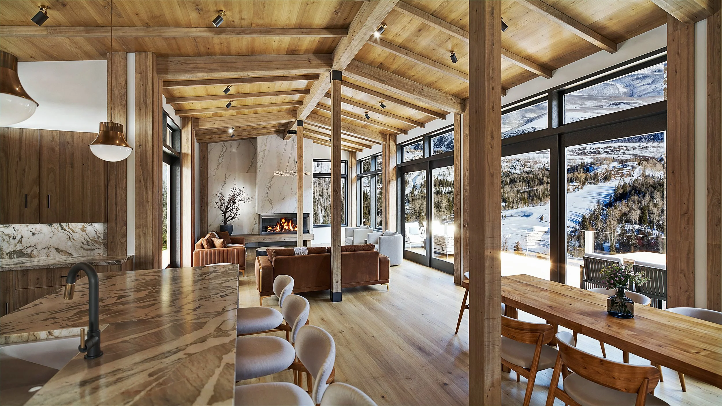

These images are high-quality, photorealistic architectural renderings designed to provide a comprehensive, emotionally appealing visualization of a luxury mountain-modern living space.
Composition
The renderings use professional composition techniques, employing the rule of thirds and eye-level camera angles to create an immersive, human-centric perspective. The wide, floor-to-ceiling windows act as a powerful focal point, framing the stunning, snow-covered mountain views and integrating the natural surroundings into the interior experience. The open-plan layout is clearly communicated, with leading lines from the kitchen island, dining table, and exposed ceiling beams guiding the viewer's eye through the space and toward the exterior vista.
Lighting
Lighting is a key strength, skillfully balanced between abundant natural light and warm, layered artificial illumination.
Natural Light: Sunlight streams through the large windows, creating depth and highlighting textures, a key feature in mountain properties that emphasizes views.
Artificial Light: A mix of recessed spotlights, pendant lights over the kitchen island and dining table, and firelight from the hearth creates a warm, inviting atmosphere and ensures the space remains cozy and functional at all times of day. The lighting choices effectively convey a sense of comfort and luxury, appealing to the target buyer's emotions.
Detail
The level of detail is meticulous, enhancing realism and justifying a high property value. Key features include:
Materials & Textures: High-resolution, physically based rendering (PBR) materials are used for the various wood grains, the veined stone of the fireplace and countertops, and the different fabrics of the furniture. Subtle imperfections and varied gloss levels on surfaces prevent a "plasticky" look.
Staging: The space is thoughtfully staged with appealing furniture, decor, and small, realistic touches (like items on the kitchen counter or dining table) that help potential buyers imagine themselves living there.
How These Renderings Help Sell the Unit
These professional renderings are powerful marketing tools that significantly boost sales potential by:
Evoking Emotion & Lifestyle: They don't just show a room; they tell a story of a luxurious, comfortable mountain retreat, allowing buyers to form an emotional connection and visualize a desired lifestyle before construction is even complete.
Enhancing Understanding: The photorealistic detail and clear composition eliminate the need for buyers to interpret complex blueprints, giving them a clear, confident understanding of the final product and layout.
Standing Out: High-quality visuals make listings pop online and in print, attracting more interest and differentiating the property from competitors who use lower-quality media.
Justifying Price: The clear depiction of high-end materials, unique architecture, and stunning location helps justify a premium price point, as buyers can clearly see the value of the investment.
These stunning visuals not only inform but also inspire, making the sales process smoother and faster.
Mastering Realism: The Essential Role of Lighting and Shadows in Architectural Rendering

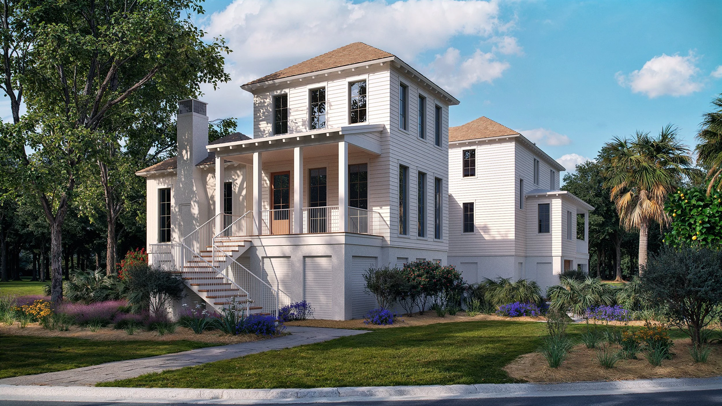
This striking architectural rendering presents a compelling vision of coastal living, defined by its elegant Lowcountry design and skillful application of digital artistry. The image is a masterclass in composition, lighting, and shadows, creating depth, realism, and a sense of inviting warmth.
The Artful Composition
The composition immediately draws the eye with a balanced, yet dynamic, presentation. The main structure, with its prominent two-story porch and crisp white board-and-batten siding, is centrally framed. The diagonal line of the front staircase acts as a strong leading line, guiding the viewer's gaze from the foreground to the main entrance. A secondary structure in the background adds depth and dimension, preventing the image from feeling flat. The surrounding landscape, rich with lush greenery, trees, and palm fronds common to areas like Johns Island, SC, perfectly frames the architecture, creating a harmonious balance between the built environment and nature. The visual interest is further enhanced by the two-car garage on the lower level, a practical, yet seamlessly integrated, design element.
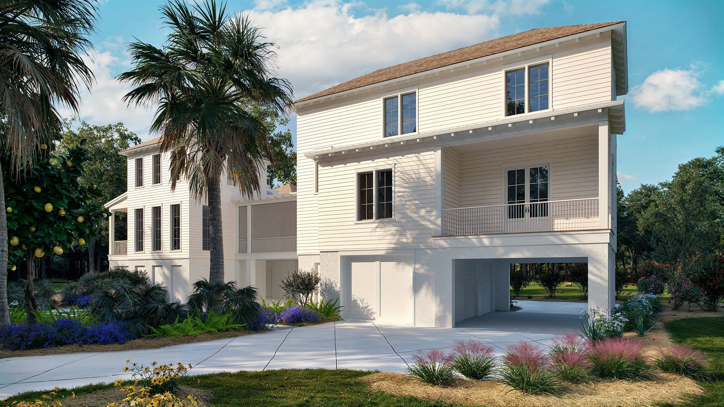
The Play of Light
The lighting in this rendering is exceptionally well-executed, simulating the bright, direct sunlight of a clear day. The primary light source comes from the front and slightly to the right, highlighting the bright white façade and creating a clean, inviting look. This intense directional light accentuates the texture of the vertical siding and the subtle details of the porch railings and columns. The blue sky with scattered white clouds provides a vibrant, natural backdrop, typical of the sunny weather found in the South Carolina region, where similar homes are often located. The light creates a sense of optimism and highlights the property's potential for outdoor enjoyment and relaxed living.
Depth and Realism Through Shadows
The use of shadows is arguably the most critical element in giving this 2D rendering its impressive three-dimensional realism. The porch overhangs, the roofline, the columns, and the lush foliage cast sharp, well-defined shadows. These shadows not only indicate the time of day—likely mid-morning or early afternoon—but they also define the structure's form and volume.
For instance, the deep shadow beneath the central second-story porch adds significant depth, making the space feel tangible and sheltered. Shadows from the trees dapple across the white walls and the front lawn, breaking up the bright surfaces and adding a natural, organic feel to the scene. The contrast between the sunlit areas and the cool, shaded spots makes the image pop and convincingly suggests the structure is grounded in a real, sun-drenched environment. The result is a highly effective, aspirational image that beautifully showcases the home's design and character.
High-Quality 3D Renderings: Why Authentic Craft Matters More Than Ever in 2026
In a world of infinite scrolling, your project has roughly 1.5 seconds to capture a stranger's attention. Today, the digital landscape is saturated with "internet noise"—generic, low-effort visuals that the human eye has learned to filter out like static. If your renderings don't force a thumb to stop, your design effectively doesn't exist.
The rise of AI-generated imagery has only complicated this. While AI is a powerful tool, the market is currently experiencing "AI fatigue." People are beginning to cringe at the tell-tale signs of unedited machine output: the surrealist physics, the uncanny valley lighting, and that hyper-saturated "plastic" sheen. When every feed is flooded with these shortcuts, they cease to be impressive; they become visual clutter.
True rendering success doesn't come from a "generate" button. To stand out in 2026, a rendering must possess a soul—a sense of atmosphere and intentionality that resonates on an emotional level. This is where my service bridges the gap. I provide high-quality renderings that make a definitive statement without the hollow hype. My goal isn't just to show a space, but to tell its story through precise light, authentic textures, and a composition that feels grounded in reality.
There are no shortcuts to this level of impact. To move beyond the noise, you need a combination of three things: hard work, seasoned skill, and a commitment to craft.
Hard Work: Every shadow and reflection is meticulously calculated to ensure the scene feels lived-in and believable.
Skill: Understanding architectural nuances and interior design principles ensures the rendering honors the integrity of your original vision.
Craft: This is the human element—the artistic eye that knows when a scene needs a subtle imperfection to feel "real" or a specific temperature of light to evoke a mood.
In an era where everyone is trying to move faster, moving better is the ultimate competitive advantage. When you choose a bespoke rendering service over generic alternatives, you aren't just buying an image; you are purchasing the ability to command attention.
Stop contributing to the noise. Give your audience something that makes them pause, look closer, and remember your work. For high-impact visuals tailored to your project, explore my portfolio or contact me directly to discuss your next masterpiece.
From Quiet to Booked: How Updated Renderings Can Revitalize Your Architectural Portfolio
When business slows down, the instinct for many firm principals is to tighten the belt and wait for the phone to ring. However, these "quiet periods" are actually your most valuable strategic assets. Instead of viewing a light project load as a setback, treat it as a dedicated production window to refine your brand's visual narrative.
The most effective "low-hanging fruit" during a lull is updating your architectural renderings. While deep-cleaning your CRM or reorganizing your server is productive, neither directly wins new business. High-quality, updated imagery does. Here is why refreshing your visuals provides the biggest bang for your buck during a slowdown.
1. Technology Moves Faster Than Your Backlog
If your firm's portfolio features renderings that are even three years old, they likely look dated. Rendering software such as V-Ray has evolved rapidly, offering levels of realism previously impossible. By taking an existing project model and re-rendering it with 2026's lighting, textures, and assets, you instantly elevate the perceived quality of your work without the cost of a new design phase.
2. Control the Narrative
During busy seasons, you often settle for "good enough" visuals to meet a client's deadline. When business is slow, you have the luxury of time to curate "hero shots." You can experiment with dramatic lighting, seasonal variations, or interior staging that speaks specifically to the types of clients you want to attract next. This is your chance to pivot; if you want more luxury residential work, update your renderings to reflect that specific aesthetic.
3. Fuel Your Marketing Engine
Marketing requires constant "fuel" in the form of content. Updated renderings provide immediate material for:
Social Media: High-resolution visuals outperform text-heavy posts.
Website Updates: A fresh hero image on your homepage signals that your firm is active and modern.
Pitch Decks: New visuals give your business development team a reason to reach out to old leads with a "look at what we're working on" update.
4. Low Effort, High Conversion
Unlike a complete website rebrand or a multi-month SEO campaign, updating a rendering is a contained task. It utilizes your existing BIM models and internal talent (or a short-term freelance contract). It is a high-impact move that bridges the gap between your current lull and your next major contract.
Don't wait for the next boom to start looking like a top-tier firm. Use the current quote to ensure that when a potential client visits your site, they see a portfolio that looks like the future of the industry.
Do high-quality renderings sell houses more than average-quality renderings?
Yes, high-quality, photorealistic 3D renderings sell houses more effectively and faster than average-quality or basic 2D floor plans. High-quality renderings create an emotional connection, build trust, and allow buyers to visualize a future lifestyle, leading to higher engagement and faster sales, particularly for off-plan or vacant properties.
Key Impacts of High-Quality Renderings on Sales:
Faster Sales: Properties marketed with high-quality 3D renderings sell up to 20–31% faster than those with average renderings.
Higher Sale Prices: Homes with high-quality renderings can achieve average price increases of 6–10% compared to those with average renderings.
Increased Engagement: Listings with high-quality 3D renderings attract up to 87% more views and 40% more inquiries than average quality renderings.
Pre-construction Success: High-quality renderings are essential for selling properties before construction, with some projects selling 85% of units within three months using detailed, immersive 3D, 360-degree tours.
Reduced Unnecessary Showings: By providing a clear, accurate, and detailed view of the property, high-quality renders help filter for serious buyers, with 54% of buyers refusing to visit in person until they have seen a virtual tour.
Why High-Quality Renders Outperform Average Ones:
Emotional Connection: Unlike average, sterile images, high-quality, photorealistic images convey a "dream home" atmosphere, allowing buyers to feel immersed in the space.
Trust and Accuracy: High-quality renderings accurately simulate lighting, textures, and materials, reducing uncertainty and building trust in the final, unbuilt product.
Contextualization: They can display the property during the "golden hour" or twilight, offering a more enticing, polished presentation than a simple, functional, or low-quality rendering.
Virtual Staging Superiority: While average renderings might just show an empty room, high-quality virtual staging can reveal potential, making it 73% faster to sell and often resulting in a 5–20% higher price point.
ROI on High-Quality Renderings:
While high-quality rendering is a higher initial investment, it often provides a superior return on investment (ROI).