

BLOG
V-Ray VFX & Game Cinematics Showreel 2013
The Official V-Ray Showreel 2013 - Film & Game Cinematics
V-Ray I.R.L.
V-Ray friends honor Chaos Group team with this special anniversary video! Thanks to some of the best VFX people for being part of the V-Ray development for over a decade!
3D Camera Technology
Floored scans office spaces, apartments and houses using 3D camera technology and proprietary software to build customizable 3D models for real estate purposes. Instead of static photos and floor plans, you can move around in real-time, add furniture and easily realize if the space is a good fit.
Post Production
It’s no secret that there are many ways to enhance an architectural rendering.
Color Correction:
Quite simply, color correction is the process of altering and enhancing the color of a rendering through a digital process. Color correction is the ultimate finishing tool for any architectural rendering.
Levels, Curves, and the Histogram
Levels and Curves are among the oldest features in Adobe Photoshop, and they continue to be two of the most fundamental tools for improving the appearance of an architectural rendering.
Most of these enhancements are done in post production. Here, is a wonderful video, showing a behind the scene at what post production looks like.
A Subliminal Portal Into The Viewer's Mind
Let's explore the power of symbolic color and how it can be used most efficiently. When you see the color red, what does it make you think of? Blood? Anger? Fire? Passion?
We associate colors with particular objects, as well as the emotions conjured by experiences. And thoughts associated with in this case red things. Color can be universal as a symbol, but it's frequently cultural and often personal. Understanding color as a symbol and an image help to convey content and meaning. It can be a single node of color or an overall pallet or a repeating pattern and can identify a particular emotion. And immediately indicates to the viewer, how they should feel or think about the content of a rendering. We can't ignore the fact that it exists, not as an isolated factor, but part of a larger context.

Color is defined by its relationship to other colors in a rendering. We have intuitive responses to the environment, or a mood cast by a particular grouping of colors, and respond to the literal content colored by the mood the palette implies. A palette change can completely change your perception of meaning, and it can strengthen or weaken your intended message.
Color as a symbol is a powerful player for the designer. And should be considered carefully, especially when used as a focal point in a rendering. Focusing our attention on it empowers that element with importance. You'll need to consider how colors play off one another in the world of your rendering. If you think of colors as personalities, it's easier to understand how a red in one setting Appears loud and boisterous, and in another, just one of the crowd.
Have you ever been to a party where you're perceived as the most vibrant and energetic person in the room? And in another situation, a bit of a wallflower? Colors function similarly. Telling stories and expressing ideas through colors is without question, one of the most valuable skills to hone. Because it provides a subliminal portal into the viewer's mind. We see color as images, so what do they say to us?
Enhancing the Architectural Image
Nik's online Trainer Dan Hughes, will demonstrate how many architectural photographers have discovered the importance of high quality image editing and the timesaving capabilities of working with Nik Software tools. Dan will go through a variety of architectural work from top pros to see how to enhance buildings, interiors, skies, grounds and more using a variety of Nik Software tools.

Six Steps To Consider Before Launching a Small Business
So you're thinking about starting your own small business but aren't pretty sure from where to start and which steps you should strike first in order to make your dreams of becoming self-employed? No problem this infographics is here to help with six simple steps to get you going on the right way to build your successful business.

This infographics answer 6 major question that small business owners should ask themselves before startup.
First step, if you've a great idea then you need to do some research that can be helpful to decide if it will give a result.
Second step, gather data from the internet about your competitors and research what their weaknesses.
Third step, if you've a clear vision for your small business try to put a vivid and inspiring statement about your vision.
Fourth step, outline some short and long term goals and how you will to chase your objectives.
Fifth step, as an entrepreneur you will be called on to wear many hats in order to successfully operate your small business. Involve an advisor that can help you to be more effective in your business venture.
Sixth step, A mixture of financial sources may be the best way to raise the money you will need to start your small business.

What is Color Temperature?
Understanding color temperature is one of the crucial rules of architectural rendering you must learn before you can begin to break them.
So what is color temperature? In short, each light source has its own individual color, or ‘color temperature’, which varies from red to blue.
Candles, sunsets and tungsten bulbs give off light that’s close to red (hence the ‘warm’ look they give to pictures), whereas clear blue skies give off a ‘cool’ blue light. It’s fairly obvious stuff once you read it.
Color temperature is typically recorded in kelvin, the unit of absolute temperature. Cool colors like blue and white generally have color temperatures over 7000K, while warmer colors like red and orange lie around the 2000K mark.
In the infographic below we’ve illustrated the color temperature scale and show you where these popular white balance settings sit within it. We’ve also shown where some common shooting conditions, such as hazy skies and sunsets, sit within the color temperature scale and what white balance setting you might want to use to capture accurate colors in these conditions.
To view the larger version of this photography cheat sheet simply click on this infographic or drag and drop it on to your desktop to save as a reference.


V-Ray 3.0 for 3ds Max Beta
The V-Ray® 3.0 for Autodesk® 3ds Max® Beta program is now open.
With this beta program, our users can get their hands on new and improved features and capabilities of the best version of V-Ray yet. Thanks to our continuous work with 3D artists all over the world, V-Ray 3.0 for 3ds Max has now become the most complete lighting, shading and rendering toolkit on the market.
We've set up a new website dedicated to become a new home for the V-Ray community. Be sure to check out www.v-ray.com for more V-Ray 3.0 related news and stay tuned for updates, videos and tutorials.
Eligibility
The V-Ray 3.0 for 3ds Max Beta program is available to licensed users of V-Ray for 3ds Max.
You may register for the beta program here. Our team will review your application and send you an email outlining next steps.

Feedback process
As a member of the beta community, you will get an advanced look at the upcoming features and enhancements in V-Ray 3.0. Plus you will have a unique opportunity to provide critical feedback, helping create the best version of V-Ray yet.
During the beta process, you will have direct access to our development team and the beta community via a V-Ray 3.0 for 3ds Max Forum. The forum is dedicated to sharing constructive feedback, works in progress, test renders, and user suggestions.
Time Frame
The Beta program will run for a period of approximately 3 months.
System Requirements
• A computer with 3ds Max 2011/3ds Max Design 2011 or later, 64 bit versions only;
• Windows XP, Windows Vista, Windows 7, Windows 8, 64 bit versions only;
• Intel Pentium IV or compatible processor with SSE2 support;
• 128 MB RAM and 350 MB swap minimum - recommended 4 GB or more RAM, 4 GB or more swap file;
• NUMA architecture is supported but not recommended*
Note: More efficient rendering on a NUMA machine is achieved with several copies of 3ds Max or DR render servers. In both cases each instance should be limited to one NUMA node because of the slower access that a core has to the rest of the RAM.
Autodesk 3ds Max is a registered trademark of Autodesk. V-Ray is a registered trademark of Chaos Software
Perfect Effects 4 Free
Improved! Library of Effects
Create images with impact using over 70 professional effects that help you enhance detail, add contrast, evoke moods, and more.

Combine Effects
Design a look all your own by combining multiple effects and adjusting the strength of each effect. With the live previews in Perfect Effects 4 Free, you can see what each effect will look like on your photo before applying it. Your creative options are limitless and easy to achieve with the easy-to-use tools in Perfect Effects 4 Free.
Masking Controls
Selectively apply any effect to specific parts of your photo with the powerful masking controls in Perfect Effects 4 Free. Use the Masking Brush to apply effects to specific areas and the Masking Bug to quickly create vignettes and graduated filter looks.


New! Paint-In Effects
With a handy set of Basic Brushes, you can solve some of your most common digital photography problems exactly where you need. Use simple brush strokes to make areas darker, lighter or warmer. Add detail, glow or more color. You can also reveal highlights and recover shadows.
New! Perfect Brush
Smoothly apply or remove effects to the specific areas you're working on without going "outside of the lines."
Turn on the Perfect Brush when using the Masking Brush or the Paint-in Effect Basic Brushes.

New! Blending Modes
Blend effects to create amazing and highly stylized looks in Perfect Effects 4 Free. By changing the Blending Modes, you can control the brightness, contrast and color of the image to dramatically alter the appearance. And, by adjusting the opacity, you can control the strength of the effect.
Combine Images for Endless Creative Options
In the Layers home module, you'll find tools designed specifically for photographers to combine the best parts of multiple photos and quickly retouch your images. You'll easily be able to swap faces or create a balanced exposure. You can also blend images for creative effects, create layouts, build composites, and more. Enjoy all of the benefits and creative power of a layered workflow, even without Adobe Photoshop. Your creative options are endless.


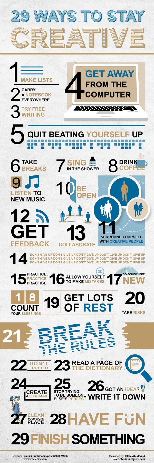
29 Ways to Boost Creativity
There’s no secret recipe to being creative. Generally when we’re researching new concepts or working on a new task, creativity breeds out of conception. That said, it’s easy to burn yourself out when consistently churning out new and creative ideas. There are however, a few ways to maintain your creative state of mind.
The below INFOGRAPHIC (from Islam Abudaoud) outlines 29 ways to wake and reinvigorate the creative side of your brain. Here’s some of our favourites:
- Carry a notebook everywhere you go, you never know when opportunity might strike!
- Get away from the computer, even if it’s for 5 minutes.
- Quit beating yourself up, stress can stunt creative thinking.
- Sing in the shower. Really, go for it!
- Be open. Don’t shut out ideas just because they’re unfamiliar, you’ll be surprised at what you can learn!
- Surround yourself with creative people.
- Always get feedback. It’s important that you know what you’re doing right/wrong in order to improve.
- DON’T GIVE UP!
- Break the rules. As long as you’re not harming yourself, or someone else – try going against the norm.
- Stop trying to be someone else’s perfect – just be YOU.
- Finish something. Even the most mundane of tasks can breed innovation, give yourself a sense of accomplishment!
- Get lots of rest. A tired brain is a useless one.
Impact The Perception
“Architectural illustrators must realize how their input can impact the perception of a project for good or ill, and the results of their aesthetics and integrity can have considerable influence.”
F*ck You. Pay Me.
Our speaker at the March 2011 San Francisco, CreativeMornings (creativemornings.com) was Mike Monteiro, Design Director, and co-founder of Mule Design Studio (muledesign.com). This event took place on March 25, 2011 and was sponsored by Happy Cog and Typekit (who also hosted the event at their office in the Mission).
Mike's book "Design is a Job" is available from A Book Apart (abookapart.com/products/design-is-a-job)
A big giant thank you to Chris Whitmore (whitmoreprod.com) for offering to shoot and edit the video. Photos were graciously provided by Rawle Anders (twitter.com/rawle42).
The San Francisco chapter of Creative Mornings is run by Greg Storey (twitter.com/brilliantcrank).
Follow us on Twitter at twitter.com/SanFrancisco_CM
Signing Nondisclosure Agreements (NDA) and Work-for-hire Agreements
Whether working directly with the client or through an agency, a freelancer architectural illustrator may be asked to sign one or both. It's also possible that a client or agency won't require either.
Let's start with an NDA; a Non-Disclosure Agreement. It's common that an agency will ask you to sign an NDA. Often, it means that their client has asked them to sign an NDA and that everyone working on the project understands that the work is confidential.
NDAs is written by attorneys, so that language is dense and confusing. I'll explain the basic gist of an NDA. The document states the date and place of the agreement along with the party's legal names. It ensures that the project is confidential and restricts any disclosure about any part of the project for a particular amount of time. Sounds simple, right? Yes, and no.

You may be asked to sign a Work for Hire agreement. It states that you will not own any of the work reproduced, even work that wasn't used. Work for Hire agreements means that, for whatever fee, you retain no copyright to the work you have done. If you are employed or an architectural illustration freelancer, the law states that, by default, you're working in a Work for Hire agreement. This ensures that when an agency sells your work to a client that it's theirs to sell. If you're working directly with the client, your agreement can be different.
Work for Hire agreements are very restrictive and should not be entered into lightly. As a freelance architectural illustrator, you need to be aware of who owns your work and when copyright transfers. It's common that copyright transfers from the designer to the client or agency when the designer is paid. Architectural Illustrators have contracts that sell limited rights to these images as opposed to the image itself. If you are acting as an architectural Illustrators, you should have two separate agreements stipulating what the agency owns or does not own, at what point, and for how long.

My final recommendation is that if you're in any way confused about a document given to you to sign, ask the agency or client to go through it with you point by point, just to make sure you're absolutely clear what you're agreeing to. Under no circumstances should you sign a document if you're not clear about what specific actions you need to take.