

BLOG

A unique piece of modern architecture


The artwork in question is a rendering of a contemporary residential building, a unique piece of modern architecture. The image beautifully captures the house's clean, geometric design, with a façade that boasts a variety of textures and colors. The sleek combination of light brick and wood accents, along with the structure's roof and large windows, creates a sense of openness and integration with the surrounding environment. The lush greenery that frames the building further enhances the harmony between the natural and built worlds.
The rendering is a testament to the illustrator’s artistic vision, excelling in composition and clarity. It effectively showcases the architectural details and design intent, with a particular focus on the house's harmonious integration into its environment. This emphasis underscores a delicate balance between modern aesthetics and organic elements, a key aspect of the illustrator’s interpretation. The play of light in the image accentuates the textures and lines, drawing attention to the thoughtful architectural features.
Encouragement lies in exploring the relationship between architecture and its environmental context. This exploration can be enriched by experimenting with different angles or capturing the building during various times of day, adding further depth and mood to the portrayal. The photographic technique already conveys a strong sense of place and personality, creating an inviting narrative of modern living..

The Power of Your Work Environment: Why It Matters More Than You Think
Whether you work from a sleek downtown office, a cozy home setup, or somewhere in between, one thing remains true: your work environment matters—a lot. It's not just about aesthetics or desk organization (though that helps); it's about creating a space that supports productivity, well-being, and creativity.
1. Productivity Starts with Environment
Have you tried focusing in a noisy, cluttered, or poorly lit room? Not fun. A well-designed work environment minimizes distractions and maximizes focus. Simple changes like proper lighting, ergonomic furniture, or noise-canceling headphones can make a noticeable difference in how efficiently you get things done.
2. Your Space Affects Your Mood
The environment you work in has a direct impact on your mental health. Studies show that natural light, plants, and clean, organized spaces can reduce stress and increase happiness. Feeling good in your workspace makes you more motivated, engaged, and resilient.
3. Culture is Part of the Environment
Physical space is just one part of the equation. A supportive, respectful, and inclusive company culture also plays a significant role. The organization benefits when employees feel safe speaking up, collaborating, and being themselves.
4. Creativity Needs Room to Breathe
Creative thinking thrives in environments that inspire it. That could mean flexible seating, visual stimulation, collaborative zones, or the freedom to personalize your workspace. When people feel comfortable, they're more likely to take creative risks.
5. Remote or Hybrid? Environment Still Counts
Working from home? The same rules apply. It's important to set boundaries, create a designated workspace, and make it feel like your zone. Even small rituals—like lighting a candle before work or playing a specific playlist—can help signal that it's time to focus.
Final Thoughts
Your work environment isn't just a backdrop—it's a key part of your daily success. Investing in it is investing in yourself. Whether you're an employee, a team leader, or a solo entrepreneur, take a moment to ask: Is my space supporting the best version of me?

A beautiful battle to be more creative
There’s something romantic about being a creative. The late nights fueled by inspiration, the flow states where time disappears, and the satisfaction of turning a vague thought into something tangible—it all sounds magical. And it is. But being creative often feels like a beautiful struggle behind the highlight reel, behind the finished pieces and curated portfolios.
1. The Pressure to Produce
Creativity isn’t a faucet you can turn on and off. Some days, inspiration flows freely. Other days, it’s like staring into a blank void. Still, the world expects content. The pressure to be constantly making can turn a passion into a source of stress.
2. Imposter Syndrome is Real
No matter how skilled or experienced, many creatives live with the nagging feeling that they’re faking it. That their work isn’t “good enough,” that success is a fluke, that one day the curtain will be pulled back and everyone will see they’re not legit. This internal critic can be paralyzing and often louder than any external voice.
3. The Vulnerability of Sharing
Every piece of art or design is a piece of yourself. Sharing it means opening yourself to judgment, misunderstanding, or indifference. Even positive feedback can feel overwhelming when you’re emotionally tied to what you create. It’s not just “content.” It’s personal. And putting it out there takes courage.
4. Financial Uncertainty
Income isn't always stable for many creatives, especially freelancers or those building their brands. Pricing your work can feel like guessing a number and hoping someone says yes. You might feel guilty charging for something you love to do—even though it’s labor, just like anything else. The dream of “doing what you love” often comes with the harsh reality of inconsistent paychecks.
5. Being Misunderstood
“Must be nice to draw all day.”
Creative work is often devalued because people only see the result, not the hours of thinking, experimenting, failing, and trying again that go into it. There’s a disconnect between how others see creative work and what it entails, which can be incredibly isolating.
6. Burnout in Disguise
Because many creatives love what they do, burnout doesn’t always look like exhaustion—it looks like overworking. It looks like pouring everything into a project and then wondering why you feel numb after it’s done. It looks like scrolling for inspiration and feeling creatively empty. The line between passion and depletion is often razor-thin.
But Here’s the Flip Side…
Being a creative is hard—but it’s also a gift. The ability to imagine, make something from nothing, and express what others can’t find the words for is power. And even when it’s tough, it’s worth it.
You’re not alone in the struggle. And you’re not failing just because it feels hard. This path isn’t easy, but it’s yours. And the world needs what only you can make.
Keep creating. Keep showing up. Keep telling your story.
You matter!

American Tiny House Rendering

This rendering depicts a quaint, single-story house in a serene and lush environment. The architectural style, a simple and traditional design, has historical significance in the region, reflecting the cultural values of simplicity and harmony with nature. The light sage green exterior with white trim, charming shutters, and muted gray roof are all elements of this traditional style. Surrounding the house is a well-maintained garden bed with various shrubs and flowers, while mature trees create a natural backdrop. The sky is vivid and clear, suggesting a bright, pleasant day.
This piece beautifully captures the essence of tranquility and simplicity. One of its strengths is the harmonious use of colors; the choice of soft, muted tones brings a sense of calm and peace to the visual experience. The way the garden and trees seamlessly integrate with the house, creating a restful haven, evokes a tranquil, natural feeling.
Overall, this artwork excels in portraying a serene, inviting dwelling. The artist's technique, particularly in color and composition, is noteworthy. It successfully encourages viewers to pause and appreciate the beauty of ordinary architectural charm set within nature's embrace. Continue to explore the balance between structure and environment, and let each piece inspire new stories and emotions for your audience.

225 Middlesex Turnpike Interior Renderings


These interior renderings are an immaculate portrayal of spaces, seamlessly combining design and functionality elements. The composition uses clean lines and neutral tones, creating a sense of simplicity and sophistication. The choice of materials, such as the exclusive polished wood flooring and the high-quality sleek stainless steel appliances, adds an element of luxury and craftsmanship. Moreover, the use of natural light flooding through large windows enhances the openness and inviting warmth of the space, offering a gentle contrast to the starkness of the kitchen fixtures.
The arrangement demonstrates an acute awareness of balance and proportion, with the centralized placement of the kitchen island serving as a focal point. The pendant lighting above is a practical feature and contributes aesthetic value, casting a soft glow that highlights the textures and finishes. The thoughtful inclusion of greenery infuses life into the space, breaking the monochrome scheme with touches of vibrant color and creating a sense of harmony and aesthetic pleasure.
The strength of this piece lies in its meticulous attention to detail and the harmony in its elements. The artist's precision in evoking a sense of calm and order draws the observer into a contemporary and welcoming space. For future artworks, exploring more diverse color palettes or incorporating unexpected elements might offer an avenue for expanding the visual dialogue within the piece. Nevertheless, the current execution is commendable for its clarity of vision and ability to communicate the essence of a modern living environment. This artwork inspires contemplation of both form and function, celebrating the beauty inherent in everyday spaces.

What is the most challenging part of my job?
What is the most challenging part of my job?
It might be software, dealing with the hardware, or being creative daily. All have their challenges, but the most difficult part of my job is milestones and deadlines. It isn't me managing milestones and deadlines; it is the client being invested in their project schedule and giving timely feedback. Your timely feedback is not just a part of the process but a crucial element in ensuring the project's success.
A project isn't a project unless the deposit is paid. Once it is, a start and finish date is set. I stress that the deposit is the commencement, so approving the quote doesn't start a job. The project schedule is set when the despot is paid. Too often, projects are approved, contracts are signed, people want me to start their projects, and there is never a deposit. Also, A lot can happen between approving a quote and paying a deposit; I can sign other projects and get a deposit before your deposit is paid.
It is a first come, first served proposition.
When a deposit arrives days or weeks later, it significantly impacts the project timeline. Unfortunately, the tentative timeline on the quote is only suitable for as long as the quote's expiration date. Often, the deposit doesn't arrive until after the agreed-upon due date has passed. Your promptness in this matter is crucial to keep the project on track.
After starting a project, I work hard to deliver proof within a day or two; I send a proof that must be approved within 12/24 hours. This is where a lot of projects go off the rails. I may not get feedback for several days or sometimes weeks. Heck, I have had projects sit for months. I understand that people get busy, and sometimes projects become unimportant. The deposit covers the modeling, and the balance covers the rest, so if I don't get timely feedback, I can shelf it, but if I had it scheduled for a week or two, who is paying for that time? Unlike airlines, I can't double book expecting cancelations. If a project goes silent, I must fill that space with another project. It gets more intense when the color is done, and the project goes silent. I might have almost completed 95% of the project, but I haven't seen any money since the deposit, so the delay in the balance can cause some financial strain. Some projects sit at 95% for weeks or months.
When a client takes weeks to comment, it can disrupt the project schedule. If the deadline has passed, and I am on another project, I must pull double duty, and everyone suffers. Usually, if they take too long for the first round of revisions, the second round is delayed, and the cycle repeats itself. A client who respects the schedule shouldn't have to suffer a project moving slower than planned, so I always prioritize that client. Your respect for the schedule is greatly appreciated and ensures a smooth project flow.
However, clients who are slow to respond usually want revisions immediately. This adds a lot of unnecessary stress to everyone, especially me.
I can have 6-12 projects sitting and waiting for comments at any given time, and they could have been sitting there for weeks or months. It is nice to have a lot of smaller projects, so juggling projects are more straightforward. However, I often schedule large projects for weeks, and the time frame is tight, so telling someone they have to get at the back of the line is hard to swallow.
Projects have a 20% buffer because I know things happen. If a set of images takes a day extra to review, that is not a problem and is expected. I will honor my part of the deal, and projects will go smoothly if my client does the same. If a project is delayed due to my clients, I always try to get it back on schedule, even if I work 80+ hours a week, but that isn't sustainable. Unfortunately, it is normal.
The most challenging part of my job is keeping projects on schedule. I used to set deadlines on my review site, which locked the project after that date had passed, but I stopped using that practice. I send email reminders for feedback, which get further apart the longer the project goes silent until I put the project on my hold list. Those projects become new, and a deposit (1/2 the balance) is required.
If you have any questions, please email me.

Clean Edge In Architectural Renderings
In architectural renderings, the concept of 'clean edges,' borrowed from the world of photography, is of paramount importance. It refers to the maintenance of distinct, crisp boundaries that separate forms, spaces, and materials. This principle is not just a technicality, but a crucial element for achieving visual clarity, precision, and a professional appearance akin to the sharpness and definition prized in photographic composition.
Just as in photography, clean edges play a pivotal role in defining visual elements clearly in architectural renderings. They allow viewers to immediately grasp the spatial relationships, structural forms, and material distinctions intended by the architect. Soft or blurry edges, by contrast, can detract from the rendering's effectiveness, causing confusion or misinterpretation of design elements.
To achieve photographic-quality clean edges in architectural renderings, adhere to the following practices:
Accurate Modeling: Start with precise geometry, ensuring all edges and vertices align neatly, like focusing a camera lens accurately to capture sharp images.
Intentional Lighting and Shadows: Thoughtful lighting placement can dramatically highlight edges, similar to how photographers use directional lighting to define form and shape.
Clear Material Transitions: Ensure crisp transitions between different materials by carefully mapping textures and managing reflectivity, akin to clearly defining subject edges in photography.
High-resolution rendering is not just a preference but a necessity. Render at high resolutions to ensure finer details and edges remain sharply defined, just as photographers prefer higher-resolution images to capture intricate details. This commitment to detail is what sets professional architectural renderings apart. Post-Processing Refinements: Utilize post-processing software like Photoshop to sharpen edges further, selectively enhancing contrast and clarity, mirroring techniques photographers use to refine final images.
Implementing clean edges inspired by photography practices ensures your architectural renderings convey precision, professionalism, and visual excellence. Clear visual communication through clean, defined edges is indispensable for successful architectural presentations.

Rustic Mountain House in a Serene Winter Landscape
Rustic Mountain House in a Serene Winter Landscape
This rendering uniquely portrays a rustic mountain house in a serene winter landscape. The wooden and stone elements of the house blend harmoniously with the snowy surroundings, creating a striking visual. The snow, gently covering the roof and the ground enhances the rustic charm of the house. The snow-dusted trees and the clear blue sky further contribute to the peaceful ambiance of the scene.
The composition of this rendering is compelling, with the house positioned centrally, drawing the viewer's eye to its architectural details. The texture of the wooden siding and stonework is beautifully captured, highlighting the tactile qualities of these materials. This effective use of texture adds depth and dimension to the piece. The balance between the natural landscape and the constructed environment is a testament to the illustrator’s skill and thoughtfulness, enhancing the overall appeal of the rendering.
An emotional tranquility permeates the scene, evoking a sense of peace and isolation that often accompanies a snowy landscape. The lighting is soft and natural, enhancing the subtle hues of the wood and stone and the crispness of the snow. This careful attention to lighting underscores the rendering's mastery of the medium, showcasing the ability to capture the moment authentically and beautifully.
The choice to focus on the harmony between the house and its environment is strong, and expanding on this relationship could unearth even more intriguing visual narratives, sparking the audience's curiosity and leaving them intrigued.
This rendering is a testament to a keen eye for detail and an appreciation for natural beauty. It is an excellent representation of a moment frozen in time, inviting the observer to linger and explore the subtleties it offers. There is a profound beauty in how architecture and nature are woven together in your work, inspiring the audience with the illustrator's appreciation for natural beauty.


Golden Hill Colorado animation

Art and Science
Architect drawing a house on paper
The work of an architectural illustrator is both an art and a science. Science starts with learning software, but unfortunately, that is where most archviz artists start and stop. Create a 3D model, slap some bitmaps on a plane, add some lights, and call it a day. That is where I start, minus slapping a bitmap on a plane (that is a science in itself).
Every image should have a purpose, which shouldn’t, and really can’t, be one shot showing everything equally. Every image should have a focus point; you must walk the viewer through your image using science. Unless the client dictates the view and isn’t flexible, every image has a purpose. I use light, shadow, color, contrast, and leading lines to bring viewers through my scenes.
I use several analytical tools to study my images. Some are low-tech, and others are high-tech. First, I squint my eyes, which removed detail, and distractions reveal themselves. Then I will crunch my colors so I only see bright spots, and then I’ll crunch it the other way to see dark spots; I want nothing 100% white and nothing 100% dark. Then I create a map over my scene that shows colors, what is hot (pure white) and cold (pure black), and since I work in float, or the camera world RAW, I can lighten up the dark and darken the light. Here is what that looks like.

Luminocity map
After I have my scene’s lighting balanced, with no 100% whites and no 100% blacks, I brighten what I want to be the focal point and darken everything else (very subtle). After everything is said and done, I analyze everything to ensure the viewer is looking where I want them to look. Here is what that looks like:

Heatmap

Regions

Visual Sequence
I initially intended for the fireplace to be the focal point, so I chose it to be right in the middle of my view. Since the outside is also bright, I darkened the fireplace to contrast more with the fire in the fireplace than the trees against the sky. Then, I ensured the fire was the most colorful part of my image. The whole project was a house that brings the outside in, so I got the viewer outside, then back into the darkest part of the image, via the table, and then back to the fireplace.

Final image
I can’t express enough the skill it takes to create a healthy, balanced, inviting, and pleasing image. I tell my clients that people might not know why an image is good, but they know when it is good (or bad).
When you hire a professional illustrator, you are hiring an artist who knows how to create an image, and they also learned the software to use as a tool to accomplish that.

Choas Cosmos Mention
Choas Cosmos
“When I first started, I didn't have a budget or money to spend on high-quality assets, and I would search online for free stuff, which was always poor quality,” says Bobby Parker of WhiteBirch Studios. “The amount and quality of assets in Cosmos alone almost pay for a V-Ray subscription.”
It's truly an honor to be recognized by an industry leader like Choas Group. I'm proud to use the best industry-leading software and to be invited to participate in beta programs. Your recognition means a lot to me.
I was thrilled when the Chaos Group invited me to join their Chaos Cosmos beta program. Cosmos, a comprehensive 3D content system, started with a library of over 650+ free models and HDRIs, catering to the most common architectural and design needs. Since then, it has expanded into something even more impressive.
I'm truly honored to have been featured on Choas's blog. It's a great feeling to be recognized by such an influential industry leader. I also want to express my gratitude for the link back to my website.
You can read the Choas Blog post here: https://www.chaos.com/blog/chaos-cosmos-free-3d-content-collection-launched

Why Bobby Parker and not Whitebirch Studio?
I have been asked why my website is www.Bobby-Parker.com, and my business name is Whitebirch Studios. The URL www.Bobby-Parker.com was chosen to reflect the digital nature of my work, and Whitebirch Studios was the name of my freelance business. Here is an explanation of why I transitioned from a company name to using my personal name for business.
In the early '90s, I started my career after college, and CAD was the thing to do. If you knew AutoCAD, you had value, so I mastered drafting on the computer and moved to programming the CAD software. The last thing to master was 3D, which was intimidating and nothing like it is today.
I remember modeling a computer hutch in 3D using AutoCAD, and it was difficult. I put in 10,000 hours to master 3D. Before CAD, I was a manual draftsman and a pencil and pen illustrator. The next step was using CAD to model houses, using the software to study light and shadow, and tracing the basic geometry on Vellum to start my hand rendering.
As software and hardware progressed, I was able to do more and more on the computer. When the modeling aspect of 3D was good enough on the PC, I started using the computer to render. I started using Accurender, Lightscape, 3D MAX, and currently V-Ray. Render times were wild. I left the laptop overnight and returned it in the morning to see if it was still processing.
Okay, back on topic. What is the name switch? There is a little more to the story. During and after college, I was interning. I worked for several Chicago area architects, all hand drafting. There were a few highly paid-CAD techs, but they were the elite. I had this skill, and the companies I was working for were not there yet, so I would cold-email architects about 3D renderings, which were brand new in the industry. These were the early days when even email wasn't typical. An email with a computer rendering caught people's attention, so most emails were immediately replied to (relative. People would check their email once a week). I started creating 3D renderings for architects as a side hustle.
Architectural firms took many years to seek talented 3D illustrators, and I was in high demand. I started working full-time as a 3D artist but was still working my side hustle. The side hustle was always kept separate, and no conflict of interest existed. I worked as a full-time 3D artist for about 20 years, also having my side hustle, and I was climbing the corporate ladder. I was always on the cutting edge, using my time to learn new things, which was appreciated.
In my two last full-time jobs, I was in middle management, managing software and hardware and creating 3D renderings and animations. The internet was a familiar place; I also kept no secret working for myself, and co-workers thought they were undermining me by telling my superiors about my side hustle and finding me online, which my superiors were very well aware of me doing my own thing. However, it came to a point where my employer didn't like the idea of me having my own company, Whitebirch Studios, so it was decided that I could do business under my name, not a company name.
So, there you have it. I went from Whitebirch Studios to using my name, which I was okay with. I liked the personalization of using my name so I could put my face to the name. When you hire me, you get me, along with my 30 years of experience and expertise. My passion for this work is unwavering, and I bring that dedication to every project.
When the housing market crashed, I was laid off (I worked for a home builder), and my side hustle turned into my full-time gig. The transition was not without its challenges. I had to adapt to the uncertainties of freelancing, manage my own business, and navigate the competitive market. However, I haven't looked back. It has been a decade of full-time freelancing; the lay-off was a blessing. I would never have had the courage to work for myself full-time.
Now, the last ten years haven't been easy. I drove away the day I was laid off (I had worked 12 years for that company) with my box of personal belongings, and my phone rang from a UK studio needing help. Since then, I have worked on a variety of projects, from architectural renderings to product designs, for a diverse range of clients. When that project wrapped up, another project landed on my desk, and the phone hadn't stopped ringing. I currently have 1033 clients, some of whom have small one-time projects and others for whom I do many projects.
If you have any questions or comments, please email me; I would love to connect. Your interest in my work means a lot to me. Let me know if you have a project or know someone who does.

Salt Pond Coastal House Rendering
“Thanks so much for everything! Salt Pond looks incredible!”


These coastal house renderings are a captivating portrayal of architectural finesse, showcasing a house that artfully blends traditional elements with a contemporary twist. The structure's symmetry is a sight to behold, with a sequence of evenly spaced windows that instill a sense of harmony and equilibrium. The white exterior, set off by the verdant surroundings, conjures a feeling of tranquil coastal living, while the azure sky above adds to the overall sense of peace.
The front porch, elevated with a stately set of stairs, beckons viewers into the space, creating an inviting ambiance. The clean lines and the consistent color palette enhance the composition, making it visually pleasing and harmonious. The choice of lighting in the renderings accentuates the architectural details, such as the railing and the porch's columns, creating a vivid contrast that accentuates the house's craftsmanship.
The coastal house rendering captures a comfortable, inviting home, reflecting an understanding of how architecture interacts with natural surroundings. This piece draws viewers in with its elegance and simplicity, encouraging them to appreciate the thoughtful design and setting.
Did you enjoy this article? I would love to hear your thoughts, so don’t be shy. Comment below! Please don’t forget to subscribe to my RSS-feed or follow my feed on Twitter and Facebook. ! If you enjoyed the following article, we humbly ask you to comment and help us spread the word! Or, if you would like, drop me an email.

Germantown Twilight Rendering


This twilight rendering skillfully captures a modern architectural structure at dusk, set against a sky tinged with soft pink and purple hues. The building's design, with its sleek and contemporary features, is a testament to your artistic eye. The clean lines and dark, muted palette contrast elegantly with the vibrant colors of the sunset. Large windows punctuate the facade, offering glimpses into the warmly lit interiors, suggesting a sense of life inside.
Including blurred vehicles and a cyclist in the foreground adds a dynamic, urban feel to the composition, effectively conveying movement and the hustle and bustle of city life. This juxtaposition between the calm, structured building and the lively street scene creates an engaging tension within the artwork.
Your mastery of light is particularly commendable. The way the windows emit a soft glow, balanced by the fading daylight, adds depth and realism to the scene. This interplay between artificial and natural light showcases your sophisticated understanding of how to evoke mood and atmosphere.
Overall, this piece captures an intriguing moment of urban existence, and its execution invites the viewer to pause and reflect. The composition's harmonious and dynamic elements are a testament to your artistic choices. It reflects a keen eye for modern architectural beauty and the vibrancy of city life.
Did you enjoy this article? I would love to hear your thoughts, so don’t be shy. Comment below! Please don’t forget to subscribe to my RSS-feed or follow my feed on Twitter and Facebook. ! If you enjoyed the following article, we humbly ask you to comment and help us spread the word! Or, if you would like, drop me an email.

Colorado Gold Hill Mountain House Renderings

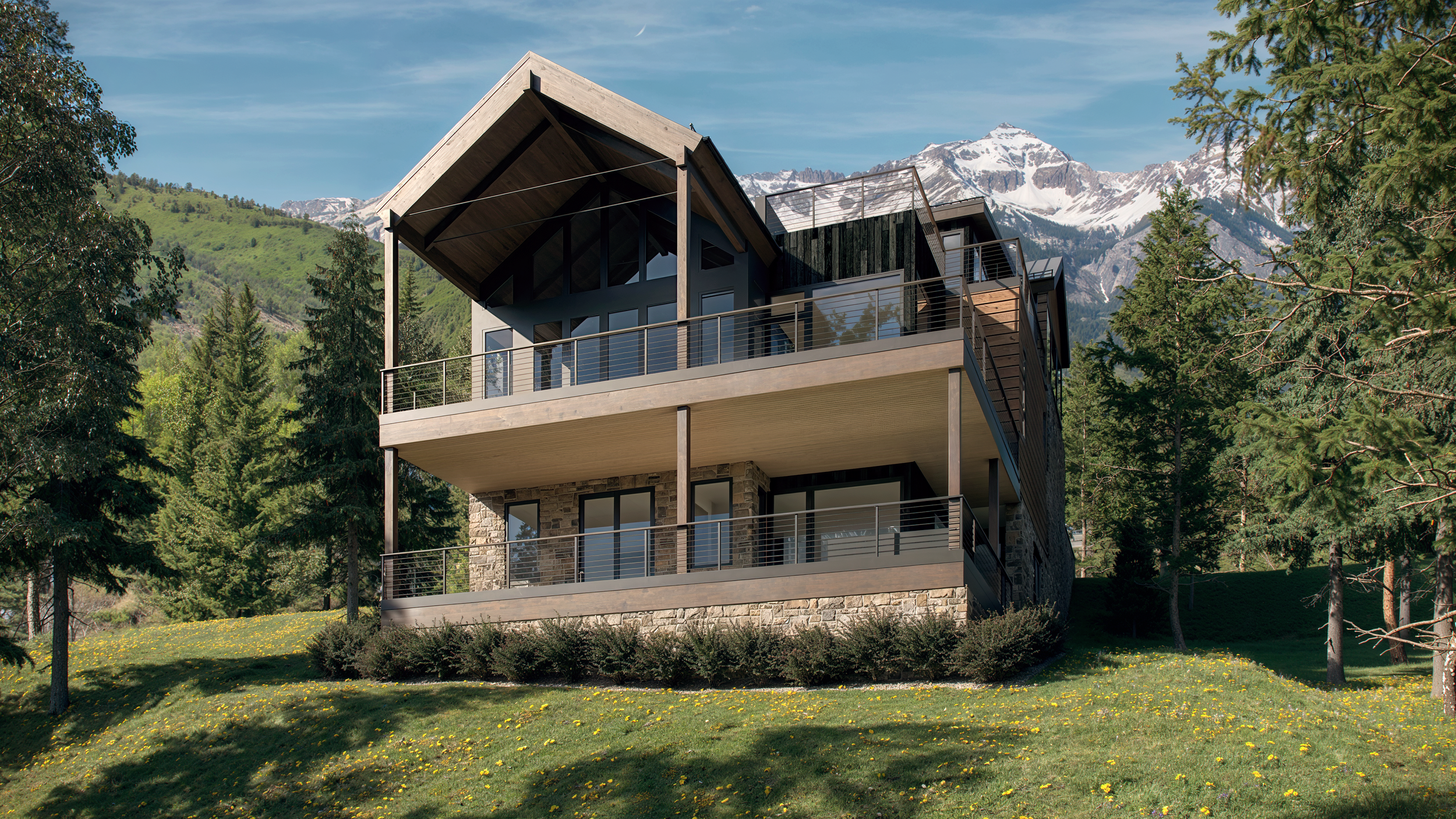
The Colorado Gold Hill Mountain House rendering in this piece captures the majestic presence of a contemporary mountain home set against a breathtaking alpine backdrop. The structure is a harmonious blend of modern architectural lines and natural materials, skillfully integrating sleek metal roofing with textured stone and warm wood cladding. This choice of materials complements the surrounding landscape and echoes its environment's rugged elegance. The play of light and shadow across the facade adds depth and dimension, enhancing the photographic quality of the piece.
The perspective you've chosen for this Colorado Gold Hill Mountain House rendering highlights the balance between the home's geometric precision and nature's organic forms. The composition is thoughtfully crafted, leading the viewer's eye through the scene and inviting exploration of the architectural details, such as the expansive windows that seem to ask the outside in. The lush greenery framing the home further enhances the tranquility and connection to nature, evoking a sense of calm and contemplation.
The illustrator's capture of the essence of the location is substantial. It allows the viewer to feel as if they are physically present, standing in the shadows of the trees with the crisp mountain air enveloping them. This immersive quality is commendable and showcases a keen eye for detail and atmosphere.
Remember that art is a journey, and each creation provides an opportunity to discover new facets of the subject and personal artistic style. Keep embracing the majestic interplay between architecture and nature, offering endless inspiration and beauty.
Did you enjoy this article? I would love to hear your thoughts, so don’t be shy. Comment below! Please don’t forget to subscribe to my RSS-feed or follow my feed on Twitter and Facebook. ! If you enjoyed the following article, we humbly ask you to comment and help us spread the word! Or, if you would like, drop me an email.

The Power of Architectural Animations in Modern Design
Architectural animations have revolutionized how architects, designers, and clients visualize spaces before they are built. Unlike static renderings, these animations bring projects to life through dynamic, immersive storytelling.
Architectural animations, with their incorporation of motion, lighting effects, and realistic textures, allow viewers to experience space as if walking through it. This not only enhances client presentations but also plays a crucial role in identifying design flaws and improving spatial planning, thereby ensuring a more efficient and effective construction process.
Architectural animations are versatile tools that find applications in various fields, including real estate marketing. They enable developers and investors to better understand a building's flow, how natural light interacts with the space, and how materials look in different conditions, thereby enhancing the marketing of properties.
Architectural animations are not just about aesthetics. They are powerful communication tools that bridge the gap between designers and clients. By conveying complex design concepts in an engaging and accessible manner, they speed up decision-making and make the design process more efficient.
As technology continues to advance, architectural animations are poised to play an even more crucial role in shaping the future of architectural visualization. This promises a future where design is more interactive, efficient, and inspiring, leaving architects, designers, and clients alike, excited about the possibilities.
Did you enjoy this article? I would love to hear your thoughts, so don’t be shy. Comment below! Please don’t forget to subscribe to my RSS-feed or follow my feed on Twitter and Facebook. ! If you enjoyed the following article, we humbly ask you to comment and help us spread the word! Or, if you would like, drop me an email.

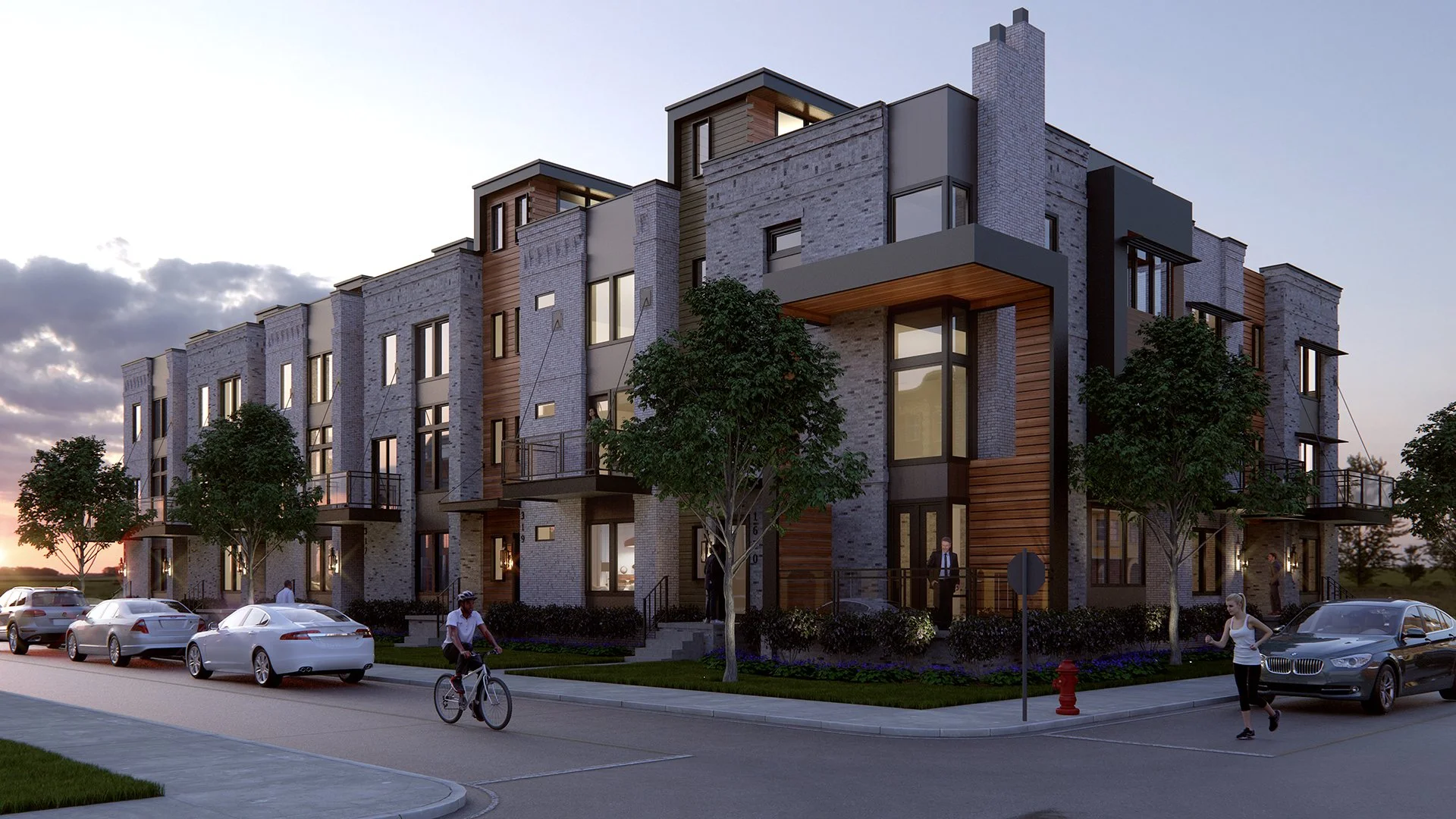
93 Bedford St Townhome Renderings


This townhouse rendering is an impressive composition capturing a serene townhouse scene. The focal point is a well-maintained, multi-story building with classic architectural features like symmetrical lines, large windows, and balconies. The building's light beige and cream tones are enhanced by the soft natural lighting, creating a warm and inviting atmosphere. The artist skillfully utilizes the time of day to capture shadows that add depth and dimension to the setting. In the foreground, a person on a bicycle adds a dynamic element, introducing a sense of movement and everyday life, while the surrounding greenery complements the calm and peaceful ambiance.
The strengths of this piece lie in its ability to evoke a sense of harmony and suburban tranquility. The choice of colors and lighting vividly captures an authentic and inviting moment. The balance between the architectural structure and the natural elements is well executed, suggesting a thoughtful consideration of composition.
Overall, the rendering successfully creates a welcoming narrative about community and serenity. Such compositions inspire viewers to appreciate the beauty in everyday settings. The interplay between structure and nature is compelling, underscoring the timeless appeal of well-captured environmental interactions. Keep exploring these themes, as they resonate well with audiences seeking a connection to the human and natural worlds.
Did you enjoy this article? I would love to hear your thoughts, so don’t be shy. Comment below! Please don’t forget to subscribe to my RSS-feed or follow my feed on Twitter and Facebook. ! If you enjoyed the following article, we humbly ask you to comment and help us spread the word! Or, if you would like, drop me an email.
Twilight Architectural Renderings: Capturing Mood & Atmosphere
Twilight Architectural Renderings: Capturing Mood & Atmosphere
Twilight architectural renderings, a unique visualization tool, bring designs to life with stunning realism and atmosphere. Unlike standard daytime renders, twilight scenes showcase buildings during dusk or dawn, when natural and artificial lighting blend harmoniously. This technique enhances the aesthetic appeal of structures by emphasizing warm interior glows, reflective surfaces, and ambient shadows, making the design more inviting and dynamic.
Twilight renderings, versatile in their application, are particularly effective for a wide range of residential and commercial projects. They help architects, designers, and developers convey a space's full potential, evoke emotion, and create a sense of place. This makes them ideal for marketing materials, client presentations, and real estate listings. By incorporating subtle lighting details, such as street lamps, illuminated windows, and landscape lighting, twilight renderings elevate the storytelling aspect of architectural visualization.
Creating a high-quality twilight render requires expertise in lighting, color balance, and post-production techniques. Software like V-Ray, Lumion, and Twinmotion allows artists to manipulate the environment, ensuring realistic reflections and accurate lighting. Whether highlighting a luxury home, a sleek office tower, or an urban streetscape, twilight architectural renderings add a touch of sophistication, depth, and mood that can elevate any project to a new level of elegance.
For architects and developers looking to captivate audiences, twilight renderings are essential in modern architectural visualization.

Did you enjoy this article? I would love to hear your thoughts, so don’t be shy. Comment below! Please don’t forget to subscribe to my RSS-feed or follow my feed on Twitter and Facebook. ! If you enjoyed the following article, we humbly ask you to comment and help us spread the word! Or, if you would like, drop me an email.

Chowan Tropical house
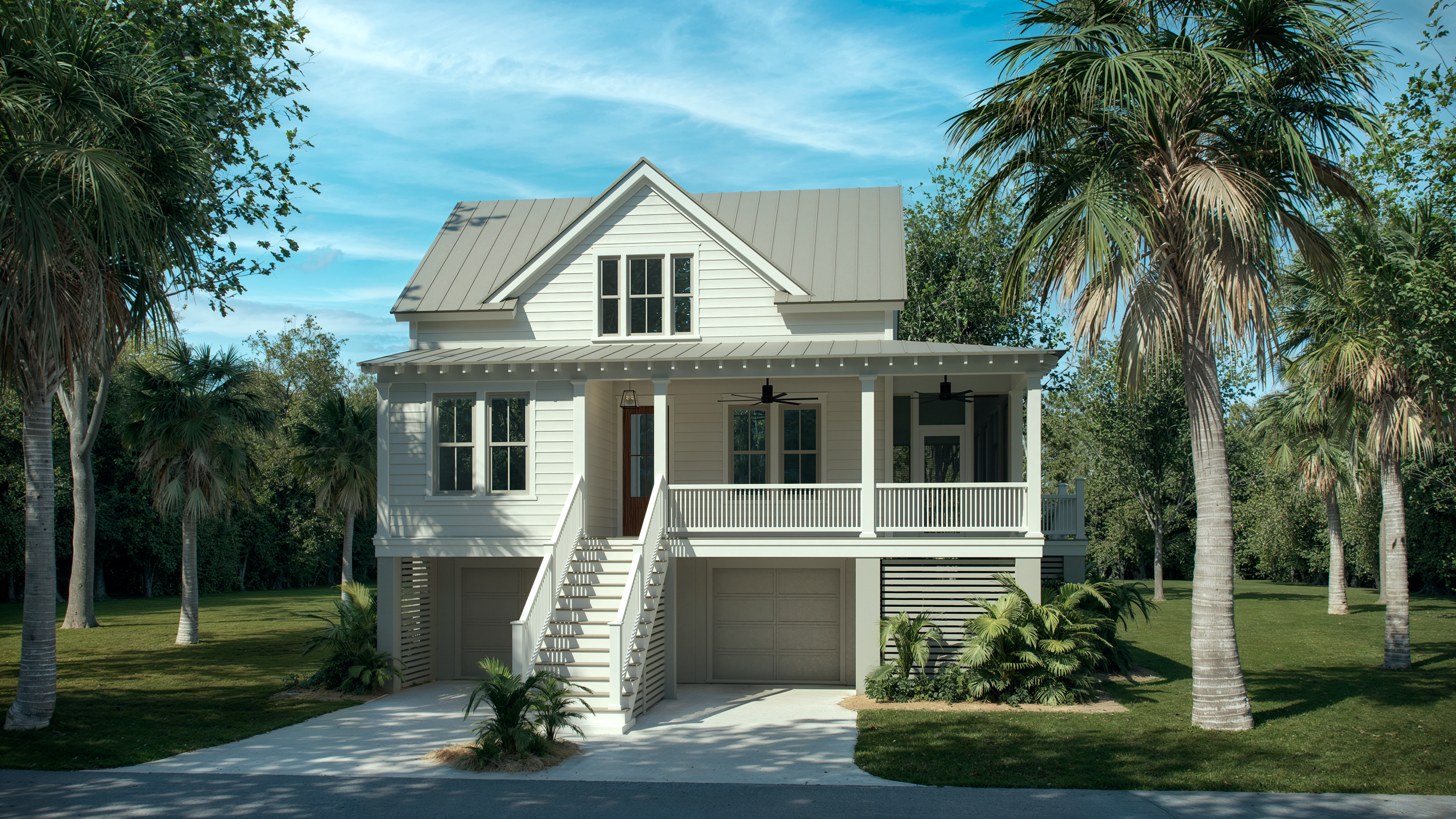

The Chowan Tropical house rendering captures a serene setting of a charming house amidst lush greenery, with the sun casting gentle shadows across the scene. The house, elevated with a staircase leading to its inviting porch, is painted in soft, welcoming tones that harmonize beautifully with the tranquil blue sky and the vibrant natural surroundings. Palm trees add an element of tropical warmth and frame the house in a way that draws the viewer's attention toward the cozy residence while maintaining a balance with nature. The simple yet elegant architecture evokes calmness and comfort, suggesting an ideal tranquil retreat.
This piece successfully conveys a peaceful and inviting atmosphere. The choice of colors is commendable, with the cool blues and greens beautifully complementing the warm tones of the house, creating a balanced and pleasing aesthetic. The composition effectively guides the viewer's eye, from the greenery to the structural details of the house, encouraging exploration and evoking a sense of wonder about life within such an idyllic setting.
The Chowan Tropical house rendering is a strong foundation, reflecting a keen eye for composition and atmosphere, inviting viewers into the serene world you have captured. Art is a deeply personal journey, and these suggestions aim to inspire further exploration and creative expression.
Did you enjoy this article? I would love to hear your thoughts, so don’t be shy. Comment below! Please don’t forget to subscribe to my RSS-feed or follow my feed on Twitter and Facebook. ! If you enjoyed the following article, we humbly ask you to comment and help us spread the word! Or, if you would like, drop me an email.

Elder Care Rendering
An elder care rendering is a visual representation—such as a 3D model, illustration, or conceptual drawing—of a senior living facility, home modification, or assistive care environment. It can be useful in various ways, including:
1. Facility Design & Development
Architects and developers use renderings to plan and visualize retirement communities, assisted living facilities, or nursing homes before construction.
Helps optimize space for accessibility, comfort, and safety.
2. Marketing & Fundraising
Senior care providers can use renderings to attract investors or donors by showcasing high-quality care environments.
Can be used in brochures, websites, and presentations to promote a facility to potential residents and families.
3. Family & Resident Decision-Making
Helps seniors and their families visualize the living spaces, amenities, and accommodations before moving in.
Provides reassurance about the quality and design of a care facility.
4. Regulatory Approvals & Compliance
Aids in presenting designs to regulatory bodies to ensure compliance with accessibility and health standards.
Helps in discussions with city planners, zoning boards, and health departments.
5. Staff Training & Workflow Planning
Caregivers and staff can use renderings to understand the layout of a facility, emergency exits, and care stations.
Helps improve operational efficiency and patient care planning.
Would you like help creating or refining an elder care rendering?


Did you enjoy this article? I would love to hear your thoughts, so don’t be shy. Comment below! Please don’t forget to subscribe to my RSS-feed or follow my feed on Twitter and Facebook. ! If you enjoyed the following article, we humbly ask you to comment and help us spread the word! Or, if you would like, drop me an email.

Charming, Single-Story House Rendering
Charming, Single-Story House Rendering
The artwork renders a charming, single-story house in a serene environment. With its classic design, the home boasts a clean, crisp facade. The light-colored siding and contrasting dark roof give it an inviting appearance. The white windows and garage door accents enhance the aesthetic, adding a touch of elegance and harmony with the surrounding nature. The neatly manicured lawn and subtle landscaping elements contribute to the peaceful atmosphere of the scene.
This rendering beautifully captures the harmony between architecture and nature. The composition is meticulously balanced, comfortably framed by the lush greenery in the background. The natural lighting is well-utilized, highlighting the house's features and creating a sense of warmth and tranquility. This enhances the inviting nature of the home, evoking feelings of comfort and serenity.
The artist's keen eye for detail effectively captures the structure's symmetry and clean lines. This attention to detail underscores an appreciation for architectural design, making the piece resonate with aspects of minimalist beauty, a style that focuses on simplicity and the use of space. The blend of natural elements and human-made structures is adeptly portrayed, emphasizing a sense of coexistence and balance.
This piece showcases a delightful snapshot of home and nature, celebrating their interconnectedness in a serene setting.
Did you enjoy this article? I would love to hear your thoughts, so don’t be shy. Comment below! Please don’t forget to subscribe to my RSS-feed or follow my feed on Twitter and Facebook. ! If you enjoyed the following article, we humbly ask you to comment and help us spread the word! Or, if you would like, drop me an email.