

BLOG
Foundations of Drawing with Will Kemp
Anyone can learn how to draw. Success comes down to three things:
Shape: By focusing on the shapes of the objects (and more importantly the shapes betweenthe objects) you can view subjects with a whole new outlook and focus.
Simplicity: You'll get better results by concentrating on simple subjects and drawing techniques that will still prove powerful when used together.
Structure: A structured approach makes drawing easier to master.
Each chapter in this course is built on these three principles, combining drawing theory and practical examples with worksheets and drawing assignments. Will Kemp brings his passion for teaching and infectious love of drawing together in these lessons. You'll learn about line, value, tone, negative space, and perspective, and come away with the confidence to start making drawing a daily practice.
This course was created and produced by Will Kemp. We're honored to host this training in our library.
Topics include:
- Materials you need to draw
- Drawing theory
- Framing your composition
- Using the picture plane
- Creating contrast
- Using negative space to create more powerful compositions
- Creating form from shadows and light
Did you enjoy this article? I would love to hear your thoughts, so don’t be shy and comment below! Please don’t forget to subscribe to my RSS-feed or follow my feed on Twitter, Google+ and Facebook! If you enjoyed the following article we humbly ask you to comment, and help us spread the word! Or, if you would like, drop me an email.
Create Depth in Your Architectural Rendering
Ever wondered how artists get that awesome sense of depth in their architectural renderings? It's all about perspective and, here is how you can apply this to your own architectural rendering.
Color plays an important role in perspective renderings!
Once you understand the color part of your perspective, you’ll be able to create stunning architectural rendering with ease.
When your rendering recedes three essential things become apparent.
- Background = Neutral (and bluish) and Foreground = Saturated
- Background = Less contrasted and Foreground is = Contrasted
- Background = Cooler and Foreground = Warmer
This is how the eye naturally sees.
Cole Thomas The Oxbow
Did you enjoy this article? I would love to hear your thoughts, so don’t be shy and comment below! Please don’t forget to subscribe to my RSS-feed or follow my feed on Twitter, Google+ and Facebook! If you enjoyed the following article we humbly ask you to comment, and help us spread the word! Or, if you would like, drop me an email.
Exterior Architectural Rendering Camera Settings
Follow These Composition Tips:
- Use a high f-stop - (such as f-16) to keep your entire rendering in focus. This will ensure that every part of the building in your frame will be sharp.
- Use the rule of thirds to line up the horizon with either the top or bottom third of the frame. Following this basic rule of composition will draw the viewer in.

The water is more important, so the horizon is sitting on the top 1/3rd

The sky is more important, so the horizon is sitting on the bottom 1/3rd
Did you enjoy this article? I would love to hear your thoughts, so don’t be shy and comment below! Please don’t forget to subscribe to my RSS-feed or follow my feed on Twitter, Google+ and Facebook! If you enjoyed the following article we humbly ask you to comment, and help us spread the word! Or, if you would like, drop me an email.
GRID Virtualized Graphics Acceleration
Take the free GRID test drive and experience virtualized graphics acceleration delivered from the cloud.
Experience the NVIDIA GRID Test Drive from the comfort of your PC. It only takes a few minutes to register and you get immediate access to the secure NVIDIA Test Drive site. Once there, you have 24 hours to experience some of the most demanding applications running from the cloud.
You will see how NVIDIA GRID:
- Delivers a better experience for remote desktops and applications
- Can run graphics-rich applications in a virtualized environment
- Handles complex graphics files and images
Important note: the Test Drive is for North America only
- See more at: http://www.nvidia.com/object/trygrid.html#sthash.qQrgZHGt.dpuf
Did you enjoy this article? I would love to hear your thoughts, so don’t be shy and comment below! Please don’t forget to subscribe to my RSS-feed or follow my feed on Twitter, Google+ and Facebook! If you enjoyed the following article we humbly ask you to comment, and help us spread the word! Or, if you would like, drop me an email.
Coolorus 2.0 for Photoshop®
Coolorus is a Color Wheel Panel for Adobe Products (Photoshop and Flash) and all native Mac apps that uses native Apple color picker.
Coolorus is for creative people who would like to improve workflow as much as possible. Reducing clicks to the minimum, learn about Color Relations, Gamut Masks and the power of triangle HSV representation.

Did you enjoy this article? I would love to hear your thoughts, so don’t be shy and comment below! Please don’t forget to subscribe to my RSS-feed or follow my feed on Twitter, Google+ and Facebook! If you enjoyed the following article we humbly ask you to comment, and help us spread the word! Or, if you would like, drop me an email.
Learn How To Use Your VRay Camera like a DSL.
Shutterfly’s New Interactive Guide Teaches the Basics of Capturing Better Images
There’s no such thing as too many resources when it comes to learning how to render out an awesome image. And here to prove this statement is a neat little pseudo-interactive web guide put together by Shutterfly for those among us who are just starting out. Called How to Take the Perfect Photo, this web-based guide is a simple-but-efficient tool for anyone looking to get a bit more .

Use these tips to create a better composition in your 3DSMAX scene.
Did you enjoy this article? I would love to hear your thoughts, so don’t be shy and comment below! Please don’t forget to subscribe to my RSS-feed or follow my feed on Twitter, Google+ and Facebook! If you enjoyed the following article we humbly ask you to comment, and help us spread the word! Or, if you would like, drop me an email.
The Right Perspective And Field Of View
By watching the tutorial below, you’ll be able to see how to make subtle changes to your images when using wide angle, long focus, and zoom lenses in order to truly be the master of what you capture.
Did you enjoy this article? I would love to hear your thoughts, so don’t be shy and comment below! Please don’t forget to subscribe to my RSS-feed or follow my feed on Twitter, Google+ and Facebook! If you enjoyed the following article we humbly ask you to comment, and help us spread the word! Or, if you would like, drop me an email.
V-Ray Mag - Issue 1, 2014
Get an in-depth look into the world of V-Ray with the new V-Ray Mag Issue 1, 2014.

Did you enjoy this article? I would love to hear your thoughts, so don’t be shy and comment below! Please don’t forget to subscribe to my RSS-feed or follow my feed on Twitter, Google+ and Facebook! If you enjoyed the following article we humbly ask you to comment, and help us spread the word! Or, if you would like, drop me an email.
Think About Symmetry With Your Light Source
Lighting has three main purposes:
- an illusion of depth (modeling).
- Create a mood.
- Normalize (or, conversely, emphasize) the subject's features.
Once you’ve worked out your composition and thought about the symmetry of the objects within it, you’re going to have to consider where your light source is coming from. Research has been done into which direction of lighting people respond to best and guess what? People generally prefer paintings lit from the left. Of course, this doesn’t mean you can’t have your light source coming from the right if you want to (and we’ve experimented with both), but you might just find your rendering will work better in some cases if you have it coming from the left.
Now here’s an interesting one. Researchers looked at more than 1000 European portrait paintings produced from the 16th until the 20th century and were surprised at what they found. Almost 60 percent of the time, the subject had their left cheek turned towards the viewer.
Why is this? Some analysts think it’s all to do with our left-right preferences again and our instinctive love of symmetry in art. It’s not always the case though, and it looks as if social standing has some influence on whether it’s the left or the right cheek that’s facing the viewer. For example, academics such as scientists are often painted or photographed with their faces inclined to the right.
Did you enjoy this article? I would love to hear your thoughts, so don’t be shy and comment below! Please don’t forget to subscribe to my RSS-feed or follow my feed on Twitter, Google+ and Facebook! If you enjoyed the following article we humbly ask you to comment, and help us spread the word! Or, if you would like, drop me an email.
B'Safe Commercial Tornado Shelters
Although not my typical client, but a returning client nevertheless, this was a nice project to work on for a few days.
Here, are some illustrations that I completed for B'Safe Commercial Tornado Shelters. Although they might look like simple boxes, sitting on some grass in the field, they were a bit challenging to make look natural.
B'Safe Commercial Tornado Shelters
B'Safe Commercial Tornado Shelters
Attention Commercial and Industrial! The B'Safe Commercial Tornado Shelters stand as the best compliant and engineer certified shelters in the industry and provide your safest solution for protection when the weather turns deadly. B'Safe© Commercial Tornado Shelters are now available for PURCHASE.
...and we deliver anywhere in the United States!
13 Things you shouldn't do in Architectural Renderings
13 Things you shouldn't do in Architectural Renderings

Andrew Price created an awesome list of the "13 Deadly Sins of Architectural Rendering"
There are 13 things that you should not do, and 13 things that you should do in architectural renderings.
Those things are:
- Too Bright- You do not want to have too much sunlight in a room. Having too much light can drown out the entire room. If you have nice designs and too much light in that room, you may not be able to see the designs. Having shadow is good, as it can show designs better sometimes.
- Too Many Colors- In each room of your house, you should never have more than 3 different colors. Having too many colors can take away from the beauty of the main colors of your walls and or designs.
- Neglecting Composition- Composition is very important. You should pay close attention to the photography and the frames as well. Coordinating them to the design of your room is crucial, as you do not want to put a photo and picture frame that does not match good with the color and design of the room they are in.
- Wide Lenses- It is better to use a tighter frame when you are trying to capture a scene for a room. Using narrow lenses can take away the important things out of the scene.
- Too Diffused- Texture is important to have for every room, as you want a little bit of reflection, but not too much. Just a little amount of gloss is good, but you do not want to have too much as it can leave oily hand prints on the walls.
- No Focal Point- You will want something such as a nice fireplace or a nice artwork piece that will draw attention to viewers so that the room can have the added focal point.
- Tilting The Camera- You always want to make sure that you hold the camera in the middle of a room, when taking a picture, so that you do not cut off the edge of a picture, or have the upside or downside of a picture.
- Personality- Your interior scenes need to have personality, as no personality can make a room dull and boring.
- Boring Ceilings- You are going to want a different visual scene for the ceiling, as just a plain texture can make the entire room dull. Wallpaper, or ceiling fans are great to have for the ceiling.
- No Nature- Having trees and plants gives the outside of your home personality, and makes it attractive for the viewers. It also helps to give a story behind the home, and a relaxed atmosphere.
- Low Visual Interest- Texture, patterns, contrast, and colors are important. Putting a plant in front of a plain colored wall gives the room texture. You can also put a piece of artwork in front of the wall, but you do not want to go overboard.
- No Harmony- You want to be careful to not pick out furniture that will not match or look good together. You have to pay attention to the whole scene.
- No Point- Always makes sure that you have something that will be eye catching, and attractive to a room. But make sure that the architectural renderings go in contrast with the room as well.
If you want to learn about lighting, start with a camera.
If you want to learn about lighting, start with a camera.
What I learned most from was a tiny manual camera. I learned so much from adjusting the f-stop, changing to different lenses. I have a digital camera now, but I use manual settings. I think it’s really, really important. Changing one setting can screw up an entire photo. If you’re always using auto settings, it’s hard to learn.

Artists Interviews on the Pencil Kings Art Podcast!
We’ve been working to bring you a weekly art podcast featuring artist interviews with the same kind of artists that you’ve grown to love on the Pencil Kings Facebook page.
This first episode will give you a taste of what’s coming up in the following weeks as we dive deep into the stories behind the artwork and get to know the creators in a one on one basis.
You’ll quickly discover that the path to being an artist is anything but easy, but the rewards that each of our guests has experienced far outweighs the often unclear and difficult path that they had to walk to get to where they are now.
While you’re listening you’ll also get to experience how these artists got their breakthrough moments, what they did to get started and what they did when they were faced with failure and difficult challenges.
You’ll also learn all about how these artists were able to translate their creative skills into viable careers so that they can continue to be creative and get paid while they’re at it. Don’t be surprised that if while you’re listening you find yourself getting inspired, uplifted and driven to make a clear path with your own art career.
- See more at: http://www.pencilkings.com/art-podcast/#sthash.G39CmgC4.dpuf
Be an artist, right now!

TEDxSeoul · 16:57 · Filmed Jul 2010
Why do we ever stop playing and creating? With charm and humor, celebrated Korean author Young-ha Kim invokes the world's greatest artists to urge you to unleash your inner child — the artist who wanted to play forever. (Filmed at TEDxSeoul.)
Blue Hour Renderings
The blue hour is a time of twilight each morning and evening where there is neither full daylight nor complete darkness. The time is regarded distinctive because of the character of the light. Artists call it sweet light. Go ahead, try it on your next architectural rendering.

The Colosseum during the blue hour
Success, Failure and the Drive to Keep Creating
Elizabeth Gilbert was once an "unpublished diner waitress," devastated by rejection letters. And yet, in the wake of the success of 'Eat, Pray, Love,' she found herself identifying strongly with her former self. With beautiful insight, Gilbert reflects on why success can be as disorienting as failure and offers a simple — though hard — way to carry on, regardless of outcomes.

This talk was presented at an official TED conference, and was featured by our editors on the home page.
Great Art Quote
“Those who do not want to imitate anything, produce nothing.”
Advance2000
I am benchmark testing a desktop as a service (DAAS) called Advance 2000, and thus far, I am impressed! The company has been around for awhile, so they have a solid understanding of the needs of the Architecture, Engineering & Construction (AEC) industry.

Here, is the scene I used.
The scene I used does use one plug-in, which I have uploaded here. I am in the middle of the test so I will post the results soon. I am using Chaos Group's V-Ray. and Autodesk's 3ds Max®, for my testing.
2 - Intel Xeon CPU X5680 @ 3.33GHz, 32.0GB, NVIDIA GeForce GTX 670 (Advance2000 Cloud)
My Advance2000 cloud render, running 2 Intel Xeons, took 1h 29m 32.7s. You can see the computer specs under the above final render.
1 - intel(R) Core i7 CPU 965 @ 3.20GHz (8 CPUs), 24.0GB, NVIDIA Quadro K5000 4095 MB (local farm)
4 - Intel(R) Core(TM) i7 CPU 920 @ 2.67GHz (8 CPUs), 12.0GB, Stock video card (local farm)
My local render farm, running 5 Intel i7s , took 1h 7m 58.9s. You can see the computer specs under the above final render.
So, we are almost running neck to neck, but in their lane is 2 rigs, and on my side is 5 rigs. Mind you, my rigs are about 7 years old and have already paid for themselves 10x.
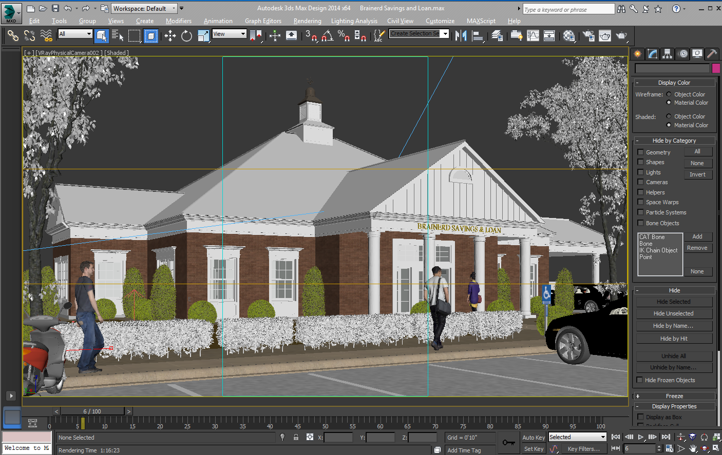
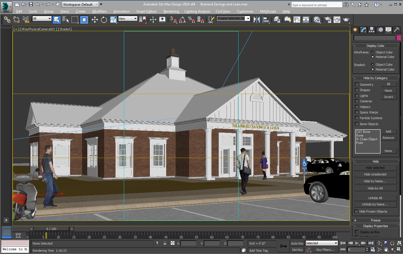
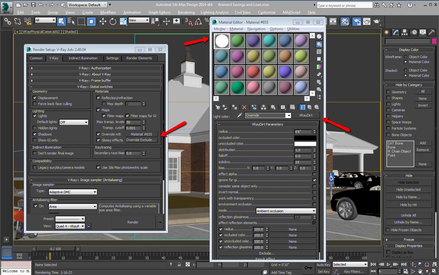
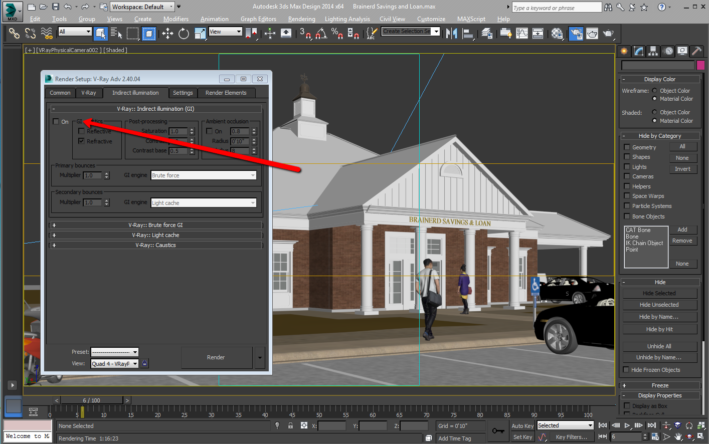
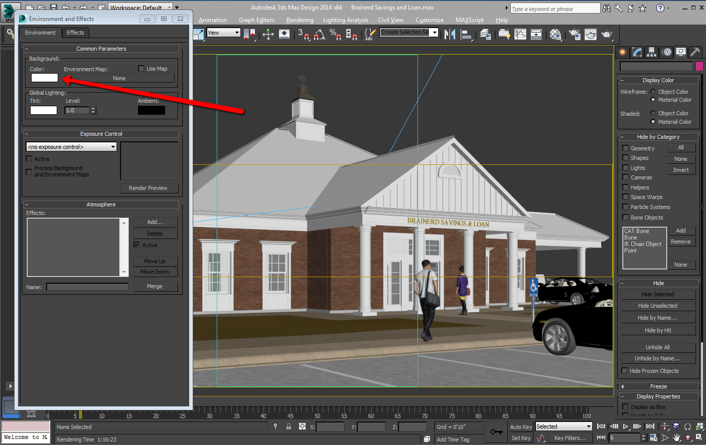
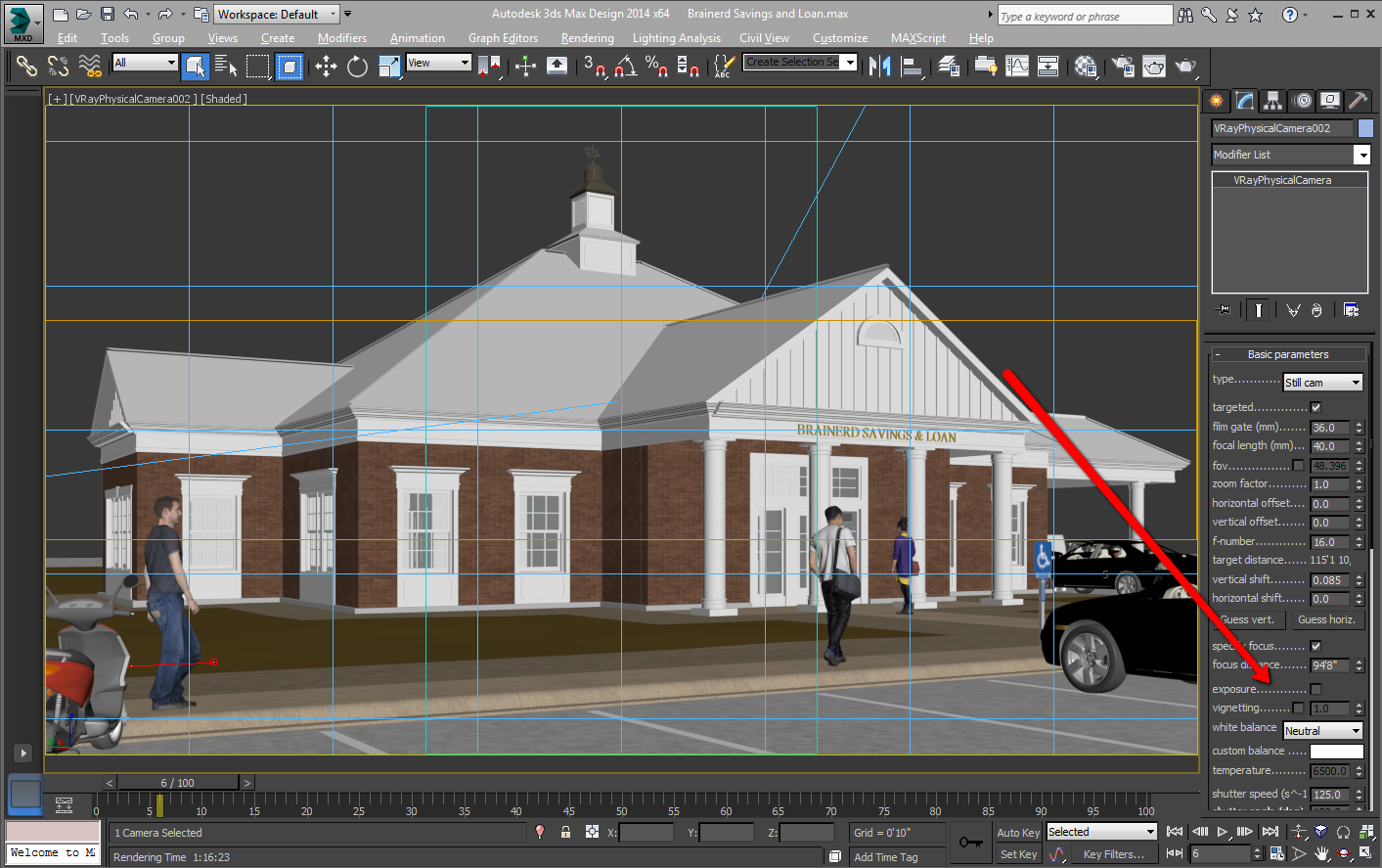
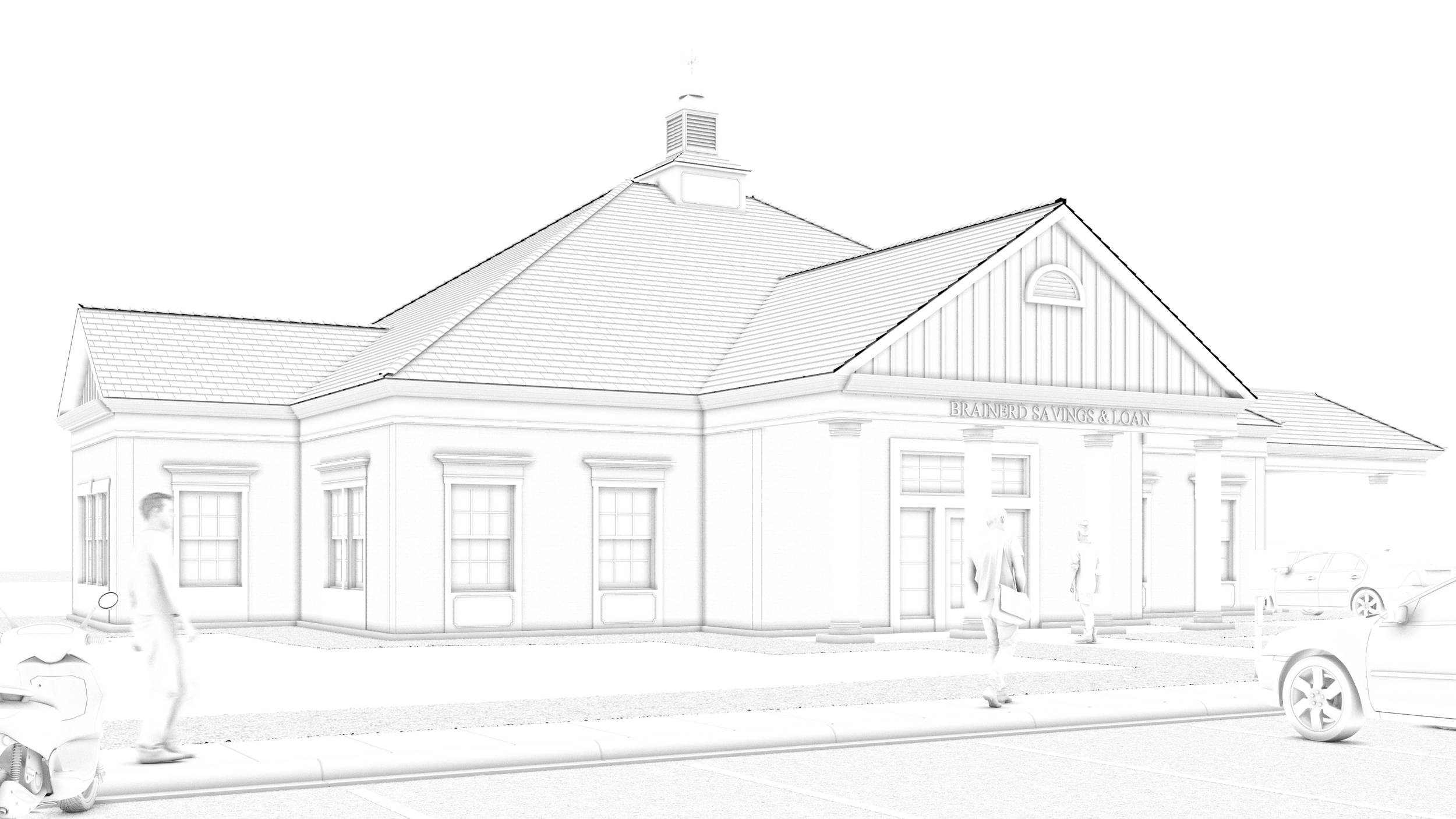
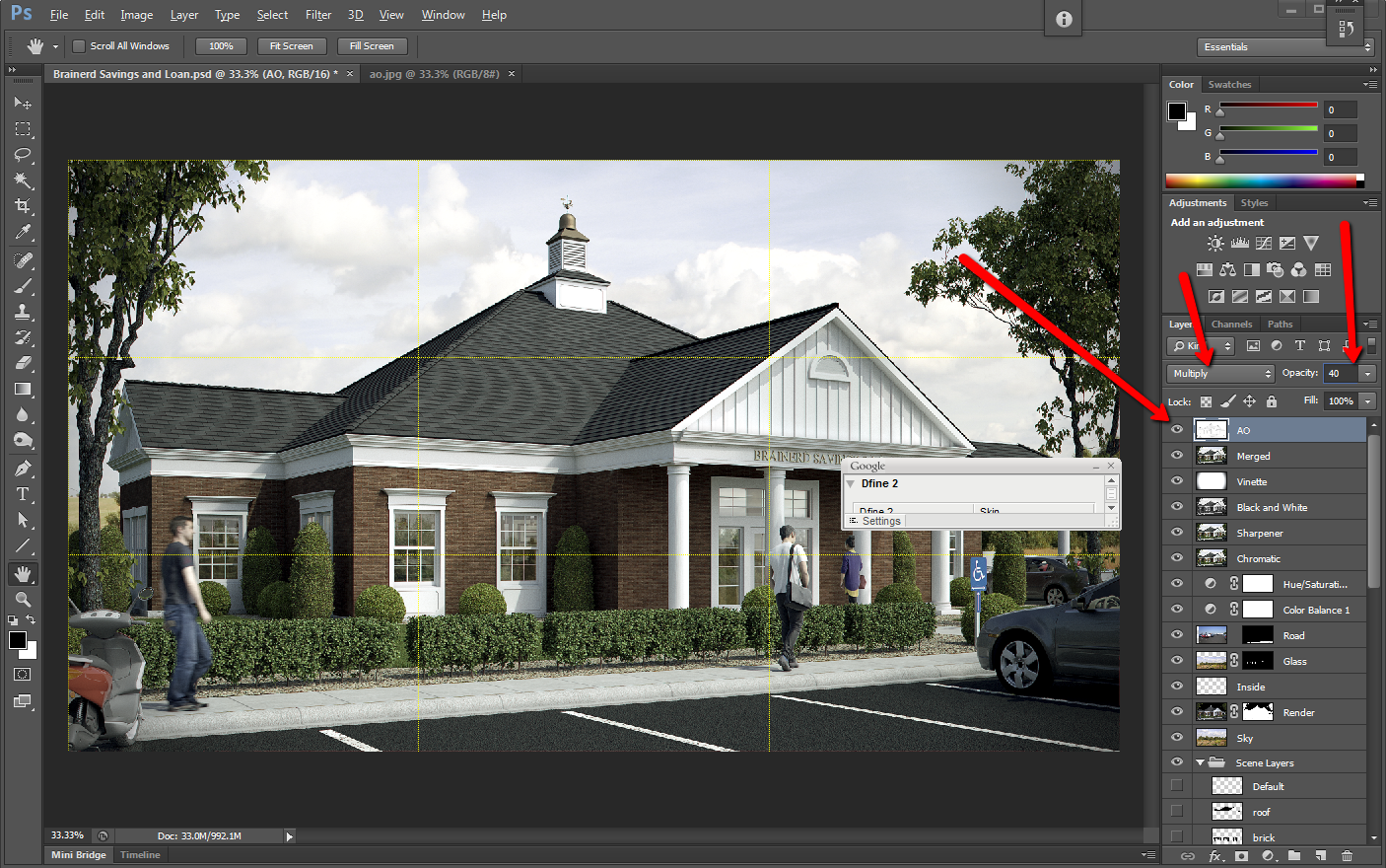
Ambient Occlusion Made Simple
I have tried scripts, plugins, and many other things to get a clean ambient occlusion pass, and this is my prefered method. I use Autodesk's 3DSMAX Design, Chaos Group's V-Ray, and Adobe's Photoshop.
In computer graphics, ambient occlusion is used to represent how exposed each point in a scene is to ambient lighting
An ambient occlusion pass is an easy way to add detail to your fine lines, and it also dirties up your rendering, for a more realistic image.
Lighting Ratio
Lighting Ratio
It’s easy to underestimate the tonal separation between the light side and the shadow side in sunlight. When lighting experts set up artificial lights for a movie shot, they call this separation the lighting ratio, and they usually try to reduce it to cancel the unflattering effect of harsh or dark shadows.
As artists we may want to do the same, depending on the feeling we want to create. But most often, beginning illustrators tend to ignore the dominance of direct illumination and play up secondary sources too much.
If you’re counting steps on a value scale from 1 to 10, you might typically see five steps of tone from sunlight to shadow, or two f-stops on a camera’s aperture setting. The separation would be reduced if there were high clouds, hazy atmosphere, or a light-colored ground surface.
The tonal scale ranges along a gradation from black to white, and all colors have an equivalent somewhere along that scale. As you practice this approach, you will become aware of occasions when it was actually the play of light on the subject that initially inspired you. You should start to try looking for tonal contrasts in the world around you, and begin to consider the play of tonal differences within a piece as an essential part of the composition.

Above: Colors you may perceive as being very different may actually be extremely close on the tonal scale. A slight variation in ‘color’ (tone) can make a big difference to your painting
Try bearing these three points in mind:
- Instead of asking what shape the object is, ask how the lights and darks flow across its surface. It is perfectly possible to depict the form of an object simply by using gradated tonal marks, without drawing a single line.
- Instead of searching for detail, ask whether some detail is difficult to see because it is in an area of shadow. This can be helpful in avoiding painting what you ‘know’ to be there, and in introducing some interest to the composition in terms of lost and found edges.
- Instead of asking what color it is, ask first where the area being considered sits on the tonal scale before asking where it sits on the color spectrum.