

BLOG
Breathing Space
Position your subject so there is sufficient "breathing room" between the front of your subject and the rendering border. Otherwise, things can appear cramped or crowded-even off-balance. It's unnerving for the viewer to see a subject just about to leave the frame.
Did you enjoy this blog post? If so, then why not:
Leave Comment | Subscribe To This Blog | Email Me
Keep An Open Mind
A major part of any staging process involved trail and error, shifting objects around while paying close attention to how the objects interact. Consider how colors overlap, how objects cast shadow on one another and how certain effects are more pleasing than others.
Here Are 7 Tips For Better Composition.
- Have a basic layout in mind, vertical or horizontal.
- Have reference photos
- Removing objects can be as helpful as adding new ones
- Experiment
- Cast shadows are a wonderful way to explain form. A shadow gives solidity to the object casting the shadow, and the shape of the shadow can help explain other forms as well.
- As you refine a composition, pay attention diagonal lines and angles created by objects; try to make diagonals more interesting through a slight adjustment. Also avoid creating tangents (places where objects abut or overlap one another) that are visually confusing.
- Be open to removing something if it isn't working, even towards the end of th process. Fine tuning the negative spacing, as well as the way the various shapes overlap.

Did you enjoy this blog post? If so, then why not:
Leave Comment | Subscribe To This Blog | Email Me
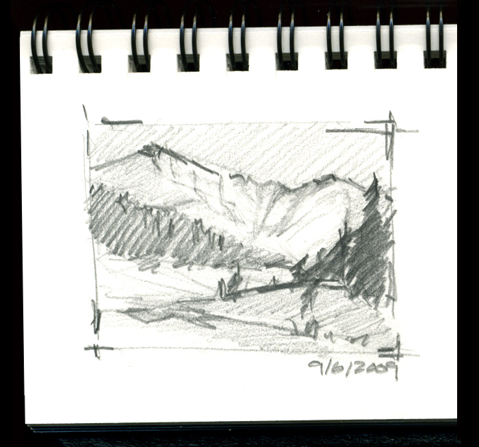
Thumbnail Sketches
Sketching is a good way to build your composition with simple shapes, lines, and tone. Nobody has to see your sketches, and they don't need to be refined; just start sketching. Start with simple shapes, and build upon that. Your sketches can fall into three groups.
Croquis
A Croquis is a thumbnail sketches that establish the image's main concept and sets the composition by indicating the most important shapes and values.
Esquisse
An Esquisse is a refined version of the Croquis: a more resolved thumbnail with a refined value structure and something closer to the final composition.
Étude
Is a drawing of an individual natural element, such as a tree, a patch of undergrowth, or a rock outcropping.
Did you enjoy this blog post? If so, then why not:
Leave Comment | Subscribe To This Blog | Email Me
Creating a Strong Composition
The composition should be simple, and it should be about one thing, or concept. A deft artist can make even the most mundane subject interesting.
- When in doubt, keep it simple. Less is more.
- Take time to plan out your composition.
- interesting renderings have a harmonious balance of opposites, such as cool and warm, dark and light, thick and thin textures, detail and ambiguity, and hard and soft edges.
- The unequal treatment of these elements is pleasing to our senses.
Seek an interesting flow of eye movement - avoid a static composition.
Great compositions don’t just happen by accident. They take planning, patience, and a knowledge of all the visual elements at your disposal.

Did you enjoy this blog post? If so, then why not:
Leave Comment | Subscribe To This Blog | Email Me
Side Lighting in CG
Side lighting emphasizes an object's mass and helps develop the contours of its form; however, a light placed directly in front of the object (or multiple lights evenly spaced on either side) will seem to flatten the object by centering the highlight, restricting the shadow area, and limiting the range of value that defines the object. Not to be overlooked, of course, is the strength of the light source itself. Extreme drama often requires the greatest contrast possible.
Although lights and shadows exist in nature as the by-products of strict physical laws, CG artists often adjust them to enhance the three-dimensional effect of a rendering and/or provide greater compositional interest.

Did you enjoy this blog post? If so, then why not:
Leave Comment | Subscribe To This Blog | Email Me
Unnecessary Complexity
As a rendering develops, you may realize that the solution to various compositional problems are resulting in unnecessary complexity. Your rendering might be deteriorating into fragmentation, and it commonly results from the artist's working on one segment of the composition at a time. While this may be a necessary part of the developmental phase of the rendering, such as isolated solutions may result in a lack of visual unity in the overall composition. However, by applying the principle of the economy, the rendering may regain a sense of unity.
Employing the principle of the economy means composing with efficient expressing an idea as a simply and directly as possible with no arbitrary or excessive use of the elements. Economy has no rules but rather must be an outgrowth of the artist's instincts. If something works with respect to the whole, it is kept; if disruptive, it may be reworked or rejected. A rendering is most successful when you express your ideas as simply and directly as possible.

Did you enjoy this blog post? If so, then why not:
Leave Comment | Subscribe To This Blog | Email Me
Help Move The Eye Around The Rendering.
While developing a rendering, an artist strives for interest by creating differences that emphasize the degrees of importance of its various parts. These differences result from compositional considerations - some features are emphasized, and others are subordinated. This creates both primary focal points and secondary areas of interest that help move the eye around the rendering.
Areas become dominant when they are emphasized by contrasts that make them stand out from the rest. Contrast draws attention like the spotlight in a dramatic production or crescendo in a musical piece. In general, the greater the contrast, the greater the emphasis and the more dominant the area becomes.
Renderings that neglect varying degrees of dominance seem to imply that everything is of equal importance, resulting in a confusing rendering that gives the viewer no direction and fails to communicate.

Did you enjoy this blog post? If so, then why not:
Leave Comment | Subscribe To This Blog | Email Me
Balance
Gravity is universal, and we spend our daily lives resisting its influence. While walking, standing on one leg, or tipping back in a chair, we experience its effect and intuitively seek a state of balance.. When we are off balance, we have a strong fear that gravity will pull us over and we will fall down. Those expectations are so strongly ingrained in our subconscious that they also have an effect on the art we experience and produce. Most artwork is viewed in an upright orientation - in terms of top, sides, and bottom. as a result, gravity effects the visual composition.
Do you know why we frame our art? Artists often mat their work to gain an "aesthetic distance" or separation from the every day world. The hope is that we will see the work in a new context. But, even here, psychological factors can affect the visual weight and balance. In the case of a mat with two inch top, sides,and bottom, the bottom may have the illusion of being pinched or smaller than the other sides. This is an optical illusion that would make the artwork appear to be unstable, even rising on the wall. To compensate, the bottom measurement is generally made wider that that of the top and sides so that the whole rendering seems stabilized or balanced.

Did you enjoy this blog post? If so, then why not:
Leave Comment | Subscribe To This Blog | Email Me
A ground level view walks you right into the space
The most experiential and dynamic perspective is a ground level view. It offers the most telling opportunity to explain height and scale to our human dimensions, and through close proximity better explains choice of materials and perceived patterns/textures through color. The downside is that the further the point of interest is away the flatter and the less interesting the project. Plan element beyond 100' are harder to perceive by our standing 5'6" average eye height and must rely on more vertical element (people, vegetation and built forms) to perceive the use of that location.
To further the dynamic perspective, it is important to have a foreground,middle and background elements. This furthers the illusion of depth and can literally walk one into the rendering. What happens in the first 60 feet is the most dynamic area in the horizontal plane. If the horizontal plane is underdeveloped or unimportant, a worms eye view can increase the dynamic perspective and removes this area from the viewers perception.
In choosing a perspective, I create several perspective viewpoint based on requirements to best access the strength and weakness of each view and find that which I want to emphasis.

Did you enjoy this blog post? If so, then why not:
Leave Comment | Subscribe To This Blog | Email Me
How Low Can You Go?
Looking for a good way to raise the rendering bar? If possible, get down low, it's often just that simple. Rendering from a near-to-the-ground perspective is a surprisingly quick and effective method for making your rendering jump out from everyone else's
For example, most children are rendered from a typical grown-up height. For more emotionally engaging rendering, bring your camera to a kneeling height, to catch kids at their eye level.
All this goes for pets, too, as well as flowers and any other short subjects that can be captured low to the ground, For some subjects, you can combine a low perspective with getting close. This can further heighten the importance of small subjects by making them appear large in relation to their surroundings.
Outside on a sunny day include a bold blue sky as the background. For instance, get as low as you can go and then aim up at a subject such as a flower. This will let you include the sky as a colorful backdrop while treating your viewers to something new. I guarantee your viewers will appreciate your fresh take on things.

Did you enjoy this blog post? If so, then why not:
Leave Comment | Subscribe To This Blog | Email Me
Organic Unity = Art?
If an artist is successfully in welding all three of these components (subject, form, and content) in a work, they become inseparable, mutually interactive, and interrelated - as if they were a living organism, When this is achieved, we can say the work has organic unity, containing nothing that is unnecessary or distracting, with relationships that seem inevitable.

Did you enjoy this blog post? If so, then why not:
Leave Comment | Subscribe To This Blog | Email Me
Leading Lines
Composing a rendering with leading lines is a traditional technique that has long captured the attention of painters, photographers, and architectural illustrators.
Like a tour guide, you'll be leading viewers where you want them to go - by giving direction to the eye. Whether the lines are straight, zigzagging, or softly curving through the composition, viewers will have a sense of the composition, viewers will have a sense of satisfaction after traveling along the line that you, the architectural illustrator, provided. Most often, a leading line starts in the near foreground and then draws your viewer into the heart of your rendering. It's an extremely effective way to direct viewers on a visual journey through your rendering.
Once you start to recognize the potential for leading lines, you'll jump at opportunities to exploit them. They can be see in in landscaping, buildings, shorelines, streets, fences, and more. They can be colorful streaks of moving taillights at night, or they can be the long shadows of a column or tree that extends from the camera to subject.

Did you enjoy this blog post? If so, then why not:
Leave Comment | Subscribe To This Blog | Email Me
Exceptions Can Sometimes Be The Rule
You'll rarely go wrong in choosing a renderings composition that follow the rules. However, for stepping up the creativity at times, don't get locked into the Rule of Thirds as a hard-and-fast policy. At times, it can be restrictive for those 3D scenes that just don't fit onto a Thirds settings. While the perfect spot fir the subject may be somewhere off-center, for example, it might not necessarily be in one of the power points.
In fact, there are times when a dead-center composition is dead-on. This can be a subject with strong symmetry, such as a wheel, in which the hub is in the middle while the spokes spread out in all directions. When rendering close up, work, too, as does symmetry in most of my architectural renderings. Likewise, some renderings don't even have a specific subject; rather, the entire rendering is the subject, such as a pattern or repetition scenes.

Did you enjoy this blog post? If so, then why not:
Leave Comment | Subscribe To This Blog | Email Me
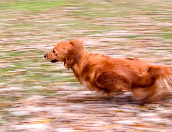
Facing The Right (or Left) Way
Here's another way to expand your portfolio of successful renderings: When a person, animal, or vehicle is positioned fairly small in your rendering, make sure the subject moves into - not out of - the composition. This keeps the viewers attention directed to the main center area, rather than having the eye wander distractedly to the edge of the render and out of the picture.
Of course, as with any rule, there can be artfully stylish exceptions, and when a subject occupies a big part of the render, this guideline may not even apply. But, in general, when a subject moved or faces in one direction, leave room to breathe in front of the subject. Viewers will find this visually pleasing, as opposed to a more unsettling placement of a subject near a rendering border and facing toward that close edge of your rendering.
Your subject doesn't even need to be moving. Plus, this concept applies not only to human subjects but also to animals, cars, boats, and even statues. Other objects may have a front that "points" in a particular direction, such as when rendering a house or vehicle from the side. Likewise, a tree that leans, for instance, should tilt toward the middle of the scene.
Yes, this strategy is yet another thing to worry about when compositing a rendering. But, trust me. You'll soon get the hang of this concept of directing the movement toward the center of your rendering.
![[2008-12-24] New Zealand__MG_6872.jpg](https://images.squarespace-cdn.com/content/v1/50357984e4b09af678ed11bf/1357427231760-95TP3P4WPLJYGAJUGQ39/%5B2008-12-24%5D+New+Zealand__MG_6872.jpg)
Did you enjoy this blog post? If so, then why not:
Leave Comment | Subscribe To This Blog | Email Me
Splitting Your Composition in Half
Occasionally, splitting your composition in half is better. This typically involves water reflection, when the rendering above is just as strong as the reflection below. Giving equal weight to both halves helps capitalize on the eye-catching combination of balance and serenity.
Other times, you may want to leave out the sky entirely. Often, this is on an overcast day rendering since the overexposed brightness can overwhelm everything else in the rendering. In other situations, you may just want the visual competition of the blue sky, concentrating on a non-sky landscape or cityscape rendering or a more intimate view.
And at times, you may not need a sky at all. A bright/white sky can detract from the rest of the rendering. Or, on a sunny day, the contrasting blue could draw the eye away from the other colors in your rendering. In those situations, no sky at all may be the best strategy.

Did you enjoy this blog post? If so, then why not:
Leave Comment | Subscribe To This Blog | Email Me
The Sky: How much or How Little
I often see newbies split exterior architectural renderings into equal halves, with the horizontal line or maybe a distant shoreline extending right across the middle of the render. The viewer, then, is left to decide which half of the architectural renderings is most beneficial, But that's for you - the architectural illustrator - to decide when composing your rendering! Keep this in mind as you compose, instead of cutting the composition in half. This will force you to decide: Which is more important, the land or the sky? Or the water?
An architectural rendering's visual weight (the most appealing things in the rendering) should determine where you place the horizon. With the Rule of Thirds, you can place the horizon line on the lower third diving line or the upper third. And you can adapt the Thirds principle as necessary. If things are exceptionally dull overhead or down below, even a third of the frame devoted to that space could be too much. So you can be more extreme and place the line extremely low or high - say, a thin trip of the sky or landscape.

Did you enjoy this blog post? If so, then why not:
Leave Comment | Subscribe To This Blog | Email Me
The Fine Art of Tilting the Camera
This shooting style - tilting the camera to turn a vertical or horizontal line into a powerful diagonal - has been around for awhile. One term used for it is the "Dutch angle", which is a longtime cinematography; to create visual tension. Still, when I tell clients that it's perfectly acceptable, if not totally desirable, to occasionally slant the camera, they express surprise. After all, your're supposed to keep the camera level at all times, correct? Well, there are exceptions! Used at the right artistic time, a nice tip of the camera can pump up the visual tension by creating exceptional angles and diagonals. Rendering with your camera askew (so as to change naturally appearing vertical or horizontal lines into diagonals) can be done for a variety of small scenes or ambitious views. Like other creative techniques, you won't want to use this method all the time, but when the subject calls for it, angling the camera is one worthy artist weapon.
Did you enjoy this blog post? If so, then why not:
Leave Comment | Subscribe To This Blog | Email Me
The WOW Factor: Point Of View
Too many architectural illustrators are locked into a standard view: pointing the virtual camera straight ahead from a standing height. An eye-level perspective is so easy to fall back on. Sure, the eye-level perspective ultimately may be the best viewpoint, but you honestly won't know unless you explore the scene for other, potentially better, viewpoints. Playing with point of view is a surefire way to put pizzazz in your architectural rendering. Go ahead. You have my permission to unleash your creative side. Whenever and wherever you can, seek out this attention grabbing camera views that most architectural illustrators fail to see. Architectural illustrations are about discovering the best camera angle to capture your building or space. It's about choosing a lower or higher viewpoint - a perspective that most architectural illustrators just don't see.

Did you enjoy this blog post? If so, then why not:
Leave Comment | Subscribe To This Blog | Email Me
Best Point of View
There may come a day, when fine tuning all the controls in your render engine is all done by the computer, but I can't ever imagine there will come a time when a render engine will be able to tell you what the best point of view is. There are two constants in the art of renderings; "seeing" and composition, and no amount of technology will replace either. The good news is that you can learn both the art of composition and how to "see".
Architectural rendering composition is based, in part, on order and structure. Every great rendering owes much of its success to the way it is composed, which is, in essence, the way the elements are arranged.

Did you enjoy this blog post? If so, then why not:
Leave Comment | Subscribe To This Blog | Email Me
Soft Glowing Atmosphere.
Soft glowing effects are common in portrait photography but are not used often for 3-D Architectural Renderings. The 3-D artist usually likes the sharpest possible image, and using a soft filter would be counter intuitive But, in certain circumstances a soft focus of an Architectural Rendering can enhance the mood of a rendering by creating a soft glowing atmosphere.

Did you enjoy this blog post? If so, then why not:
Leave Comment | Subscribe To This Blog | Email Me