

BLOG

Minneapolis, MN Townhouses
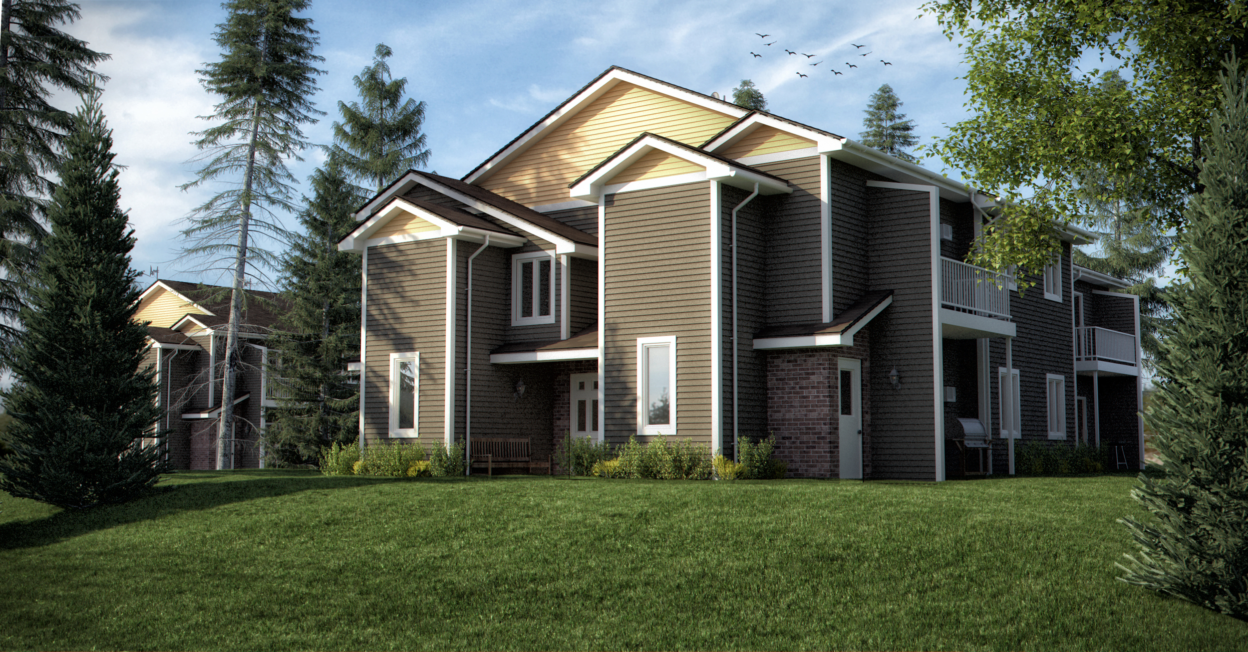
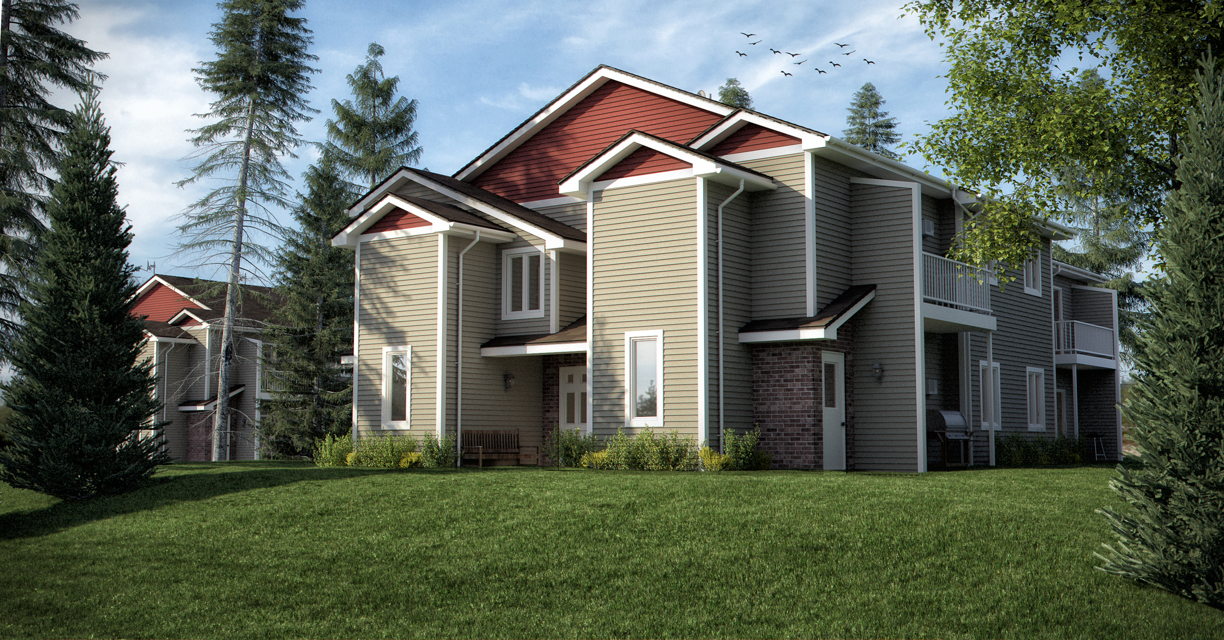
Here are a couple color options for a townhouse in Minneapolis, MN. The association commissioned me to help them study colors prior to a commitment.
The Art & Science Of Creativity

The Art & Science Of Creativity
I’m really excited to announce that my newest online video course, The Art And Science Of Creativity is now live on Udemy.
How many times have you heard that certain people are just “born creative,” and certain people “aren’t.” It’s not true. Creativity is a process with clearly defined steps that you can learn and apply towards ANY project. Using techniques taken from brain science to rocket science, you’ll learn that everyone, including you, is born creative. If you think of yourself as creative already, this course will make you more efficient and productive with your creativity. If you think of yourself as one of the “not creative” people, this class will show you that you ARE creative, and how to bring that creativity to fruition.
The course teaches a creative process: from coming up with an initial idea, unpacking and expanding upon it, to shaping and refining it, the seven key principles of creativity – principles that apply whether you are working by yourself or as part of a team, the common roadblocks to creativity, and the remedies to get you through these roadblocks if and when they occur, so you can move forward on your project.
And in the course we talk about the brain science of the unconscious, how it applies to creativity, and how to give your brain the right data it needs to figure out the problem or next course of action, even when you are not consciously working on it.
Here’s the opening lesson:
Go to the Udemy page for more information, to register for the course, or preview more videos.
We are offering a special price ($89, more than 50% off) if you register by March 3, 2014 and use the coupon code: VIPEntry
Instead of teaching this one by myself, I’ve got a co-instructor, Sam Spitzer. Sam is a rocket scientist, inventor, and composer. He’s very creative! I think you will enjoy learning from the two of us together.
Color Theory In Architectural Renderings

Colors are important in any field that involves communication and visual cues. Many architects forget that their field is not one that deals strictly in math and science, and that there really is a major artistic element to their industry. In architectural renderings, the colors that are used to illustrate concepts can go a long way when it comes to helping clients see your vision for their building.

Color Theory
If you think back to several movies, you may have noticed that cinematic renderings of different scenes used different lighting to subtly suggest a mood to the audience. For example, cool lighting is often associated with high tech scenes, danger, or industrial settings. Certain forms of cool lighting may also denote buildings that are exceptionally clean. On the other hand, warm lighting has a tendency of suggesting a homey, warm, welcoming, and comfortable place.
Think about some of the more popular architectural renderings you’ve seen that deal with a major company’s exterior façade. They make the building look even better than it normally would by putting it in front of a crisp blue sky, with lush green foliage around it. Buildings that have a darker exterior tend to look more modern in renderings, while lighter colored buildings tend to be considered more traditional and are often associated with home architecture. Interior renderings using bright lighting subtly convey loads of open spaces.
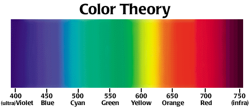
Architects who want to sell their designs would be wise to take a look at the color filters that they use in their renderings. Studying up on color theory, as well as the psychological impact that certain colors may have in people, is a smart way to improve the way that people see your designs. It’s also worth noting that good shadowing and color contrast can help highlight interesting contours in building architecture.
Building architecture should be highlighted by the right lighting - not overshadowed. Great color theory suggests that architectural renderings should not be monotonous or overly complex in terms of color harmonies. Ideally, the colors should stimulate instead of take away from the overall look of a rendering.
As an architectural illustrator, I do take into account the colors that I use on all of my renderings, and not only the lighting that I cast my renderings in. With the right coloring, viewers get the best possible idea of how the building will look, but also how people will feel in the building. As an architectural illustrator, I feel like it’s important to make sure that people get as good a view of their future building as possible. And, if you think about it, the colors that an architect chooses for their building is also a pretty big part of the overall layout, too.
Utilizing the Visual Arts

Seeing is Believing
In some cases, believing is seeing. However, there are other cases where, if you can’t see it with your own eyes, you aren't buying, believing, or even acknowledging it. It’s one thing to imagine a building, person, or place, but we all know that what we imagine seldom turns out to be the reality. With Bobby Parker’s architectural illustrations, you won’t have to worry about using your imagination or hoping that something will turn out the way you pictured it. Bobby Parker is a Minnesota based architectural illustrator who specializes in creating photo-real renderings of buildings. His illustrations make you feel as if you’re actually staring directly into a real-life kitchen or at a luxurious house in the woods, or even a child’s playground in the charming front yard of a suburban home. Parker is well skilled in the visual arts, and his renderings have helped architecture and design businesses to give their clients exactly what they want. When people can see, rather than just picture themselves how something is going to look, it gives them a sense of trust and excitement. How does Parker accomplish this? It all comes down to composition and the visual arts.
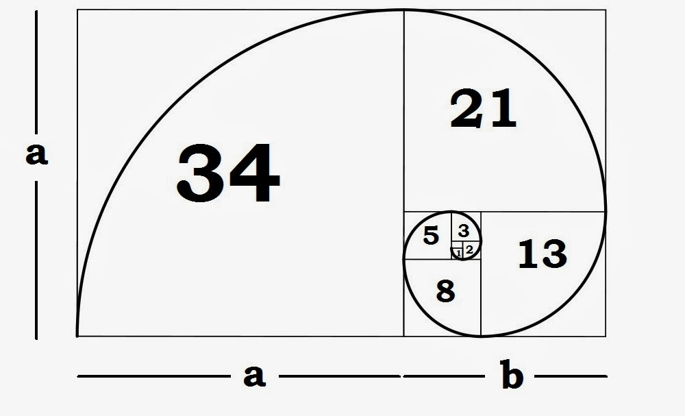
Golden Ratio Fibonacci Sequence
What Does Composition Mean?
In the visual arts, composition refers to the arrangement of visual elements in a painting, photo, graphic, or a sculpture. Technically, it refers to the organization of the various elements that go into an artwork, according to the standard principles of art. Under the dictionary definition, you’ll find that composition means “putting together”. It’s like a puzzle piece being arranged in just the right way to relay the bigger picture. Composition is the key in art work because it is what allows the brain to decipher and understand what it is looking at. Some artists use composition to differently by rearranging the visual elements to look confusing and abstract. However in architectural renderings, proper use of composition can make the difference between an active project and a scrapped plan idea.
How is Composition Used?
In Parker’s architectural renderings, composition is used incredibly effectively. Parker’s renderings are advertised as “photo-real” which means they are not only drawn to look highly realistic, they are also drawn with real time and space in mind. To be photo-real, these renderings must have depth, volume, light, shadow, lines, texture, and a professional execution. The sharper the image, the better a potential client can visualize what their future home, business, office, kitchen, bathroom, or whatever will look like.

Hand Drawing
Why Use Hand Drawings?
In today’s digital age, a computer or some sort of software may be enough to achieve the photo-real look businesses are after. Parker’s craftsmanship, however, gives his renderings a human element that a computer cannot capture. Though technology is most definitely used to create these renderings, beginning with old fashioned pencil and paper is the best way to start a rendering. It all comes down to layers, and the correct composition can birth a stunning visual art piece that will resonate with various clients.
Composition in the visual arts is extremely important. Placement, arrangement, skill, and detail are all elements of composition that can really bring an artwork, or in this case, a “photo-real” architectural rendering, to life. Check out Bobby Parker’s work for more information.
Sampling for Arch Vis renders in Vray 2.4
“This is a run through of how I approach sampling in vray 2.4 starting with the anti-aliasing and working my way through the different aspects of a scene methodically, to try and get predictable and clean results.”
Make Your Autodesk® Revit® Drawings and Presentations Look Great!
Description
This class will show you how to get the most out of the powerful graphic features of Autodesk Revit software and incorporate all of the exiting new features in Revit 2013. You will learn valuable tips and tricks and time-proven visualization techniques to make your drawings look great. You will learn how to enhance non-rendered and rendered views with out-of-the-box advanced graphic techniques, how to improve the trees and plants used in Revit for non-rendered views, how to add photo backgrounds to renderings using a unique overlay approach, how to add a fully controllable gradient color background behind multiple views, as well as tips for improving interior and exterior rendered views. And finally, you will learn how to use old-world hand drafting techniques to add visual clarity and make your construction documents communicate and look better. Techniques include poche and surface shading patterns, profiling, transparency, and toning to create graphical layering and sheet layout.
Key Learning
- Learn unique out-of-the-box tips and tricks to prepare presentations more quickly and better than ever
- Use time-proven techniques to make your construction documents communicate better and look as beautiful as they are smart
- Explore and take full advantage of powerful basic and advanced graphic tools and capabilities in Revit
- Use a variety of presentation techniques to help develop your own artistic style
Speakers
Primary Speaker : Steven Shell
Steven C. Shell graduated from the University of Arizona in 1982, and has had his own architectural firm in Tucson, Arizona, for over 23 years. Mr. Shell has been using Autodesk Revit Architecture® exclusively for over eight years. He is the co-founder and co-chair of the Southern Arizona Revit users group (SARUG). Mr. Shell is certified by Autodesk in Revit, and chairs monthly SARUG meetings. He has taught Revit at the University of Arizona College of Architecture and Landscape Architecture where he also hosted Revit workshops for the students and faculty. He has presented at Pima College and presented at the Revit Technology Conferences (RTC – USA) where his class was voted one of the top 10 classes. In addition to his Architecture practice and teaching Revit, he was re-appointed to the City of Tucson’s Board of Adjustment, where he previously served as chairperson for 8 years, as well as serving 10 years on the City’s Design Review Board and Sign Code Advisory & Appeals Board.
Best Of Houzz 2014 Award

Bobby Parker Architectural Renderings of Breezy Point Receives
Best Of Houzz 2014 Award
Annual Survey and Analysis of 16 Million Monthly Users
Reveals Top-Rated Building, Remodeling and Design Professionals
Breezy Point, MN, February 4, 2014 – Bobby Parker Architectural Renderings of Breezy Point, MN has been awarded “Best Of Houzz” by Houzz, the leading platform for home remodeling and design. The Photo-Real Architectural Rendering Portfolio was chosen by the more than 16 million monthly users that comprise the Houzz community.
The Best Of Houzz award is given in two categories: Customer Satisfaction and Design. Customer Satisfaction honors are determined by a variety of factors, including the number and quality of client reviews a professional received in 2013. Design award winners’ work was the most popular among the more than 16 million monthly users on Houzz, known as “Houzzers,” who saved more than 230 million professional images of home interiors and exteriors to their personal ideabooks via the Houzz site, iPad/iPhone app and Android app. Winners will receive a “Best Of Houzz 2014” badge on their profiles, showing the Houzz community their commitment to excellence. These badges help homeowners identify popular and top-rated home professionals in every metro area on Houzz.
“Once you’re done with school, you have to keep learning. Not a forced “study” like in school, but you need to love trying out new things. Technology is moving so fast, sometimes it can be quite overwhelming to keep up.” – Bobby Parker
“Houzz provides homeowners with the most comprehensive view of home building, remodeling and design professionals, empowering them to find and hire the right professional to execute their vision,” said Liza Hausman, vice president of community for Houzz. “We’re delighted to recognize Bobby Parker among our “Best Of” professionals for customer satisfaction as judged by our community of homeowners and design enthusiasts who are actively remodeling and decorating their homes.”
With Houzz, homeowners can identify not only the top-rated professionals like Bobby Parker, but also those whose work matches their own aspirations for their home. Homeowners can also evaluate professionals by contacting them directly on the Houzz platform, asking questions about their work and reviewing their responses to questions from others in the Houzz community.
Follow Bobby Parker Architecural Renderings on Houzz
About Houzz
Houzz is the leading platform for home remodeling and design, providing people with everything they need to improve their homes from start to finish - online or from a mobile device. From decorating a room to building a custom home, Houzz connects millions of homeowners, home design enthusiasts and home improvement professionals across the country and around the world. With the largest residential design database in the world and a vibrant community powered by social tools, Houzz is the easiest way for people to get the design inspiration, project advice, product information and professional reviews they need to help turn ideas into reality. For more information, visit www.houzz.com
All you need to know about Ambient Occlusion
If you have come across a term called as Ambient Occlusion and wonder what it is, then let me tell you in brief about it. Ambient Occlusion is a term which is used in computer graphics. It is used to represent how much each point that is present in a scene is being exposed to ambient lighting. Hence, we can say that the inner side of a tube which is enclosed is darker i.e. it is more occluded than the other surface which is on the outer side. And when it comes to even deeper inner side of the tube, it becomes even more occluded.

Ambient Occlusion
It is a highly sophisticated calculation that includes simulating the darkness on the corners, cracks, creases and intersections of objects. It is an effective method to approximately simulate the radiation and deflection of light in the real world, through the computer graphics. It tries to give a darkening effect to the areas of an object that would not receive enough light and thus makes the object appear more realistic. Ambient occlusion completely depends on the theory of illumination. So it needs a good understanding of light and its properties to give a real time effect to the objects in graphics. However, there is no ambient occlusion in the real world. It is a rendering technique in the world of graphics that can duplicate the shading of light on an object in the real world. This method is implemented in real-time games, animation fields etc.
The visual effect ambient occlusion was first developed by ILM i.e. Industrial Light and Magic and was used for the first time in the film Pearl Harbor in 2001. With NVIDIA’s GeForce FX, the hardware support for this effect is available since 2003.

Ambient Occlusion
When it comes to the games, it was first used in a game developed by Crytek called as Crysis which was out in 2007. And in 2009 ambient occlusion was added in the drivers of v185 as a control panel feature, by NVIDIA. Use of this technique in games has become enormously popular for its 3D effect which gives a real time effect to the user. It is capable of creating a duplicate graphical model for any real world object which would seem as real as the actual object.
In case of all modern games, the ambient occlusion is present in the graphics menu as HBAO i.e. Horizon Based Ambient Occlusion and SSAO i.e. Screen Space Ambient Occlusion. Both of these refer to Ambient Occlusion only. If you want to know how to activate Ambient Occlusion in a game that by default doesn’t support it, then you can do it easily by following the steps mentioned here one by one.
Ambient Occlusion
At first you have to right click on the desktop and right click on the NVIDIA control panel option. Then, right click on the “Manage 3D option” after which you have to highlight “Ambient Occlusion”. Then choose the other options as per your need and desire and enable the AO feature to experience better gaming experience.

See It & Sell It: Professional Architectural Illustration with Bobby Parker
“Architecture is a competitive business. There are thousands of talented designers out there, and selling your concepts, or choosing between different plans if you’re a home buyer, is a lot like other parts of life: it all starts with great presentation. That’s where architectural illustration comes in. A beautiful rendering is like great package design – it attracts attention and teases out buyer curiosity. But it’s also part of the product itself. Effective illustrations breathe life and zest into building plans, firing up the imagination and bringing depth of understanding to those of us who struggle to see an architect’s vision without additional help.
Minnesota-based architectural illustrator Bobby Parker has many years experience in architectural rendering and kindly spared a bit of time to fill us in on some of the aspects of working in this rapidly changing field”

Creating Photo Real Architectural Renderings

Photo Real Kitchen Rendering
Architectural renderings are visual representations of construction projects before they are built. This is done to make any un-built architecture a reality. Creating and designing the rendering allows for further conversation in the project after approval from the client. Rendering companies take in hand the floor plans and turn it to realistic rendering that look stunning. Converting a photo to real architecture can be brought straightaway when the ideas are innovative and creative. The visual appeal brings in satisfaction and delivers quality work and helps companies get the goodwill of clients in quick time. Professionals in this field make use of their creative ideas and knowledge in architecture and pour their imagination in coincidence with architectural parameters and designs to deliver an awesome rendering.

Photo Real Exterior Rendering
Renderings add great touch to construction projects. A building or construction is a dream of people be it a home or commercial setup. It involves huge investment and it is obvious that building owners wish to see their dream and investment in one picture and architectural renderings do the job. It is also helpful for companies to get best benefits by creating a visual appeal to clients with the renderings. Lots and lots of rendering companies with qualified professionals offer these services.

Photo Real Exterior Rendering
Architectural rendering can include 3D interior and exterior models, house plans, modeling, animations and architecture. The virtual walkthroughs are stunning and give a great appeal. The colors, textures and concepts employed make rendering magical. It is in the hands of professionals to turn any simple plan into a realistic construction with his pioneering ideas and architectural knowledge along with design. Quality can be witnessed in the renderings from professional hands. The architectural design looks error free and has clear visualization to impress any person who looks into it.

Photo Real Exterior Rendering
For companies, it is an excellent solution to have renderings to present to clients. It creates a strong base for them to carry put architectural projects in best form. It is a great way to know how the project would be after completion and give some suggestions of enhancement if any. As professionals have substantial experience in design, architecture and technology, it remains a complete pouring of ideas and creativity with best building plans. With online websites delivering lots of renderings and rendering services, building owners and architectural lovers have a great platform to derive the benefits.

Photo Real Exterior Rendering
Being popular tools of project creation, renderings can add value great value to projects and ideas where investment matters. The renderings are highly photo realistic and this credit goes to the designer who makes use of his immense knowledge in transforming a rough sketch into something visually complete. Backgrounds, colors, maps, shadows and other effects incorporated in the design turn each and every aspect of the rendering much striking. With the wide array of services from online websites, it has turned out to be a real challenge in the architecture industry to have competing renderings. With services open to all people, it is quite convenient to get in touch with reliable services and feel the comfort. It gives immense satisfaction to all clients when they look into the renderings. It is a matter of viewing one’s dream in reality through the perfect design in hand. It is magical and impressive to have visually appealing renderings that speak what the project can deliver.
Color Palette Creation is a Breeze With ColorPic
Ever tried using a color picker on a high resolution monitor? It's impossible. That's why this color picker has a magnifier attached. Grab palettes of up to 16 colors at once and use four advanced color mixers to select a spectrum of possibilities.
Version 4 is now available, with the following features:

- Easily pick any color from the screen
- Totally 100% Free!
- No popup adverts or spyware, it really is free
- Colors shown in hex and decimal
- Adjust Hue, Saturation, Value, Red, Green and Blue values
- Cyan, Magenta, Yellow and Black percentages shown
- Easy to use with any other program
- Resizable magnification area
- Overlay a grid for quick colorpicker alignment
- Use arrow keys to nudge mouse pointer
- Save multiple palettes of colors automatically
- WebSafe Colors and names displayed
- Snap to nearest WebSafe color
- Point sample, 3x3 or 5x5 pixel color sampling
- Adjust color with four advanced color mixers
- Edit colorpicker values after selection easily
- Easy to use collapsible sections
- Works with Firefox, Internet Explorer, Photoshop and any other application
Theft vs Creative Inspiration
Rick Sammon joins me for a discussion about drawing the line between stealing and being inspired by someone's work.
Managing Nonpayment Situations
Once in a great while, polite correspondence between you and a client about an unpaid invoice stops being productive. You need to take a more aggressive approach to recuperate at least some of the money that you're owed. If things get really bad, I found that threatening letters from attorneys can be helpful.

Depending on the amount owed, your best option may be going to small claims court. You can get a judgment against your client if you are able to prove that you performed according to the contract, and that the client owes you money. This may or may not help you. Small claims court can pass a judgment in your favor, but that doesn't make cash magically appear. It does give you the leeway though to garnish funds from their bank account. Small claims court resolves disputes under $7,500.
Even if the client owes you $10,000, it's sometimes worth it to cut your losses and get a judgment for $7,500 through small claims court. In regular courts, attorney's fees and legal costs can mount up quickly. If what is owed to you is more than $10,000, my recommendation is to resolve the issue through binding arbitration in a city where you do business. These problems rarely happen to me because I'm really conscientious about the language of my contracts. But when they do, it takes persistence and professionalism.
There have been times when I've been persistent, and after two years, I was paid $20,000 that I was owed. But there have been a couple of times where I've had to let payments go that were under $1,000 because it just wasn't worth my time to collect them. Generally, being conscientious of your client's financial health at the beginning of a project is one of the best ways to determine whether you will be well-served to work with them. Following professional protocol and making sure you have signed contracts and approvals for your revisions should keep you out of trouble
White Color Balance in PhotoShop
This tutorial is for those “special times” when you either forgot to set the white balance setting on your V-Ray virtual camera, or you like the control you get in post.

White Color Balance in PhotoShop
Dodge and Burn

Dodge and Burn refer to a darkroom technique when printing analog photographs in a dark room.
When you are dodging a print, you take a wand with a shape on the end of it that would block out some of the light from the enlarger from reaching the paper. Conversely, you could burn a print, or make it darker, by taking a card with a hole in it and only adding light to the print through that hole.
Working Non-Destructively

I want to talk a bit about working non-destructively. Some rendering artists prefer to work completely non-destructively or never apply color correction directly to a layer. I began my career painting traditionally, with physical paint, markers, and color pencils. Where, every stroke the artist added to a matte was for real and couldn't be taken back unless you painted over it. In some ways, I think artists have lost something. Especially in spontaneity and directness, when you never have to make a final decision on any element.
Working entirely non destructively also results in huge file sizes. And projects with so many layers it gets nearly impossible to tell what layer is doing what, or find any element. This is counter to where the industry is moving, but I will often work directly on simple layers for the sake of keeping my project more manageable. Like I said, this is a matter of workflow, and you may want to work completely non-destructively in your rendering.
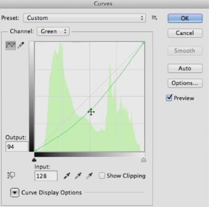
Color Correcting Individual RGB Channels
Lets talk about the really super charged part of color correcting, and that's working with the individual RGB channels and curves. I'm just going to show you how to do this in curves from here on out, but you can do all of this in levels just not as well. First lets look at the red channel, so choose it from the drop down menu If you pull up on the mid tone you'll add red to the image and lighten it. If you pull down on the curve you darken the image since you are removing red, and add blue green to the image.


RGB color correcting can be a little confusing since the next choice in the menu is green. You may think, won't that do kind of the same thing, when I pulled down on red, I added green, so won't this just be the reverse of the red channel? The answer is no, the two channels give you very different results, since if you pull down on the green channel, you add a magenta-red. Well the red channel added an orange-red when you pulled up on it. If you pull up on the green curve, it adds a yellow-green to the image, quite different from the blue-green the red channel added.

So, the two channels aren't just mirror images of each other. They yield very different color results when you modify them. The last channel is blue, and it's obvious that if you pull up on the curve it adds blue to the image, and lightens it. But, if you pull down on he curve it adds yellow.Maybe not the color you would have immediately thought of as the opposite of blue. So the color you get, especially from pulling down on curves may not initially be what you expect. The only way to internalize what these channels do is to work with them a lot and over time, you'll see what moves give you the results you want.
I'm primarily showing moving the mid-tones of the color channels, but you can also pull down on the white point in blue to flood the image with yellow. Or pull up on the black point to reduce contrast, and add blue all over the image. Same with the red channel. Pull up to flood the image with red, or pull down to remove red. And the green channel. So you'll just need to experiment with these, until you really get the hang of what each channel does. Before we leave this topic, I want to mention what I think is the best book on color correction ever written, called Professional Photoshop: The Classic Guide to Color Correction by Dan Margulis.

Books by Dan Margulis
Dan is a prepress master, and a lot of the book involves color correcting in CMYK color space, the space where all printed materials live. However, all of the color correcting concepts are valid in other color spaces, and in later editions he has gone more into RGB color correction. I learned more about color correction from this book than from anything else I've ever read, and I would highly recommend it to any aspiring matt artist.
Websites for Rendering Reference
Let's talk about websites where you can find reference for your rendering projects. Obviously, You can go to Google and find lots of reference there. But there are three problems with reference you find on the Internet. And those are copyright, resolution, and quality. The first is Copyright. If you use someone else's copyrighted material without asking permission, you can get sued. The chances of you getting sued are slight if you massively change the photos you're using, color correcting and distorting them, or only using small pieces.

However the chance is still there if you're using copyrighted material. Second is resolution. I think every matte artist has had the experience of finding what looks like the perfect piece of photo reference, but when you click on it, you find it's not at a usable resolution. The higher resolution you start from with your reference material, the sharper it'll be. And the more distortion and color correction it can stand. The last is quality. Most of the photos on the Internet have severe JPEG compression on them, to make them as small as possible.
Those compression artifacts compromise the image to a greater or lesser extent. So finding higher quality reference is desirable. That brings me to the first great site for finding reference for you rendering, environment-textures.com. It costs a bit more than $100 a year to belong, or about $18 a month for monthly membership. You can download three photos a day for free if you register with them. The site was set up specifically for matte and texture artists and features a huge collection of photos of every possible subject.

It doesn't have people on it, the same organization has another website specifically for figures. But it has buildings, mountains, skies, everything you could need for a rendering, all at very high resolution and extremely good quality. If you're a yearly member, you can also download large quantities of photos of the same subject in a zip file. I've been a member for many years, and would highly recommend you buy a membership, once you become a working professional.
Also, there's an effort made to shoot the photo straight on. In general, having photos with no perspective in them is easier. If the photo was shot with the subject at an angle, you'll often have to remove the existing perspective before you can distort it into the perspective required for your project. With a membership in this site, you can use the photos for commercial projects, as long as you modify them and use them creatively. One thing you can't do is download a bunch of the photos and resell them unaltered. Next is freetextures.3dtotal.com.
This site doesn't have anywhere near as many textures as enviroment-textures.com, but like the name says its free. All the photos are at very high resolution and good quality. After that, its cgtextures.com. This site has an usual policy where you can download up to 15 megabytes a day. And then it cuts you off for 24 hours. You can also buy a membership for around $80 a year, and you can download up to 100 megabytes every 24 hours.

Once again, these are very high quality and at a usable resolution. The next site I'm going to mention is the most expensive one, cgskies.com. This is run by the same people who run CG Textures, and it's all about skies. Each sky costs about $30. And these are huge files up to 18,000 pixels wide. The free version that give away so you can test it in your project is 3000 pixels wide. This price may seem steep, but the quality is top notch.
And if you're working on a big project and need the perfect sky at very high res, this is the site to visit.
Global illumination (GI) explained

V-Ray comes equipped with a number of extremely powerful Global Illumination, or GI, engines that can help us recreate pretty much any natural lighting scenario-- and a good number of unnatural ones--should we have a mind to. If we just come into the 3ds Max User Interface, if we come up to the Render Setup dialog, we can just show you where V-Ray's Indirect Illumination Tools are found. And we just want to come along in our tabs to the Indirect Illumination tab, and here you can see with the systems turned on, we have access to a whole array of Global Illumination Tools.

We have access to a number of different Global Illumination engines. The feature sets of these tools are robust, they are powerful, they give us the ability to easily switch between physically-correct and artistically-correct approaches to our lighting setups. They can be tuned to be fast enough for even the most demanding of production schedules and yet at the same time still output high-quality images for us. Ultimately, these systems can remove an awful lot of the guesswork that would otherwise be involved in trying to manually recreate a realistic lighting solution.
Really all we need to do is evaluate the lighting needs of our current project, choose the tools we want or need to use--of course we need to run through our lighting setup--and then we can have V-Ray's GI engines assist us in achieving our artistic goals. Now, for the benefit of those somewhat newer to 3D rendering, we are going to start this chapter making the assumption that you may be somewhat unfamiliar with just what Global Illumination is and so would benefit from just a quick breakdown of its definition and workings. An understanding of just what Global, or Indirect Illumination, is can probably best be gained by contrasting it to its lighting opposite, which is Local or Direct Illumination, as we see here.
By default adding CG lights into a 3D scene and rendering without any GI systems enabled will give us only this type of Local Illumination. This computer graphics illumination is not, of course, how light behaves in the real world. This is why we need GI systems in our renderers. They allow us to simulate the physical reality of light, which of course in the real world, spends a lot of time, a lot of energy bouncing around our environments.

Even the V-Ray Dome Light, although it does give 180 degrees of light, is still a direct only light source. Let's have a look at the basic GI process. It goes a little bit like this. As direct light is emitted from a source, such as our light here, it will travel until it strikes the surface of an object in our scene. At this point, a lighting phenomenon known as inter-surface reflection occurs. All this phrase really means is that a portion of our life energy will reflect, or bounce, and create a Global or Indirect Illumination effect in the scene.
Dependent upon the amount of energy coming from our light source, we should actually see that our light is able to bounce from a number of surfaces. With each bounce, it will lose a bit of energy, and with each bounce it will pick up a little bit of coloration inherited from the diffuse properties of surfaces it has interacted with so far. The result of all of this bouncing is that our surroundings become lit, and even the dark nooks and crannies of an environment will end up receiving at least some level of lighting, even though they may be far away from direct light sources.
This complex process is what really gives us the ability to create lighting scenarios that have a very high degree of accuracy and realism to them. We can even conduct lighting analysis test that will give architects, engineers the ability to measure just how much illumination a given environment and a given set of light sources will produce. And now with that primary explanation of Global Illumination, we are ready to move on to examining a very particular aspect of V-Ray's GI implementation, and that is its use of primary and secondary bounce engines.
Staying Motivated and Inspired

Successful freelancers are passionate about what they do. They commit to their clients and to the projects they work together on. To be inspired, you should be interested in where architectural rendering is going. It will help you craft a vision and a plan. Become voracious about architectural renderings. What work is being done that is transforming our industry creatively and economically? Knowing this helps you see where you can be most efficient in the work that you do. The best architectural illustrators keep great resource files, either digital or physical, to draw upon for ideas and inspiration.

One of the most insightful tools are architectural illustrator's journals and sketchbooks. They become rich documentation of a illustrator's evolution. They force you to become committed to your view of the world. I suggest joining and participating in cg rendering-related communities such as the American Society of Architectural Illustrators (ASAI). Meet fellow architectural illustrators and contribute your ideas. Become part of communities that are positive about the impact that architectural renderings can have for commerce and for social or environmental good.
Avoid the complainers. Commiserating with whiny architectural illustrators is a waste of time. Read forums such as Chaos Group, CGRamp, Evermotion, CGArena, and Computer Graphics Society; they will help you understand the greater impact that architectural renderings is capable of making. What you will learn will make your conversations with colleagues and clients much richer. It's great because you become a resource for new and innovative thinking. Understand the economy and culture of the city that you live in.
Even though we're in a global economy, most of the freelancers' work will come from large and small local sources. Stay relevant and clear. Clarity is necessary to make tough decisions faster. It's a required skill to navigate the peaks and valleys of our economy. Clarity is also required to access our intuition and our creativity. It's a necessary component for empathy, the successful Architectural Illustrator's secret weapon. As a freelancer you should ask yourself, is this work meaningful and lucrative? If the answer is yes, you have a great foundation for your work that can sustain your effort for the long term.
Enjoy yourself and take pride in the fact that you're in control of your own destiny.