Color Theory In Architectural Renderings
Colors are important in any field that involves communication and visual cues. Many architects forget that their field is not one that deals strictly in math and science, and that there really is a major artistic element to their industry. In architectural renderings, the colors that are used to illustrate concepts can go a long way when it comes to helping clients see your vision for their building.
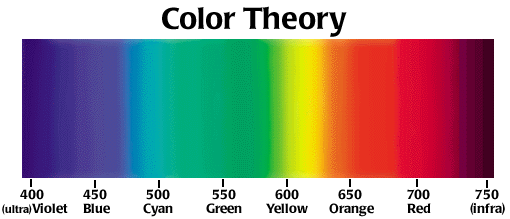
Color Theory
If you think back to several movies, you may have noticed that cinematic renderings of different scenes used different lighting to subtly suggest a mood to the audience. For example, cool lighting is often associated with high tech scenes, danger, or industrial settings. Certain forms of cool lighting may also denote buildings that are exceptionally clean. On the other hand, warm lighting has a tendency of suggesting a homey, warm, welcoming, and comfortable place.
Think about some of the more popular architectural renderings you’ve seen that deal with a major company’s exterior façade. They make the building look even better than it normally would by putting it in front of a crisp blue sky, with lush green foliage around it. Buildings that have a darker exterior tend to look more modern in renderings, while lighter colored buildings tend to be considered more traditional and are often associated with home architecture. Interior renderings using bright lighting subtly convey loads of open spaces.
Architects who want to sell their designs would be wise to take a look at the color filters that they use in their renderings. Studying up on color theory, as well as the psychological impact that certain colors may have in people, is a smart way to improve the way that people see your designs. It’s also worth noting that good shadowing and color contrast can help highlight interesting contours in building architecture.
Building architecture should be highlighted by the right lighting - not overshadowed. Great color theory suggests that architectural renderings should not be monotonous or overly complex in terms of color harmonies. Ideally, the colors should stimulate instead of take away from the overall look of a rendering.
As an architectural illustrator, I do take into account the colors that I use on all of my renderings, and not only the lighting that I cast my renderings in. With the right coloring, viewers get the best possible idea of how the building will look, but also how people will feel in the building. As an architectural illustrator, I feel like it’s important to make sure that people get as good a view of their future building as possible. And, if you think about it, the colors that an architect chooses for their building is also a pretty big part of the overall layout, too.


