Utilizing the Visual Arts
Seeing is Believing
In some cases, believing is seeing. However, there are other cases where, if you can’t see it with your own eyes, you aren't buying, believing, or even acknowledging it. It’s one thing to imagine a building, person, or place, but we all know that what we imagine seldom turns out to be the reality. With Bobby Parker’s architectural illustrations, you won’t have to worry about using your imagination or hoping that something will turn out the way you pictured it. Bobby Parker is a Minnesota based architectural illustrator who specializes in creating photo-real renderings of buildings. His illustrations make you feel as if you’re actually staring directly into a real-life kitchen or at a luxurious house in the woods, or even a child’s playground in the charming front yard of a suburban home. Parker is well skilled in the visual arts, and his renderings have helped architecture and design businesses to give their clients exactly what they want. When people can see, rather than just picture themselves how something is going to look, it gives them a sense of trust and excitement. How does Parker accomplish this? It all comes down to composition and the visual arts.
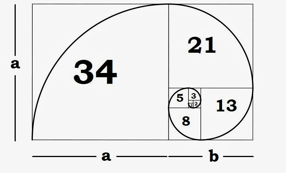
Golden Ratio Fibonacci Sequence
What Does Composition Mean?
In the visual arts, composition refers to the arrangement of visual elements in a painting, photo, graphic, or a sculpture. Technically, it refers to the organization of the various elements that go into an artwork, according to the standard principles of art. Under the dictionary definition, you’ll find that composition means “putting together”. It’s like a puzzle piece being arranged in just the right way to relay the bigger picture. Composition is the key in art work because it is what allows the brain to decipher and understand what it is looking at. Some artists use composition to differently by rearranging the visual elements to look confusing and abstract. However in architectural renderings, proper use of composition can make the difference between an active project and a scrapped plan idea.
How is Composition Used?
In Parker’s architectural renderings, composition is used incredibly effectively. Parker’s renderings are advertised as “photo-real” which means they are not only drawn to look highly realistic, they are also drawn with real time and space in mind. To be photo-real, these renderings must have depth, volume, light, shadow, lines, texture, and a professional execution. The sharper the image, the better a potential client can visualize what their future home, business, office, kitchen, bathroom, or whatever will look like.
Hand Drawing
Why Use Hand Drawings?
In today’s digital age, a computer or some sort of software may be enough to achieve the photo-real look businesses are after. Parker’s craftsmanship, however, gives his renderings a human element that a computer cannot capture. Though technology is most definitely used to create these renderings, beginning with old fashioned pencil and paper is the best way to start a rendering. It all comes down to layers, and the correct composition can birth a stunning visual art piece that will resonate with various clients.
Composition in the visual arts is extremely important. Placement, arrangement, skill, and detail are all elements of composition that can really bring an artwork, or in this case, a “photo-real” architectural rendering, to life. Check out Bobby Parker’s work for more information.


