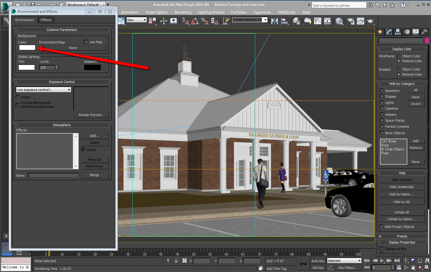
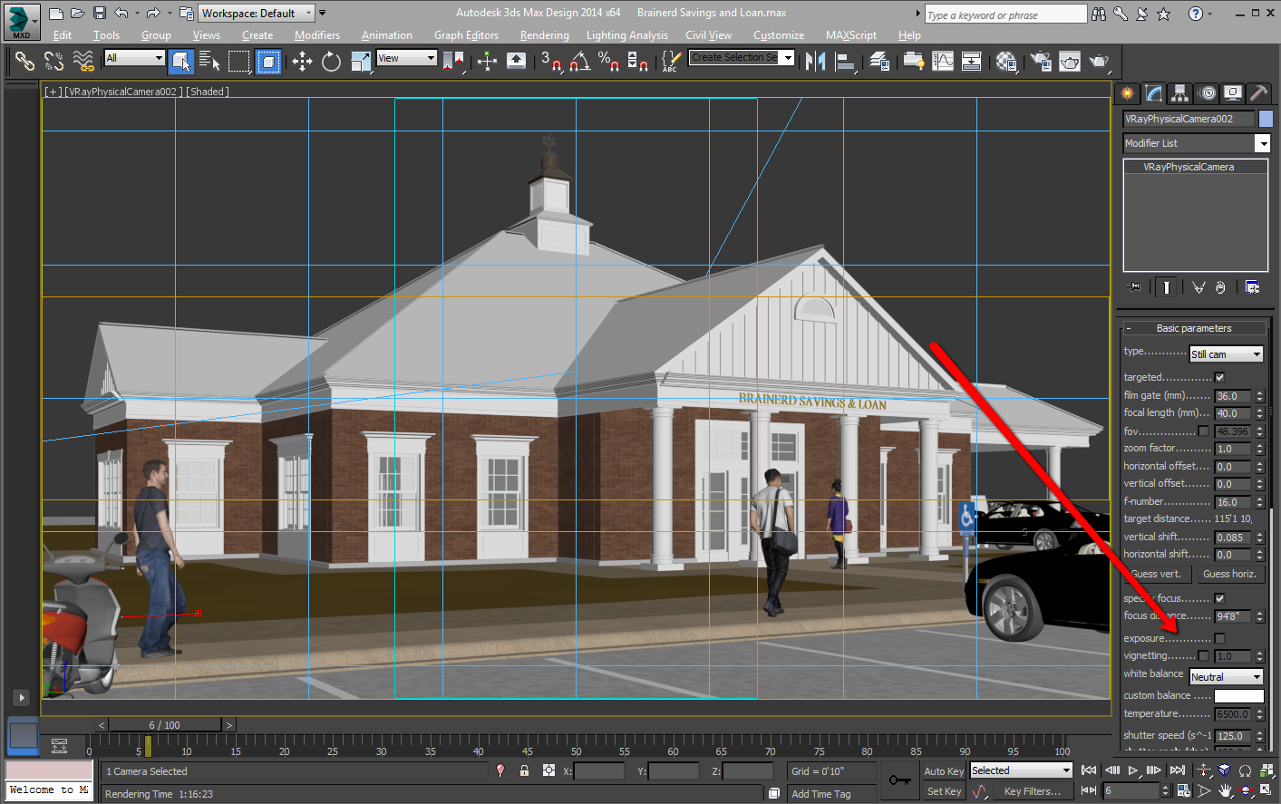
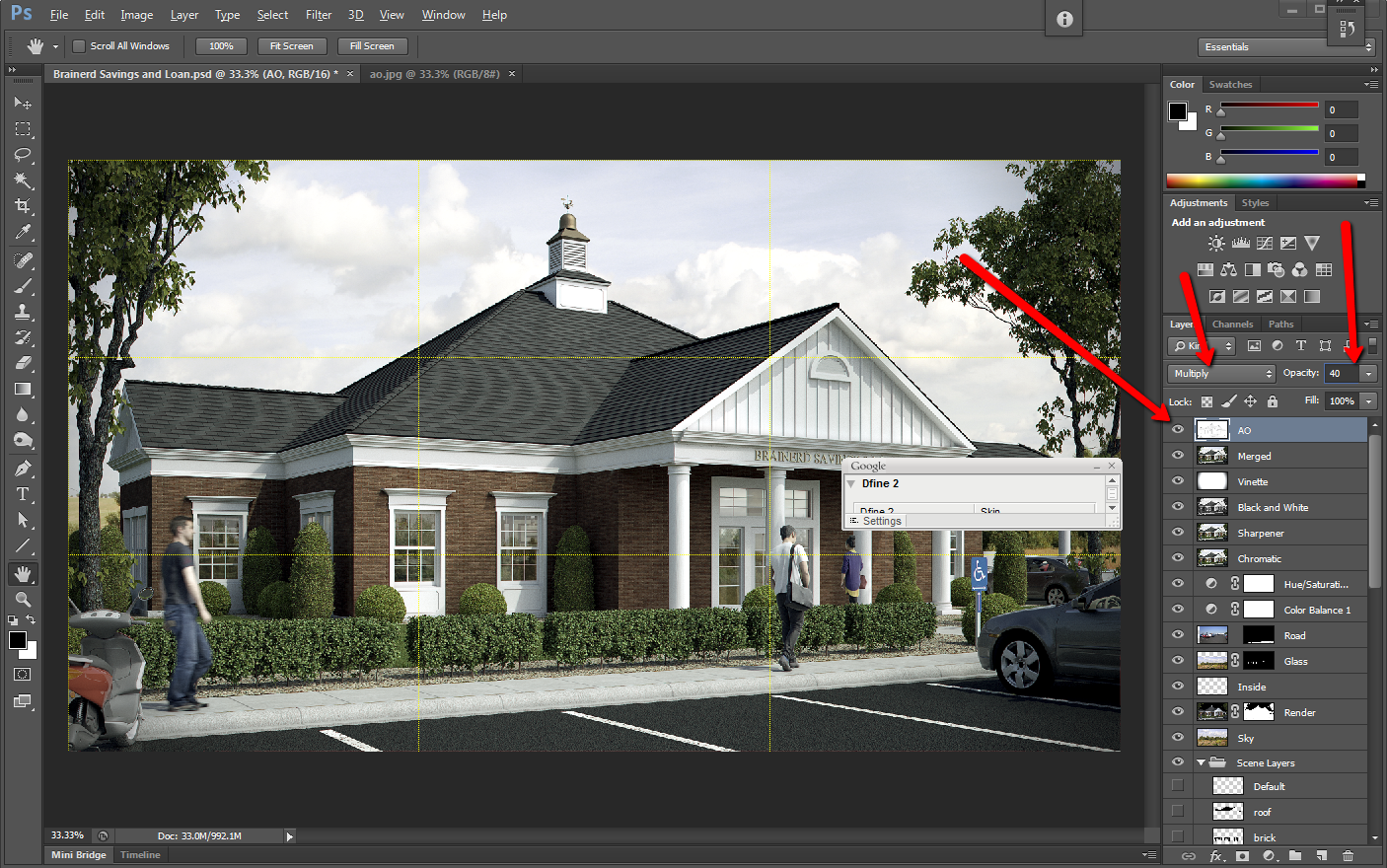
Viewing entries in
Artists's Tip

Ambient Occlusion Made Simple

I have tried scripts, plugins, and many other things to get a clean ambient occlusion pass, and this is my prefered method. I use Autodesk's 3DSMAX Design, Chaos Group's V-Ray, and Adobe's Photoshop.

In computer graphics, ambient occlusion is used to represent how exposed each point in a scene is to ambient lighting

An ambient occlusion pass is an easy way to add detail to your fine lines, and it also dirties up your rendering, for a more realistic image.


Did you enjoy this article? I would love to hear your thoughts, so don’t be shy and comment below! Please don’t forget to subscribe to my RSS-feed  or follow my feed on TwitterGoogle+ and Facebook! If you enjoyed the following article we humbly ask you to comment, and help us spread the word!

Lighting Ratio

Lighting Ratio
It’s easy to underestimate the tonal separation between the light side and the shadow side in sunlight. When lighting experts set up artificial lights for a movie shot, they call this separation the lighting ratio, and they usually try to reduce it to cancel the unflattering effect of harsh or dark shadows.

As artists we may want to do the same, depending on the feeling we want to create. But most often, beginning illustrators tend to ignore the dominance of direct illumination and play up secondary sources too much.

If you’re counting steps on a value scale from 1 to 10, you might typically see five steps of tone from sunlight to shadow, or two f-stops on a camera’s aperture setting. The separation would be reduced if there were high clouds, hazy atmosphere, or a light-colored ground surface.

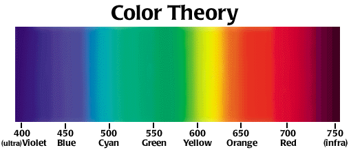
The tonal scale ranges along a gradation from black to white, and all colors have an equivalent somewhere along that scale. As you practice this approach, you will become aware of occasions when it was actually the play of light on the subject that initially inspired you. You should start to try looking for tonal contrasts in the world around you, and begin to consider the play of tonal differences within a piece as an essential part of the composition.

Above: Colors you may perceive as being very different may actually be extremely close on the tonal scale. A slight variation in ‘color’ (tone) can make a big difference to your painting

Above: Colors you may perceive as being very different may actually be extremely close on the tonal scale. A slight variation in ‘color’ (tone) can make a big difference to your painting

Try bearing these three points in mind:

  1. Instead of asking what shape the object is, ask how the lights and darks flow across its surface. It is perfectly possible to depict the form of an object simply by using gradated tonal marks, without drawing a single line.
  2. Instead of searching for detail, ask whether some detail is difficult to see because it is in an area of shadow. This can be helpful in avoiding painting what you ‘know’ to be there, and in introducing some interest to the composition in terms of lost and found edges.
  3. Instead of asking what color it is, ask first where the area being considered sits on the tonal scale before asking where it sits on the color spectrum.

Did you enjoy this article? I would love to hear your thoughts, so don’t be shy and comment below! Please don’t forget to subscribe to my RSS-feed  or follow my feed on TwitterGoogle+ and Facebook! If you enjoyed the following article we humbly ask you to comment, and help us spread the word!

Color Theory In Architectural Renderings

header_colortheory.jpg

Colors are important in any field that involves communication and visual cues. Many architects forget that their field is not one that deals strictly in math and science, and that there really is a major artistic element to their industry. In architectural renderings, the colors that are used to illustrate concepts can go a long way when it comes to helping clients see your vision for their building. 

Color Theory

Color Theory

If you think back to several movies, you may have noticed that cinematic renderings of different scenes used different lighting to subtly suggest a mood to the audience. For example, cool lighting is often associated with high tech scenes, danger, or industrial settings. Certain forms of cool lighting may also denote buildings that are exceptionally clean. On the other hand, warm lighting has a tendency of suggesting a homey, warm, welcoming, and comfortable place. 

Think about some of the more popular architectural renderings you’ve seen that deal with a major company’s exterior façade. They make the building look even better than it normally would by putting it in front of a crisp blue sky, with lush green foliage around it. Buildings that have a darker exterior tend to look more modern in renderings, while lighter colored buildings tend to be considered more traditional and are often associated with home architecture. Interior renderings using bright lighting subtly convey loads of open spaces. 

gamcolorgrad.gif

Architects who want to sell their designs would be wise to take a look at the color filters that they use in their renderings. Studying up on color theory, as well as the psychological impact that certain colors may have in people, is a smart way to improve the way that people see your designs. It’s also worth noting that good shadowing and color contrast can help highlight interesting contours in building architecture. 

Building architecture should be highlighted by the right lighting - not overshadowed. Great color theory suggests that architectural renderings should not be monotonous or overly complex in terms of color harmonies. Ideally, the colors should stimulate instead of take away from the overall look of a rendering. 

As an architectural illustrator, I do take into account the colors that I use on all of my renderings, and not only the lighting that I cast my renderings in. With the right coloring, viewers get the best possible idea of how the building will look, but also how people will feel in the building. As an architectural illustrator, I feel like it’s important to make sure that people get as good a view of their future building as possible. And, if you think about it, the colors that an architect chooses for their building is also a pretty big part of the overall layout, too.


Did you enjoy this article? I would love to hear your thoughts, so don’t be shy and comment below! Please don’t forget to subscribe to my RSS-feed  or follow my feed on TwitterGoogle+ and Facebook! If you enjoyed the following article we humbly ask you to comment, and help us spread the word!

ARCHITECTURAL 3D AWARDS 2013

The CGarchitect Architectural 3D Awards are the largest awards event for the architectural visualization industry. Now in its 10th year, the awards attract entries from top studios, freelancers and students from around the world.

The CGarchitect.com Architectural 3D Awards were started in 2004 to recognize outstanding achievement in the field of architectural visualization. In such a competitive field it becomes more and more difficult make yourself seen. With the wide visibility of CGarchitect, what better way to use this exposure than to help the artists that make up our community. 2013 marks our 10th annual awards, which will once again take place in La Coruna, Spain during the Mundos Digitales conference. Past awards have taken place in Los Angeles, San Diego and Boston. Over the past nine years many extremely talented individuals and companies have gone on to form new alliances and partnerships and advanced their careers.

Did you enjoy this blog post? If so, then why not:

Leave Comment | Subscribe To This Blog | Email Me

Artist's Tip - Post Production

The most enjoyable part of any rendering is adding the finer details of light and color, but don't overdo things or the rendering could become busy and overworked. It is not always easy to know when a rendering is finished, so if you are not sure, put down the mouse for awhile and then come back to it with  fresh eyes.

​Post Production

​Post Production

Did you enjoy this blog post? If so, then why not:

Leave Comment | Subscribe To This Blog | Email Me

Artist's Tip - Compare Shapes and Directions

It is important to compare shapes and directions when you draw. Usually people see objects in isolation; for example, landscape is seen as first one tree, then another, and then a background. As an artist, you need to learn how to see and compare all these features simultaneously, and use background features as a check for shapes.

i-spy-shapes-in-art.jpg

Did you enjoy this blog post? If so, then why not:

Leave Comment | Subscribe To This Blog | Email Me