

BLOG
Filters in Photoshop CS
Photoshop has made it easy to get those warm colors I love. Adobe added a whole set of adjustments that resemble the filters you'd use on your lenses. And, the best part is that they are available as adjustment layers, so you can apply them to your image and then mask out areas you don't want to be effected by the filter.
So, want to add warmth to an image you rendered? On your Photoshop menu bar, click image, then adjustment, and then Photo Filters. You'll get a choice of eighteen filters to use on your image, including several that warm things up. You can vary the intensity of these filters; and if you use Adjustment Layers to add the filter effect, you can apply those filter effects to selected parts of your image by using layer masks. To do this, select any of a number of tools from the toolbox, and using the mouse, select an area where you would like to apply filter effects. The area will be indicated by a dotted line. Then choose Layer on the pull down menu bar, then New Adjustment Layer, and then Photo Filter. Once the filter list comes up, you can choose your filter for that selected area.

Did you enjoy this blog post? If so, then why not:
Leave Comment | Subscribe To This Blog | Email Me

PSD-Manager and Gamma
If you save a 32-bit per channel (HDR) PSD file:
There is no gamma correction applied to anything by psd-manager itself. Photoshop expects a 32-bit (HDR) file to have a linear color profile (which means Gamma needs to be 1.0). Photoshop will show you the colors corrected for your display if you have enabled View > Proof Colors, so you will see the image adjusted.
In the V-ray Color mapping rollout you should set Gamma to 2.2 and enable Don't Affect Colors (adaptation only). This tells V-ray that you will later want to display the image using a Gamma of 2.2 (like on a typical sRGB monitor) but will not actually bake the color correction into the pixels. So you are setup for whats called a linear workflow this way.
If you save an 8 or 16 -bit per channel PSD file:
psd-manager uses the Gamma options set in the 3ds max Preferences dialog. So if you have setup an 3ds max output gamma of 2.2 then this is what psd-manager will use. However there are important exceptions to that:
Per default there is no gamma correction applied to render elements, only to the main render output (and layers using RenderCutout mode). This is important because otherwise render elements would not match the look of the main render when combined. So in Photoshop you will typically add an Exposure Adjustment layer on top of your render elements layer stack to correct the Gamma (to match the rest of the file).
If you don't want psd-manager to apply Gamma correction for some reason then you can turn it off in the psd-manager Advanced Options dialog (Gear Icon button in psd-manager).
Recommended typical setup for V-Ray:
V-ray Color mapping rollout:
- Gamma: 2.2
- Don't Affect Colors: on
- Linear workflow: off (this is an old option in V-ray, you have a true linear workflow without it)
3ds max Preferences > Gamma LUT:
- Enable Gamma correction: on
- Input Gamma & Display Gamma & Output Gamma: all set to 2.2
Your V-ray setup:
If you set Gamma in V-Ray Color Mapping to 1.0 that would be fine for saving 32-bit PSD, and also fine for saving 8/16 bit PSDs if your 3ds max Output Gamma is set to 2.2. But it would help the V-Ray renderer if you set the V-Ray Gamma to 2.2 and turn Don't Affect colors: on. V-ray will then spend more time calculating detail in darker areas instead but not actually do a gamma correction to the color values. So this is better than you having to fix it it by cranking up other V-Ray options for the whole scene to counteract lacking precision in dark areas that becomes visible when displaying the image using a sRGB working space.
If you set Gamma in V-Ray Color Mapping to 2.2 and you have Don't Affect Colors turned off, then you would get a double gamma correction if your 3ds max Output Gamma is set to 2.2, because psd-manager will use this value for its gamma correction and apply it on top (just like it happens if you save using the 3ds max VFB with the same options).
Did you enjoy this blog post? If so, then why not:
Leave Comment | Subscribe To This Blog | Email Me
Best Point of View
There may come a day, when fine tuning all the controls in your render engine is all done by the computer, but I can't ever imagine there will come a time when a render engine will be able to tell you what the best point of view is. There are two constants in the art of renderings; "seeing" and composition, and no amount of technology will replace either. The good news is that you can learn both the art of composition and how to "see".
Architectural rendering composition is based, in part, on order and structure. Every great rendering owes much of its success to the way it is composed, which is, in essence, the way the elements are arranged.

Did you enjoy this blog post? If so, then why not:
Leave Comment | Subscribe To This Blog | Email Me
Magician
Artists aren't magicians. There's no penalty for revealing your secretes.

Did you enjoy this blog post? If so, then why not:
Leave Comment | Subscribe To This Blog | Email Me
Good Theft vs. Bad Theft
“At some point, you’ll have to move from imitating your heroes to emulating them. Imitation is about copying. Emulation is when imitation goes one step further, breaking through into your own thing.”

Did you enjoy this blog post? If so, then why not:
Leave Comment | Subscribe To This Blog | Email Me
How to Look at the World (Like an Artist)
“Where do you get your ideas?”
The honest artist answer,
“I steal them”
How does an artist look at the world?
First, you figure out what's worth stealing, then you move on to the next thing.
Did you enjoy this blog post? If so, then why not:
Leave Comment | Subscribe To This Blog | Email Me
Make Every Detail Perfect
““Make every detail perfect, and limit the number of details to perfect.””
Did you enjoy this blog post? If so, then why not:
Leave Comment | Subscribe To This Blog | Email Me
Architectural Rendering Art
It is said that a picture is worth a thousand words, and this is particularly true in the field of architectural renderings. There is no better medium than a balanced, well-done rendering, for capturing and displaying the look and feel of a building.
At what point does architectural rendering become art, and how can we differentiate between artistic architectural renderings and its documentary sibling?
The variety of definitions that exist justify some inquiry. The following are a few that come to mind:
“An action by means of which one man, having experienced a feeling, intentionally transmits it to others”
“Art is nature expressed through personality”
“Everything which we distinguish from nature”
“Art is the expression of pleasure in work”
Please, bookmark this, because I am going to add to it as my thoughts develop. If you would like to contribute please, leave me some feedback.

Did you enjoy this blog post? If so, then why not:
Leave Comment | Subscribe To This Blog | Email Me
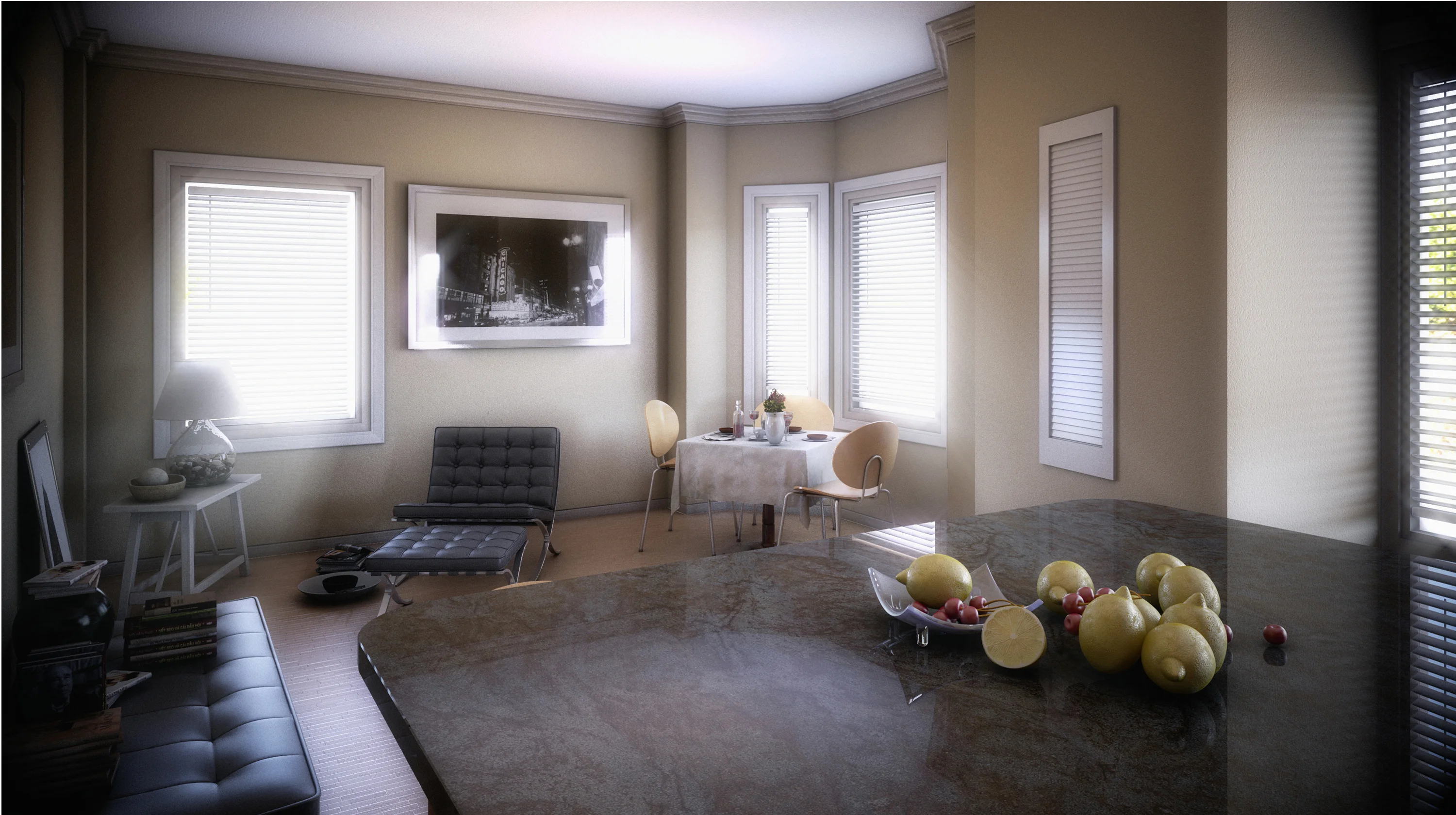
Chicago Apartment
Here are two more interior spaces of another Chicago apartment. My machine's are acting wonky, and my render times are through the roof, so I am done for now. It's a really small space so I used furniture sparingly. I also used a lot of monochrome to give it that urban feeling.
Did you enjoy this blog post? If so, then why not:
Leave Comment | Subscribe To This Blog | Email Me
Soft Glowing Atmosphere.
Soft glowing effects are common in portrait photography but are not used often for 3-D Architectural Renderings. The 3-D artist usually likes the sharpest possible image, and using a soft filter would be counter intuitive But, in certain circumstances a soft focus of an Architectural Rendering can enhance the mood of a rendering by creating a soft glowing atmosphere.

Did you enjoy this blog post? If so, then why not:
Leave Comment | Subscribe To This Blog | Email Me
Keep it Intriguing
While the overall appearance of a building can oftentimes be fascinating on its own, many buildings have small designs details that can stick out. Just think of all the smaller characters of an old church or cathedral, for example, such as sculptured gargoyles and angels etc. Taking renders of smaller details can communicate a lot about the character and type of architecture.

Did you enjoy this blog post? If so, then why not:
Leave Comment | Subscribe To This Blog | Email Me
Temperature
Temperature refers to the relative warmth or coolness of a color. We generally categorize reds, yellows and oranges as warm colors, and blues, greens and violets as cool ones, but it is possible to have cool reds (tending towards blue) and warm greens (tending towards yellow). It's all a matter of comparison.

Did you enjoy this blog post? If so, then why not:
Leave Comment | Subscribe To This Blog | Email Me
Distribution of Visual Weight
Balance is the even distribution of visual weight from left to right on the picture plane. This principle seems simple enough, but it's often over looked.
Symmetrical balance refers to work that is centered, and matched item for item, left to right. Superficially, it is the easiest to achieve. While it can be done effectively and elegantly, the trick is to avoid being predictable and stiff.
Asymmetrical balance is by far the common form used in renderings. It requires an off-center focal point, with enough interest or visual weight on the opposing side to keep the work appearing equally balanced. Because it relies on an uneven division of space, it is more suggestive of movement and, in most cases, is more interesting to the eye. Whether the shape, colors and textures employed keep the weight scale even is determined by how visually heavy the objects appear to be. The more they contrast with their background, the more weight they seem to have: bright versus neutral, dark versus light, and so on. There are an infinite number of variables. Even "dead" space in which nothing is happening can have weight.
Did you enjoy this blog post? If so, then why not:
Leave Comment | Subscribe To This Blog | Email Me
V-Ray Stainless Steel Material
Several of my subscribers commented on the stainless steel V-Ray material I used in my Chicago Apartment rendering. Well, I am glad you guys liked it, and as promised, here are my settings, along with an Autodesk® 3ds Max® Design file.
Did you enjoy this blog post? If so, then why not:
Leave Comment | Subscribe To This Blog | Email Me
The Quadrant Test
While every rendering needs quiet space for the eye to rest, to much "dead" space in any direction is, well, deadly. Examine your rendering in quadrants; be sure every quadrant is interesting.
Did you enjoy this blog post? If so, then why not:
Leave Comment | Subscribe To This Blog | Email Me
American Creativity is Declining
““For the first time, research shows that American creativity is declining” in part due to a “focus on standardized curriculum, rote memory and nationalized testing.””
Knowledge is Power
Knowledge is power; the Wright brothers flew because they understood the laws of aerodynamic. Likewise, understanding the "rules" of composition sets you free. It doesn't obligate you to use all of them all of the time. Knowing them well, you'll know when you can safely ignore them. You'll use the rules not merely to prevent or solve problems, but also to have fun thumbing your nose at them. Degas could challenge the rules of composition because he know them well - you could say they spent a lot of time together.
Did you enjoy this blog post? If so, then why not:
Leave Comment | Subscribe To This Blog | Email Me
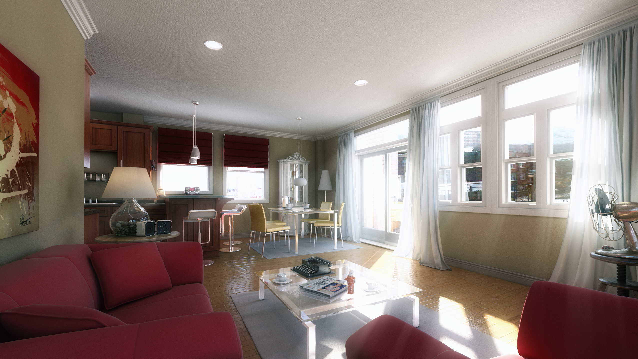
The Morse - Chicago Apartment
Below are two views, of a Chicago apartment, done for Chicago Architect Zesong Feng.
Did you enjoy this blog post? If so, then why not:
Leave Comment | Subscribe To This Blog | Email Me
Rhythm and Movement
Music exists in time; visual art exists in space. Yes, the two have much in common. It's intriguing to find music texts speaking of "directional lines through space," and of intervals and other terms we would have thought were exclusive to visual arts. Likewise, visual artists speak of rhythms, tempos and movements - all better known as musical terms. Many concepts overlap, and the overlaps have things to tell us.
Variations in tempo create rhythm, intervals of space or size have a similar impact in visual art. Anything of a similar nature that appears in sequence but can be broken or separated at irregular intervals. - a line of clouds or mountains, a border of foliage - also creates rhythm. Repetition is the key. When you look at a row of trees or picket in a fence, and each is lined up with military precision, with no variations in intervals of space, there are no surprises, nothing to take your breath away. But suddenly one tree or picket steps out of line or leaps above the rest. Something is happening, and we watch to see what comes next. The effect is subtler than its equivalent in music, but the impact is significant.
Movement may be diagonal, horizontal, vertical, pyramidal, circular or perhaps convoluted. These are lines of sight through a picture plane - directional lines through space! They are created by edges of contrasting value or temperature, by objects of repeated shapes or color, or applied line. The eye follows up, over and around, wherever those lines of sight lead. How rapidly the eye follows may be determined by how straight and unencumbered the line is., how hard the edge is, or, with implied line, how widely spaced the objects are that form it. Straight lines that converge have the effect of "zooming" the eye along towards their junction; if the line stops, the eye stops, too. Remember, you, the artist, make it happen, All this is under your control.
Compositional schemes are varieties of movements meant to move the eye through the rendering. The eye flows along one applied or implied line until redirected. In Western culture, we read left to right. Horizontal and diagonal patterns tend to lead the eye out at far right, rather than turn them around to revisit the entire picture plane. So to block the eye from making a rapid exit, we add an eye-catcher, otherwise known as a "stopper"

Did you enjoy this blog post? If so, then why not:
Leave Comment | Subscribe To This Blog | Email Me