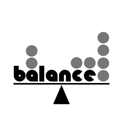
Distribution of Visual Weight
Balance is the even distribution of visual weight from left to right on the picture plane. This principle seems simple enough, but it's often over looked.
Symmetrical balance refers to work that is centered, and matched item for item, left to right. Superficially, it is the easiest to achieve. While it can be done effectively and elegantly, the trick is to avoid being predictable and stiff.
Asymmetrical balance is by far the common form used in renderings. It requires an off-center focal point, with enough interest or visual weight on the opposing side to keep the work appearing equally balanced. Because it relies on an uneven division of space, it is more suggestive of movement and, in most cases, is more interesting to the eye. Whether the shape, colors and textures employed keep the weight scale even is determined by how visually heavy the objects appear to be. The more they contrast with their background, the more weight they seem to have: bright versus neutral, dark versus light, and so on. There are an infinite number of variables. Even "dead" space in which nothing is happening can have weight.
Did you enjoy this blog post? If so, then why not:
Leave Comment | Subscribe To This Blog | Email Me


