Does Orientation Matter?
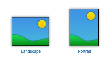
The orientation and proportions of a rendering's format should be whatever is required to support your composition and the form you plan to present.
If you settle on a horizontal format, the issue is not just how wide, but how tall in proportion to the width. Likewise with vertical. What mood or experience are you trying to convey to the viewer? Different formats inspire different feelings. A horizontal rendering is usually calming, expansive and restful; a vertical may be more dramatic or inspiring. Though some artists regard square format as static, I consider them simply neutral.
Did you enjoy this blog post? If so, then why not:
Leave Comment | Subscribe To This Blog | Email Me


