
Success, Failure and the Drive to Keep Creating
Elizabeth Gilbert was once an "unpublished diner waitress," devastated by rejection letters. And yet, in the wake of the success of 'Eat, Pray, Love,' she found herself identifying strongly with her former self. With beautiful insight, Gilbert reflects on why success can be as disorienting as failure and offers a simple — though hard — way to carry on, regardless of outcomes.

This talk was presented at an official TED conference, and was featured by our editors on the home page.
Great Art Quote
“Those who do not want to imitate anything, produce nothing.”
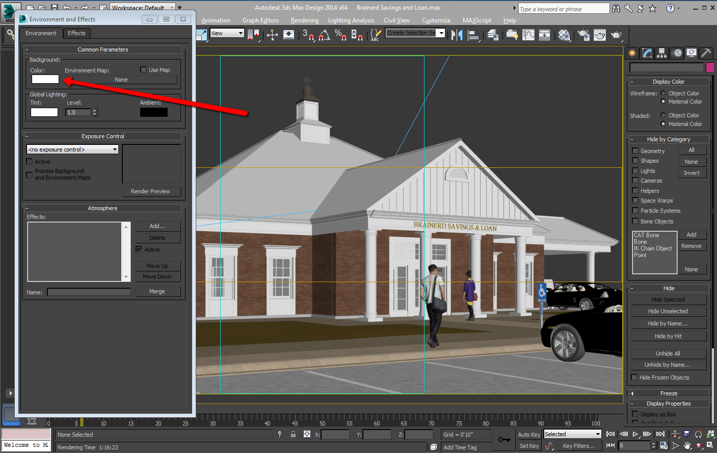
Advance2000
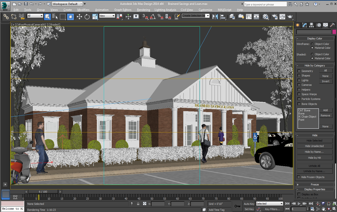
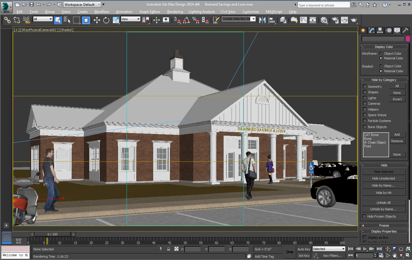
I am benchmark testing a desktop as a service (DAAS) called Advance 2000, and thus far, I am impressed! The company has been around for awhile, so they have a solid understanding of the needs of the Architecture, Engineering & Construction (AEC) industry.

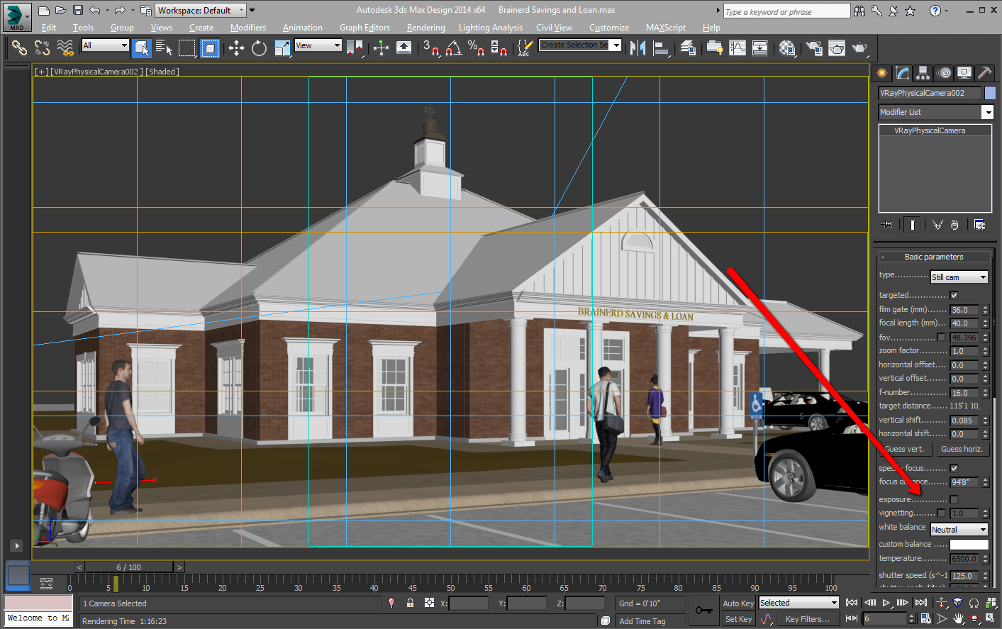
Here, is the scene I used.
The scene I used does use one plug-in, which I have uploaded here. I am in the middle of the test so I will post the results soon. I am using Chaos Group's V-Ray. and Autodesk's 3ds Max®, for my testing.
2 - Intel Xeon CPU X5680 @ 3.33GHz, 32.0GB, NVIDIA GeForce GTX 670 (Advance2000 Cloud)
My Advance2000 cloud render, running 2 Intel Xeons, took 1h 29m 32.7s. You can see the computer specs under the above final render.
1 - intel(R) Core i7 CPU 965 @ 3.20GHz (8 CPUs), 24.0GB, NVIDIA Quadro K5000 4095 MB (local farm)
4 - Intel(R) Core(TM) i7 CPU 920 @ 2.67GHz (8 CPUs), 12.0GB, Stock video card (local farm)
My local render farm, running 5 Intel i7s , took 1h 7m 58.9s. You can see the computer specs under the above final render.
So, we are almost running neck to neck, but in their lane is 2 rigs, and on my side is 5 rigs. Mind you, my rigs are about 7 years old and have already paid for themselves 10x.
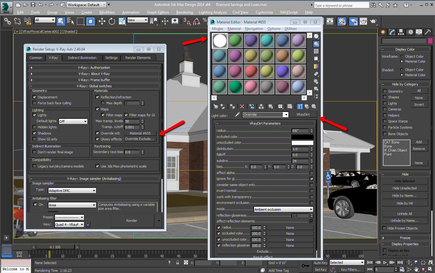
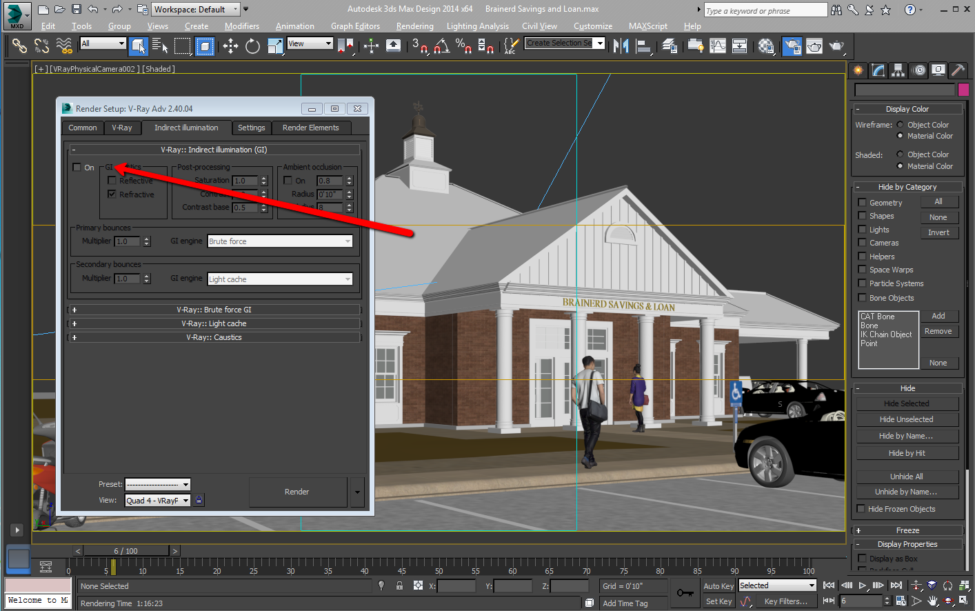
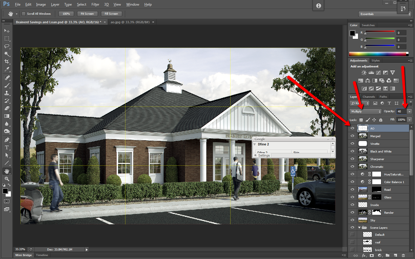
Ambient Occlusion Made Simple
I have tried scripts, plugins, and many other things to get a clean ambient occlusion pass, and this is my prefered method. I use Autodesk's 3DSMAX Design, Chaos Group's V-Ray, and Adobe's Photoshop.
In computer graphics, ambient occlusion is used to represent how exposed each point in a scene is to ambient lighting
An ambient occlusion pass is an easy way to add detail to your fine lines, and it also dirties up your rendering, for a more realistic image.

Lighting Ratio
Lighting Ratio
It’s easy to underestimate the tonal separation between the light side and the shadow side in sunlight. When lighting experts set up artificial lights for a movie shot, they call this separation the lighting ratio, and they usually try to reduce it to cancel the unflattering effect of harsh or dark shadows.
As artists we may want to do the same, depending on the feeling we want to create. But most often, beginning illustrators tend to ignore the dominance of direct illumination and play up secondary sources too much.
If you’re counting steps on a value scale from 1 to 10, you might typically see five steps of tone from sunlight to shadow, or two f-stops on a camera’s aperture setting. The separation would be reduced if there were high clouds, hazy atmosphere, or a light-colored ground surface.
The tonal scale ranges along a gradation from black to white, and all colors have an equivalent somewhere along that scale. As you practice this approach, you will become aware of occasions when it was actually the play of light on the subject that initially inspired you. You should start to try looking for tonal contrasts in the world around you, and begin to consider the play of tonal differences within a piece as an essential part of the composition.

Above: Colors you may perceive as being very different may actually be extremely close on the tonal scale. A slight variation in ‘color’ (tone) can make a big difference to your painting
Try bearing these three points in mind:
- Instead of asking what shape the object is, ask how the lights and darks flow across its surface. It is perfectly possible to depict the form of an object simply by using gradated tonal marks, without drawing a single line.
- Instead of searching for detail, ask whether some detail is difficult to see because it is in an area of shadow. This can be helpful in avoiding painting what you ‘know’ to be there, and in introducing some interest to the composition in terms of lost and found edges.
- Instead of asking what color it is, ask first where the area being considered sits on the tonal scale before asking where it sits on the color spectrum.
How Quickly Our Brains Can Redefine Normality

So let me show you how quickly our brains can redefine normality, even at the simplest thing the brain does, which is color. I want you to first notice that those two desert scenes are physically the same. One is simply the flipping of the other. Okay? Now I want you to look at that dot between the green and the red. Okay? And I want you to stare at that dot. Don't look anywhere else. And we're going to look at that for about 30 seconds.
And I'll tell you -- don't look anywhere else -- and I'll tell you what's happening inside your head. Your brain is learning. And it's learning that the right side of its visual fieldis under red illumination; the left side of its visual field is under green illumination. That's what it's learning. Okay? Now, when I tell you, I want you to look at the dot between the two desert scenes. So why don't you do that now?
Your brain is seeing that same information as if the right one is still under red light, and the left one is still under green light. That's your new normal.
So, what does this mean for context? It means that I can take these two identical squares, and I can put them in light and dark surrounds. And now the one on the dark surround looks lighter than the one on the light surround. What's significant is not simply the light and dark surrounds that matter. It's what those light and dark surrounds meant for your behavior in the past.

Notan – A Term That Architectural Illustrators Should Know
For many architecture friends, the line between engineering and art can be very blurred. A well designed building is one that is highly functional, sturdy, and of course, breathtakingly beautiful. Buildings designed with artistic finesse will often have excellent use of trusses, the Golden Ratio, and color theory. When you take a look at a photo featuring architecture of famous buildings, you can also see another element of design and aesthetics that many people overlook – notan.

Haven’t heard of Notan? You are not alone. This term is used in Japan as a way to describe a perfect harmony between white and black in artwork, especially when it is used as the foundation of a piece of artwork. Notan is a stark black-and-white contrast that reaches the core of the work of art, and it is something that can be witnessed when you look at the photo of a well-designed building. Notan simplifies things into the solid shapes that are the very basis of the structure. Moreover, though the term itself is Japanese, the truth is that the Notan is a universal concept.
When every portion of the drawing, painting or photo is rendered into black and white, you get the purest example of Notan that you could have, and in many cases, it is one of the most striking ways to view artwork. Notan is known for bringing out the very basic skeleton and foundation of any artwork, primarily through the use of contrast between black and white. It turns the concrete into the abstract, adds depth to every design, and also can help emphasize the focal point in the work of art. Though Notan is regarded as an aspect of art that is relegated to just black and white, you can see a lot of the aspects of Notan as the display of the very basis of a piece of artwork with monochromatic pieces featuring 3 or 4 different shades of a single color.

In many ways, notan can be used to judge the foundation of the work of art or architectural design. The stronger the notan is in the design, the more aesthetically appealing a painting will usually be. The same idea can be used to help make decisions about an architectural rendering. This is because notan, in its rawest form, is the very bare bones of the work of art, be it an architectural rendering or a painting. With architectural renderings, notan can be used to emphasize sharp angles, deep cuts, and particular stylistic focal points.
Notan can be an architect’s best friend, despite the fact that most people in the architecture industry are unaware of this universal art idea. Black and white architectural renderings, be it done by pencil or CADD, can make a huge impression on both admirers of architecture and potential buyers, as well. If you are unsure about the way that your architectural rendering will be received, looking at the Notan of the rendering may yield flaws that would otherwise be difficult to find.
Construct GTC Teaser
Construct GTC Teaser from Kevin Margo on Vimeo.
CONSTRUCT is a Sci-Fi short film advancing the art of filmmaking, VFX and virtual production.
This teaser was presented as part of a tech demo at Nvidia's GTC conference March 25, 2014. This is a work in progress intended to illustrate recent advancements in graphics hardware and software capabilities.
Watch how we're pioneering new filmmaking and virtual production workflows.
youtube.com/watch?v=nnaz8q6FLCk
Special thanks to Chaos Group, NVIDIA, Boxx, OptiTrack, iTooSoft, Just Cause Entertainment and the AMAZINGLY TALENTED team of artists, actors and stunt performers who've supported this project.
1. Rendered using V-Ray RT GPU 3.0 for 3ds Max
2. Rendered with NVIDIA K6000s and K40s on 3DBOXX 4920 GPU Edition
3. Typical video RAM usage 6-7GB
4. Typical render time 5-10 minutes (DOF and motion blur are all rendered in camera)
CONSTRUCT in its entirety is coming soon...
For more info:
constructfilm.com/
facebook.com/constructfilm
twitter.com/MargoKevin
kevinmargo.com
Optical Illusions Show How We See
Beau Lotto's color games puzzle your vision, but they also spotlight what you can't normally see: how your brain works. This fun, first-hand look at your own versatile sense of sight reveals how evolution tints your perception of what's really out there.

“Beau Lotto is founder of Lottolab, a hybrid art studio and science lab. With glowing, interactive sculpture — and old-fashioned peer-reviewed research—he’s illuminating the mysteries of the brain’s visual system.”
Why you should listen
"Let there be perception," was evolution's proclamation, and so it was that all creatures, from honeybees to humans, came to see the world not as it is, but as was most useful. This uncomfortable place--where what an organism's brain sees diverges from what is actually out there--is what Beau Lotto and his team at Lottolab are exploring through their dazzling art-sci experiments and public illusions. Their Bee Matrix installation, for example, places a live bee in a transparent enclosure where gallerygoers may watch it seek nectar in a virtual meadow of luminous Plexiglas flowers. (Bees, Lotto will tell you, see colors much like we humans do.) The data captured isn't just discarded, either: it's put to good use in probing scientific papers, and sometimes in more exhibits.
At their home in London’s Science Museum, the lab holds "synesthetic workshops" where kids and adults make abstract paintings that computers interpret into music, and they host regular Lates--evenings of science, music and "mass experiments." Lotto is passionate about involving people from all walks of life in research on perception--both as subjects and as fellow researchers. One such program, called "i,scientist," in fact led to the publication of the first ever peer-reviewed scientific paper written by schoolchildren ("Blackawton Bees," December 2010). It starts, "Once upon a time ..."
These and Lotto's other conjurings are slowly, charmingly bending the science of perception--and our perceptions of what science can be.
What others say
"All his work attempts to understand the visual brain as a system defined, not by its essential properties, but by its past ecological interactions with the world. In this view, the brain evolved to see what proved useful to see, to continually redefine normality." —British Science Association