

BLOG
Keep it Intriguing
While the overall appearance of a building can oftentimes be fascinating on its own, many buildings have small designs details that can stick out. Just think of all the smaller characters of an old church or cathedral, for example, such as sculptured gargoyles and angels etc. Taking renders of smaller details can communicate a lot about the character and type of architecture.

Did you enjoy this blog post? If so, then why not:
Leave Comment | Subscribe To This Blog | Email Me
Temperature
Temperature refers to the relative warmth or coolness of a color. We generally categorize reds, yellows and oranges as warm colors, and blues, greens and violets as cool ones, but it is possible to have cool reds (tending towards blue) and warm greens (tending towards yellow). It's all a matter of comparison.

Did you enjoy this blog post? If so, then why not:
Leave Comment | Subscribe To This Blog | Email Me
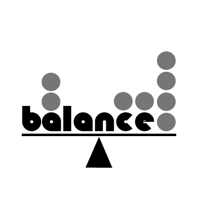
Distribution of Visual Weight
Balance is the even distribution of visual weight from left to right on the picture plane. This principle seems simple enough, but it's often over looked.
Symmetrical balance refers to work that is centered, and matched item for item, left to right. Superficially, it is the easiest to achieve. While it can be done effectively and elegantly, the trick is to avoid being predictable and stiff.
Asymmetrical balance is by far the common form used in renderings. It requires an off-center focal point, with enough interest or visual weight on the opposing side to keep the work appearing equally balanced. Because it relies on an uneven division of space, it is more suggestive of movement and, in most cases, is more interesting to the eye. Whether the shape, colors and textures employed keep the weight scale even is determined by how visually heavy the objects appear to be. The more they contrast with their background, the more weight they seem to have: bright versus neutral, dark versus light, and so on. There are an infinite number of variables. Even "dead" space in which nothing is happening can have weight.
Did you enjoy this blog post? If so, then why not:
Leave Comment | Subscribe To This Blog | Email Me
V-Ray Stainless Steel Material
Several of my subscribers commented on the stainless steel V-Ray material I used in my Chicago Apartment rendering. Well, I am glad you guys liked it, and as promised, here are my settings, along with an Autodesk® 3ds Max® Design file.
Did you enjoy this blog post? If so, then why not:
Leave Comment | Subscribe To This Blog | Email Me
The Quadrant Test
While every rendering needs quiet space for the eye to rest, to much "dead" space in any direction is, well, deadly. Examine your rendering in quadrants; be sure every quadrant is interesting.
Did you enjoy this blog post? If so, then why not:
Leave Comment | Subscribe To This Blog | Email Me
American Creativity is Declining
““For the first time, research shows that American creativity is declining” in part due to a “focus on standardized curriculum, rote memory and nationalized testing.””
Knowledge is Power
Knowledge is power; the Wright brothers flew because they understood the laws of aerodynamic. Likewise, understanding the "rules" of composition sets you free. It doesn't obligate you to use all of them all of the time. Knowing them well, you'll know when you can safely ignore them. You'll use the rules not merely to prevent or solve problems, but also to have fun thumbing your nose at them. Degas could challenge the rules of composition because he know them well - you could say they spent a lot of time together.
Did you enjoy this blog post? If so, then why not:
Leave Comment | Subscribe To This Blog | Email Me
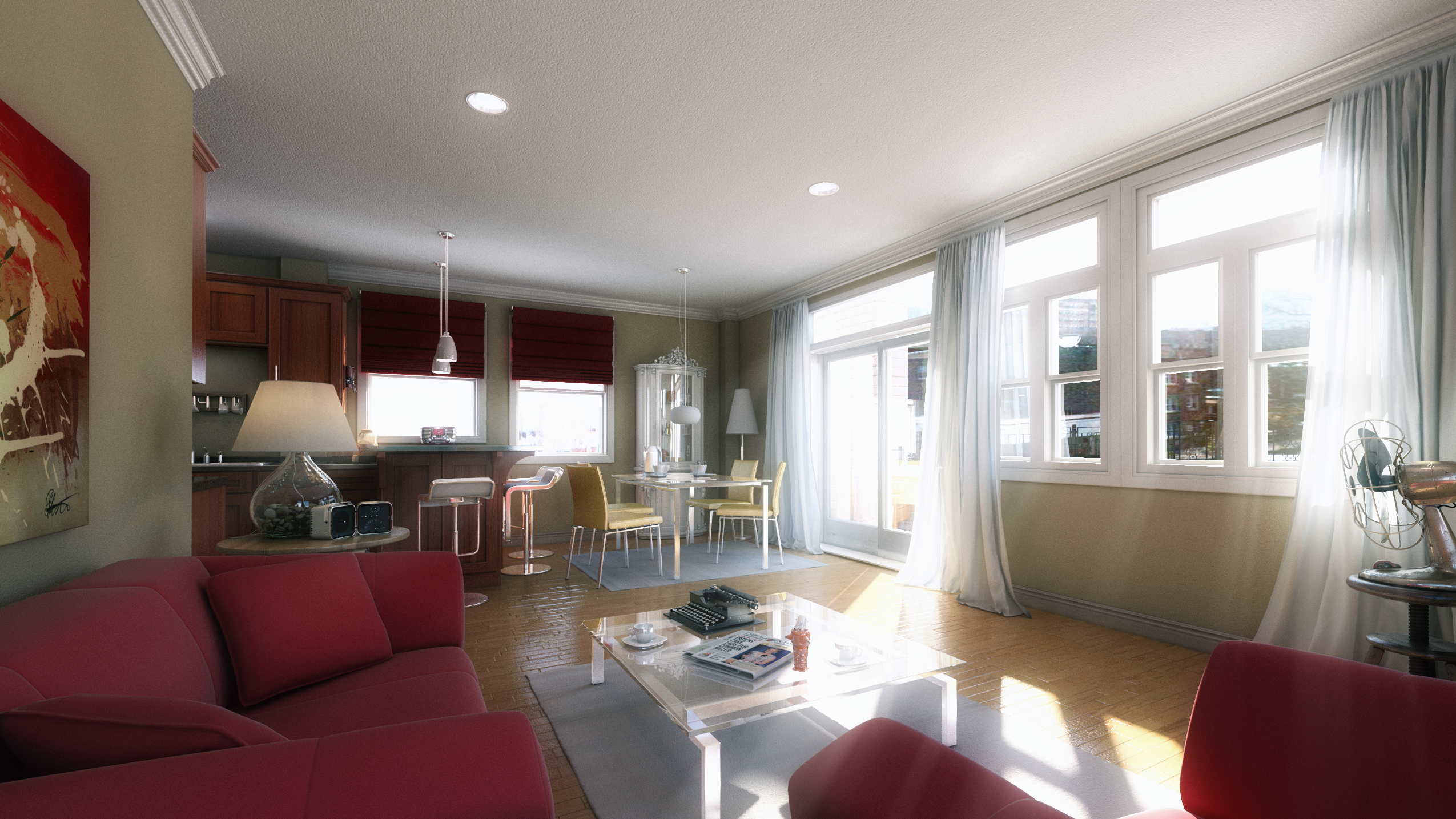
The Morse - Chicago Apartment
Below are two views, of a Chicago apartment, done for Chicago Architect Zesong Feng.
Did you enjoy this blog post? If so, then why not:
Leave Comment | Subscribe To This Blog | Email Me
Rhythm and Movement
Music exists in time; visual art exists in space. Yes, the two have much in common. It's intriguing to find music texts speaking of "directional lines through space," and of intervals and other terms we would have thought were exclusive to visual arts. Likewise, visual artists speak of rhythms, tempos and movements - all better known as musical terms. Many concepts overlap, and the overlaps have things to tell us.
Variations in tempo create rhythm, intervals of space or size have a similar impact in visual art. Anything of a similar nature that appears in sequence but can be broken or separated at irregular intervals. - a line of clouds or mountains, a border of foliage - also creates rhythm. Repetition is the key. When you look at a row of trees or picket in a fence, and each is lined up with military precision, with no variations in intervals of space, there are no surprises, nothing to take your breath away. But suddenly one tree or picket steps out of line or leaps above the rest. Something is happening, and we watch to see what comes next. The effect is subtler than its equivalent in music, but the impact is significant.
Movement may be diagonal, horizontal, vertical, pyramidal, circular or perhaps convoluted. These are lines of sight through a picture plane - directional lines through space! They are created by edges of contrasting value or temperature, by objects of repeated shapes or color, or applied line. The eye follows up, over and around, wherever those lines of sight lead. How rapidly the eye follows may be determined by how straight and unencumbered the line is., how hard the edge is, or, with implied line, how widely spaced the objects are that form it. Straight lines that converge have the effect of "zooming" the eye along towards their junction; if the line stops, the eye stops, too. Remember, you, the artist, make it happen, All this is under your control.
Compositional schemes are varieties of movements meant to move the eye through the rendering. The eye flows along one applied or implied line until redirected. In Western culture, we read left to right. Horizontal and diagonal patterns tend to lead the eye out at far right, rather than turn them around to revisit the entire picture plane. So to block the eye from making a rapid exit, we add an eye-catcher, otherwise known as a "stopper"

Did you enjoy this blog post? If so, then why not:
Leave Comment | Subscribe To This Blog | Email Me

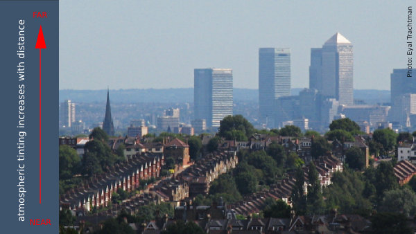
The Quality of Light
When light fades, color go with it, yet this is not just a question of the quantity of light; it's also the quality. Both time of the day and climactic conditions make a big difference. Morning, midday and afternoon light all have a different effect on color, making them cooler or warmer, crisp of vague.
Distance. Color nearest to us appear brighter and warmer than those in the distance; colors seem duller and cooler as the atmosphere in between increases. If you want objects to recede in the distance, they have to lighten, as well.
Surrounding Colors. Every aspect of color is relative. Learn to see each color with a fresh eye every time.
Did you enjoy this blog post? If so, then why not:
Leave Comment | Subscribe To This Blog | Email Me

Try The Seesaw Test
Imagine your rendering poised - compositionally speaking - on the tip of a triangle, with your hands steadying it. Ask yourself : if you took your hands away, which direction would it fall? What needs to be added, subtracted, lightened or darkened, or made more interesting to provide the needed balance?

Did you enjoy this blog post? If so, then why not:
Leave Comment | Subscribe To This Blog | Email Me

Determining the Viewpoint
The viewpoint - the level and angle of the viewer's eye in relation to your subject. How high or low the horizon line is placed determines whether the viewer is looking down, straight ahead or up at the subject.
Your viewpoint indeed makes a difference. A portrait with the face placed high on the picture plane projects force and dignity; one placed lower is approachable and less intimidating.. In an exterior architectural rendering, a low horizon line suggests that the viewer is looking down from above, surveying a scene that is expansive and open, Looking up at the horizon line suggests a more intimate, perhaps introspective scene.
When placing the horizon line, remember that unequal division of space are generally considered the most interesting. Avoid centering the horizon line and the renderings focal point.

Did you enjoy this blog post? If so, then why not:
Leave Comment | Subscribe To This Blog | Email Me
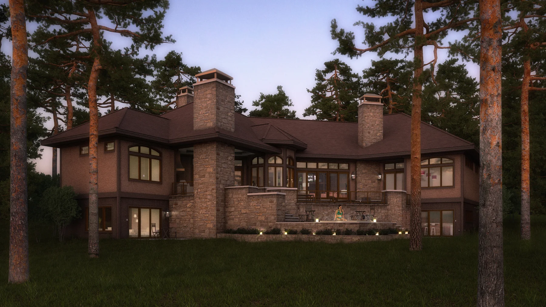
House in the Woods
In this 3-D architectural rendering, I tried to highlight a majestic open-air space by showing the home in its surroundings, with its towering trees.

Did you enjoy this blog post? If so, then why not:
Leave Comment | Subscribe To This Blog | Email Me

15 Components of Great Composition
By studying the masters you admire with the design elements and principles in mind, you can discover much that will be helpful. Refer to this list of design components commonly found in great compositions. Popular myths to the contrary, a great rendering is seldom all spontaneous, mysterious, and free-flow. It just looks that way. Successful artists know what they are doing, and they know how to repeat it. If they know it, you can learn it.
As you review art in books or exhibits, practice identifying these components. Then consciously incorporate them into your own work.
- A strong value pattern. This means the work has connected light and shadow shapes that unify and give power to the rendering. One rule of thumb is that 80 percent of the dark values (shadow shapes) should be connected to each other.
- A compositional scheme. A good rendering is usually not without its surprises , but it should have an overall organizational plan.
- A dominant focal point or center of interest. There should be no question where to look first.
- An overall mood. The scene may be upbeat or solemn, peaceful or haunting, joyful or angst-ridden. However subtle or strong, you should feel something about what you re seeing.
- Balanced shapes. Compositions can be symmetrical or asymmetrical. Bright color, high contrast, detail and direction of line all effect the balance of shapes.
- Balanced temperature. We generally don't want to be cold. Therefore, a painting that is overwhelmingly warm still draws the eye, but one that is predominantly cold often repels it. Find ways to introduce warmth into cold subjects.
- A sense of freshness. The rendering should breath as though fresh off the vine - not appearing overworked.
- Interesting intervals. This commonly refers to the spacing of similar objects. Intervals should be irregular, not perfectly repetitious.
Did you enjoy this blog post? If so, then why not:
Leave Comment | Subscribe To This Blog | Email Me

15 Pointers for Better Composition
There's an exception for every rule. But it is worth knowing what the rules are - and adhering to most of them most of the time. - that allows artists to break selected rules successfully, and thereby to make the stunning, memorable exceptions! Here is a laundry list of pointers to keep in mind. Note how many of them apply to the planning phase.
- Render only what you love or what intrigues you. if you are bored, your viewers will pick up on it - and they may share you opinion
- Thumbnail sketches are worth the trouble. Thumbnails quickly give you a sense of the compositional possibilities. Do several.
- Think three-dimensionally in your design. Consider all planes; foreground, middle ground and background.
- Work on modelling skills. Well-developed modelling skills give you the freedom to rearrange, to manipulate shapes, lines and color, and to be loose without losing believability.
- Simplify. If you can get along without an object or detail, eliminate it.
- Include quite places for the eye to rest. Contrast between open and busy spaces adds interest.
- Mood is best made, not happened onto. Decide what feeling you're after, and support it early on
- Consider color early on. Color scheme can develop along with the rendering, but it's best to give yours some thought beforehand.
- Either warm or cold colors should dominate. Keep in mind that the human eye is more attracted to warm colors
- Watch format proportions.
- Start with big, simple shapes. Don't hamstring yourself with detail early in your rendering's development
- Leave something to the imagination. Omitting detail requires much greater discipline and skill than putting it all in. This also keeps the viewers mind engaged.
- Remember the finishing touches. Highlights, dark accents and bright jewels of color bring your rendering to life.
- Step away from your monitor after a couple hours. Rendering is a two-step process; application alternated with evaluation
- When you think you are through, give it time to cool. Turn your monitor off and revisit it later - once, twice, or several times more.
Did you enjoy this blog post? If so, then why not:
Leave Comment | Subscribe To This Blog | Email Me
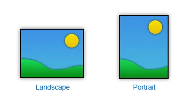
Does Orientation Matter?
The orientation and proportions of a rendering's format should be whatever is required to support your composition and the form you plan to present.
If you settle on a horizontal format, the issue is not just how wide, but how tall in proportion to the width. Likewise with vertical. What mood or experience are you trying to convey to the viewer? Different formats inspire different feelings. A horizontal rendering is usually calming, expansive and restful; a vertical may be more dramatic or inspiring. Though some artists regard square format as static, I consider them simply neutral.
Did you enjoy this blog post? If so, then why not:
Leave Comment | Subscribe To This Blog | Email Me
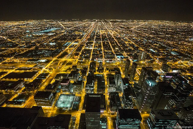
Cityscape Chicago: A Timelapse of Chicago in 30,000 Photographs by Eric Hines

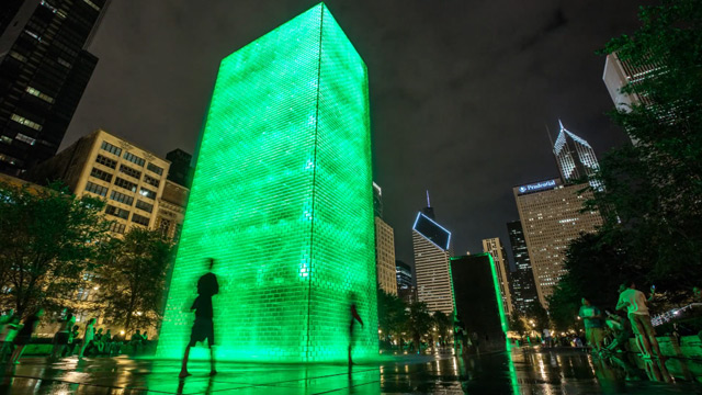

Filmmaker Eric Hines does a phenomenal job of making us look good here in the windy city with his most recent timelapse, Cityscape Chicago. The clip consists of over 30,000 still photographs taken between July and October of this year primarily around the bustling downtown areas including the financial district, Navy pier, Wacker drive and the lakefront.
Did you enjoy this blog post? If so, then why not:
Leave Comment | Subscribe To This Blog | Email Me
Pay Your Dues and be Patient
“Pay your dues and be patient. Very rarely does one come right out of art school and land their dream job. And I find that a lot of young creatives want that right away. If you stay true to your passion, eventually you’ll get to where you want to be.””
Did you enjoy this blog post? If so, then why not:
Leave Comment | Subscribe To This Blog | Email Me
Contrast and Emphasis
Contrast is emphasis. The sharpest contrast should be where you want the eye to go first. Contrast comes in many forms, including value, color, detail and line.
Value Contrast
The most important element is the value; the most influential of the principles is contrast. Put them together and you have a kind of contrast that packs the most punch.
Color Contrast
This usually refers to contrast in hue or temperature, but intensity also can play a role. A power struggle ensues when hues are equally intense. One must dominate, or the eye won't know where to look.
Contrast in Complexity
Just as brightness is enhanced by neutrality, detail, texture and pattern are more exciting next to areas of simplicity.
Contrast in Line
A rendering with entirely horizontal lines is effectively no rendering at all. When even a minimum of diagonal and vertical lines is added, the improvement is dramatic.

Did you enjoy this blog post? If so, then why not:
Leave Comment | Subscribe To This Blog | Email Me