Viewing entries in
knowledge

Chiaroscuro

Chiaroscuro

Chiaroscuro

Chiaroscuro

  1. :  pictorial representation in terms of light and shade without regard to color
  2. a:   the arrangement or treatment of light and dark parts in a pictorial work of artb:   the interplay or contrast of dissimilar qualities (as of mood or character)
  3. :  a 16th century woodcut technique involving the use of several blocks to print different tones of the same color; also:  a print made by this technique
  4. :  the interplay of light and shadow on or as if on a surface
  5. :  the quality of being veiled or partly in shadow

Contrasting effects of light and shade in a work of art. Leonardo da Vinci brought the technique to its full potential, but it is usually associated with such 17th-century artists as Caravaggio and Rembrandt, who used it to outstanding effect. The chiaroscuro woodcut, produced by printing different tones of a colour from separate woodblocks on a single sheet of paper, was first produced in 16th-century Italy.


Did you enjoy this article? I would love to hear your thoughts, so don’t be shy and comment below! Please don’t forget to subscribe to my RSS-feed  or follow my feed on Twitter, Google+ and Facebook! If you enjoyed the following article we humbly ask you to comment, and help us spread the word! Or, if you would like, drop me an email.

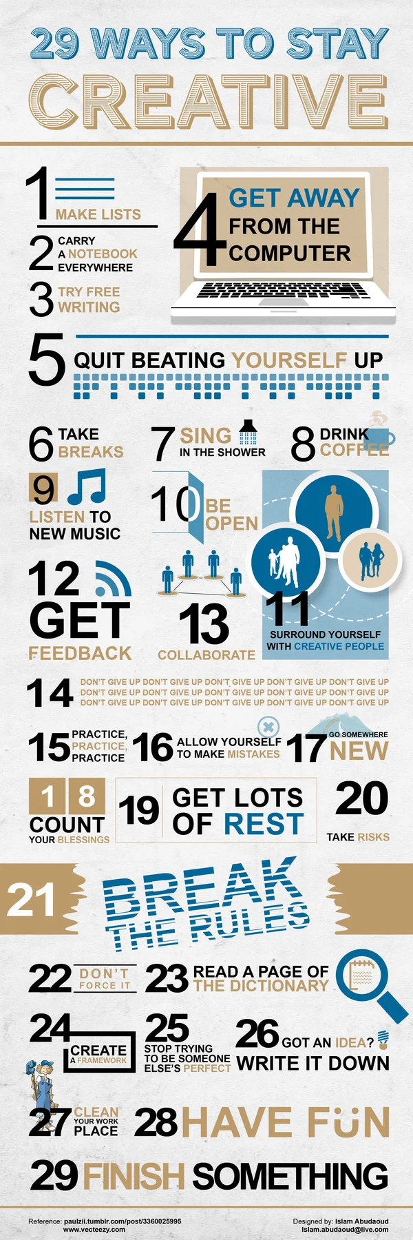
29 Ways to Boost Creativity

29 Ways to Boost Creativity

There’s no secret recipe to being creative. Generally when we’re researching new concepts or working on a new task, creativity breeds out of conception. That said, it’s easy to burn yourself out when consistently churning out new and creative ideas. There are however, a few ways to maintain your creative state of mind.

The below INFOGRAPHIC (from Islam Abudaoud) outlines 29 ways to wake and reinvigorate the creative side of your brain. Here’s some of our favourites:

  • Carry a notebook everywhere you go, you never know when opportunity might strike!
  • Get away from the computer, even if it’s for 5 minutes.
  • Quit beating yourself up, stress can stunt creative thinking.
  • Sing in the shower. Really, go for it!
  • Be open. Don’t shut out ideas just because they’re unfamiliar, you’ll be surprised at what you can learn!
  • Surround yourself with creative people.
  • Always get feedback. It’s important that you know what you’re doing right/wrong in order to improve.
  • DON’T GIVE UP!
  • Break the rules. As long as you’re not harming yourself, or someone else – try going against the norm.
  • Stop trying to be someone else’s perfect – just be YOU.
  • Finish something. Even the most mundane of tasks can breed innovation, give yourself a sense of accomplishment!
  • Get lots of rest. A tired brain is a useless one. 

Did you enjoy this article? I would love to hear your thoughts, so don’t be shy and comment below! Please don’t forget to subscribe to my RSS-feed  or follow my feed on TwitterGoogle+ and Facebook! If you enjoyed the following article we humbly ask you to comment, and help us spread the word!

Who Needs 3-D Design?

In the world of architectural design things have evolved rather rapidly in the past few years in what regards the visualization of the project before the actual building. This is due to the amazing softwares available that allow the designer to turn their 2-D sketches and plans into illustrated and rendered 3-D images. A 3-D design helps the client see how the building will look like months before the actual building of it, and it also helps them make any changes if they sense something isn’t quite as they’ve imagined.

Although architects and designers have an excellent sense of 3-D visualizing of a building just by looking at a 2-D plan, the ordinary people don’t have this ability; hence 3-D design has come to their rescue. But let’s see who needs 3-D design and mostly why and how it can draw the line between an architectural success and a total failure. Are you ready?

1. Visualizing 2-D Design is Difficult

As we were saying, for the client, who isn't knowledgeable in most cases, visualizing a 2-D plan is rather difficult and in the end not that satisfactory. What does this mean? You’ll deal with a lot of changes and adjustments of the plans (meaning extra work) or even worse, it won’t meet the needs and expectations of your clients, and they’ll either reject it or refuse funding it, depending on the case.

2. Instant Changes

A 3-D design and rendering helps the client see how the building will look like until the very last details. Also, the software programs allow you to make instant changes during the board meeting presentation so that, at the end of the meeting everybody’s 100% happy with how things will work out. Isn't this a giant plus?

3. 3-D Design Presentations to Impress

A 3-D design illustration is clearly the best way to impress a board of investors right from the very start. The project will look astonishing due to the rendering and the 3-D illustration on one hand, and on the other you will look like a professional (that you are). This is the message you will convey to your audience and in the end things will work out your way.

4. Fewer Changes during Construction

Another giant plus, when it comes to 3-D rendering, is the fact that there will be fewer changes during the actual construction of the building that you've projected. This means fewer headaches and moving back and forth with the work. In the end,  this will save, time, money and stress on both parts.

5. Reduce Extra Charges

We all know that extra work means extra costs and still no one wants it, especially not the clients who in most cases run on a tight budget. 3-D design and rendering saves you from spending far beyond the budget you’ve allocated this is why it’s so critical. Next time you ask yourself “who needs 3-D design” you’ll know the answer already: everybody!


Did you enjoy this article? I would love to hear your thoughts, so don’t be shy and comment below! Please don’t forget to subscribe to my RSS-feed  or follow my feed on TwitterGoogle+ and Facebook! If you enjoyed the following article we humbly ask you to comment, and help us spread the word!

Everything about Photo-Real Architectural Rendering

For those of you who aren’t familiar with photo-real architectural rendering and want to learn more about it you’ve landed on the right side of the web.

Also called architectural illustration, architectural rendering is the art that refers to the creation of 2D and 3D images or animations in order to highlight the most important attributes and facets of the given architectural design.

While architectural rendering has been used in the construction and design industry for decades now, its more modern form uses computer-generated renderings, also known as photo-real renderings.

What is the main use of photo-real architectural renderings?

Well, the combination of 3D drawing art and software technology has led to a variety of uses of these renderings. First and foremost, architectural renderings are used for presentation of new architectural and design purposes, as well as for marketing and advertisement. Another use of architectural rendering is the design analysis purpose.

Still, one of the most powerful uses it has is to help people see how their house or property will look when it will be done constructed and decorated. Nowadays more and more architect bureaus and construction companies use photo-real architectural rendering in order to show their clients the final product and make sure that this is what they want.

Moreover, architectural renderings we see today are to the right proportion, scale and even use real life textures or materials and even color and finishes.

Another important use of these types of renderings are in real estate sales because they facilitate the possibility to make slight changes in design well before the house or property is actually built.

Are there more types of photo-real architectural renderings?

The answer is yes. And this depends on what the client wants and needs. Hence, architectural renderings can refer to still renderings, animations, virtual tours, renovation renderings, as well as 3D and panoramic renderings.

Depending on the purpose of the rendering, a professional architectural illustrator can help you with the exact type of rendering that you need. Basically, the job of the architectural illustrator is to put complex concepts or objects into reality and elaborate photo-real or non-realistic 3D images or animations. The renderings are used to communicate design ideas to clients, customers, to the general public or to owners and committees.

What does it take to be a professional architectural illustrator?

Although there are very many softwares and technologies that architectural illustrators use to create this type of artwork, not everybody can create a photo-real rendering. You need to have the knowhow in order to operate the special softwares and create the final version of this architectural art.

All of the professional architectural illustrators are artists at their core and they know a vast deal about proportions, sections, parameters and the architecture of buildings, besides having a tremendous imagination and creativity. Besides, a professional render knows all about the psychology of color, he understands how light and shadow works in other words, he sees like an artist, and this is visible it the final product.

Last but not least, in order to deliver spectacular art pieces such as design renderings, a pro needs to be passionate of his work. Every great man in the history of mankind has been passionate of his work to the point in which he managed to revolutionize the world.

How does a photo-real rendering come to life?

If you’ve ever wondered how one can “bring to life” such abstract concepts in a sheer visual manner, you’ll find the answer right away. Well, an architectural rendering is the direct result of combining the fundamentals of art with the latest software technology.

A render engine is included with every major 3D software suite nowadays, and it depends on the artist on which software he uses. Due to the evolution of technology, the softwares available today come with easy to use and understand parameters that help a whole lot the illustrator editing his art in order to come out as realistic and complete as possible. The material and lighting packages that come with most rendering softwares help even more with achieving that over the top level of realism.

Some of the most used software in architectural rendering to get that photo-real feel to the final product are 3D MAX Design Studio, ArchiCad, Revit, Maya, AutoCad Architecture, Google Sketch Up as well as Rhinoceros.

The architectural illustrator uses one of these softwares, adds texturing, transparency, shadows as well as radiosity and caustics for the finishing touches. With a bit of magic, a lot of knowhow and an artistic touch, the photo-real architectural rendering comes to life and is ready to use.

Why do we need photo-real architectural renderings?

We live in a world where taking risks, especially when it comes to constructing or renovating a property, is not worth it, in fact, is quite risky. Photo-real renderings come to help those who face difficulty in choosing among the infinite options when building, designing or decorating their place.

We need photo-real architectural rendering because it eases our imaginative work and it shows exactly how things will look after completion. Architectural rendering excludes all the unexpected and unpleasant surprises that could come along and shows to the client the final look and design of their property.

In the world,  we live in today we can take no more risks. We work all of our lives to purchase the home of our dreams, and we don’t want that moment to turn into a nightmare. This is why photo-real architectural rendering is the answer to designing and decorating a house before taking action and completing the construction.


Did you enjoy this article? I would love to hear your thoughts, so don’t be shy and comment below! Please don’t forget to subscribe to my RSS-feed  or follow my feed on TwitterGoogle+ and Facebook! If you enjoyed the following article we humbly ask you to comment, and help us spread the word!

Copying Rendering Techniques

Copying rendering techniques is one of the most challenging and revealing ways for, 3D artists to test themselves and further their abilities.

Copying the 3D artwork of the masters are something every 3D artist can relate to. Copying is a form of inquiry that can bring significant understanding to an artist. And the practice is not just for beginners; even master 3D artists have returned to copying for their own edification.

The practice of copying drawings dates as far back as the 14th century and has long been considered one of the best ways to learn.

Copying good ideas.jpg

Did you enjoy this blog post? If so, then why not:

Leave Comment | Subscribe To This Blog | Email Me


Skill vs. Creativity

Skill is applied knowledge. It's when you know something and can use it over and over again  - a little like programming a computer to perform certain functions. That's skill. Some teachers are apposed to skill because they believe it kills creativity. But, in fact, it's the opposite - skill gives you the capacity to create. 

Creativity takes place in the unknown - the discovery of a form or image not yet manifested. It is why artists make art. Consider Van Goch in the last 70 days of his life - he created about one painting a day. Why? It doesn't seem his motivation was money. Just imagine coming each day with a painting, propping it up on the bed, and wondering where the image come from. I believe what motivates him to go out the next day and paint again and again was the excitement of not knowing what was going to happen next.

images.jpg

Did you enjoy this blog post? If so, then why not:

Leave Comment | Subscribe To This Blog | Email Me

Sharp and Diminishing Detail

Because we do not have the eyes of eagles and because we perceive things through the earth's atmosphere, we are not able to see near and distant planes with equal clarity at the same time. A glance out the window confirms that close objects appear sharp, and in detail, whereas those far away look blurred and lack clarity. In your rendering, either using environmental effects in your rendering engine, or in post software like Photoshop, you can slightly blur the background, make it less saturated, and even add a slight blue tint to it.

Distant Fog

Distant Fog

Did you enjoy this blog post? If so, then why not:

Leave Comment | Subscribe To This Blog | Email Me

Critique Guidelines

Unfortunately, many beginning artist let their fear of making errors prevent them from creating anything at all. Don't stop before you start. Get your work out there so people can look at it, give you some advice, and you can get some critiques.

How does one begin a critique? Unfortunately, there are no formulas. You may want to identify the three components of the work (subject, form, and content), evaluate them separately, and then examine how they work together as a whole. Analysis may seem awkward in the beginning, but asking some of the following questions may help.

  • What area feels most successful and why?
  • What areas feel incomplete or troublesome, and what is the cause?
  • How is the subject presented?
  • Are there visual or symbolic metaphors that could have helped expand the rendering?
  • If the rendering is nonobjective, what suggests the meaning?
  • How are the elements used to support or destroy the rendering compositionally?
  • Have the principles of organization been observed?
  • What is the intention behind the rendering?
  • What is being communicated - a feeling, and idea, a personal aesthetic?
  • Is it too esoteric?
  • Is it to obvious?
  • Where does the rendering succeed in integrating these components, and where is it less successful?
You may want to begin with your own feelings about each issue but then ask yourself what sets up that response and how it could be altered. - are there other interpretations, viewpoints, or relationships that could have been present? As you become more skilled at analysis, you may find it becomes less necessary to consciously explore a list of questions. The most relevant may simply rise to the subconscious.

images.jpg

Did you enjoy this blog post? If so, then why not:

Leave Comment | Subscribe To This Blog | Email Me

What's That?

Step away from your work for at least a day. After coming back, look at what you have created and if you see anything that makes you say, "what's that?", get rid of it. If you say, "what's that?", you can almost guarantee your viewer will say, "what's that?", as well.

1409010_question_mark_.jpg

Did you enjoy this blog post? If so, then why not:

Leave Comment | Subscribe To This Blog | Email Me

Creative Leaders

John Maeda, President of the Rhode Island School of Design, delivers a funny and charming talk that spans a lifetime of work in art, design and technology, concluding with a picture of creative leadership in the future. Watch for demos of Maeda’s earliest work -- and even a computer made of people.

John Maeda is the president of the Rhode Island School of Design, where he is dedicated to linking design and technology. Through the software tools, web pages and books he creates, he spreads his philosophy of elegant simplicity.

Did you enjoy this blog post? If so, then why not:

Leave Comment | Subscribe To This Blog | Email Me