

BLOG
Organic Unity = Art?
If an artist is successfully in welding all three of these components (subject, form, and content) in a work, they become inseparable, mutually interactive, and interrelated - as if they were a living organism, When this is achieved, we can say the work has organic unity, containing nothing that is unnecessary or distracting, with relationships that seem inevitable.

Organic Unity
Did you enjoy this blog post? If so, then why not:
Leave Comment | Subscribe To This Blog | Email Me
Leading Lines
Composing a rendering with leading lines is a traditional technique that has long captured the attention of painters, photographers, and architectural illustrators.
Like a tour guide, you'll be leading viewers where you want them to go - by giving direction to the eye. Whether the lines are straight, zigzagging, or softly curving through the composition, viewers will have a sense of the composition, viewers will have a sense of satisfaction after traveling along the line that you, the architectural illustrator, provided. Most often, a leading line starts in the near foreground and then draws your viewer into the heart of your rendering. It's an extremely effective way to direct viewers on a visual journey through your rendering.
Once you start to recognize the potential for leading lines, you'll jump at opportunities to exploit them. They can be see in in landscaping, buildings, shorelines, streets, fences, and more. They can be colorful streaks of moving taillights at night, or they can be the long shadows of a column or tree that extends from the camera to subject.

Did you enjoy this blog post? If so, then why not:
Leave Comment | Subscribe To This Blog | Email Me
Exceptions Can Sometimes Be The Rule
You'll rarely go wrong in choosing a renderings composition that follow the rules. However, for stepping up the creativity at times, don't get locked into the Rule of Thirds as a hard-and-fast policy. At times, it can be restrictive for those 3D scenes that just don't fit onto a Thirds settings. While the perfect spot fir the subject may be somewhere off-center, for example, it might not necessarily be in one of the power points.
In fact, there are times when a dead-center composition is dead-on. This can be a subject with strong symmetry, such as a wheel, in which the hub is in the middle while the spokes spread out in all directions. When rendering close up, work, too, as does symmetry in most of my architectural renderings. Likewise, some renderings don't even have a specific subject; rather, the entire rendering is the subject, such as a pattern or repetition scenes.

Did you enjoy this blog post? If so, then why not:
Leave Comment | Subscribe To This Blog | Email Me
Facing The Right (or Left) Way
Here's another way to expand your portfolio of successful renderings: When a person, animal, or vehicle is positioned fairly small in your rendering, make sure the subject moves into - not out of - the composition. This keeps the viewers attention directed to the main center area, rather than having the eye wander distractedly to the edge of the render and out of the picture.
Of course, as with any rule, there can be artfully stylish exceptions, and when a subject occupies a big part of the render, this guideline may not even apply. But, in general, when a subject moved or faces in one direction, leave room to breathe in front of the subject. Viewers will find this visually pleasing, as opposed to a more unsettling placement of a subject near a rendering border and facing toward that close edge of your rendering.
Your subject doesn't even need to be moving. Plus, this concept applies not only to human subjects but also to animals, cars, boats, and even statues. Other objects may have a front that "points" in a particular direction, such as when rendering a house or vehicle from the side. Likewise, a tree that leans, for instance, should tilt toward the middle of the scene.
Yes, this strategy is yet another thing to worry about when compositing a rendering. But, trust me. You'll soon get the hang of this concept of directing the movement toward the center of your rendering.
![[2008-12-24] New Zealand__MG_6872.jpg](https://images.squarespace-cdn.com/content/v1/50357984e4b09af678ed11bf/1357427231760-95TP3P4WPLJYGAJUGQ39/%5B2008-12-24%5D+New+Zealand__MG_6872.jpg)
Did you enjoy this blog post? If so, then why not:
Leave Comment | Subscribe To This Blog | Email Me
Splitting Your Composition in Half
Occasionally, splitting your composition in half is better. This typically involves water reflection, when the rendering above is just as strong as the reflection below. Giving equal weight to both halves helps capitalize on the eye-catching combination of balance and serenity.
Other times, you may want to leave out the sky entirely. Often, this is on an overcast day rendering since the overexposed brightness can overwhelm everything else in the rendering. In other situations, you may just want the visual competition of the blue sky, concentrating on a non-sky landscape or cityscape rendering or a more intimate view.
And at times, you may not need a sky at all. A bright/white sky can detract from the rest of the rendering. Or, on a sunny day, the contrasting blue could draw the eye away from the other colors in your rendering. In those situations, no sky at all may be the best strategy.

Did you enjoy this blog post? If so, then why not:
Leave Comment | Subscribe To This Blog | Email Me
The Sky: How much or How Little
I often see newbies split exterior architectural renderings into equal halves, with the horizontal line or maybe a distant shoreline extending right across the middle of the render. The viewer, then, is left to decide which half of the architectural renderings is most beneficial, But that's for you - the architectural illustrator - to decide when composing your rendering! Keep this in mind as you compose, instead of cutting the composition in half. This will force you to decide: Which is more important, the land or the sky? Or the water?
An architectural rendering's visual weight (the most appealing things in the rendering) should determine where you place the horizon. With the Rule of Thirds, you can place the horizon line on the lower third diving line or the upper third. And you can adapt the Thirds principle as necessary. If things are exceptionally dull overhead or down below, even a third of the frame devoted to that space could be too much. So you can be more extreme and place the line extremely low or high - say, a thin trip of the sky or landscape.

Rule of Thirds
Did you enjoy this blog post? If so, then why not:
Leave Comment | Subscribe To This Blog | Email Me
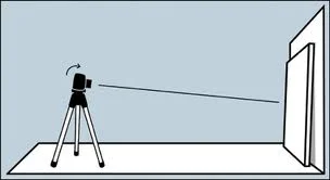
The Fine Art of Tilting the Camera
This shooting style - tilting the camera to turn a vertical or horizontal line into a powerful diagonal - has been around for awhile. One term used for it is the "Dutch angle", which is a longtime cinematography; to create visual tension. Still, when I tell clients that it's perfectly acceptable, if not totally desirable, to occasionally slant the camera, they express surprise. After all, your're supposed to keep the camera level at all times, correct? Well, there are exceptions! Used at the right artistic time, a nice tip of the camera can pump up the visual tension by creating exceptional angles and diagonals. Rendering with your camera askew (so as to change naturally appearing vertical or horizontal lines into diagonals) can be done for a variety of small scenes or ambitious views. Like other creative techniques, you won't want to use this method all the time, but when the subject calls for it, angling the camera is one worthy artist weapon.
Did you enjoy this blog post? If so, then why not:
Leave Comment | Subscribe To This Blog | Email Me
The WOW Factor: Point Of View
Too many architectural illustrators are locked into a standard view: pointing the virtual camera straight ahead from a standing height. An eye-level perspective is so easy to fall back on. Sure, the eye-level perspective ultimately may be the best viewpoint, but you honestly won't know unless you explore the scene for other, potentially better, viewpoints. Playing with point of view is a surefire way to put pizzazz in your architectural rendering. Go ahead. You have my permission to unleash your creative side. Whenever and wherever you can, seek out this attention grabbing camera views that most architectural illustrators fail to see. Architectural illustrations are about discovering the best camera angle to capture your building or space. It's about choosing a lower or higher viewpoint - a perspective that most architectural illustrators just don't see.

Did you enjoy this blog post? If so, then why not:
Leave Comment | Subscribe To This Blog | Email Me
Best Point of View
There may come a day, when fine tuning all the controls in your render engine is all done by the computer, but I can't ever imagine there will come a time when a render engine will be able to tell you what the best point of view is. There are two constants in the art of renderings; "seeing" and composition, and no amount of technology will replace either. The good news is that you can learn both the art of composition and how to "see".
Architectural rendering composition is based, in part, on order and structure. Every great rendering owes much of its success to the way it is composed, which is, in essence, the way the elements are arranged.

Did you enjoy this blog post? If so, then why not:
Leave Comment | Subscribe To This Blog | Email Me
Soft Glowing Atmosphere.
Soft glowing effects are common in portrait photography but are not used often for 3-D Architectural Renderings. The 3-D artist usually likes the sharpest possible image, and using a soft filter would be counter intuitive But, in certain circumstances a soft focus of an Architectural Rendering can enhance the mood of a rendering by creating a soft glowing atmosphere.

Did you enjoy this blog post? If so, then why not:
Leave Comment | Subscribe To This Blog | Email Me
Keep it Intriguing
While the overall appearance of a building can oftentimes be fascinating on its own, many buildings have small designs details that can stick out. Just think of all the smaller characters of an old church or cathedral, for example, such as sculptured gargoyles and angels etc. Taking renders of smaller details can communicate a lot about the character and type of architecture.

Did you enjoy this blog post? If so, then why not:
Leave Comment | Subscribe To This Blog | Email Me
Temperature
Temperature refers to the relative warmth or coolness of a color. We generally categorize reds, yellows and oranges as warm colors, and blues, greens and violets as cool ones, but it is possible to have cool reds (tending towards blue) and warm greens (tending towards yellow). It's all a matter of comparison.

Did you enjoy this blog post? If so, then why not:
Leave Comment | Subscribe To This Blog | Email Me
Distribution of Visual Weight
Balance is the even distribution of visual weight from left to right on the picture plane. This principle seems simple enough, but it's often over looked.
Symmetrical balance refers to work that is centered, and matched item for item, left to right. Superficially, it is the easiest to achieve. While it can be done effectively and elegantly, the trick is to avoid being predictable and stiff.
Asymmetrical balance is by far the common form used in renderings. It requires an off-center focal point, with enough interest or visual weight on the opposing side to keep the work appearing equally balanced. Because it relies on an uneven division of space, it is more suggestive of movement and, in most cases, is more interesting to the eye. Whether the shape, colors and textures employed keep the weight scale even is determined by how visually heavy the objects appear to be. The more they contrast with their background, the more weight they seem to have: bright versus neutral, dark versus light, and so on. There are an infinite number of variables. Even "dead" space in which nothing is happening can have weight.
Did you enjoy this blog post? If so, then why not:
Leave Comment | Subscribe To This Blog | Email Me
The Quadrant Test
While every rendering needs quiet space for the eye to rest, to much "dead" space in any direction is, well, deadly. Examine your rendering in quadrants; be sure every quadrant is interesting.
Did you enjoy this blog post? If so, then why not:
Leave Comment | Subscribe To This Blog | Email Me
Knowledge is Power
Knowledge is power; the Wright brothers flew because they understood the laws of aerodynamic. Likewise, understanding the "rules" of composition sets you free. It doesn't obligate you to use all of them all of the time. Knowing them well, you'll know when you can safely ignore them. You'll use the rules not merely to prevent or solve problems, but also to have fun thumbing your nose at them. Degas could challenge the rules of composition because he know them well - you could say they spent a lot of time together.
Did you enjoy this blog post? If so, then why not:
Leave Comment | Subscribe To This Blog | Email Me
Rhythm and Movement
Music exists in time; visual art exists in space. Yes, the two have much in common. It's intriguing to find music texts speaking of "directional lines through space," and of intervals and other terms we would have thought were exclusive to visual arts. Likewise, visual artists speak of rhythms, tempos and movements - all better known as musical terms. Many concepts overlap, and the overlaps have things to tell us.
Variations in tempo create rhythm, intervals of space or size have a similar impact in visual art. Anything of a similar nature that appears in sequence but can be broken or separated at irregular intervals. - a line of clouds or mountains, a border of foliage - also creates rhythm. Repetition is the key. When you look at a row of trees or picket in a fence, and each is lined up with military precision, with no variations in intervals of space, there are no surprises, nothing to take your breath away. But suddenly one tree or picket steps out of line or leaps above the rest. Something is happening, and we watch to see what comes next. The effect is subtler than its equivalent in music, but the impact is significant.
Movement may be diagonal, horizontal, vertical, pyramidal, circular or perhaps convoluted. These are lines of sight through a picture plane - directional lines through space! They are created by edges of contrasting value or temperature, by objects of repeated shapes or color, or applied line. The eye follows up, over and around, wherever those lines of sight lead. How rapidly the eye follows may be determined by how straight and unencumbered the line is., how hard the edge is, or, with implied line, how widely spaced the objects are that form it. Straight lines that converge have the effect of "zooming" the eye along towards their junction; if the line stops, the eye stops, too. Remember, you, the artist, make it happen, All this is under your control.
Compositional schemes are varieties of movements meant to move the eye through the rendering. The eye flows along one applied or implied line until redirected. In Western culture, we read left to right. Horizontal and diagonal patterns tend to lead the eye out at far right, rather than turn them around to revisit the entire picture plane. So to block the eye from making a rapid exit, we add an eye-catcher, otherwise known as a "stopper"

Did you enjoy this blog post? If so, then why not:
Leave Comment | Subscribe To This Blog | Email Me

Try The Seesaw Test
Imagine your rendering poised - compositionally speaking - on the tip of a triangle, with your hands steadying it. Ask yourself : if you took your hands away, which direction would it fall? What needs to be added, subtracted, lightened or darkened, or made more interesting to provide the needed balance?

Did you enjoy this blog post? If so, then why not:
Leave Comment | Subscribe To This Blog | Email Me

Determining the Viewpoint
The viewpoint - the level and angle of the viewer's eye in relation to your subject. How high or low the horizon line is placed determines whether the viewer is looking down, straight ahead or up at the subject.
Your viewpoint indeed makes a difference. A portrait with the face placed high on the picture plane projects force and dignity; one placed lower is approachable and less intimidating.. In an exterior architectural rendering, a low horizon line suggests that the viewer is looking down from above, surveying a scene that is expansive and open, Looking up at the horizon line suggests a more intimate, perhaps introspective scene.
When placing the horizon line, remember that unequal division of space are generally considered the most interesting. Avoid centering the horizon line and the renderings focal point.

Did you enjoy this blog post? If so, then why not:
Leave Comment | Subscribe To This Blog | Email Me

15 Components of Great Composition
By studying the masters you admire with the design elements and principles in mind, you can discover much that will be helpful. Refer to this list of design components commonly found in great compositions. Popular myths to the contrary, a great rendering is seldom all spontaneous, mysterious, and free-flow. It just looks that way. Successful artists know what they are doing, and they know how to repeat it. If they know it, you can learn it.
As you review art in books or exhibits, practice identifying these components. Then consciously incorporate them into your own work.
- A strong value pattern. This means the work has connected light and shadow shapes that unify and give power to the rendering. One rule of thumb is that 80 percent of the dark values (shadow shapes) should be connected to each other.
- A compositional scheme. A good rendering is usually not without its surprises , but it should have an overall organizational plan.
- A dominant focal point or center of interest. There should be no question where to look first.
- An overall mood. The scene may be upbeat or solemn, peaceful or haunting, joyful or angst-ridden. However subtle or strong, you should feel something about what you re seeing.
- Balanced shapes. Compositions can be symmetrical or asymmetrical. Bright color, high contrast, detail and direction of line all effect the balance of shapes.
- Balanced temperature. We generally don't want to be cold. Therefore, a painting that is overwhelmingly warm still draws the eye, but one that is predominantly cold often repels it. Find ways to introduce warmth into cold subjects.
- A sense of freshness. The rendering should breath as though fresh off the vine - not appearing overworked.
- Interesting intervals. This commonly refers to the spacing of similar objects. Intervals should be irregular, not perfectly repetitious.
Did you enjoy this blog post? If so, then why not:
Leave Comment | Subscribe To This Blog | Email Me

15 Pointers for Better Composition
There's an exception for every rule. But it is worth knowing what the rules are - and adhering to most of them most of the time. - that allows artists to break selected rules successfully, and thereby to make the stunning, memorable exceptions! Here is a laundry list of pointers to keep in mind. Note how many of them apply to the planning phase.
- Render only what you love or what intrigues you. if you are bored, your viewers will pick up on it - and they may share you opinion
- Thumbnail sketches are worth the trouble. Thumbnails quickly give you a sense of the compositional possibilities. Do several.
- Think three-dimensionally in your design. Consider all planes; foreground, middle ground and background.
- Work on modelling skills. Well-developed modelling skills give you the freedom to rearrange, to manipulate shapes, lines and color, and to be loose without losing believability.
- Simplify. If you can get along without an object or detail, eliminate it.
- Include quite places for the eye to rest. Contrast between open and busy spaces adds interest.
- Mood is best made, not happened onto. Decide what feeling you're after, and support it early on
- Consider color early on. Color scheme can develop along with the rendering, but it's best to give yours some thought beforehand.
- Either warm or cold colors should dominate. Keep in mind that the human eye is more attracted to warm colors
- Watch format proportions.
- Start with big, simple shapes. Don't hamstring yourself with detail early in your rendering's development
- Leave something to the imagination. Omitting detail requires much greater discipline and skill than putting it all in. This also keeps the viewers mind engaged.
- Remember the finishing touches. Highlights, dark accents and bright jewels of color bring your rendering to life.
- Step away from your monitor after a couple hours. Rendering is a two-step process; application alternated with evaluation
- When you think you are through, give it time to cool. Turn your monitor off and revisit it later - once, twice, or several times more.
Did you enjoy this blog post? If so, then why not:
Leave Comment | Subscribe To This Blog | Email Me