

BLOG
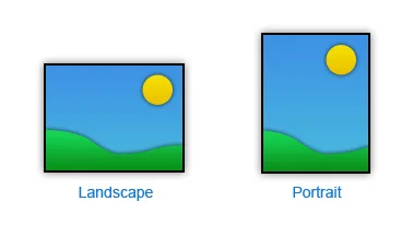
Does Orientation Matter?
The orientation and proportions of a rendering's format should be whatever is required to support your composition and the form you plan to present.
If you settle on a horizontal format, the issue is not just how wide, but how tall in proportion to the width. Likewise with vertical. What mood or experience are you trying to convey to the viewer? Different formats inspire different feelings. A horizontal rendering is usually calming, expansive and restful; a vertical may be more dramatic or inspiring. Though some artists regard square format as static, I consider them simply neutral.
Did you enjoy this blog post? If so, then why not:
Leave Comment | Subscribe To This Blog | Email Me
Contrast and Emphasis
Contrast is emphasis. The sharpest contrast should be where you want the eye to go first. Contrast comes in many forms, including value, color, detail and line.
Value Contrast
The most important element is the value; the most influential of the principles is contrast. Put them together and you have a kind of contrast that packs the most punch.
Color Contrast
This usually refers to contrast in hue or temperature, but intensity also can play a role. A power struggle ensues when hues are equally intense. One must dominate, or the eye won't know where to look.
Contrast in Complexity
Just as brightness is enhanced by neutrality, detail, texture and pattern are more exciting next to areas of simplicity.
Contrast in Line
A rendering with entirely horizontal lines is effectively no rendering at all. When even a minimum of diagonal and vertical lines is added, the improvement is dramatic.

Did you enjoy this blog post? If so, then why not:
Leave Comment | Subscribe To This Blog | Email Me
Quick Thumbnail Sketches
To avoid basic mistakes in your composition, make a quick sketch of the main shapes.
It may sound laborious to make small sketches before embarking on the main 3D Architectural Rendering, but it is helpful, because it can save you having to make changes later. The more preparation you do, the more chance you have of achieving a successful 3D Architectural Rendering.

Making a Composite
A composite is a collection of photos, sketches, or ideas that you use to create one piece of art. Using certain elements from each image and then applying the rules of composition, you can create a successful composition.
By using this process, the artist has endless opportunities to create the perfect composition. Grab your camera and sketch pad and begin making some composites of your own.

Color Complements
Complimentary colors always appear opposite each other on the color wheel. Use complements to create color balance in your 3D Architectural Rendering. It takes practice to understand how to use compliments, but a good rule of thumb is to use the complement - or form of the complement of the predominant color in your 3D Architectural Rendering to highlight, accent or gray that color.
For example, if your 3D Architectural Rendering has a lot of green, use its complement, red - or a form of red such as orange or red-orange - for highlights. If you have a lot of blue in your 3D Architectural Rendering , use blue's complement, orange - or a form of orange such as yellow-orange or red-orange. The complement of yellow is purple or a form of purple. Keep a color wheel handy until you have memorized the color complements.

Composition is one of the Most Misunderstood Concepts
Composition is one of the most misunderstood concepts, in any form of artwork, It has been said that you can be the greatest illustrator in the world, but if you don't know how to compose properly, your 3D Architectural Renderings will fall apart. I have seen hundreds, if not thousands, of 3D Architectural Renderings. I always ask myself, " what makes this 3D Architectural Rendering better than most". My answer is always that the 3D Architectural Rendering has a strong composition and is well-designed. In this, my 3D Architectural Rendering Blog, I explore the different aspects of composition, the principles of good design, the effective use of "eye stoppers", the proper use of negative space, and how to locate the center of interest correctly. Composition is really about moving the viewer's eye. The challenge is to arrange all of the components of the composition so it's a pleasure for the viewer to look at your 3D Architectural Rendering.

Center of Interest
The first and most important aspect of your 3D rendering is the focal point or center of interest, the one spot in your 3D rendering where your eye ultimately ends up.
Once you decide what your center of interest is and where you want to place it, you can begin adding all of the other elements of composition that help your eye flow through the 3D rendering The goal in any rendering is to lead the eye to your center of interest.
It takes a lot of thought and careful planning to make all the elements of composition successful.

Importance of Lighting
Whether lighting is harsh, gentle, glaring, or diffused; whether it is cold; whether it comes straight at us like a spotlight or from the side, behind, above, or below - it plays perhaps the greatest role in determining the mood of a 3D rendering.
All light - whether it's frontlight, sidelight, backlight, or diffused light - imparts a color cast onto the subject, depending on the time of day. Morning light is warmer than midday light, and late afternoon light (shortly before sunset) is even warmer still, wheres diffused light can at times be "blue".
What is meant by frontlight?
It's light that hits the front of your subject, as if your camera were a giant spotlight bathing everything in front of it in light.
Sidelight hits one side of a subject, illuminating only part of it leaving the other parts in "darkness". The subject takes on a three-dimensional quality due to the illusion of depth created by the contrast between light and dark. As a result, sidelight is often considered the most dramatic type of lighting.
It is backlighting (when the light hits the back of your subject) that renders so many subjects in silhouettes. Backlighting will always find you reaching for your sunglasses or, at least, shading your eyes. Why? Because to render backlight, you must be facing the sun itself.
Unlike sidelight, which conceals the subject in partial darkness, backlighitng can cloak the entire subject in total darkness. The resulting silhouetted shape - whether it's a tree, your building, or a person - is devoid of all detail.
If you have any question please, contact me, and I'll reply as soon as possible.
Sky Composition
Your skies will always profit from some preparation beforehand. In most renderings, the sky should enhance the building features without trying to dominate, and help to highlight the center of interest, particularly in those features that extend up into the sky, such as the tall buildings, trees, and so on.
The positioning of elements such as large cloud masses, the brightest part of the sky, or the most colorful, can considerably influence the overall composition of the rendering. On the other hand, you may wish to play down an area, most commonly the utmost point of the rendering.

In the above image, where is your eye drawn? because of the sky composition, your eye is drawn to the bottom, left 3rd, of the photo.
If you have any question please, contact me, and I'll reply as soon as possible.

Atmosphere - Pink Mud
Mood or atmosphere is the icing on the rendering cake. When used with thought, it can completely transform a scene and can inject a sense of power and drama at the same time. You can use atmosphere to enhance a "normal" rendering into one conveying power and beauty of nature's finest moods. We can use it to lose unwanted detail, or suggest mystery, impending doom, a light, airy afternoon, tranquil moments, and much more.
Mood can be especially effective in highlighting a center of interest or suggesting a narrative. Try to get out of the habit of always rendering fields green, clouds white, or mud brown - flood the whole composition with a color mood to suit your idea, even if it conflicts with color we normally assume to be correct. Those who fail to see pink mud are truly restricting their imaginative palette.

atmosphere and mood
If you have any question please, contact me, and I'll reply as soon as possible.
A Blend of Color Temperature
A full cloud cover brings together the color of the sun (white, 5200k) and that of the blue sky (about 8000k to 10,000k), merging them into a color temperature that is slightly higher than the sunlight alone. The amount of blending depends on the cloud cover, but a general rule of thumb is 6000k.

Proportions
When you have a structure, that isn't characteristic, it's essential to add something that gives your rendering scale. People are one of the advisable things to bring to your composition. Not only do people add liveliness, they contribute scale. Be mindful! You can be slightly off with your scale, and you will through your viewer off.

A acceptable architectural figure is six feet tall, give or take a sensible variance for sex, age, or ethnic differences. The average body is proportioned to a height of eight head lengths. Legs are four head lengths, shoulder width is two lengths, and hip width one and half head lengths.
Children's heads are slightly larger in proportion to their bodies.
From proper proportions, the figure can be laid out as a series of simplified shapes. I apply my people in post-production so; I use boxes in my scene, to symbolize these proportions.
Architectural Vignettes
Architectural Vignettes show only a detail or a portion of a structure rather than en entire subject. Unfinished edges and free forms of composition are distinctive features.
They are used widely in advertising to stress a particular selling point of a building, and editorial stories to emphasize important features of design function.
In architectural offices, vignettes illustrate key areas of a structure. During preliminary planning stages, they can indicate a direction of design without the necessity of delineating the entire subject.
Architectural Vignettes
Paper is Flat
The essence of paper is flat, a dimensional plane. When possible, put your light source in a spot that helps accentuate the big plane changes of your model. This often means placing the light a little off to the side of the model. Angle the light source so either the light or the shadow shapes dominate your design. A 3-to-1 ratio is usually a safe bet.
Atmospheric Perspective
Atmospheric perspective. Often referred to as aerial perspective, atmospheric perspective references the compounded effect that air and light have on objects as they recede. As the reflective light off the object filters its way through the intervening air to the viewer’s eyes (referred to as the line of sight), the contrast between the object and its surroundings diminish, detail decreases, color saturation (chroma) weakens and shifts towards the skylight color, which is generally blue unless it is sunrise or sunset.
Point and Click (render)
Pulling a camera view and hitting render is much like picking up a point-and-shoot camera and clicking away. Many renderings I'm seeing have exceedingly little that is artistically pleasing. The renderings provide raw information that does not take into account the concept of aesthetics. An artist, working digitally, can manipulate the viewer's eye by leading it through the composition to a specific focal point. The lightest part in an architectural scene is the part that is perpendicular to the light source, and the closer the parts are to the light source, the brighter they will be. You can take some artistic liberties and pitch planes toward and away from light to create drama.
Search out the Composition
Sometimes ideas for composition just come to you, fully formed. Other times you have to build them from scratch. In both cases, you still need to play with the idea to develop it. Once you start to render, there many other things to work out that you may not notice serious compositional flaws. Once you have committed a lot of effort to developing a view, you may be reluctant to make changes.
If ten people set up to render the same thing you'll get ten different renders People see from different points of view, both literally and figuratively. Everyone has cliched ways of looking at things. Breaking those habits and taking a fresh viewpoint is vital to the artistic process. You know the experience of seeing something familiar as if for the first time; it seems alive and exciting. That's the way you want to try to see things before you render.
Rhythm in your Rendering
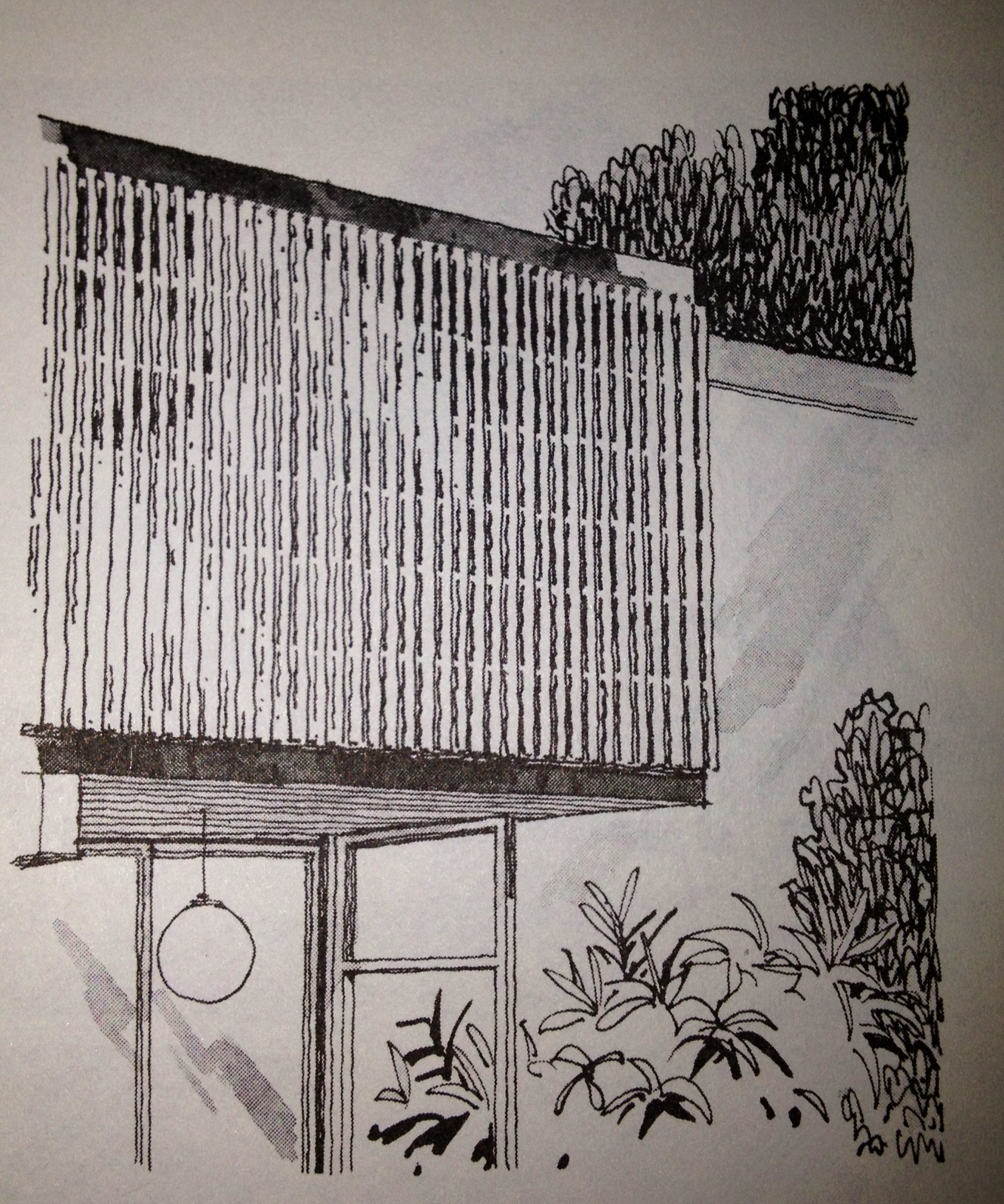
If any interval, or rhythm, in your rendering, becomes too repetitious or systematic, it feels lifeless and unnatural. This remains a typical problem that afflicts beginners, but it happens to me all the time. In art, the principle of line rhythm is essential in creating a hierarchy of information that feels comfortable and natural for your viewer to interpret. Without variety, your rendering can become wallpaper fading into the background of our attention. Like an endless row of fence post, we cease to notice or pay attention.
Too much variation is incredibly disruptive, Each decision you make when putting information into your model has visual implications. Not enough unity and you have confusion. Too much unity and you are bored.
Sunshine Adds Pizzazz
Sunshine adds pizzazz to your rendering and makes life seem more charismatic. The human eye sees in three dimensions and can compensate for poor lighting. A rendering is only two-dimensional; therefore, to make an impression of form, depth, and texture to the subject, you should ideally have the light come from the side or at least at an angle.