

BLOG
Atmosphere - Pink Mud
Mood or atmosphere is the icing on the rendering cake. When used with thought, it can completely transform a scene and can inject a sense of power and drama at the same time. You can use atmosphere to enhance a "normal" rendering into one conveying power and beauty of nature's finest moods. We can use it to lose unwanted detail, or suggest mystery, impending doom, a light, airy afternoon, tranquil moments, and much more.
Mood can be especially effective in highlighting a center of interest or suggesting a narrative. Try to get out of the habit of always rendering fields green, clouds white, or mud brown - flood the whole composition with a color mood to suit your idea, even if it conflicts with color we normally assume to be correct. Those who fail to see pink mud are truly restricting their imaginative palette.

If you have any question please, contact me, and I'll reply as soon as possible.
A Blend of Color Temperature
A full cloud cover brings together the color of the sun (white, 5200k) and that of the blue sky (about 8000k to 10,000k), merging them into a color temperature that is slightly higher than the sunlight alone. The amount of blending depends on the cloud cover, but a general rule of thumb is 6000k.

Proportions
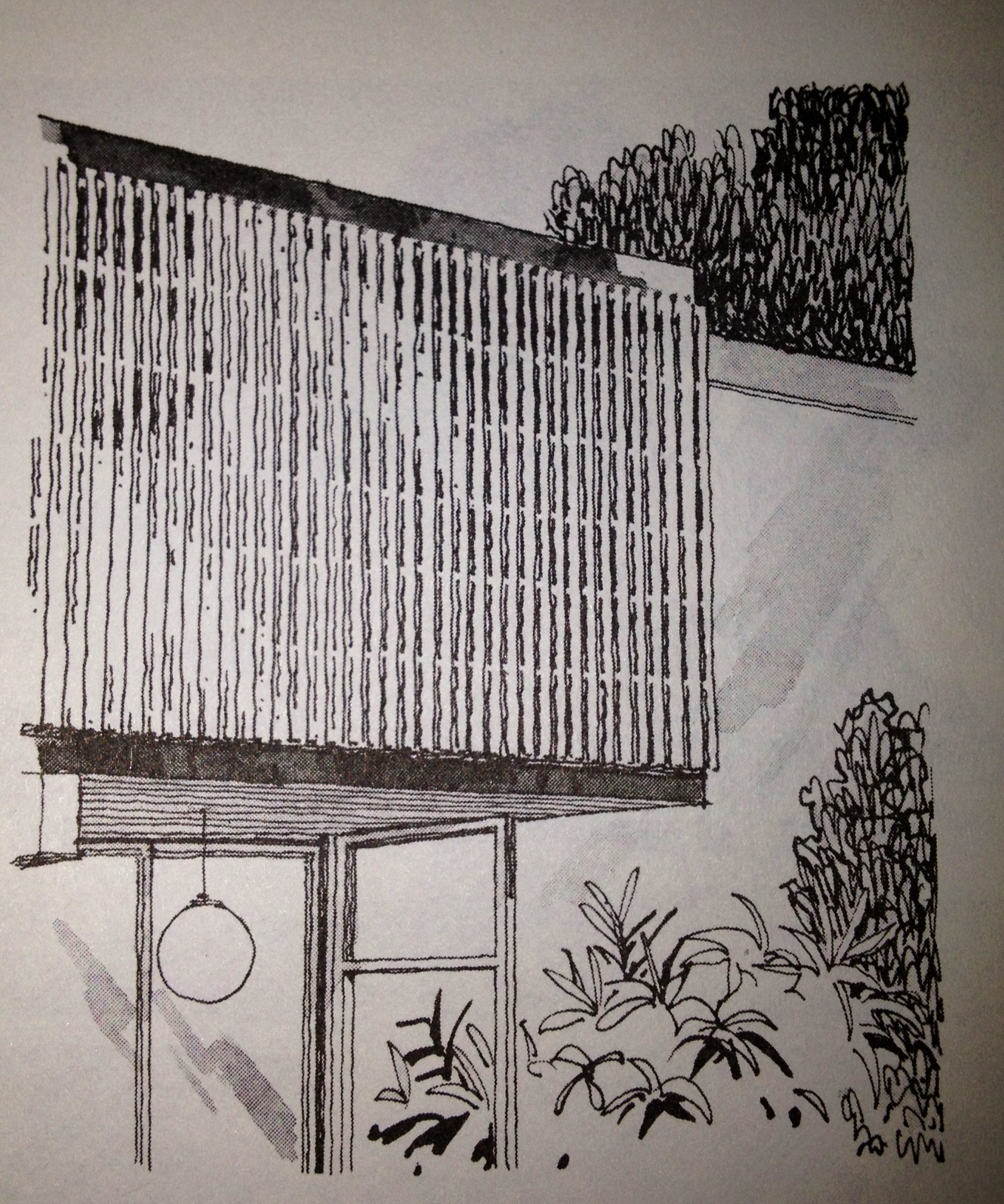
When you have a structure, that isn't characteristic, it's essential to add something that gives your rendering scale. People are one of the advisable things to bring to your composition. Not only do people add liveliness, they contribute scale. Be mindful! You can be slightly off with your scale, and you will through your viewer off.

A acceptable architectural figure is six feet tall, give or take a sensible variance for sex, age, or ethnic differences. The average body is proportioned to a height of eight head lengths. Legs are four head lengths, shoulder width is two lengths, and hip width one and half head lengths.
Children's heads are slightly larger in proportion to their bodies.
From proper proportions, the figure can be laid out as a series of simplified shapes. I apply my people in post-production so; I use boxes in my scene, to symbolize these proportions.
Architectural Vignettes
Architectural Vignettes show only a detail or a portion of a structure rather than en entire subject. Unfinished edges and free forms of composition are distinctive features.
They are used widely in advertising to stress a particular selling point of a building, and editorial stories to emphasize important features of design function.
In architectural offices, vignettes illustrate key areas of a structure. During preliminary planning stages, they can indicate a direction of design without the necessity of delineating the entire subject.
Paper is Flat
The essence of paper is flat, a dimensional plane. When possible, put your light source in a spot that helps accentuate the big plane changes of your model. This often means placing the light a little off to the side of the model. Angle the light source so either the light or the shadow shapes dominate your design. A 3-to-1 ratio is usually a safe bet.
Atmospheric Perspective
Atmospheric perspective. Often referred to as aerial perspective, atmospheric perspective references the compounded effect that air and light have on objects as they recede. As the reflective light off the object filters its way through the intervening air to the viewer’s eyes (referred to as the line of sight), the contrast between the object and its surroundings diminish, detail decreases, color saturation (chroma) weakens and shifts towards the skylight color, which is generally blue unless it is sunrise or sunset.
Point and Click (render)
Pulling a camera view and hitting render is much like picking up a point-and-shoot camera and clicking away. Many renderings I'm seeing have exceedingly little that is artistically pleasing. The renderings provide raw information that does not take into account the concept of aesthetics. An artist, working digitally, can manipulate the viewer's eye by leading it through the composition to a specific focal point. The lightest part in an architectural scene is the part that is perpendicular to the light source, and the closer the parts are to the light source, the brighter they will be. You can take some artistic liberties and pitch planes toward and away from light to create drama.
Search out the Composition
Sometimes ideas for composition just come to you, fully formed. Other times you have to build them from scratch. In both cases, you still need to play with the idea to develop it. Once you start to render, there many other things to work out that you may not notice serious compositional flaws. Once you have committed a lot of effort to developing a view, you may be reluctant to make changes.
If ten people set up to render the same thing you'll get ten different renders People see from different points of view, both literally and figuratively. Everyone has cliched ways of looking at things. Breaking those habits and taking a fresh viewpoint is vital to the artistic process. You know the experience of seeing something familiar as if for the first time; it seems alive and exciting. That's the way you want to try to see things before you render.
Rhythm in your Rendering
If any interval, or rhythm, in your rendering, becomes too repetitious or systematic, it feels lifeless and unnatural. This remains a typical problem that afflicts beginners, but it happens to me all the time. In art, the principle of line rhythm is essential in creating a hierarchy of information that feels comfortable and natural for your viewer to interpret. Without variety, your rendering can become wallpaper fading into the background of our attention. Like an endless row of fence post, we cease to notice or pay attention.
Too much variation is incredibly disruptive, Each decision you make when putting information into your model has visual implications. Not enough unity and you have confusion. Too much unity and you are bored.
Sunshine Adds Pizzazz
Sunshine adds pizzazz to your rendering and makes life seem more charismatic. The human eye sees in three dimensions and can compensate for poor lighting. A rendering is only two-dimensional; therefore, to make an impression of form, depth, and texture to the subject, you should ideally have the light come from the side or at least at an angle.
The Snow Is Not White
We, as architectural illustrators, have to see the world with an artist's eye. Often, I get questions, about how I create such realistic renderings. My reply is simply, use a lot of real world references and try to recreate it virtually. Our brain often plays tricks with our eyes. We tend to see what we want to see and not what reality is. Try this. Grab a photo of a snowy day (just an example) and using an image editor like Photoshop sample the color of the snow. You'll find that the snow isn't actually white at all, but our brian knows snow to be white, so it is overriding what we actually see.
Most of the time, when we look at the world, we aren’t actually looking at all. Instead, we are relying on the knowledge about the world we have stored up over years. We know the table is flat, so we don’t actually bother to observe how that flat rectangle on four sticks looks out there in the world from the particular position in which we are currently standing.
Our brains operate as efficiently as possible to filter the wealth of information coming through our senses. In fact, we don’t truly see with our eyes at all – we see with our brains. Only those things which are unusual, a potential threat, or have changed significantly, cause the brain to react – our attention is caught and for once we are genuinely looking at what is out there.
When we were children we looked at the world like this most of the time – everything was new to us – exciting and waiting for us to discover it. As we got older, less things were new. We’d already seen so many trees we stopped looking at bark patterns, the same happened with the clouds in the sky and on it went – as our body of knowledge grew ever larger we paid less and less attention to those things we had seen before’.
Fortunately it is possible to recapture that the ability to pay attention to the world again – and to look at things directly rather than filtered through a cloud of knowledge. Some knowledge is of course required for rendering, but make sure it’s the right knowledge. The laws of perspective, what something looks like from every angle – this is the kind of knowledge you need and will develop as you learn how to render.
One of the most crucial part of a photo-real architectural rendering is textures. In my snow example If, you make your snow white it will not be natural; it'll look off and your viewer will sense something is wrong. Try adding either a fresnel reflection or tinting your snow material blue, which is actually what is happening in real life.
Window Masking
http://youtu.be/9oVM1PJ20Y8 When it come to architectural renderings, one of the first things to learn is to create good masks to retouch objects in Adobe® Photoshop®. In this video I'm using Autodesk® 3ds Max®, V-Ray for 3ds Max, and Adobe® Photoshop®, to create glass reflections.
The Little Things
Argh. It’s not quite what I was hoping it would be... BUT I JUST DON’T KNOW WHAT TO DO!
Sesame Street Primary Colors
I caught my 6 years old daughter, Emma Grace, watching this on Youtube
Abstract Masses
The french poet Paul Valery observed, "To see is to forget the name of the thing one sees." This is a perfect expression of the mind-set for rendering. Something has to shift. Maybe it's a shift from left brain to right brain; but that shift seems absolutely necessary to create a strong composition. Until the shift is made and you start thinking in abstract masses on a rendering scene, you are, in sense, on the outside of the rendering process looking in.
The Cruciform
The cruciform (from the same root as crucifix or cross) is way to use horizontals and verticals. This diagram shows how endlessly flexible and adaptable the cruciform is. The diagram is not to suggest that everything withing the cruciform needs to be dark value. It just shows the cruciform's versatility and helps to get you thinking about how abstract masses can interact with the picture plane.
180 Rule
When animating characters interacting with one another, it's crucial to keep a well-defined visual relationship between the characters on screen. The cameras should remain on one side of the axis of action in order to preserve the scene's spatial continuity and screen direction.
Sometimes breaking the 180 rule can result in a better visual impact and can also enable you to get a great reaction shot that you couldn’t get otherwise.”
Zoom Way Out
If you open your rendering, in your image editor, and reduce it to thumbnail size and it still holds together compositionally, you've got a good piece on your hands.
If your rendering has the ability to catch your eye when it is that small it either has a strong underlying perspective grounding the composition or interesting shapes that lead you through the work.
Walk away!
Looking at your render too long without a break is one of the biggest pitfalls that hinder even the best artist. Sometimes the best solution is to simply walk away from your computer for a few minutes, or just step back from your screen a few feet.
There is probably no better tool to routine out bad renders than looking at your render in reverse. Reversing your render allows you to see your rendering in its proportions with a fresh eye. You can mirror you rendering in Photoshop, or simply print it out and look at it from the back side, through a bright light.