
EVERMOTION Cover "White Kitchen"
The 'White Kitchen" made the EVERMOTION Cover.
EVERMOTION Cover
Did you enjoy this blog post? If so, then why not:
Leave Comment | Subscribe To This Blog | Email Me
Creative Leaders

John Maeda, President of the Rhode Island School of Design, delivers a funny and charming talk that spans a lifetime of work in art, design and technology, concluding with a picture of creative leadership in the future. Watch for demos of Maeda’s earliest work -- and even a computer made of people.
John Maeda is the president of the Rhode Island School of Design, where he is dedicated to linking design and technology. Through the software tools, web pages and books he creates, he spreads his philosophy of elegant simplicity.
Did you enjoy this blog post? If so, then why not:
Leave Comment | Subscribe To This Blog | Email Me
Overcast Front Light
Of all the different lighting conditions that I can use, overcast front lighting is the one that I consider being the safest. This is because overcast front light illuminates most everything evenly. Overcasting front light is good for white balancing since overall illumination is balanced. The softness of this light results in more natural-looking renderings and it also eliminates the contrast problems that a sunny day creates.
Some of my clients have a preconceived notion of how a color should look. Holding the color swatch up to the print will usually not produce the expected result; "the colors don't match!", is a typical response I get. I can go into color theory, monitor calibration, gamma, but it's typically received with the deer in the headlight gaze. Instead of pulling out the before and after images as to proof, I am usually spot-on, I chose to go with a nice, and very safe, overcast lighting setup.
As for me, I prefer the high contrast, and more dramatic scenes. I understand basic color theory and how light and color react to each other. The work that I am most proud of, and has been recognized by my peers, has not been by playing it safe. I can guarantee that the color swatch will change colors with every light source you view it under. That color, on that color swatch, will not look that way on your building.
So, if you want to play it safe, I can recommend Peter Guthrie's 0902 Overcast HDRI.

Overcast HDRI by Peter Guthrie
Did you enjoy this blog post? If so, then why not:
Leave Comment | Subscribe To This Blog | Email Me
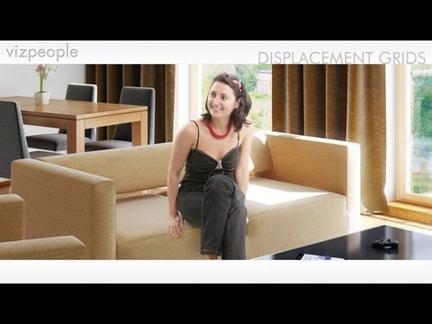
The Human Shape
The human shape is perhaps the most unmistakable shape in all the world. As a result, when you include its shape in any rendering, an obvious sense of scope and scale result. This happens regardless of whether that rendering is a nature scene, or something urban or industrial.
One of my favorite resources for people cutouts is, by far, VizPeople. I have many of their libraries and they have created a great video on how to composite people in your rendering.
Did you enjoy this blog post? If so, then why not:
Leave Comment | Subscribe To This Blog | Email Me
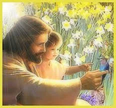
Sandy Hook Elementary School Poem
“Twas’ 11 days before Christmas, around 9:38
when 20 beautiful children stormed through heaven’s gate.
their smiles were contagious, their laughter filled the air.
they could hardly believe all the beauty they saw there.
they were filled with such joy, they didn’t know what to say.
they remembered nothing of what had happened earlier that day.
”where are we?” asked a little girl, as quiet as a mouse.
”this is heaven.” declared a small boy. “we’re spending Christmas at
God’s house.”
when what to their wondering eyes did appear,
but Jesus, their savior, the children gathered near.
He looked at them and smiled, and they smiled just the same.
then He opened His arms and He called them by name.
and in that moment was joy, that only heaven can bring
those children all flew into the arms of their King
and as they lingered in the warmth of His embrace,
one small girl turned and looked at Jesus’ face.
and as if He could read all the questions she had
He gently whispered to her, “I’ll take care of mom and dad.”
then He looked down on earth, the world far below
He saw all of the hurt, the sorrow, and woe
then He closed His eyes and He outstretched His hand,
”Let My power and presence re-enter this land!”
”may this country be delivered from the hands of fools”
”I’m taking back my nation. I’m taking back my schools!”
then He and the children stood up without a sound.
”come now my children, let me show you around.”
excitement filled the space, some skipped and some ran.
all displaying enthusiasm that only a small child can.
and i heard Him proclaim as He walked out of sight,
”in the midst of this darkness, I AM STILL THE LIGHT.””
Did you enjoy this blog post? If so, then why not:
Leave Comment | Subscribe To This Blog | Email Me

CGRAMP Image of the Week
CGRAMP has announced Image of the Week
CGRAMP Image Of the Week, 12/16/2012

You can view the announcement here
Did you enjoy this blog post? If so, then why not:
Leave Comment | Subscribe To This Blog | Email Me
Correcting Keystoning
Keystoning is the term used to describe the "Leaning Tower of Pisa" effect of converging lines in architectural renderings. it's a very common result when rendering with a wide-angle lens. Photoshop can oftentimes straighten those buildings for you, correcting this perspective problem in a matter of seconds
Open your rendering in Photoshop, select the Crop tool from the toolbox, and drag the cursor from the top left corner to the bottom right corner and release. You will see the "marching ants" around your entire rendering. Go to the lower menu bar at the top of the screen and check the small box next to Perspective. Now, using the cursor, drag the top left corner of the marching ant border into the rendering so that the border is parallel to the tilting structure in the rendering. Do the same thing on the right side of the rendering. Then, double click in the rendering just to the right or left of the small center circle that appears on the rendering. Photoshop adjusts the image so that any tilting lines appear truly vertical, as they do when the human eye views the actual scene.

Did you enjoy this blog post? If so, then why not:
Leave Comment | Subscribe To This Blog | Email Me
Filters in Photoshop CS
Photoshop has made it easy to get those warm colors I love. Adobe added a whole set of adjustments that resemble the filters you'd use on your lenses. And, the best part is that they are available as adjustment layers, so you can apply them to your image and then mask out areas you don't want to be effected by the filter.
So, want to add warmth to an image you rendered? On your Photoshop menu bar, click image, then adjustment, and then Photo Filters. You'll get a choice of eighteen filters to use on your image, including several that warm things up. You can vary the intensity of these filters; and if you use Adjustment Layers to add the filter effect, you can apply those filter effects to selected parts of your image by using layer masks. To do this, select any of a number of tools from the toolbox, and using the mouse, select an area where you would like to apply filter effects. The area will be indicated by a dotted line. Then choose Layer on the pull down menu bar, then New Adjustment Layer, and then Photo Filter. Once the filter list comes up, you can choose your filter for that selected area.

Did you enjoy this blog post? If so, then why not:
Leave Comment | Subscribe To This Blog | Email Me

PSD-Manager and Gamma
If you save a 32-bit per channel (HDR) PSD file:
There is no gamma correction applied to anything by psd-manager itself. Photoshop expects a 32-bit (HDR) file to have a linear color profile (which means Gamma needs to be 1.0). Photoshop will show you the colors corrected for your display if you have enabled View > Proof Colors, so you will see the image adjusted.
In the V-ray Color mapping rollout you should set Gamma to 2.2 and enable Don't Affect Colors (adaptation only). This tells V-ray that you will later want to display the image using a Gamma of 2.2 (like on a typical sRGB monitor) but will not actually bake the color correction into the pixels. So you are setup for whats called a linear workflow this way.
If you save an 8 or 16 -bit per channel PSD file:
psd-manager uses the Gamma options set in the 3ds max Preferences dialog. So if you have setup an 3ds max output gamma of 2.2 then this is what psd-manager will use. However there are important exceptions to that:
Per default there is no gamma correction applied to render elements, only to the main render output (and layers using RenderCutout mode). This is important because otherwise render elements would not match the look of the main render when combined. So in Photoshop you will typically add an Exposure Adjustment layer on top of your render elements layer stack to correct the Gamma (to match the rest of the file).
If you don't want psd-manager to apply Gamma correction for some reason then you can turn it off in the psd-manager Advanced Options dialog (Gear Icon button in psd-manager).
Recommended typical setup for V-Ray:
V-ray Color mapping rollout:
- Gamma: 2.2
- Don't Affect Colors: on
- Linear workflow: off (this is an old option in V-ray, you have a true linear workflow without it)
3ds max Preferences > Gamma LUT:
- Enable Gamma correction: on
- Input Gamma & Display Gamma & Output Gamma: all set to 2.2
Your V-ray setup:
If you set Gamma in V-Ray Color Mapping to 1.0 that would be fine for saving 32-bit PSD, and also fine for saving 8/16 bit PSDs if your 3ds max Output Gamma is set to 2.2. But it would help the V-Ray renderer if you set the V-Ray Gamma to 2.2 and turn Don't Affect colors: on. V-ray will then spend more time calculating detail in darker areas instead but not actually do a gamma correction to the color values. So this is better than you having to fix it it by cranking up other V-Ray options for the whole scene to counteract lacking precision in dark areas that becomes visible when displaying the image using a sRGB working space.
If you set Gamma in V-Ray Color Mapping to 2.2 and you have Don't Affect Colors turned off, then you would get a double gamma correction if your 3ds max Output Gamma is set to 2.2, because psd-manager will use this value for its gamma correction and apply it on top (just like it happens if you save using the 3ds max VFB with the same options).
Did you enjoy this blog post? If so, then why not:
Leave Comment | Subscribe To This Blog | Email Me