
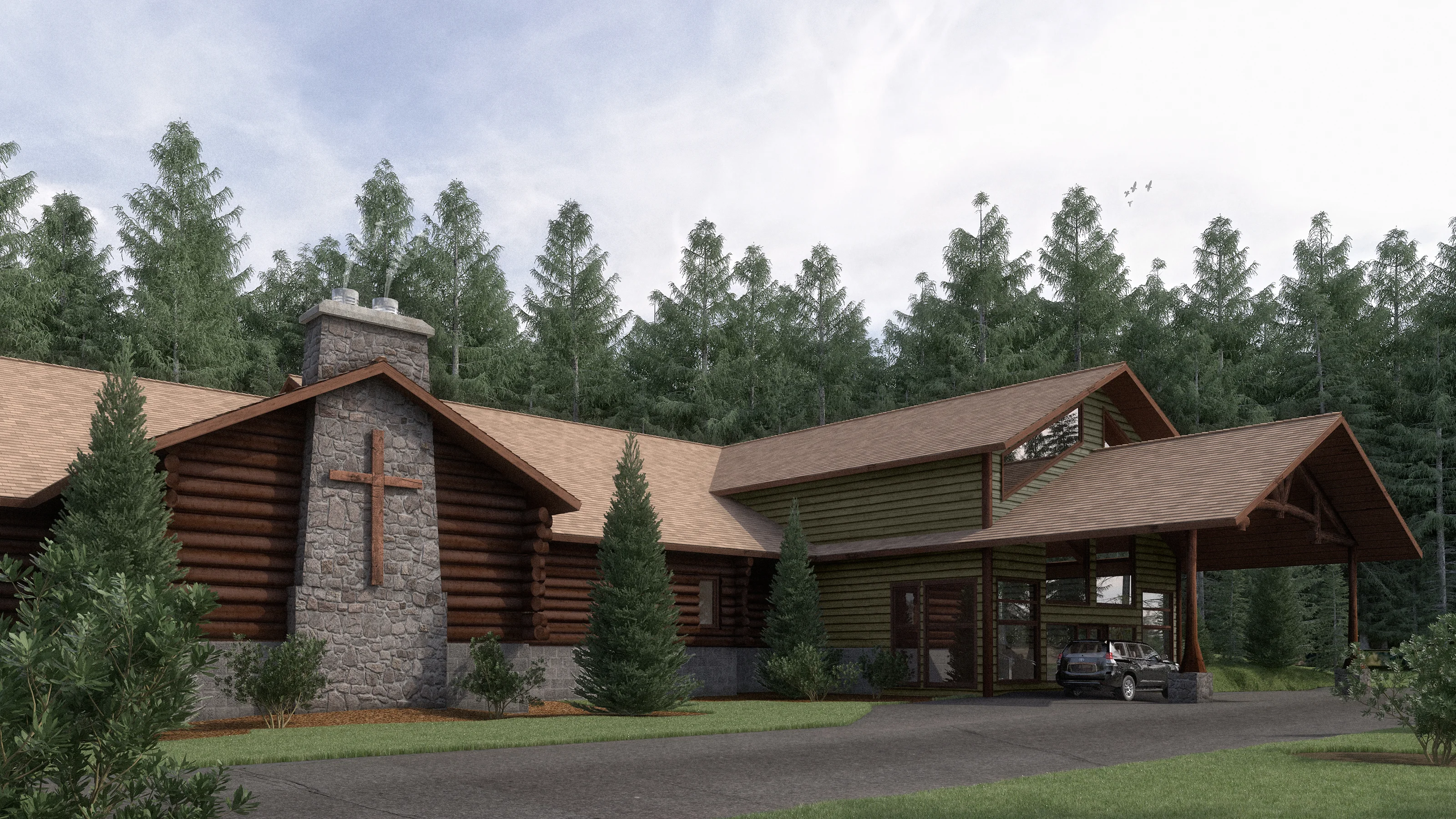
Crosslake Evangelical Free Church Rendering
Crosslake Evangelical Free Church in Crosslake, MN, also known as the Log Church, is proposing an addition to their historic church building. I was asked to illustrate the addition, attached to the existing log church, for fundraising.
Did you enjoy this blog post? If so, then why not:
Leave Comment | Subscribe To This Blog | Email Me
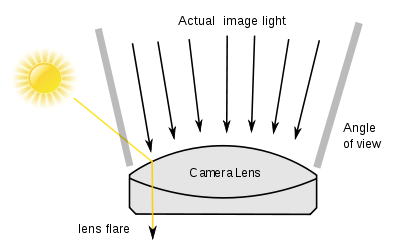
A Rendering with Flare
Flare adds atmosphere of a kind, and also a sense of actuality. Certainly, for strongly manipulated and special-effects imagery, adding flare can be a useful way of helping to convince the viewer that a scene is genuine.
The polygonal flare patterns that are created by internal aperture reflections and refractions from a point source of light (such as the sun) that is either just inside or just outside the picture frame.
From your final 3D rendering, inside your post processing application, you can add your flare. For the most part, you add a flare for a treatment that conveys the intensity of the sun and a general feeling of heat. The software I use is the Knoll Light Factory plug-in for Photoshop.
Keeping the generated flare on a separate layer makes it easy to align with the sun and the rest of your 3D scene.
Did you enjoy this blog post? If so, then why not:
Leave Comment | Subscribe To This Blog | Email Me
The Properties of Color
Any color has three basic properties - it's hue, its tone, and its intensity. Hue means the color as identified by its name - red or blue, for example. Tone means the lightness or darkness of a color. You can, for instance, have a light blue or a dark blue. In addition to the properties of hue and tone, colors have a varying degree of intensity. Two reds may be identical in tone and yet be clearly different, with one more intense, or brighter, than the other. The difference in intensity is sometimes called color saturation.
When you use the word color, you are generally referring to these three properties - hue, tone, and intensity - simultaneously. However, it is helpful to be able to identify them separately because when you notice that a color is "wrong", you will be better able to pinpoint what is wrong with it - whether it is too light in tone or too intense.

Did you enjoy this blog post? If so, then why not:
Leave Comment | Subscribe To This Blog | Email Me

Quick Thumbnail Sketches
To avoid basic mistakes in your composition, make a quick sketch of the main shapes.
It may sound laborious to make small sketches before embarking on the main 3D Architectural Rendering, but it is helpful, because it can save you having to make changes later. The more preparation you do, the more chance you have of achieving a successful 3D Architectural Rendering.


John Maeda: How art, technology and design inform creative leaders
John Maeda, President of the Rhode Island School of Design, delivers a funny and charming talk that spans a lifetime of work in art, design and technology, concluding with a picture of creative leadership in the future. Watch for demos of Maeda’s earliest work -- and even a computer made of people.
John Maeda is the president of the Rhode Island School of Design, where he is dedicated to linking design and technology. Through the software tools, web pages and books he creates, he spreads his philosophy of elegant simplicity.

Softness and Building Blur
Bryan O'Neil Hughes explains the importance of softness and shallow depth of field in photographs and how it is possible to mimic it in Photoshop CS6.

All Children are Artists
“All children are artists. The problem is how to remain an artist once he grows up.”
Making a Composite
A composite is a collection of photos, sketches, or ideas that you use to create one piece of art. Using certain elements from each image and then applying the rules of composition, you can create a successful composition.
By using this process, the artist has endless opportunities to create the perfect composition. Grab your camera and sketch pad and begin making some composites of your own.
