BLOG
All Children are Artists
“All children are artists. The problem is how to remain an artist once he grows up.”
Making a Composite
A composite is a collection of photos, sketches, or ideas that you use to create one piece of art. Using certain elements from each image and then applying the rules of composition, you can create a successful composition.
By using this process, the artist has endless opportunities to create the perfect composition. Grab your camera and sketch pad and begin making some composites of your own.
Color Complements
Complimentary colors always appear opposite each other on the color wheel. Use complements to create color balance in your 3D Architectural Rendering. It takes practice to understand how to use compliments, but a good rule of thumb is to use the complement - or form of the complement of the predominant color in your 3D Architectural Rendering to highlight, accent or gray that color.
For example, if your 3D Architectural Rendering has a lot of green, use its complement, red - or a form of red such as orange or red-orange - for highlights. If you have a lot of blue in your 3D Architectural Rendering , use blue's complement, orange - or a form of orange such as yellow-orange or red-orange. The complement of yellow is purple or a form of purple. Keep a color wheel handy until you have memorized the color complements.
Fall Inspiration
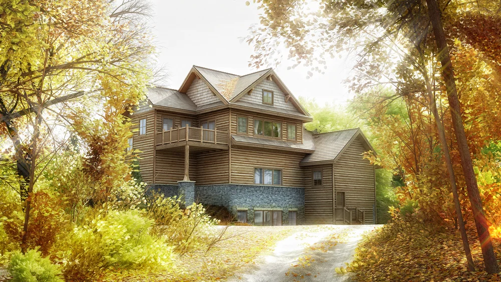
Fall, my favorite time of the year!. I was inspired by all the Fall colors so, here is my latest 3D Architectural rendering, with some Fall inspiration.
Composition is one of the Most Misunderstood Concepts
Composition is one of the most misunderstood concepts, in any form of artwork, It has been said that you can be the greatest illustrator in the world, but if you don't know how to compose properly, your 3D Architectural Renderings will fall apart. I have seen hundreds, if not thousands, of 3D Architectural Renderings. I always ask myself, " what makes this 3D Architectural Rendering better than most". My answer is always that the 3D Architectural Rendering has a strong composition and is well-designed. In this, my 3D Architectural Rendering Blog, I explore the different aspects of composition, the principles of good design, the effective use of "eye stoppers", the proper use of negative space, and how to locate the center of interest correctly. Composition is really about moving the viewer's eye. The challenge is to arrange all of the components of the composition so it's a pleasure for the viewer to look at your 3D Architectural Rendering.
Perfect Reflection
When rendering a building with a large expanse of water in front of it, the classic approach is to include the reflection, along with the whole building, to create a symmetrical rendering. For a perfect reflection you’ll need water to be as still as possible, so this technique won’t work on water with large bump maps, or noise. That said, you can also look for much smaller areas of water that reflect just a small detail of the building to add foreground interest to your rendering. On rainy days renders, you can even look out for reflections in puddles or rain-soaked streets. This technique is particularly good at night, when you can include bright lights in the reflection.
With reflections, it pays to explore lots of different camera views – don’t just render the first composition that presents itself. An inch to the left or right, or up or down, can make a big difference to how a reflection fits in a pond or puddle.
Lens Distortion
You’d normally want to avoid any type of lens distortion when rendering architecture, but a virtual fisheye lens can add a creative twist to your renderings. This distorted style of the rendering isn't to everyone’s taste, but used sparingly – and with the right subjects – it can produce very striking renders.
Fisheye lenses come in two main types – those that give completely circular images, and those that produce conventional rectangular ones. But both will cause straight lines in your image to bulge outwards, especially at the edges.
Because the distorted renders from a fisheye break many of the ‘rules’ of rendering architecture, they often lend themselves to unusual framing and viewpoints. Try rendering with the lens pointing directly upwards to shoot ceilings or roofs, for example. The circular nature of fisheye renders is also perfect for symmetrical or even circular subjects.
You Don’t Have to Render the Whole Building
You don’t have to render the whole building for stunning architectural renderings. You can isolate details such as windows or columns to produce renderings with a ton of impact. Glass, metal and concrete structures, are full of graphic details that are perfect for producing this type of renderings, but you can also find them in older buildings.
The key to this style of rendering is simplicity, so look for areas of the building that you can isolate from their surroundings, or repetitive patterns in the structure. Then try rendering them either straight on to make the most of repetitive patterns, or at a deliberate angle for more dynamic images.
The Technically "Correct" Way to Render Architecture
Even though, the technically "correct" way to render architecture is to have all the verticals vertical, you can often conceive more energetic renderings by ignoring these conventions and rendering from a low or high point of view. The key is to avoid looking up or down at a slight angle, as this will look like a blunder, and instead go for a really climactic perspective.
Rendering from low down and looking up at a building really emphasizes its height, so it’s a great technique for rendering office blocks and other tall buildings. Look for point of view that will permit you to render the building at an extreme angle for an energetic composition (again this needs to be extreme enough to look deliberate), or strive for a symmetrical image.
“No great work is ever done in a hurry. …to do anything great requires time, patience, and perseverance.”
W. J. Wilmont Buxton
Church Worship Center
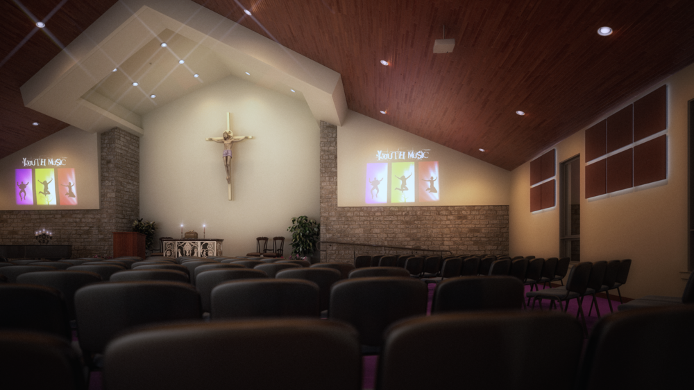
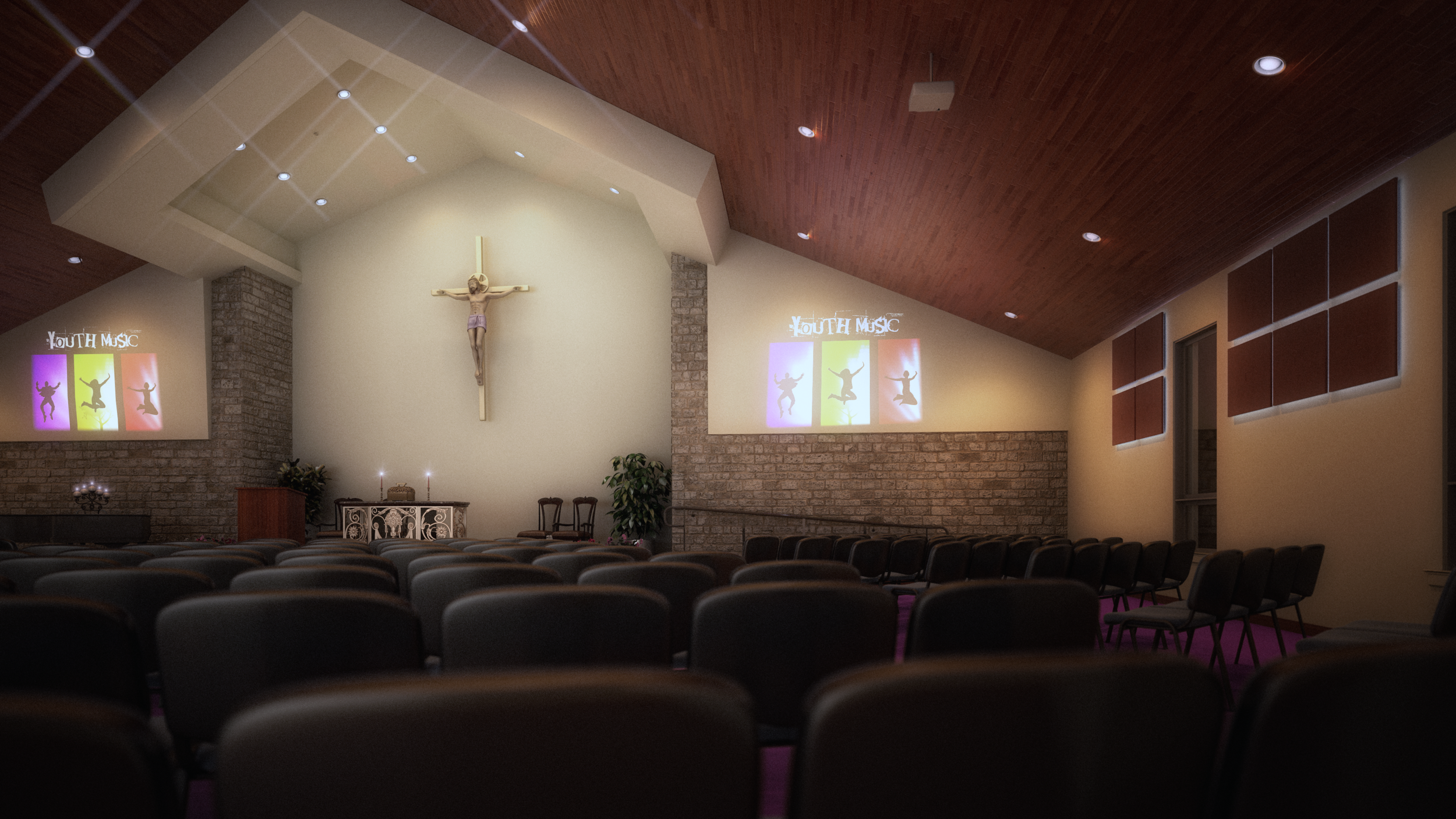
Here, is a Church Worship Center, that I had the pleasure to work on, and I would like to share it with you. If you have any questions, please leave a comment.
Center of Interest
The first and most important aspect of your 3D rendering is the focal point or center of interest, the one spot in your 3D rendering where your eye ultimately ends up.
Once you decide what your center of interest is and where you want to place it, you can begin adding all of the other elements of composition that help your eye flow through the 3D rendering The goal in any rendering is to lead the eye to your center of interest.
It takes a lot of thought and careful planning to make all the elements of composition successful.
Importance of Lighting
Whether lighting is harsh, gentle, glaring, or diffused; whether it is cold; whether it comes straight at us like a spotlight or from the side, behind, above, or below - it plays perhaps the greatest role in determining the mood of a 3D rendering.
All light - whether it's frontlight, sidelight, backlight, or diffused light - imparts a color cast onto the subject, depending on the time of day. Morning light is warmer than midday light, and late afternoon light (shortly before sunset) is even warmer still, wheres diffused light can at times be "blue".
What is meant by frontlight?
It's light that hits the front of your subject, as if your camera were a giant spotlight bathing everything in front of it in light.
Sidelight hits one side of a subject, illuminating only part of it leaving the other parts in "darkness". The subject takes on a three-dimensional quality due to the illusion of depth created by the contrast between light and dark. As a result, sidelight is often considered the most dramatic type of lighting.
It is backlighting (when the light hits the back of your subject) that renders so many subjects in silhouettes. Backlighting will always find you reaching for your sunglasses or, at least, shading your eyes. Why? Because to render backlight, you must be facing the sun itself.
Unlike sidelight, which conceals the subject in partial darkness, backlighitng can cloak the entire subject in total darkness. The resulting silhouetted shape - whether it's a tree, your building, or a person - is devoid of all detail.
If you have any question please, contact me, and I'll reply as soon as possible.
Sky Composition
Your skies will always profit from some preparation beforehand. In most renderings, the sky should enhance the building features without trying to dominate, and help to highlight the center of interest, particularly in those features that extend up into the sky, such as the tall buildings, trees, and so on.
The positioning of elements such as large cloud masses, the brightest part of the sky, or the most colorful, can considerably influence the overall composition of the rendering. On the other hand, you may wish to play down an area, most commonly the utmost point of the rendering.
In the above image, where is your eye drawn? because of the sky composition, your eye is drawn to the bottom, left 3rd, of the photo.
If you have any question please, contact me, and I'll reply as soon as possible.
Atmosphere - Pink Mud
Mood or atmosphere is the icing on the rendering cake. When used with thought, it can completely transform a scene and can inject a sense of power and drama at the same time. You can use atmosphere to enhance a "normal" rendering into one conveying power and beauty of nature's finest moods. We can use it to lose unwanted detail, or suggest mystery, impending doom, a light, airy afternoon, tranquil moments, and much more.
Mood can be especially effective in highlighting a center of interest or suggesting a narrative. Try to get out of the habit of always rendering fields green, clouds white, or mud brown - flood the whole composition with a color mood to suit your idea, even if it conflicts with color we normally assume to be correct. Those who fail to see pink mud are truly restricting their imaginative palette.
atmosphere and mood
If you have any question please, contact me, and I'll reply as soon as possible.
Creating a Tranquil Mood
While wind, storms, and dramatic scenes rely on diagonals and vertical emphasis, to convey a sense of peace and tranquility, you need the emphasis to be on a more horizontal composition.
A Tranquil Mood
If you have any question please, contact me, and I'll reply as soon as possible.


