

BLOG
Removing lens distortion with the Adaptive Wide Angle filter
Did you enjoy this blog post? If so, then why not:
Leave Comment | Subscribe To This Blog | Email Me
Form the "How"
As a component of art, the word form refers to the total overall arrangement or organization of an artwork
Definition:
(noun) - Form is an element of art. At its most basic, a form is a three-dimensional geometrical figure (i.e.: sphere, cube, cylinder, cone, etc.), as opposed to a shape, which is two-dimensional, or flat.
In a broader sense, form, in art, means the whole of a piece's visible elements and the way those elements are united. In this context, form allows us as viewers to mentally capture the work and understand it.
Finally, form refers to the visible elements of a piece, independent of their meaning. For example, when viewing Leonardo's Mona Lisa, the formal elements therein are: color, dimension, lines, mass, shape, etc., while the feelings of mystery and intrigue the piece evokes are informal products of the viewer's imagination.
Pronunciation: fôrm
Examples:
"Sculpture is not the mere cutting of the form of anything in stone; it is the cutting of the effect of it." - John Ruskin
Did you enjoy this blog post? If so, then why not:
Leave Comment | Subscribe To This Blog | Email Me
I've completed the Twitter for Business course on lynda.com

Join author Anne-Marie Concepción as she shows you how to leverage the power of tweeting for business promotion and customer engagement. This course reviews the basics of tweeting for business and shares smart ways to set up an account that reflects your brand. It explains how to tweet strategically in order to engage customers and attract followers. Anne-Marie also offers suggestions for creating a richer Twitter experience, managing your feed and activity using third-party apps and utilities, and integrating Twitter with other marketing endeavors.
Topics include:
- Understanding the role of social media marketing vs. traditional marketing
- Specifying business goals for Twitter
- Choosing a strong username and creating a strong profile
- Creating a Twitter landing page
- Following the people who matter most
- Using mentions, replies, and conversations
- Finding potential clients
- Providing support to customers and prospects
- Using hashtags for events and promotions
- Sharing photos and video with Flickr and YouTube
- Automating and archiving tweets
- Integrating Twitter with your blog, Facebook, and LinkedIn
Did you enjoy this blog post? If so, then why not:
Leave Comment | Subscribe To This Blog | Email Me
Overcast Front Light
Of all the different lighting conditions that I can use, overcast front lighting is the one that I consider being the safest. This is because overcast front light illuminates most everything evenly. Overcasting front light is good for white balancing since overall illumination is balanced. The softness of this light results in more natural-looking renderings and it also eliminates the contrast problems that a sunny day creates.
Some of my clients have a preconceived notion of how a color should look. Holding the color swatch up to the print will usually not produce the expected result; "the colors don't match!", is a typical response I get. I can go into color theory, monitor calibration, gamma, but it's typically received with the deer in the headlight gaze. Instead of pulling out the before and after images as to proof, I am usually spot-on, I chose to go with a nice, and very safe, overcast lighting setup.
As for me, I prefer the high contrast, and more dramatic scenes. I understand basic color theory and how light and color react to each other. The work that I am most proud of, and has been recognized by my peers, has not been by playing it safe. I can guarantee that the color swatch will change colors with every light source you view it under. That color, on that color swatch, will not look that way on your building.
So, if you want to play it safe, I can recommend Peter Guthrie's 0902 Overcast HDRI.

Did you enjoy this blog post? If so, then why not:
Leave Comment | Subscribe To This Blog | Email Me
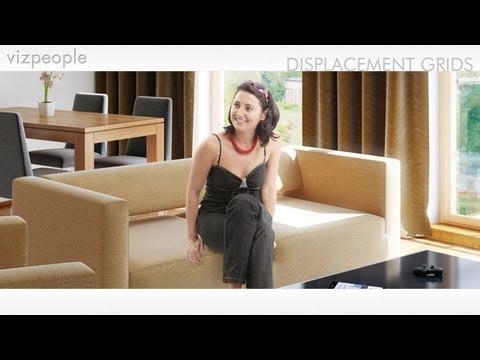
The Human Shape
The human shape is perhaps the most unmistakable shape in all the world. As a result, when you include its shape in any rendering, an obvious sense of scope and scale result. This happens regardless of whether that rendering is a nature scene, or something urban or industrial.
One of my favorite resources for people cutouts is, by far, VizPeople. I have many of their libraries and they have created a great video on how to composite people in your rendering.
Did you enjoy this blog post? If so, then why not:
Leave Comment | Subscribe To This Blog | Email Me
Correcting Keystoning
Keystoning is the term used to describe the "Leaning Tower of Pisa" effect of converging lines in architectural renderings. it's a very common result when rendering with a wide-angle lens. Photoshop can oftentimes straighten those buildings for you, correcting this perspective problem in a matter of seconds
Open your rendering in Photoshop, select the Crop tool from the toolbox, and drag the cursor from the top left corner to the bottom right corner and release. You will see the "marching ants" around your entire rendering. Go to the lower menu bar at the top of the screen and check the small box next to Perspective. Now, using the cursor, drag the top left corner of the marching ant border into the rendering so that the border is parallel to the tilting structure in the rendering. Do the same thing on the right side of the rendering. Then, double click in the rendering just to the right or left of the small center circle that appears on the rendering. Photoshop adjusts the image so that any tilting lines appear truly vertical, as they do when the human eye views the actual scene.

Did you enjoy this blog post? If so, then why not:
Leave Comment | Subscribe To This Blog | Email Me
Filters in Photoshop CS
Photoshop has made it easy to get those warm colors I love. Adobe added a whole set of adjustments that resemble the filters you'd use on your lenses. And, the best part is that they are available as adjustment layers, so you can apply them to your image and then mask out areas you don't want to be effected by the filter.
So, want to add warmth to an image you rendered? On your Photoshop menu bar, click image, then adjustment, and then Photo Filters. You'll get a choice of eighteen filters to use on your image, including several that warm things up. You can vary the intensity of these filters; and if you use Adjustment Layers to add the filter effect, you can apply those filter effects to selected parts of your image by using layer masks. To do this, select any of a number of tools from the toolbox, and using the mouse, select an area where you would like to apply filter effects. The area will be indicated by a dotted line. Then choose Layer on the pull down menu bar, then New Adjustment Layer, and then Photo Filter. Once the filter list comes up, you can choose your filter for that selected area.

Did you enjoy this blog post? If so, then why not:
Leave Comment | Subscribe To This Blog | Email Me
Architectural Rendering Art
It is said that a picture is worth a thousand words, and this is particularly true in the field of architectural renderings. There is no better medium than a balanced, well-done rendering, for capturing and displaying the look and feel of a building.
At what point does architectural rendering become art, and how can we differentiate between artistic architectural renderings and its documentary sibling?
The variety of definitions that exist justify some inquiry. The following are a few that come to mind:
“An action by means of which one man, having experienced a feeling, intentionally transmits it to others”
“Art is nature expressed through personality”
“Everything which we distinguish from nature”
“Art is the expression of pleasure in work”
Please, bookmark this, because I am going to add to it as my thoughts develop. If you would like to contribute please, leave me some feedback.

Did you enjoy this blog post? If so, then why not:
Leave Comment | Subscribe To This Blog | Email Me
V-Ray Stainless Steel Material
Several of my subscribers commented on the stainless steel V-Ray material I used in my Chicago Apartment rendering. Well, I am glad you guys liked it, and as promised, here are my settings, along with an Autodesk® 3ds Max® Design file.
Did you enjoy this blog post? If so, then why not:
Leave Comment | Subscribe To This Blog | Email Me
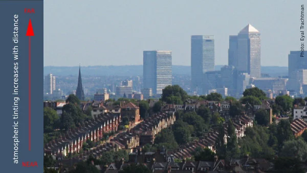
The Quality of Light
When light fades, color go with it, yet this is not just a question of the quantity of light; it's also the quality. Both time of the day and climactic conditions make a big difference. Morning, midday and afternoon light all have a different effect on color, making them cooler or warmer, crisp of vague.
Distance. Color nearest to us appear brighter and warmer than those in the distance; colors seem duller and cooler as the atmosphere in between increases. If you want objects to recede in the distance, they have to lighten, as well.
Surrounding Colors. Every aspect of color is relative. Learn to see each color with a fresh eye every time.

Did you enjoy this blog post? If so, then why not:
Leave Comment | Subscribe To This Blog | Email Me
Contrast and Emphasis
Contrast is emphasis. The sharpest contrast should be where you want the eye to go first. Contrast comes in many forms, including value, color, detail and line.
Value Contrast
The most important element is the value; the most influential of the principles is contrast. Put them together and you have a kind of contrast that packs the most punch.
Color Contrast
This usually refers to contrast in hue or temperature, but intensity also can play a role. A power struggle ensues when hues are equally intense. One must dominate, or the eye won't know where to look.
Contrast in Complexity
Just as brightness is enhanced by neutrality, detail, texture and pattern are more exciting next to areas of simplicity.
Contrast in Line
A rendering with entirely horizontal lines is effectively no rendering at all. When even a minimum of diagonal and vertical lines is added, the improvement is dramatic.

Did you enjoy this blog post? If so, then why not:
Leave Comment | Subscribe To This Blog | Email Me
Many 3D Artists Feel Intimidated by Design
Architectural illustrations and 3D renderings are the same thing as composition. Despite rumours to the contrary, there's no imperative difference. They both boil down to what you put where. We make decisions then we place 3D geometry in one place or another on our screen.
Composition and design are ultimately what an architectural illustration and 3D rendering is about. Many 3D artists feel intimidated by design, that it's more than they want to deal with. They push it into the back-burner and hope that somehow it will take care of itself. However, the fact is that design can be demystified - and it must be, since consistently successful results come no other way.
Mountain climbing seems to mirror the act of creating 3D art. Does anyone just forgo planning and "hit the road" to reach the peak? Obviously, not if you intent to see the view from the top, and not if you plan to get there again. Happy accidents seldom happen when climbing to great heights. That requires understanding, planning and practice.
Even with a plan, success is never guaranteed. It just improves the chances. Good composition requires a well-developed sense of design. How do you require good design? You study, observe, and ask questions. In the process, you learn to see critically. And you render - a lot, while consciously applying the concepts you've discovered.
We're all aware that there's much about art that is intuitive. But few realise how much of art is logical and reasonable. It can be understood. And, once understood and absorbed, eventually it becomes second nature. Anyone who sets out with serious intent can master design.

Did you enjoy this blog post? If so, then why not:
Leave Comment | Subscribe To This Blog | Email Me
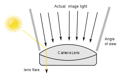
A Rendering with Flare
Flare adds atmosphere of a kind, and also a sense of actuality. Certainly, for strongly manipulated and special-effects imagery, adding flare can be a useful way of helping to convince the viewer that a scene is genuine.
The polygonal flare patterns that are created by internal aperture reflections and refractions from a point source of light (such as the sun) that is either just inside or just outside the picture frame.
From your final 3D rendering, inside your post processing application, you can add your flare. For the most part, you add a flare for a treatment that conveys the intensity of the sun and a general feeling of heat. The software I use is the Knoll Light Factory plug-in for Photoshop.
Keeping the generated flare on a separate layer makes it easy to align with the sun and the rest of your 3D scene.
Did you enjoy this blog post? If so, then why not:
Leave Comment | Subscribe To This Blog | Email Me
The Properties of Color
Any color has three basic properties - it's hue, its tone, and its intensity. Hue means the color as identified by its name - red or blue, for example. Tone means the lightness or darkness of a color. You can, for instance, have a light blue or a dark blue. In addition to the properties of hue and tone, colors have a varying degree of intensity. Two reds may be identical in tone and yet be clearly different, with one more intense, or brighter, than the other. The difference in intensity is sometimes called color saturation.
When you use the word color, you are generally referring to these three properties - hue, tone, and intensity - simultaneously. However, it is helpful to be able to identify them separately because when you notice that a color is "wrong", you will be better able to pinpoint what is wrong with it - whether it is too light in tone or too intense.

Did you enjoy this blog post? If so, then why not:
Leave Comment | Subscribe To This Blog | Email Me

John Maeda: How art, technology and design inform creative leaders
John Maeda, President of the Rhode Island School of Design, delivers a funny and charming talk that spans a lifetime of work in art, design and technology, concluding with a picture of creative leadership in the future. Watch for demos of Maeda’s earliest work -- and even a computer made of people.
John Maeda is the president of the Rhode Island School of Design, where he is dedicated to linking design and technology. Through the software tools, web pages and books he creates, he spreads his philosophy of elegant simplicity.

Softness and Building Blur
Bryan O'Neil Hughes explains the importance of softness and shallow depth of field in photographs and how it is possible to mimic it in Photoshop CS6.

Perfect Reflection
When rendering a building with a large expanse of water in front of it, the classic approach is to include the reflection, along with the whole building, to create a symmetrical rendering. For a perfect reflection you’ll need water to be as still as possible, so this technique won’t work on water with large bump maps, or noise. That said, you can also look for much smaller areas of water that reflect just a small detail of the building to add foreground interest to your rendering. On rainy days renders, you can even look out for reflections in puddles or rain-soaked streets. This technique is particularly good at night, when you can include bright lights in the reflection.
With reflections, it pays to explore lots of different camera views – don’t just render the first composition that presents itself. An inch to the left or right, or up or down, can make a big difference to how a reflection fits in a pond or puddle.

Lens Distortion
You’d normally want to avoid any type of lens distortion when rendering architecture, but a virtual fisheye lens can add a creative twist to your renderings. This distorted style of the rendering isn't to everyone’s taste, but used sparingly – and with the right subjects – it can produce very striking renders.
Fisheye lenses come in two main types – those that give completely circular images, and those that produce conventional rectangular ones. But both will cause straight lines in your image to bulge outwards, especially at the edges.
Because the distorted renders from a fisheye break many of the ‘rules’ of rendering architecture, they often lend themselves to unusual framing and viewpoints. Try rendering with the lens pointing directly upwards to shoot ceilings or roofs, for example. The circular nature of fisheye renders is also perfect for symmetrical or even circular subjects.

You Don’t Have to Render the Whole Building
You don’t have to render the whole building for stunning architectural renderings. You can isolate details such as windows or columns to produce renderings with a ton of impact. Glass, metal and concrete structures, are full of graphic details that are perfect for producing this type of renderings, but you can also find them in older buildings.
The key to this style of rendering is simplicity, so look for areas of the building that you can isolate from their surroundings, or repetitive patterns in the structure. Then try rendering them either straight on to make the most of repetitive patterns, or at a deliberate angle for more dynamic images.