

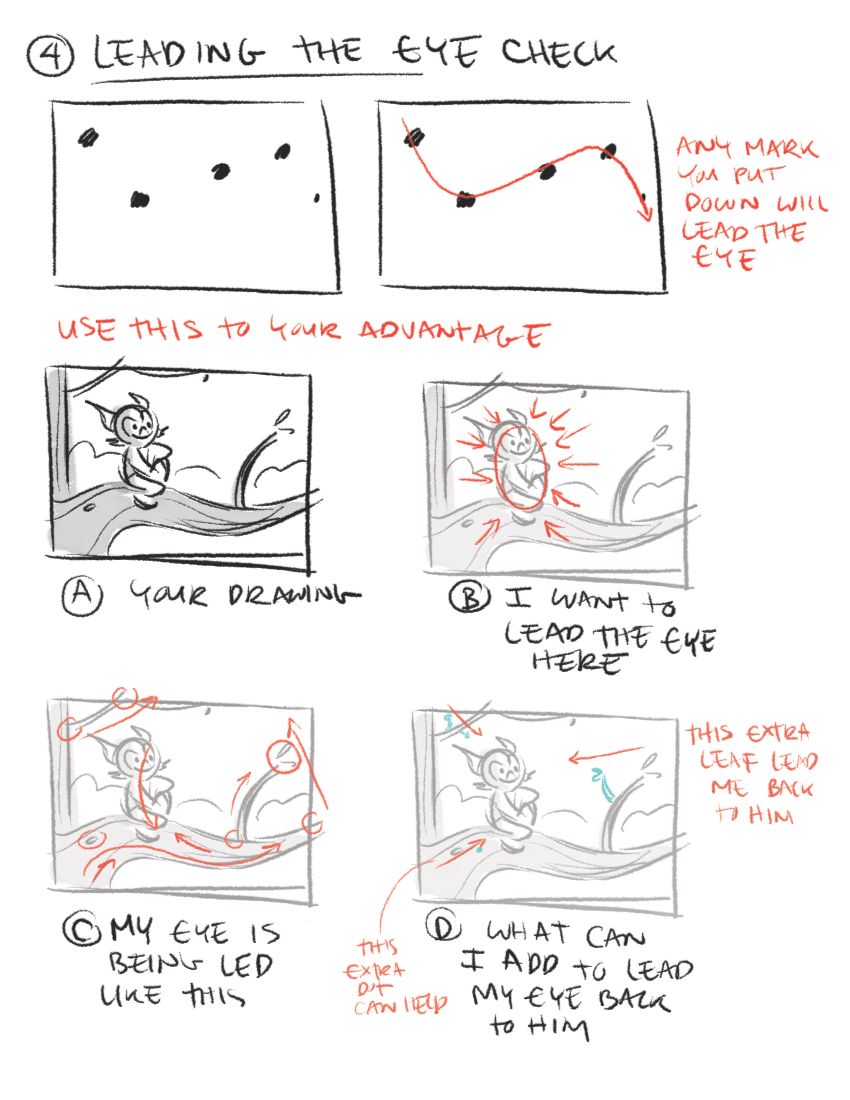
Lesser Known Composition Tricks
So you already know that the rule of thirds, leading lines, and framing your rendering are some of the essential composition techniques architectural illustrators commonly use. Here are a few other not so common composition techniques that can set your renderings apart from the rest!

Left to Right
Put the focus point of your subject more to the right side rather than the left. Our eyes are used to reading text left to right, just like you are reading this article, so follow the same idea in your renderings. No, this is not the rule of thirds or leading lines; rather, it draws your viewer’s eye into the image.
Tell a Story
A picture is worth a thousand words, right?
Telling a story with your composition is nothing new. You have probably heard that before; however, one thing that I consistently see results from in my renderings is paying more attention to what is excluded from the rendering than what is included in the rendering. The key to composition is to analyze every single thing in the rendering, and then place it in a way that adds to the subject itself.
Simplify Your Compositions
Keep the focus on the subject, not all the details in the scene. Too many details take the focus away from the story your rendering is trying to tell and make it more difficult for the viewer to figure out what you are trying to convey.
Another way to bring focus to your subject is with light. The eye is naturally drawn to the brightest spot of an image By using light, positioning, and depth-of-field to make the viewer pay closer attention to the subject, you will capture much more impactful photos.
Odd vs. Even
Odd numbers of things tend to be more visually exciting than even amounts. Because of this, triangles are more dynamic than squares (which often look like a frame). Three’s the magic number rather than two or four. Choose seven over six or eight, and nine over ten… You get the idea.
Crop with Care
I don’t go crazy about exactly where a crop, but I do think it is necessary to crop with care. My rule of thumb is if you are going to crop off, crop hard. Cut off a good chunk. The real problem happens when you just barely cut off a skiff.
Break the rules!
Don’t be afraid to break the rules and try something new. There are times when breaking the rules is precisely what makes a rendering stand out from all the rest