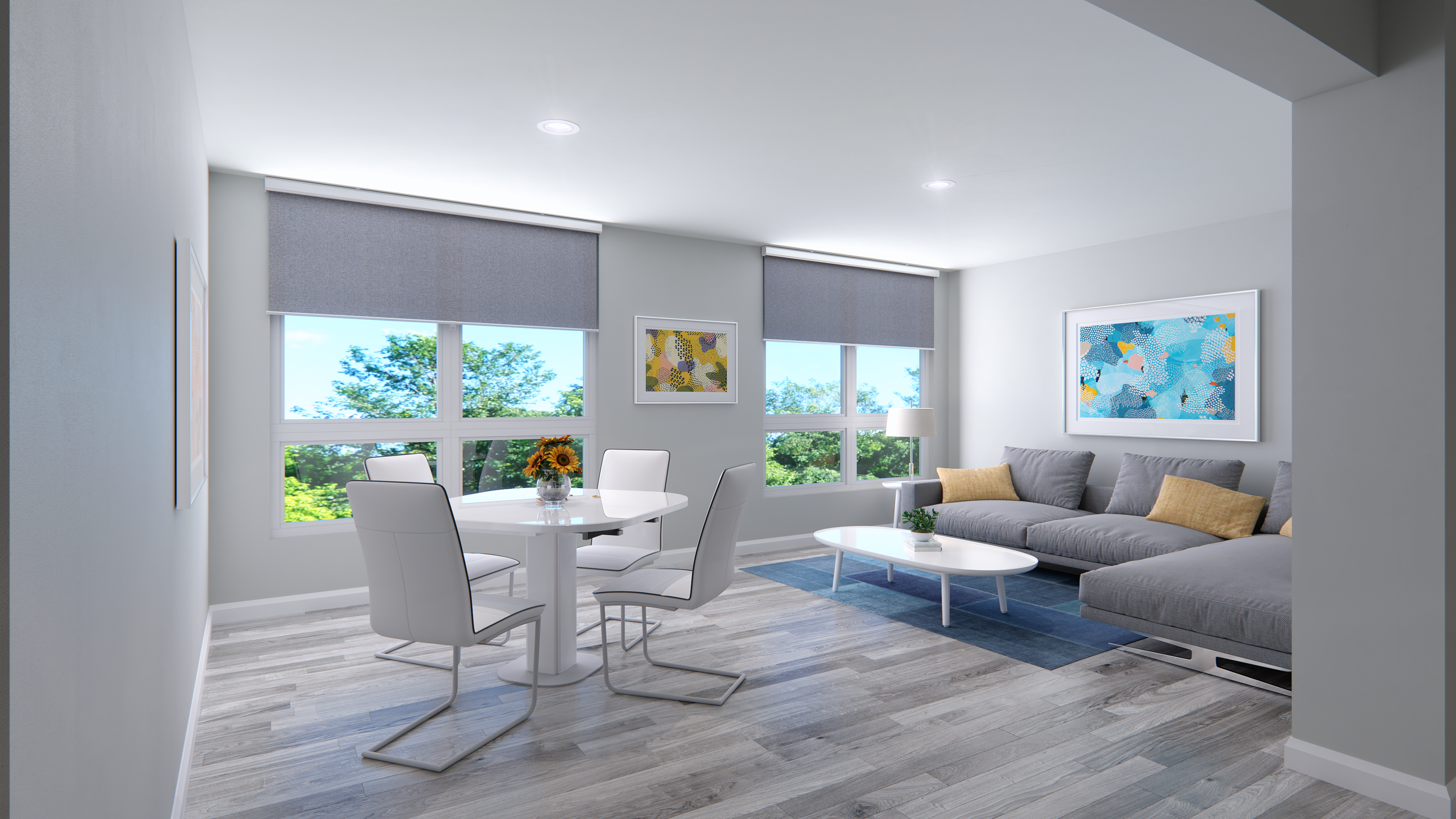
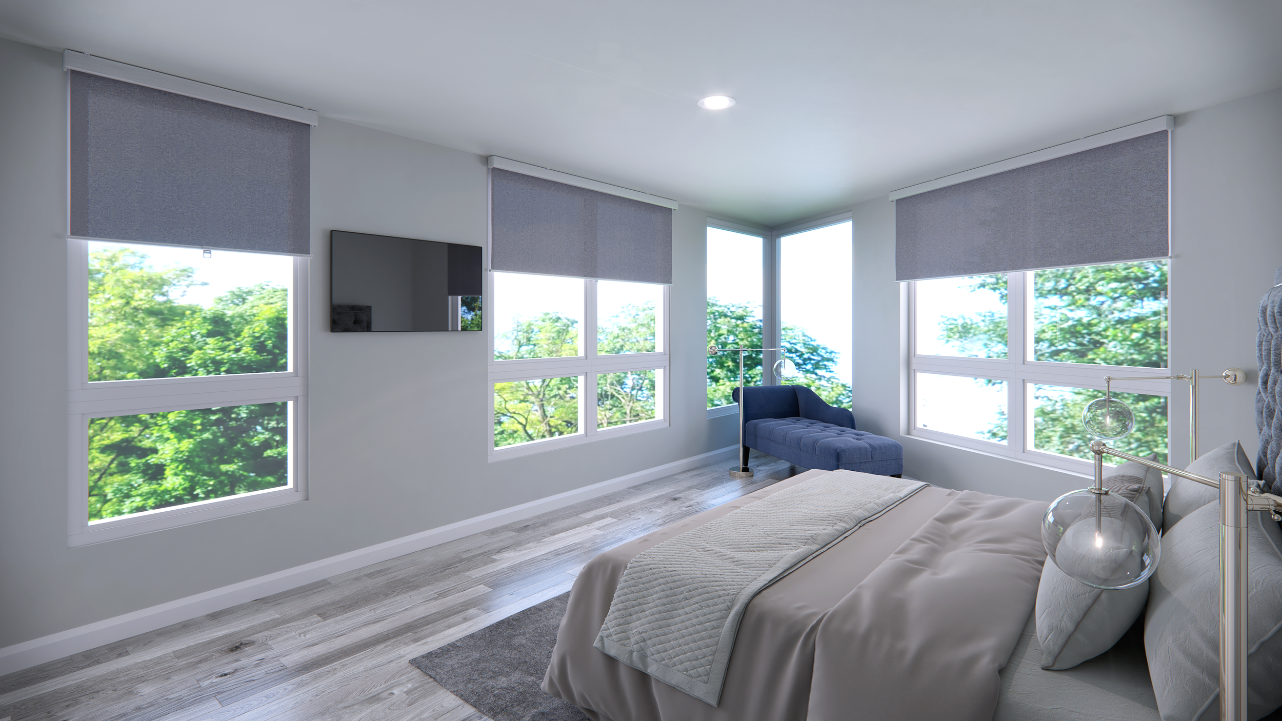
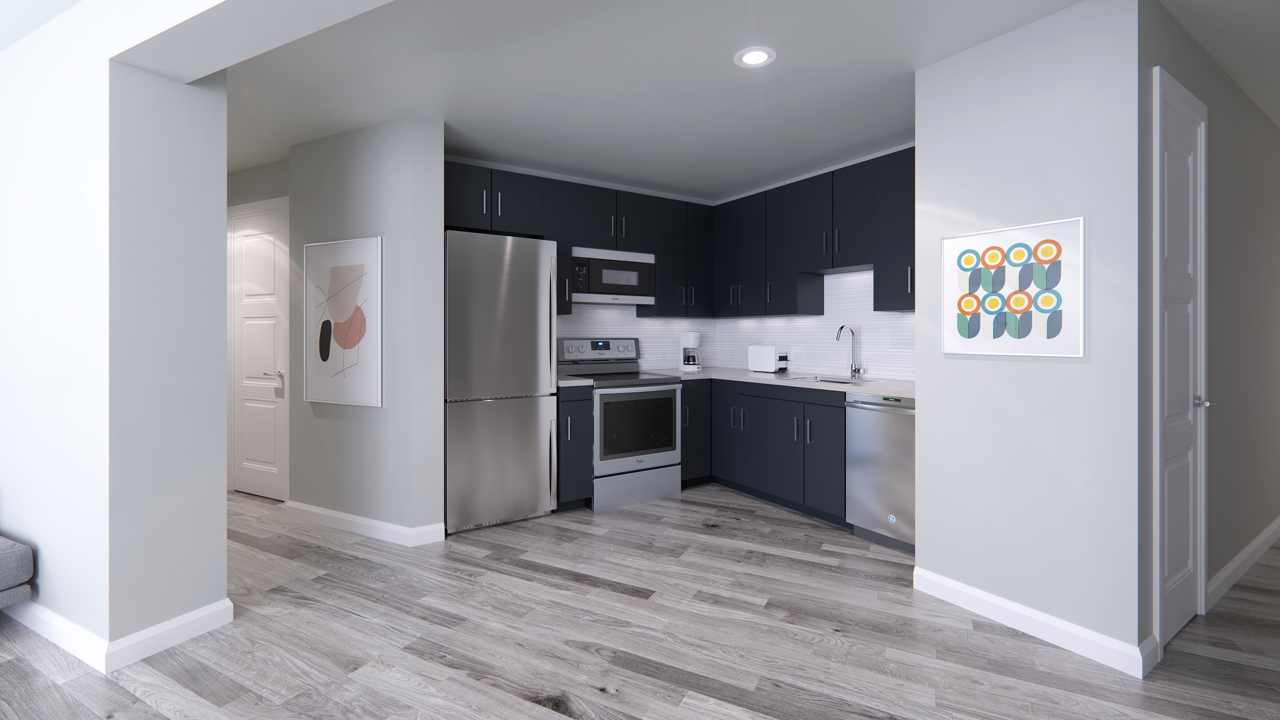
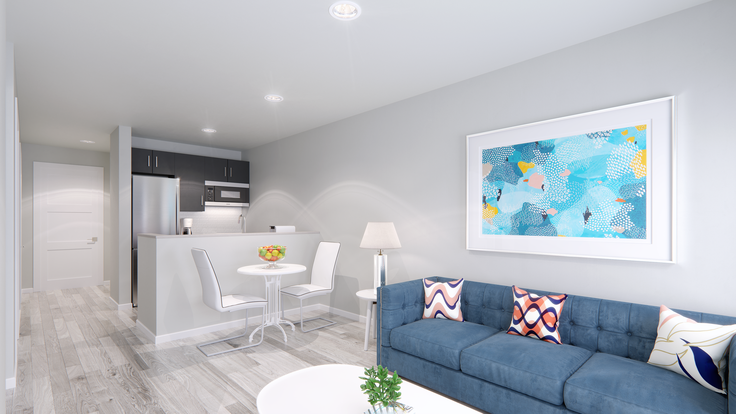
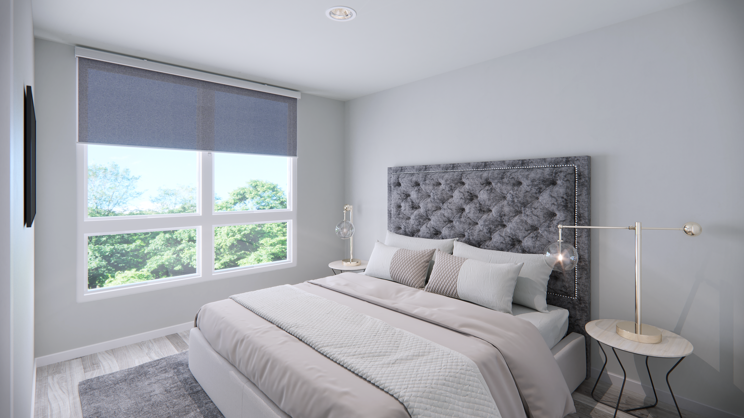
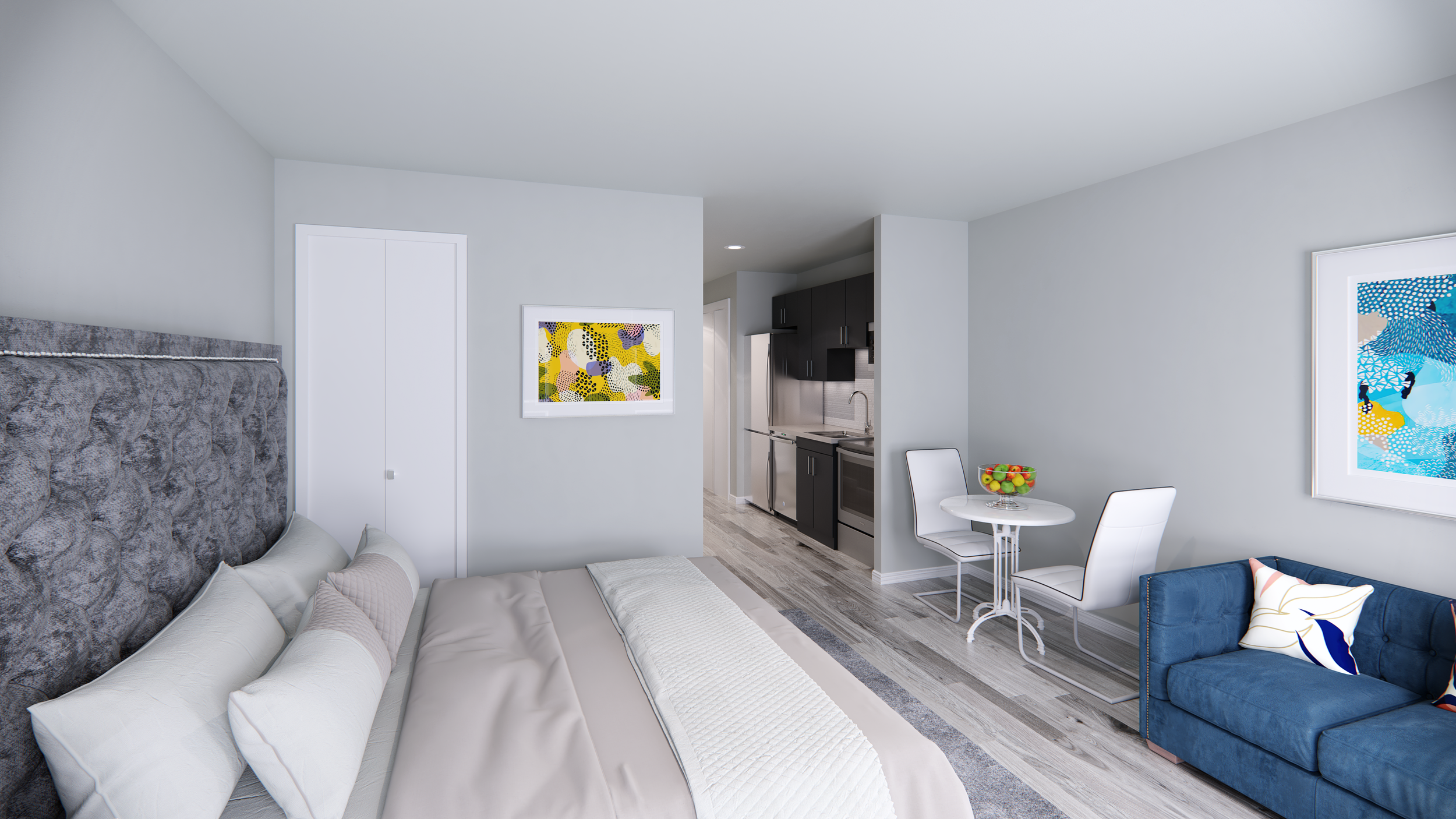
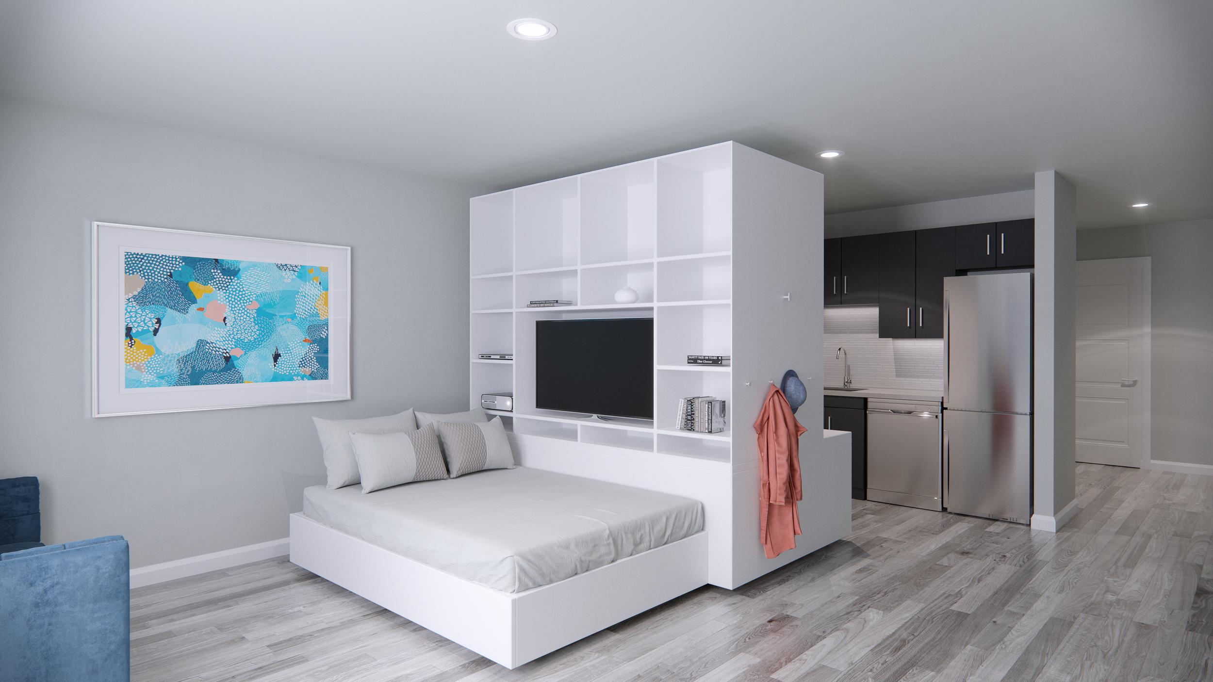
Hancock Apartment Interior Renderings
These came to me as a previous client referral, which is always a great complement. They already had interior renderings created, by someone else, but they were not happy with them and they didn’t think they could use them for their marketing campaign.
At first, I received partial information, so the project started off strange. The interior images were dark and gloomy, however, I wanted to show the client an unbiased look into their interior spaces, so I didn’t do any tricks to brighten things up. After receiving more information we realized that the windows I had built, where 1/2 as small and 1/2 as many. Once I opened up some more exterior wall with openings, the spaces became bright an cheery.
Truth be known, the spaces are a little small, however, with some photography tricks, light and bright colors, and limited furniture, the spaces look spacious.
Did you enjoy this article? I would love to hear your thoughts, so don’t be shy and comment below! Please don’t forget to subscribe to my RSS-feed or follow my feed on Twitter, Google+ and Facebook! If you enjoyed the following article we humbly ask you to comment and help us spread the word! Or, if you would like, drop me an email.


