

Getting the Color Average
One of the most difficult parts of any architectural rendering is getting the colors correct. Typically, I receive a swatch, photo, or a web link. Now, people tend to see things as they remember them being. Our brains have a way to filter things out. For example, white snow is actually bluish, due to the sky, but our brains filter out the blue and shows us white because snow is white after all.

When I receive a color sample I crop out everything that isn't part of the material and I take an average sample. If I want snow to look real, I can't just apply a white material, because the snow isn't white; I have to create a bluish material.
In Photoshop go to Filter, Blur and select Average

Blur Average
Now, I can use Photoshop's Color Picker to get the average color and build my material from there.
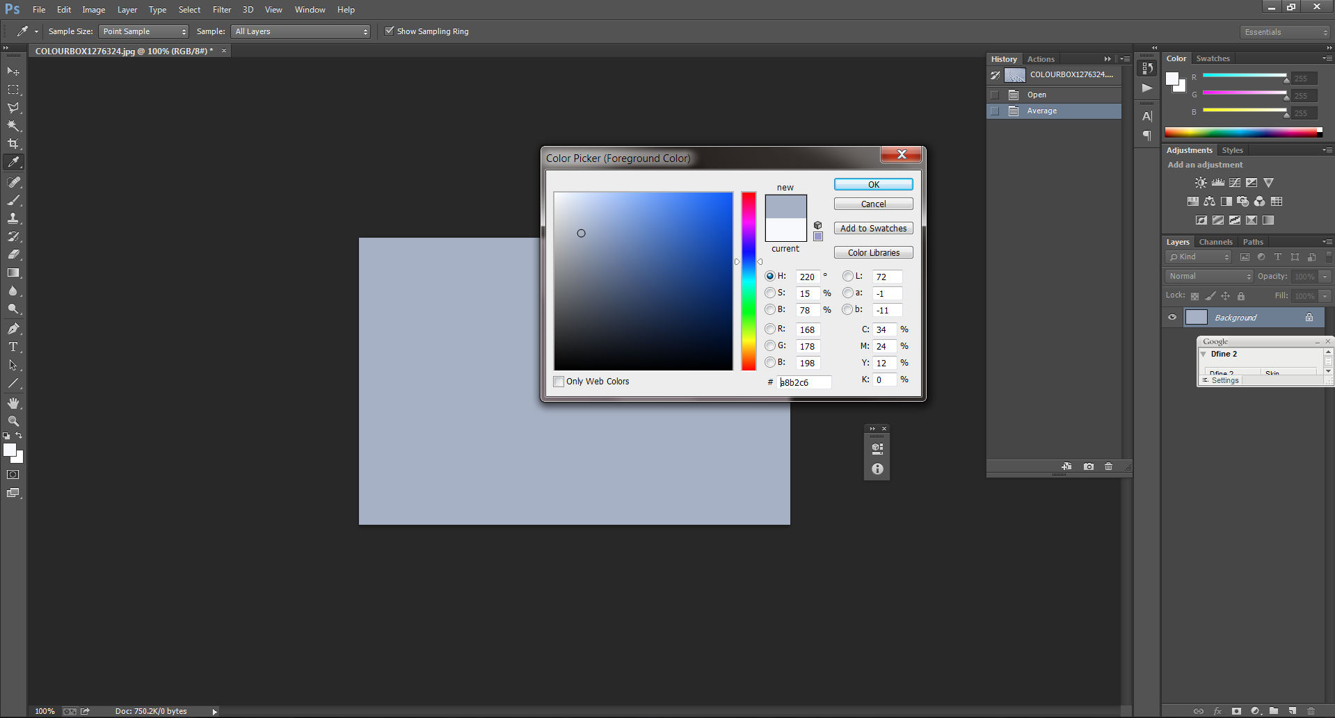
Photoshop Color Picker
I hope this helps you when you are creating your materials from a sample. If anything, you can show your client the actual color and not the color they think the sample is. I have had clients insist that a color is one thing, when in fact it is something totally different.
A photorealistic architectural rendering is only successful when you successfully recreate a reality. If you would like your snow scene to look real you'll have to make it blue.
Did you enjoy this article? I would love to hear your thoughts, so don’t be shy and comment below! Please don’t forget to subscribe to my RSS-feed or follow my feed on Twitter, Google+ and Facebook! If you enjoyed the following article we humbly ask you to comment, and help us spread the word! Or, if you would like, drop me an email.