

BLOG
Working Non-Destructively

I want to talk a bit about working non-destructively. Some rendering artists prefer to work completely non-destructively or never apply color correction directly to a layer. I began my career painting traditionally, with physical paint, markers, and color pencils. Where, every stroke the artist added to a matte was for real and couldn't be taken back unless you painted over it. In some ways, I think artists have lost something. Especially in spontaneity and directness, when you never have to make a final decision on any element.
Working entirely non destructively also results in huge file sizes. And projects with so many layers it gets nearly impossible to tell what layer is doing what, or find any element. This is counter to where the industry is moving, but I will often work directly on simple layers for the sake of keeping my project more manageable. Like I said, this is a matter of workflow, and you may want to work completely non-destructively in your rendering.
Color Correcting Individual RGB Channels
Lets talk about the really super charged part of color correcting, and that's working with the individual RGB channels and curves. I'm just going to show you how to do this in curves from here on out, but you can do all of this in levels just not as well. First lets look at the red channel, so choose it from the drop down menu If you pull up on the mid tone you'll add red to the image and lighten it. If you pull down on the curve you darken the image since you are removing red, and add blue green to the image.


RGB color correcting can be a little confusing since the next choice in the menu is green. You may think, won't that do kind of the same thing, when I pulled down on red, I added green, so won't this just be the reverse of the red channel? The answer is no, the two channels give you very different results, since if you pull down on the green channel, you add a magenta-red. Well the red channel added an orange-red when you pulled up on it. If you pull up on the green curve, it adds a yellow-green to the image, quite different from the blue-green the red channel added.

So, the two channels aren't just mirror images of each other. They yield very different color results when you modify them. The last channel is blue, and it's obvious that if you pull up on the curve it adds blue to the image, and lightens it. But, if you pull down on he curve it adds yellow.Maybe not the color you would have immediately thought of as the opposite of blue. So the color you get, especially from pulling down on curves may not initially be what you expect. The only way to internalize what these channels do is to work with them a lot and over time, you'll see what moves give you the results you want.
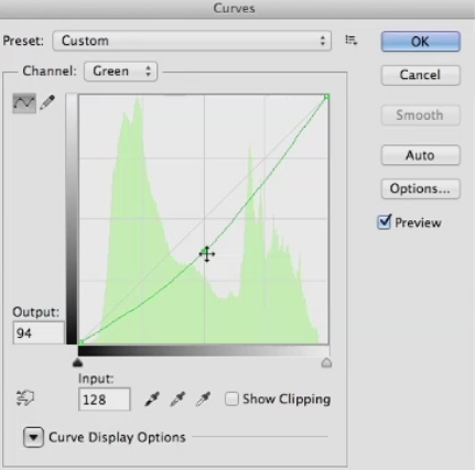
I'm primarily showing moving the mid-tones of the color channels, but you can also pull down on the white point in blue to flood the image with yellow. Or pull up on the black point to reduce contrast, and add blue all over the image. Same with the red channel. Pull up to flood the image with red, or pull down to remove red. And the green channel. So you'll just need to experiment with these, until you really get the hang of what each channel does. Before we leave this topic, I want to mention what I think is the best book on color correction ever written, called Professional Photoshop: The Classic Guide to Color Correction by Dan Margulis.

Books by Dan Margulis
Dan is a prepress master, and a lot of the book involves color correcting in CMYK color space, the space where all printed materials live. However, all of the color correcting concepts are valid in other color spaces, and in later editions he has gone more into RGB color correction. I learned more about color correction from this book than from anything else I've ever read, and I would highly recommend it to any aspiring matt artist.
Websites for Rendering Reference
Let's talk about websites where you can find reference for your rendering projects. Obviously, You can go to Google and find lots of reference there. But there are three problems with reference you find on the Internet. And those are copyright, resolution, and quality. The first is Copyright. If you use someone else's copyrighted material without asking permission, you can get sued. The chances of you getting sued are slight if you massively change the photos you're using, color correcting and distorting them, or only using small pieces.

However the chance is still there if you're using copyrighted material. Second is resolution. I think every matte artist has had the experience of finding what looks like the perfect piece of photo reference, but when you click on it, you find it's not at a usable resolution. The higher resolution you start from with your reference material, the sharper it'll be. And the more distortion and color correction it can stand. The last is quality. Most of the photos on the Internet have severe JPEG compression on them, to make them as small as possible.
Those compression artifacts compromise the image to a greater or lesser extent. So finding higher quality reference is desirable. That brings me to the first great site for finding reference for you rendering, environment-textures.com. It costs a bit more than $100 a year to belong, or about $18 a month for monthly membership. You can download three photos a day for free if you register with them. The site was set up specifically for matte and texture artists and features a huge collection of photos of every possible subject.

It doesn't have people on it, the same organization has another website specifically for figures. But it has buildings, mountains, skies, everything you could need for a rendering, all at very high resolution and extremely good quality. If you're a yearly member, you can also download large quantities of photos of the same subject in a zip file. I've been a member for many years, and would highly recommend you buy a membership, once you become a working professional.
Also, there's an effort made to shoot the photo straight on. In general, having photos with no perspective in them is easier. If the photo was shot with the subject at an angle, you'll often have to remove the existing perspective before you can distort it into the perspective required for your project. With a membership in this site, you can use the photos for commercial projects, as long as you modify them and use them creatively. One thing you can't do is download a bunch of the photos and resell them unaltered. Next is freetextures.3dtotal.com.
This site doesn't have anywhere near as many textures as enviroment-textures.com, but like the name says its free. All the photos are at very high resolution and good quality. After that, its cgtextures.com. This site has an usual policy where you can download up to 15 megabytes a day. And then it cuts you off for 24 hours. You can also buy a membership for around $80 a year, and you can download up to 100 megabytes every 24 hours.

Once again, these are very high quality and at a usable resolution. The next site I'm going to mention is the most expensive one, cgskies.com. This is run by the same people who run CG Textures, and it's all about skies. Each sky costs about $30. And these are huge files up to 18,000 pixels wide. The free version that give away so you can test it in your project is 3000 pixels wide. This price may seem steep, but the quality is top notch.
And if you're working on a big project and need the perfect sky at very high res, this is the site to visit.
Global illumination (GI) explained

V-Ray comes equipped with a number of extremely powerful Global Illumination, or GI, engines that can help us recreate pretty much any natural lighting scenario-- and a good number of unnatural ones--should we have a mind to. If we just come into the 3ds Max User Interface, if we come up to the Render Setup dialog, we can just show you where V-Ray's Indirect Illumination Tools are found. And we just want to come along in our tabs to the Indirect Illumination tab, and here you can see with the systems turned on, we have access to a whole array of Global Illumination Tools.

We have access to a number of different Global Illumination engines. The feature sets of these tools are robust, they are powerful, they give us the ability to easily switch between physically-correct and artistically-correct approaches to our lighting setups. They can be tuned to be fast enough for even the most demanding of production schedules and yet at the same time still output high-quality images for us. Ultimately, these systems can remove an awful lot of the guesswork that would otherwise be involved in trying to manually recreate a realistic lighting solution.
Really all we need to do is evaluate the lighting needs of our current project, choose the tools we want or need to use--of course we need to run through our lighting setup--and then we can have V-Ray's GI engines assist us in achieving our artistic goals. Now, for the benefit of those somewhat newer to 3D rendering, we are going to start this chapter making the assumption that you may be somewhat unfamiliar with just what Global Illumination is and so would benefit from just a quick breakdown of its definition and workings. An understanding of just what Global, or Indirect Illumination, is can probably best be gained by contrasting it to its lighting opposite, which is Local or Direct Illumination, as we see here.
By default adding CG lights into a 3D scene and rendering without any GI systems enabled will give us only this type of Local Illumination. This computer graphics illumination is not, of course, how light behaves in the real world. This is why we need GI systems in our renderers. They allow us to simulate the physical reality of light, which of course in the real world, spends a lot of time, a lot of energy bouncing around our environments.

Even the V-Ray Dome Light, although it does give 180 degrees of light, is still a direct only light source. Let's have a look at the basic GI process. It goes a little bit like this. As direct light is emitted from a source, such as our light here, it will travel until it strikes the surface of an object in our scene. At this point, a lighting phenomenon known as inter-surface reflection occurs. All this phrase really means is that a portion of our life energy will reflect, or bounce, and create a Global or Indirect Illumination effect in the scene.
Dependent upon the amount of energy coming from our light source, we should actually see that our light is able to bounce from a number of surfaces. With each bounce, it will lose a bit of energy, and with each bounce it will pick up a little bit of coloration inherited from the diffuse properties of surfaces it has interacted with so far. The result of all of this bouncing is that our surroundings become lit, and even the dark nooks and crannies of an environment will end up receiving at least some level of lighting, even though they may be far away from direct light sources.
This complex process is what really gives us the ability to create lighting scenarios that have a very high degree of accuracy and realism to them. We can even conduct lighting analysis test that will give architects, engineers the ability to measure just how much illumination a given environment and a given set of light sources will produce. And now with that primary explanation of Global Illumination, we are ready to move on to examining a very particular aspect of V-Ray's GI implementation, and that is its use of primary and secondary bounce engines.
Staying Motivated and Inspired

Successful freelancers are passionate about what they do. They commit to their clients and to the projects they work together on. To be inspired, you should be interested in where architectural rendering is going. It will help you craft a vision and a plan. Become voracious about architectural renderings. What work is being done that is transforming our industry creatively and economically? Knowing this helps you see where you can be most efficient in the work that you do. The best architectural illustrators keep great resource files, either digital or physical, to draw upon for ideas and inspiration.

One of the most insightful tools are architectural illustrator's journals and sketchbooks. They become rich documentation of a illustrator's evolution. They force you to become committed to your view of the world. I suggest joining and participating in cg rendering-related communities such as the American Society of Architectural Illustrators (ASAI). Meet fellow architectural illustrators and contribute your ideas. Become part of communities that are positive about the impact that architectural renderings can have for commerce and for social or environmental good.
Avoid the complainers. Commiserating with whiny architectural illustrators is a waste of time. Read forums such as Chaos Group, CGRamp, Evermotion, CGArena, and Computer Graphics Society; they will help you understand the greater impact that architectural renderings is capable of making. What you will learn will make your conversations with colleagues and clients much richer. It's great because you become a resource for new and innovative thinking. Understand the economy and culture of the city that you live in.
Even though we're in a global economy, most of the freelancers' work will come from large and small local sources. Stay relevant and clear. Clarity is necessary to make tough decisions faster. It's a required skill to navigate the peaks and valleys of our economy. Clarity is also required to access our intuition and our creativity. It's a necessary component for empathy, the successful Architectural Illustrator's secret weapon. As a freelancer you should ask yourself, is this work meaningful and lucrative? If the answer is yes, you have a great foundation for your work that can sustain your effort for the long term.
Enjoy yourself and take pride in the fact that you're in control of your own destiny.
Overview of Color Mapping

Without the final translation of collected information into RGB pixel values, we would never get any images out of our rendering engine. One of the extremely cool things about V-Ray, though, is that it allows us to make some pre-render choices as to just how this color mapping will take place, and so ultimately we can affect a little bit how our final renders will be looking.
So of course we need to go and open up the Render Setup dialog for ourselves, we want to come into the V-Ray tab, and I am just going to close up everything except our color mapping rollout. Now, the parameter shared in common by our color mapping modes is this Gamma value. In fact, if we just very quickly flick through each of the options available, you can see that, that Gamma parameter stays consistent. It is available for each and every one of them. Now the Gamma value can be almost be thought of as a mid-tones control, it is really placed there to give us the ability to compensate for the Gamma response curve of our display device, and because it is available in each of the color mapping modes, we can do this irrespective of the color mapping we want to work with.
To correct for a 2.2 Gamma display curve, which is a typical Window system setting, we would use a value of 2.2 in this option, just as we have here, and the render that we can see is the end result that we would get. If of course we were working with an operating system that has a different Gamma response curve, or we just wanted to make a change for artistic preference, then a value of 1.8, for instance, is something that we could work with, and this is the image that we would get. You can see just a little bit of a shift down in terms of the mid-tones, the image is a little bit darker with the Gamma 1.8 option.
So that's the parameter that all of our color mapping modes hold in common. We want to look now at the Dark and Bright multiplier, which are parameters-- these are controls that most of our color mapping modes are going to be working with. So if we just minimize our render frame window and just pull up the RAM Player for ourselves, again, just remember all of the images we are looking at here are available in the Exercise_Files folder in your Render Output and Ch02 folder. So I just want to set the Gamma value here to a value of 1.0, because each of these renders were taken using this value.
Whenever we are rendering with such a high levels of contrast in our scenes, we really see the effects of the Dark and Bright multipliers and the color mapping modes as well, so that is why we just use this value for these particular renders. Now, the Dark and Bright multipliers-- as their name would suggest--control the darkest and brightest values found in our rendered image. If we were to take a render with the settings as we see them now, you can see this is the way our image, our render would turn out. If we to make changes to the Dark multiplier, for instance, if we were to drop the Dark multiplier down--I just want you to pay attention to the dark values just around the edges of our render-- and if we take this and drop it down to a value of .5, and then take a look at the result in render, you can see just how all of these dark areas all drop down in value.
So you can really see what the Dark multiplier is doing there. Of course, if you keep an eye on those same values, as we go up to a value of 2, so now everything around these edges is pushed quite a bit. And if we just compare it to our start point, you can see all of these dark areas really do brighten up. And of course the same is true of the Bright multiplier itself. So let's set it back to 1, and if we go to a value of .5, this time we want to pay attention to all the brightest spots in our image. So for instance, where we get the light blowout here, again, let's go back to our reference. You can see we've got very bright areas where the light is blowing out our material, and if we go to the Bright multiplier render of .5, you can see all if that blowout is gone.
Now, just a word of caution here, oftentimes you do see the Bright multiplier recommended as a method of handling blowout or burnt areas in the scene, but as you can see, because we have made quite a drastic change to the Bright multiplier, we have quite bit of artifacting going on inside of our render here. So generally for subtle tweaks the Dark and Bright multipliers work well. If we want to get rid of something very severe, then making changes of this order, of this magnitude, really not a recommended way of doing things. And again, if we keep an eye on those bright areas, if we really push up to a value of 2, you can see our resulting render really does have quite bright values in it indeed.
Beautiful Accidents
“Beautiful accidents can happen, but accident is not the basis for design excellence. Purposeful discovery followed by focused, skillful conceptualization and execution is the basis for design excellence.”
Rendering Your Own Reality
One of the most important part of any architectural project is being able to communicate the finished vision before the actual work brings it to life. Shaping the final product before you begin renovations or new construction allows you to make more informed choices for every detail of the venture from the color of the tile to the patterns that will appear on the wood grain. Additionally, a visual reference for a finished architectural project will keep things moving even when small setbacks may arise. architectural renderings created using a digital platform will bring a project to life before your eyes. The potential vividness of digital renderings will take the guesswork out of any endeavor and make communication between multiple parties a process that occurs naturally.
Photo-Real Architectural Rendering
Architectural renderings by Bobby Parker offer all of the above benefits to designers and homeowners for any kind of project both large and small. Bobby Parker renderings can reflect ideas and finalized designs for single rooms, entire houses, or multiple layouts and floor plans. Bobby Parker brings customers more than wire-rendered, digital drawings or 2-dimensional drawings that only vaguely reference the final concept. Instead, Bobby Parker delivers Photo-Real Architectural Renderings that can be virtually indistinguishable from an actual photograph of the final project. There is no other artist in the area who can offer the same skill and diversity in their portfolio when it comes to creating a photo-real rendering that will ensure the integrity of your designs when the work is done.
Photo-real architectural renderings can allow for advance completion of every aspect of interior design planning. These images can assist in shaping ideas for everything from the furniture in the room to the pictures that are hanging on the wall. With Bobby Parker as your partner, imagination in design comes to life in most realistic way possible. Over 24 years of professional experience will allow you to have the resources necessary to achieve stunning results in every architectural project in which you engage. The images are rich in quality and delivered quickly regardless of the project scope. Allow your imagination to have freedom and express itself with precision by allowing Bobby Parker to give it tangible expression
The Sketchbook Project Explained in 96 Seconds
"Everything you ever wanted to know about The Sketchbook Project explained in 96 seconds! Featuring James K. Polk and Presidents, A horse, and some other fun characters.…"
Understanding Tools Required for Color Management

Like any other craft, there are a few tools you need to ensure accurate and consistent color throughout your architectural rendering's color journey. Your monitor is probably the most serious tool you're going to be dealing with in any kind of color workflow, and you have to have a way to calibrate and profile that. Since most monitors don't come out of the box calibrated, well you need to know that what you're seeing on the screen is an accurate depiction of what's actually in your file.
So what happens if you don't take care of your monitor color? Stop and think about it. If your monitor is not accurately showing you your images, with the correct color and tonality, then your edits are guesses. I don't think anyone out there wants to sit in front of a computer for hours on end. Only get bad prints because your monitor wasn't showing you the correct color and tones in your image. Now what commonly happens? Let's take a closer look. Let's say your monitor is overly blue, and this is something that's not uncommon.
When you view your image on the screen, even if the file is actually correct it will appear bluish and you want to edit it. So in this case, we bring our editing software. We add yellow to the color balance and, oh now it looks great on the screen. But, the original file was actually pretty good, and you made it more yellow to counter your blue monitor. It may look better on the screen now, but when you print the image, it comes out yellow. Having your monitor set too bright is also very common. When you view your image on the screen, well, the image looks too light because in this case, the luminance of your display is set too high.

So you make some brightness adjustments in your software to get it looking the way you want. Now that looks better. But, once again, even though the screen looks better, but the original file was actually exposed correctly, and you made it darker just to counter your too bright monitor. Again, it may look better on the screen, but when you print the image, it comes out dark. I hear this from some of my architectural rendering friends all the time. The exposure was a bit under, sometimes done on purpose to keep from blowing out details, but it looks great on a monitor.
You get fooled into thinking the images are perfect, when in fact, the images are a bit dark and could use some brightening. When these images are sent to the printer, and come print too dark, you want to blame the printer when in fact, the culprit is your overly bright monitor. Monitor profiling and calibration help to end these common problems, and will make it much easier for you to get great prints. We don't want yellow prints, we don't want dark prints. We want perfect prints. Now to do this, you need some tools. Colorimeter-based devices like the X-Rite ColorMunki, along with other devices like Datacolor Spyder series, are great for those who need to profile their monitors when they're not planning on doing serious fine art printing on their own.

A colorimeter like these makes use of filters to measure the intensity of red, green and blue. Measuring these primaries is roughly similar to how our eyes work. The filters reduce a broad range of light into a few measurement values that allow your monitor to then show you red when it's asking for red. And these two X-Rite devices can also provide some other useful functions, including the ability to calibrate and profile projectors. They can also continuously monitor the ambient light around your workspace and even adjust your monitor's brightness if the ambient light should reach a certain level.

So for example, if your desk is near a window and you've got from sunny to cloudy to dark, it will automatically adjust your monitor so that what you're seeing when you're editing is best displayed. Now both devices sit flush on the front of your display , and use their softwares to read color patches.
They are the way to go if you also want the ability to create custom paper profiles for your printer. If you're doing a lot of your own final printing, or setting up devices for others to use, custom profiles can go a long way towards making the most accurate print possible. Factory supplied profiles are certainly better than not having a profile at all. But a custom profile can sometimes be much better. The last tool in this group is also the least expensive and supports the idea that having the best files right at the start will produce the best print.
Lesser Known Composition Tricks
So you already know that the rule of thirds, leading lines, and framing your rendering are some of the essential composition techniques architectural illustrators commonly use. Here are a few other not so common composition techniques that can set your renderings apart from the rest!

Left to Right
Put the focus point of your subject more to the right side rather than the left. Our eyes are used to reading text left to right, just like you are reading this article, so follow the same idea in your renderings. No, this is not the rule of thirds or leading lines; rather, it draws your viewer’s eye into the image.
Tell a Story
A picture is worth a thousand words, right?
Telling a story with your composition is nothing new. You have probably heard that before; however, one thing that I consistently see results from in my renderings is paying more attention to what is excluded from the rendering than what is included in the rendering. The key to composition is to analyze every single thing in the rendering, and then place it in a way that adds to the subject itself.
Simplify Your Compositions
Keep the focus on the subject, not all the details in the scene. Too many details take the focus away from the story your rendering is trying to tell and make it more difficult for the viewer to figure out what you are trying to convey.
Another way to bring focus to your subject is with light. The eye is naturally drawn to the brightest spot of an image By using light, positioning, and depth-of-field to make the viewer pay closer attention to the subject, you will capture much more impactful photos.
Odd vs. Even
Odd numbers of things tend to be more visually exciting than even amounts. Because of this, triangles are more dynamic than squares (which often look like a frame). Three’s the magic number rather than two or four. Choose seven over six or eight, and nine over ten… You get the idea.
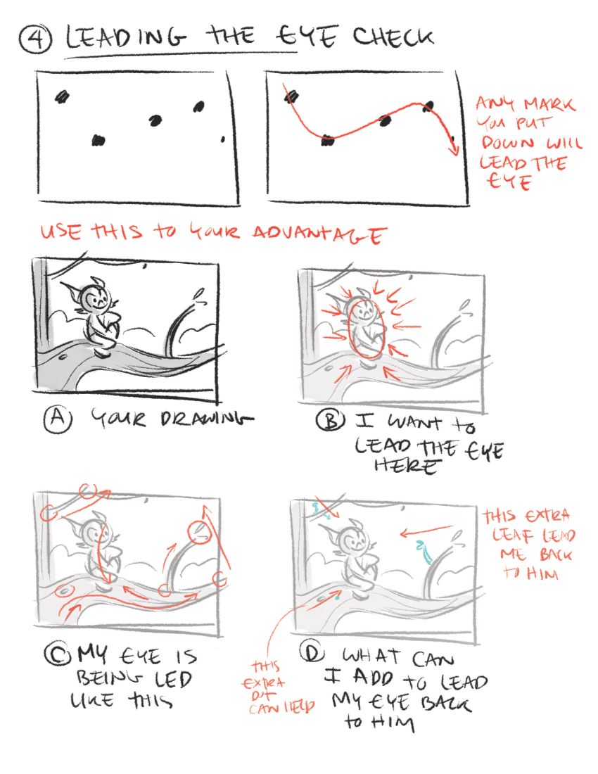
Crop with Care
I don’t go crazy about exactly where a crop, but I do think it is necessary to crop with care. My rule of thumb is if you are going to crop off, crop hard. Cut off a good chunk. The real problem happens when you just barely cut off a skiff.
Break the rules!
Don’t be afraid to break the rules and try something new. There are times when breaking the rules is precisely what makes a rendering stand out from all the rest
The Ultimate Guide to Adjustment Layers – Levels
In this tutorial, we will take a close look at the Levels Adjustment Layer in Photoshop. We will see how levels can improve low-key, high-key, and low contrast photos, as well as how you can use the Levels Adjustment Layer to make color corrections. We will also spend some time in this tutorial explaining a bit about Photoshop’s histogram and how it works. Let’s get started!
Histogram Details
For more information about Histograms, see this tutorial "What Does a Histogram Tell Us?"
- Mean: represents the average intensity value of the pixels in the image.
- Standard Deviation: (abbreviated "Std. Dev.") shows how widely the image’s intensity values vary.
- Median: is the midpoint of the intensity values.
- Pixels: tells you how many pixels Photoshop analyzed to generate the histogram.
- Cache Level: shows the current image cache Photoshop used to make the histogram. When this number is higher than 1, Photoshop is basing the histogram on a representative sampling of pixels in the image rather than on all of them. You can click the Uncached Refresh button to make the program redraw the histogram based on the current version of the image.
If you position your cursor over the histogram, you also see values for the following:
- Level: displays the intensity level of the area beneath the cursor.
- Count: shows the total number of pixels that are at the intensity level beneath the cursor.
- Percentile: indicates the number of pixels at or below the intensity level beneath the cursor, expressed as a percentage of all the pixels in the image.
Be More Creative Instantly
Smile to get smart! Being in a good mood makes you more creative, finds new research from the University of California, San Francisco.

Scientists reviewed a collection of studies that all pointed to the pros of a positive mood. Happy men had a more holistic approach to problems than negative guys, meaning they were able to recognize innovative solutions others may have missed.
How come? Research suggests when you’re happy, you release more dopamine—a neurotransmitter linked with motivation—which increases your control over your mind. Happiness also boosts activity in areas of the brain that handle decision-making, learning, and processing.
Manipulate your mind—even if you’re down in the dumps—by recalling happy experiences or simply smiling. Research has shown that if you’re bummed out, faking a grin can trick your brain into feeling happier.
Increasing Your Creativity at Work
Do you ever think, "I'm just not that creative"? You're not alone. But companies increasingly expect their employees to think about problems in new ways and devise unexpected solutions. The good news is that creativity is not a gift, but a skill that can be developed over time. Learn how in this course with innovation expert Drew Boyd. Discover nine simple tips to boost your creative output at work and learn how to think about the world in a different way, break problems down into manageable parts, divide and conquer a problem, and evaluate ideas systematically.

SAVE 20% OFF New Chaos Group Products and Upgrades

If you’re new to Chaos Group you’ll get 20% off any Chaos Group products just for registering for one of CGschool's live or online masterclasses. If you’re an existing customer, you’ll get 20% off any product upgrade. With V-Ray 3.0 just around the corner this could save you hundreds or even thousands of dollars off your studio’s upgrades.
FREE V-Ray for 3ds Max License
We’re also giving away one full license of V-Ray for 3ds Max in each Masterclass city and we’ll also have a bunch of cool Chaos Group swag to give out to students.
For more information, go to http://masterclass.thecgschool.com/
Announce Your Availability
Let's say you're all set up and ready to go. You know where you'll be working, your office systems are in place, and you're ready to show your portfolio to prospective clients. Now it's time to find those prospective clients, and more importantly, to let them find you. In another video, I talked about building your professional network but cautioned at that stage not to hit them up for work. Now it's time to get a bit more aggressive. First, follow up on all past leads. Always keep track of whom you talk to, when, and why as you go. Make that a habit.

That's how you build your professional network over time. Once that's done, here are some things you can do to make yourself more accessible and attractive to clients going forward. The first is to beef up your website. In an earlier video, we talked about preparing your portfolio and, of course, that's going to become a substantial part of your site. But there are a few other elements it needs as well. First, a description of what you do. Put it front and center, preferably, on the homepage. This is where you express all the soul-searching you did earlier while sharpening your market focus.
It should define your business in terms of the skill you're selling, the industry you'll target and the type of customer you'll sell to. Other elements include information about your credentials. That is, why people should trust you with their projects. Finally, make sure it's easy to find a way to contact you and that it. You can also add other elements, and I recommend you start paying close attention to other freelancers' sites for ideas. But your website is not done yet. You'll also need a domain name and a place to host the site.

Your site will also need occasional maintenance. A website isn't just a set it and forget it kind of thing that won't take a lot of time. But you'll either need to get the necessary skills or hire someone who has them. In either case realize that benefits you get from your site are directly proportional to the attention you give to its planning, creation, and promotion. Your website is only one way to announce your availability online. You'll also want to have presences on the big social networks, such as Twitter and Facebook.
I recommend that you do a land grab on those services for a name that reflects your business, even if you're not ready to add any content yet. And don't forget to add yourself to professional directories related to your skill and location. But eventually you will start building out your social media homes. Twitter of course, is only as good as the regular post you make to it, but there is a little space for self-description. And on Facebook it's possible to display quite a lot about yourself. On both systems, as on other social sites, there are opportunities for responsible promotion.
GRAVEL - VOLUME ONE
Next to 3D people and vegetation, rendering realistic gravel is one of the last remaining challenges when it comes to architectural visualization. Most 3D artists try to avoid graveled surfaces wherever possible. But gravel is a very important building material and cannot always be avoided - nor should it be. Its role in architecture, landscaping and even interior design will let this challenge persist.

Fortunately, technology has now caught up with the problem. With this texture collection we are attempting to close this particular gap between the imagination of the client and what you as a 3D artist can deliver. This collection contains 134 different gravel textures and - as an industry first - gravel as real 3D geometry. Along with the included 257 stone textures, this opens up a near-endless variety of different gravel styles.
The product consists of the following three major parts:
GRAVEL TEXTURES (Disks 1 and 2):
This product contains a total of 134 gravel textures, based on 15 different gravel styles. Each texture consists of diffuse, bump, normal, displacement and reflectivity maps, as well as a number of special maps that will help you to modify the gravel textures or to create entirely new textures. Also included are ready-to-use material setups for 3DS Max™ and MaxwellRender™.
GRAVEL MESHES (Disk 3):
As a first on the market, we offer gravel 'textures' in form of real 3D geometry. This product contains gravel meshes based on 15 different gravel styles in sizes of 4m² and 16m². All meshes are provided in .max format (compatible with 3DS Max™ 2010+), as well as .obj format (compatible with many other applications).
STONE TEXTURES (Disks 4 to 6):
Meant to be used with the 3D gravel meshes, this product also contains especially optimized stone textures in 257 different styles and colors, based on 94 distinct sets. Each texture set consists of diffuse, bump, normal, as well as reflectivity maps. As with the gravel textures, we also provide ready-to-use material setups for 3DS Max™ (2010+) and MaxwellRender™ (2.x). For further information to this and other products,
please visit our website: www.arroway-textures.de
New, FREE 3D scene for you!

There is new, FREE scene for you in Downloads section - Living room by heobunt. Grab it here: http://goo.gl/Ex5yWi
Talking Money: General Tips
Be straightforward about money and how you charge for your services. Make sure that all the financial aspects of the project are clear in your contracts, then make sure your invoices match your Designer-Client Agreements, and any change orders you provide.

Financial consistency will facilitate, smooth sailing, and prompt payment from the client. Make sure to communicate financial information verbally, as well as in writing your agreement. There are two categories of money that you need to cover. Fees, which are the designer's compensation for their labor and expertise. Design fees are typically fixed and are only revised with the change order due to additional scope of work; and estimated expenses. These are the out-of-pocket cost for things purchased specifically for the project. All expenses are subject to the industry-standard markup of 15 to 25%.
Don't be afraid to ask for what you need. If you have issues talking about money, practice with a friend; describe the project, state your fee and then stop talking. Don't feel the need to fill the void with words, have confidence.
Here, some tips for dealing with clients regarding money.
State exactly what the price includes, define your payment terms by telling the client when you expect to be paid. For example, you might say net 30 days, meaning you require payment one month from the invoice date. Also, will you be invoicing half upfront and the balance upon completion, or will you bill progress payments at the completion of each phase. Make sure to also state the number of revisions included and then stick to that.

Another money related tip is to keep good records. You need to keep project related expense receipts in order to pass those costs on to clients. In addition, make sure to integrate the project schedule with regular cost reviews. If you review these frequently, you can communicate any problems or issues to the team and the client. Make sure you capture all time, for example, telephone conversation, travel time, admin, etcetera, get all required client paperwork and financial information in order upfront.
If it's required by the client, get a purchase order number and/or a vendor ID number, then put these numbers on all your invoices. Also, introduce yourself to the client contact person in Accounts Payable. Make sure to have anything related to money signed by the client. For legal reasons and also to prompt a detailed conversation about money before the work gets underway, then stay in communication throughout the process.
Architectural Photography Shannon McGrath
Shannon has honed her practice over the last 12 years, concentrating on architecture and interior design, producing amazing photos used in many international magazines.
Hosts: Catherine Hall and Leo Laporte
Guest: Shannon McGrath
Don't miss a chance to watch or listen to your favorite photographers -- download and subscribe to TWiT Photo podcast on iTunes for free.
Follow Catherine on Twitter. You can also check out her blog here.
Submit your guest photographer at twitphoto.feedbackroad.com
Download or subscribe to this show at twit.tv/photo.
Thanks to Cachefly for providing the bandwidth for this podcast.