Viewing entries in
Composition

TRICKS OF THE TRADE

The ability to create realistic depth in a photograph (rendering), a 2-dimensional plane, is the sign of a good photographer (rendering) When shooting stills or video, it’s an important detail to make sure your shots have depth. Sometimes, however, that is sometimes easier said than done. In the quick, 3-minute video clip below, cinematographer Matthew Rosen, covers his top 5 favorite ways to ensure his image aren’t falling flat. The video is geared towards cinematography and moving pictures, but many of the techniques can be transferred into still photography as well. Well worth a watch even if you never shoot video.

TRICKS OF THE TRADE

In the beginning of the clip, Rosen explains why it’s important to have depth in an image, “It’s always my goal when I shoot to give this 2D image as much depth as I possibly can. The more tricks you have up your sleeve to conjure up depth, the more you will immerse your audience.” In order to achieve it, he suggests using these old tricks of the trade:

  • Lighting And Shadow – Use a higher contrast between light and shadow to create a deeper feel.
  • Focus – Use a shallow depth of field to create a visual of distance between subjects.
  • Perspective – Use a perspective that creates a convergence of parallel lines (think leading lines) to simulate a deep depth of field.
  • Parallax – Objects closest to the camera will appear to move quicker than those in the background.
  • Occlusion – A type of transition in which a foreground subject completely covers a subject in the background as the camera pans behind the foreground subject.

Let’s listen to Rosen break it down in the video clip:


Did you enjoy this article? I would love to hear your thoughts, so don’t be shy and comment below! Please don’t forget to subscribe to my RSS-feed  or follow my feed on Twitter, Google+ and Facebook! If you enjoyed the following article we humbly ask you to comment, and help us spread the word! Or, if you would like, drop me an email.

Create Depth in Your Architectural Rendering

Ever wondered how artists get that awesome sense of depth in their architectural renderings? It's all about perspective and, here is how you can apply this to your own architectural rendering. 

Color plays an important role in perspective renderings!

Once you understand the color part of your perspective, you’ll be able to create stunning architectural rendering with ease.

When your rendering recedes three essential things become apparent.

  1. Background = Neutral (and bluish) and Foreground = Saturated
  2. Background = Less contrasted and Foreground is = Contrasted
  3. Background = Cooler and Foreground = Warmer

This is how the eye naturally sees.

Cole Thomas The Oxbow


Did you enjoy this article? I would love to hear your thoughts, so don’t be shy and comment below! Please don’t forget to subscribe to my RSS-feed  or follow my feed on TwitterGoogle+ and Facebook! If you enjoyed the following article we humbly ask you to comment, and help us spread the word! Or, if you would like, drop me an email.


Exterior Architectural Rendering Camera Settings

Follow These Composition Tips:

  1. Use a high f-stop - (such as f-16) to keep your entire rendering in focus. This will ensure that every part of the building in your frame will be sharp.
  2. Use the rule of thirds to line up the horizon with either the top or bottom third of the frame. Following this basic rule of composition will draw the viewer in. 
The water is more important, so the horizon is sitting on the top 1/3rd

The water is more important, so the horizon is sitting on the top 1/3rd

The sky is more important, so the horizon is sitting on the bottom 1/3rd

The sky is more important, so the horizon is sitting on the bottom 1/3rd


Did you enjoy this article? I would love to hear your thoughts, so don’t be shy and comment below! Please don’t forget to subscribe to my RSS-feed  or follow my feed on TwitterGoogle+ and Facebook! If you enjoyed the following article we humbly ask you to comment, and help us spread the word! Or, if you would like, drop me an email.

Think About Symmetry With Your Light Source

Lighting has three main purposes:

  1. an illusion of depth (modeling).
  2. Create a mood.
  3. Normalize (or, conversely, emphasize) the subject's features.

Once you’ve worked out your composition and thought about the symmetry of the objects within it, you’re going to have to consider where your light source is coming from. Research has been done into which direction of lighting people respond to best and guess what? People generally prefer paintings lit from the left. Of course, this doesn’t mean you can’t have your light source coming from the right if you want to (and we’ve experimented with both), but you might just find your rendering will work better in some cases if you have it coming from the left.

Now here’s an interesting one. Researchers looked at more than 1000 European portrait paintings produced from the 16th until the 20th century and were surprised at what they found. Almost 60 percent of the time, the subject had their left cheek turned towards the viewer.

Why is this? Some analysts think it’s all to do with our left-right preferences again and our instinctive love of symmetry in art. It’s not always the case though, and it looks as if social standing has some influence on whether it’s the left or the right cheek that’s facing the viewer. For example, academics such as scientists are often painted or photographed with their faces inclined to the right.


Did you enjoy this article? I would love to hear your thoughts, so don’t be shy and comment below! Please don’t forget to subscribe to my RSS-feed  or follow my feed on TwitterGoogle+ and Facebook! If you enjoyed the following article we humbly ask you to comment, and help us spread the word! Or, if you would like, drop me an email.

13 Things you shouldn't do in Architectural Renderings

13 Things you shouldn't do in Architectural Renderings

Andrew Price created an awesome list of the "13 Deadly Sins of Architectural Rendering"

There are 13 things that you should not do, and 13 things that you should do in architectural renderings. 

Those things are:

  • Too Bright- You do not want to have too much sunlight in a room. Having too much light can drown out the entire room. If you have nice designs and too much light in that room, you may not be able to see the designs. Having shadow is good, as it can show designs better sometimes.
  • Too Many Colors- In each room of your house, you should never have more than 3 different colors. Having too many colors can take away from the beauty of the main colors of your walls and or designs.
  • Neglecting Composition- Composition is very important. You should pay close attention to the photography and the frames as well. Coordinating them to the design of your room is crucial, as you do not want to put a photo and picture frame that does not match good with the color and design of the room they are in.
  • Wide Lenses- It is better to use a tighter frame when you are trying to capture a scene for a room. Using narrow lenses can take away the important things out of the scene.
  • Too Diffused- Texture is important to have for every room, as you want a little bit of reflection, but not too much. Just a little amount of gloss is good, but you do not want to have too much as it can leave oily hand prints on the walls.
  • No Focal Point- You will want something such as a nice fireplace or a nice artwork piece that will draw attention to viewers so that the room can have the added focal point.
  • Tilting The Camera- You always want to make sure that you hold the camera in the middle of a room, when taking a picture, so that you do not cut off the edge of a picture, or have the upside or downside of a picture.
  • Personality- Your interior scenes need to have personality, as no personality can make a room dull and boring.
  • Boring Ceilings- You are going to want a different visual scene for the ceiling, as just a plain texture can make the entire room dull. Wallpaper, or ceiling fans are great to have for the ceiling.
  • No Nature- Having trees and plants gives the outside of your home personality, and makes it attractive for the viewers. It also helps to give a story behind the home, and a relaxed atmosphere. 
  • Low Visual Interest- Texture, patterns, contrast, and colors are important. Putting a plant in front of a plain colored wall gives the room texture. You can also put a piece of artwork in front of the wall, but you do not want to go overboard.
  • No Harmony- You want to be careful to not pick out furniture that will not match or look good together. You have to pay attention to the whole scene. 
  • No Point- Always makes sure that you have something that will be eye catching, and attractive to a room. But make sure that the architectural renderings go in contrast with the room as well.

Don't make these mistakes in your architectural renders :) Watch the Full Introduction to Architectural Rendering: http://www.thearchitectureacademy.com/fe/51372-introduction-to-architecture


Did you enjoy this article? I would love to hear your thoughts, so don’t be shy and comment below! Please don’t forget to subscribe to my RSS-feed  or follow my feed on TwitterGoogle+ and Facebook! If you enjoyed the following article we humbly ask you to comment, and help us spread the word!

Blue Hour Renderings

The blue hour is a time of twilight each morning and evening where there is neither full daylight nor complete darkness. The time is regarded distinctive because of the character of the light. Artists call it sweet light. Go ahead, try it on your next architectural rendering.

The Colosseum during the blue hour

The Colosseum during the blue hour

Did you enjoy this article? I would love to hear your thoughts, so don’t be shy and comment below! Please don’t forget to subscribe to my RSS-feed  or follow my feed on TwitterGoogle+ and Facebook! If you enjoyed the following article we humbly ask you to comment, and help us spread the word!

Utilizing the Visual Arts

Seeing is Believing

Seeing is Believing

In some cases, believing is seeing. However, there are other cases where, if you can’t see it with your own eyes, you aren't buying, believing, or even acknowledging it. It’s one thing to imagine a building, person, or place, but we all know that what we imagine seldom turns out to be the reality. With Bobby Parker’s architectural illustrations, you won’t have to worry about using your imagination or hoping that something will turn out the way you pictured it. Bobby Parker is a Minnesota based architectural illustrator who specializes in creating photo-real renderings of buildings. His illustrations make you feel as if you’re actually staring directly into a real-life kitchen or at a luxurious house in the woods, or even a child’s playground in the charming front yard of a suburban home. Parker is well skilled in the visual arts, and his renderings have helped architecture and design businesses to give their clients exactly what they want. When people can see, rather than just picture themselves how something is going to look, it gives them a sense of trust and excitement. How does Parker accomplish this? It all comes down to composition and the visual arts.

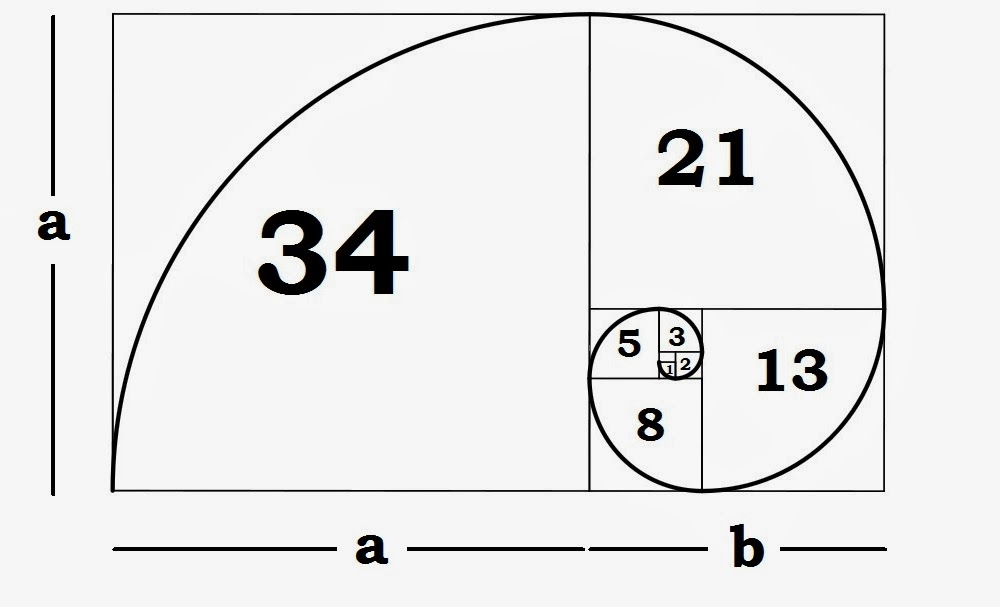
Golden Ratio Fibonacci Sequence

Golden Ratio Fibonacci Sequence

What Does Composition Mean?

In the visual arts, composition refers to the arrangement of visual elements in a painting, photo, graphic, or a sculpture. Technically, it refers to the organization of the various elements that go into an artwork, according to the standard principles of art. Under the dictionary definition, you’ll find that composition means “putting together”. It’s like a puzzle piece being arranged in just the right way to relay the bigger picture. Composition is the key in art work because it is what allows the brain to decipher and understand what it is looking at. Some artists use composition to differently by rearranging the visual elements to look confusing and abstract. However in architectural renderings, proper use of composition can make the difference between an active project and a scrapped plan idea. 

How is Composition Used?

In Parker’s architectural renderings, composition is used incredibly effectively. Parker’s renderings are advertised as “photo-real” which means they are not only drawn to look highly realistic, they are also drawn with real time and space in mind. To be photo-real, these renderings must have depth, volume, light, shadow, lines, texture, and a professional execution. The sharper the image, the better a potential client can visualize what their future home, business, office, kitchen, bathroom, or whatever will look like. 

Hand Drawing

Hand Drawing

Why Use Hand Drawings?

In today’s digital age, a computer or some sort of software may be enough to achieve the photo-real look businesses are after. Parker’s craftsmanship, however, gives his renderings a human element that a computer cannot capture. Though technology is most definitely used to create these renderings, beginning with old fashioned pencil and paper is the best way to start a rendering. It all comes down to layers, and the correct composition can birth a stunning visual art piece that will resonate with various clients. 

Composition in the visual arts is extremely important. Placement, arrangement, skill, and detail are all elements of composition that can really bring an artwork, or in this case, a “photo-real” architectural rendering, to life. Check out Bobby Parker’s work for more information.


Did you enjoy this article? I would love to hear your thoughts, so don’t be shy and comment below! Please don’t forget to subscribe to my RSS-feed  or follow my feed on TwitterGoogle+ and Facebook! If you enjoyed the following article we humbly ask you to comment, and help us spread the word!

Lesser Known Composition Tricks

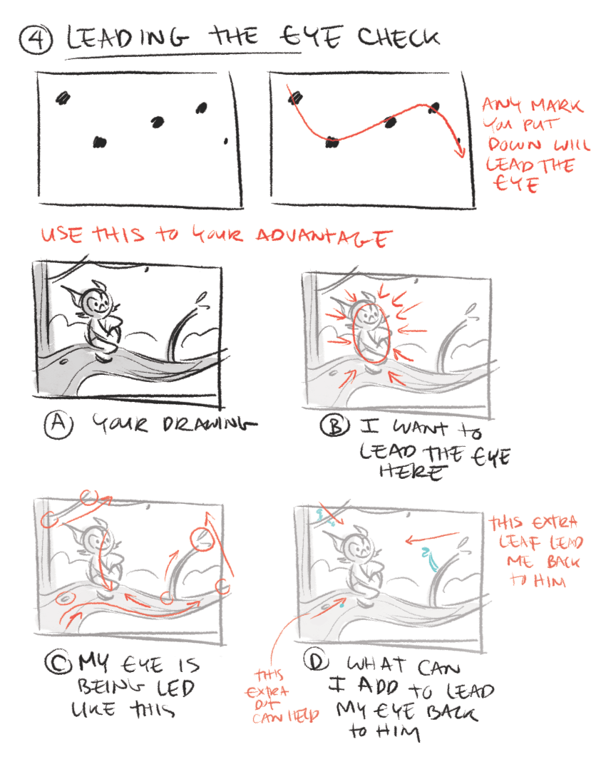
So you already know that the rule of thirds, leading lines, and framing your rendering are some of the essential composition techniques architectural illustrators commonly use. Here are a few other not so common composition techniques that can set your renderings apart from the rest!

layout-tricks2.gif

Left to Right

Put the focus point of your subject more to the right side rather than the left. Our eyes are used to reading text left to right, just like you are reading this article, so follow the same idea in your renderings. No, this is not the rule of thirds or leading lines; rather, it draws your viewer’s eye into the image.

Tell a Story

A picture is worth a thousand words, right? 

Telling a story with your composition is nothing new.  You have probably heard that before; however, one thing that I consistently see results from in my renderings is paying more attention to what is excluded from the rendering than what is included in the rendering.  The key to composition is to analyze every single thing in the rendering, and then place it in a way that adds to the subject itself.

Simplify Your Compositions

Keep the focus on the subject, not all the details in the scene. Too many details take the focus away from the story your rendering is trying to tell and make it more difficult for the viewer to figure out what you are trying to convey. 

Another way to bring focus to your subject is with light. The eye is naturally drawn to the brightest spot of an image By using light, positioning, and depth-of-field to make the viewer pay closer attention to the subject, you will capture much more impactful photos.

Odd vs. Even

Odd numbers of things tend to be more visually exciting than even amounts. Because of this, triangles are more dynamic than squares (which often look like a frame). Three’s the magic number rather than two or four. Choose seven over six or eight, and nine over ten… You get the idea.

layout-tricks3.gif

Crop with Care

I don’t go crazy about exactly where a crop, but I do think it is necessary to crop with care.  My rule of thumb is if you are going to crop off, crop hard.  Cut off a good chunk.  The real problem happens when you just barely cut off a skiff.

Break the rules!

Don’t be afraid to break the rules and try something new. There are times when breaking the rules is precisely what makes a rendering stand out from all the rest

Did you enjoy this article? I would love to hear your thoughts, so don’t be shy and comment below! Please don’t forget to subscribe to my RSS-feed  or follow my feed on TwitterGoogle+ and Facebook! If you enjoyed the following article we humbly ask you to comment, and help us spread the word!

A Subliminal Portal Into The Viewer's Mind

Let's explore the power of symbolic color and how it can be used most efficiently. When you see the color red, what does it make you think of? Blood? Anger? Fire? Passion?

We associate colors with particular objects, as well as the emotions conjured by experiences. And thoughts associated with in this case red things. Color can be universal as a symbol, but it's frequently cultural and often personal. Understanding color as a symbol and an image help to convey content and meaning. It can be a single node of color or an overall pallet or a repeating pattern and can identify a particular emotion. And immediately indicates to the viewer, how they should feel or think about the content of a rendering. We can't ignore the fact that it exists, not as an isolated factor, but part of a larger context.

wallpaper-colors.jpeg

Color is defined by its relationship to other colors in a rendering. We have intuitive responses to the environment, or a mood cast by a particular grouping of colors, and respond to the literal content colored by the mood the palette implies. A palette change can completely change your perception of meaning, and it can strengthen or weaken your intended message.

Color as a symbol is a powerful player for the designer. And should be considered carefully, especially when used as a focal point in a rendering. Focusing our attention on it empowers that element with importance. You'll need to consider how colors play off one another in the world of your rendering. If you think of colors as personalities, it's easier to understand how a red in one setting Appears loud and boisterous, and in another, just one of the crowd.

Have you ever been to a party where you're perceived as the most vibrant and energetic person in the room? And in another situation, a bit of a wallflower? Colors function similarly. Telling stories and expressing ideas through colors is without question, one of the most valuable skills to hone. Because it provides a subliminal portal into the viewer's mind. We see color as images, so what do they say to us?


Did you enjoy this article? I would love to hear your thoughts, so don’t be shy and comment below! Please don’t forget to subscribe to my RSS-feed  or follow my feed on TwitterGoogle+ and Facebook! If you enjoyed the following article we humbly ask you to comment, and help us spread the word!

Cut the Crap

Simplicity in one phrase means, “Cut the crap”, in your 3D Architectural Rendering, leave only what you want the viewer to see. Make the background less cluttered, remove unnecessary distractions and have few important elements. Very Simple! 

Clean and Simple Composition

Did you enjoy this article? I would love to hear your thoughts, so don’t be shy and comment below! Please don’t forget to subscribe to my RSS-feed  or follow my feed on TwitterGoogle+ and Facebook! If you enjoyed the following article we humbly ask you to comment, and help us spread the word!